
Handling user input
Handling user input
Flutter 起步教程chevron_rightFundamentalschevron_rightHandling user input
Now that you know how to manage state in your Flutter app, how can you let users interact with your app and change its state?
Introduction to handling user input
As a multi-platform UI framework, there are many different ways for users to interact with a Flutter app. The resources in this section introduce you to some of the common widgets used for enabling user interaction within your app.
Some user input mechanisms, like scrolling, have already been covered in Layouts.
About design system support
Flutter ships with prebuilt components for two design systems as part of the SDK, Material and Cupertino. For educational purposes, this page focuses on Material widgets, components that are stylized according to the Material 3 design language specifications.
The Flutter community on pub.dev, the package repository for Dart and Flutter, create and support additional design languages such as Fluent UI, macOS UI, and more. If the existing design system components don't quite fit what you need, Flutter lets you build your own custom widgets, which is covered at the end of this section. No matter which design system you choose, the principals on this page apply.
menu_book Reference: The widget catalog has an inventory of commonly used widgets in the Material and Cupertino libraries.
Next, we'll cover a few of the Material widgets that support common use cases for handling user input in your Flutter app.
Buttons
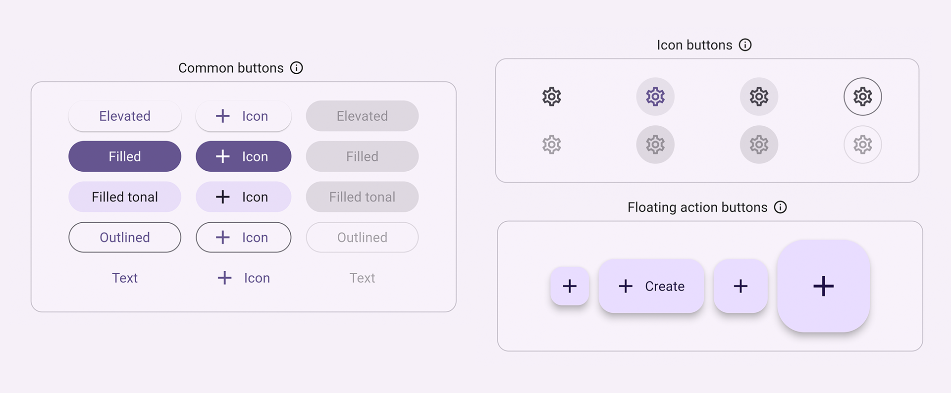
Buttons allow a user to initiate an action in the UI by clicking or tapping. The Material library provides a variety of button types that are functionally similar, but styled differently for various use cases, including:
ElevatedButton: A button with some depth. Use elevated buttons to add dimension to otherwise mostly flat layouts.FilledButton: A filled button that should be used for important, final actions that complete a flow, like Save, Join now, or Confirm.Tonal Button: A middle ground button betweenFilledButtonandOutlinedButton. They're useful in contexts where a lower-priority button requires more emphasis than an outline, like Next.OutlinedButton: A button with text and a visible border. These buttons contain actions that are important, but aren't the primary action in an app.TextButton: Clickable text, without a border. Since text buttons don't have visible borders, they must rely on their position relative to other content for context.IconButton: A button with an icon.FloatingActionButton: An icon button that hovers over content to promote a primary action.
slideshow Video: FloatingActionButton (Widget of the Week)
There are usually 3 main aspects to constructing a button: style, callback, and its child, as seen in the following ElevatedButton sample code:
- A button's callback function,
onPressed, determines what happens when the button is clicked, therefore, this function is where you update your app state. If the callback isnull, the button is disabled and nothing happens when a user presses the button. - The button's
child, which is displayed within the button's content area, is usually text or an icon that indicates the button's purpose. - Finally, a button's
stylecontrols its appearance: color, border, and so on.
dart
int count = 0;

@override
Widget build(BuildContext context) {
  return ElevatedButton(
    style: ElevatedButton.styleFrom(
      textStyle: const TextStyle(fontSize: 20),
    ),
    onPressed: () {
      setState(() {
        count += 1;
      });
    },
    child: const Text('Enabled'),
  );
}
content_copy
 This figure shows an ElevatedButton with the text "Enabled" being clicked.
star Checkpoint: Complete this tutorial that teaches you how to build a "favorite" button: Add interactivity to your Flutter app
menu_book API Docs: ElevatedButton • FilledButton • OutlinedButton • TextButton • IconButton • FloatingActionButton
Text
Several widgets support text input.
SelectableText
Flutter's Text widget displays text on the screen, but doesn't allow users to highlight or copy the text. SelectableText displays a string of user-selectable text.
dart
@override
Widget build(BuildContext context) {
  return const SelectableText('''
Two households, both alike in dignity,
In fair Verona, where we lay our scene,
From ancient grudge break to new mutiny,
Where civil blood makes civil hands unclean.
From forth the fatal loins of these two foes''');
}
content_copy
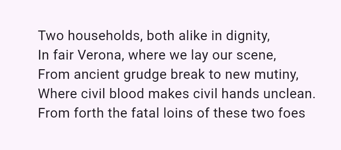 This figure shows a cursor highlighting a portion of a string of text.
slideshow Video: SelectableText (Widget of the Week)
RichText
RichText lets you display strings of rich text in your app. TextSpan, similar to RichText, allows you to display parts of text with different text styles. It's not for handling user input, but is useful if you're allowing users edit and format text.
dart
@override
Widget build(BuildContext context) {
  return RichText(
    text: TextSpan(
      text: 'Hello ',
      style: DefaultTextStyle.of(context).style,
      children: const <TextSpan>[
        TextSpan(text: 'bold', style: TextStyle(fontWeight: FontWeight.bold)),
        TextSpan(text: ' world!'),
      ],
    ),
  );
}
content_copy
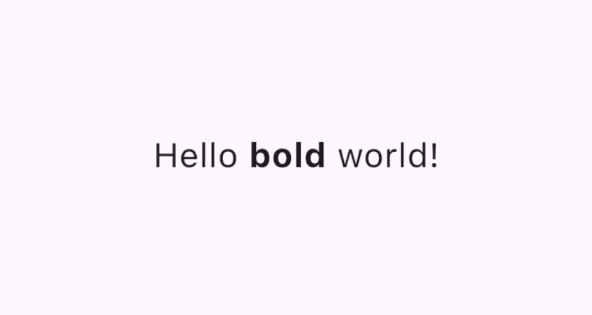 This figure shows a string of text formatted with different text styles.
slideshow Video: Rich Text (Widget of the Week)
flutter Demo: Rich Text Editor
code Code: Rich Text Editor code
TextField
A TextField lets users enter text in text box using a hardware or onscreen keyboard.
TextFields have many different properties and configurations. A few of the highlights:
InputDecorationdetermines the text field's appearance, such as color and border.controller: ATextEditingControllercontrols the text being edited. Why might you need a controller? By default, your app's users can type into the text field, but if you want to programmatically control theTextFieldand clear its value, for example, you'll need aTextEditingController.onChanged: This callback function triggers when the user changes the text field's value, such as when inserting or removing text.onSubmitted: This callback is triggered when the user indicates that they are done editing the text in the field; for example, by tapping the "enter" key when the text field is in focus.
The class supports other configurable properties, such as obscureText that turns each letter into a readOnly circle as its entered and readOnly which prevents the user from changing the text.
dart
final TextEditingController _controller = TextEditingController();

@override
Widget build(BuildContext context) {
  return TextField(
    controller: _controller,
    decoration: const InputDecoration(
      border: OutlineInputBorder(),
      labelText: 'Mascot Name',
    ),
  );
}
content_copy
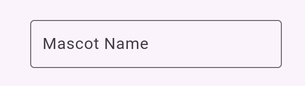 This figure shows text being typed into a TextField with a selected border and label.
star Checkpoint: Complete this 4-part cookbook series that walks you through how to create a text field, retrieve its value, and update your app state:
Form
Form is an optional container for grouping together multiple form field widgets, such as TextField.
Each individual form field should be wrapped in a FormField widget with the Form widget as a common ancestor. Convenience widgets exist that pre-wrap form field widgets in a FormField for you. For example, the Form widget version of TextField is TextFormField.
Using a Form provides access to a FormState, which lets you save, reset, and validate each FormField that descends from this Form. You can also provide a GlobalKey to identify a specific form, as shown in the following code:
dart
final GlobalKey<FormState> _formKey = GlobalKey<FormState>();

@override
Widget build(BuildContext context) {
  return Form(
    key: _formKey,
    child: Column(
      crossAxisAlignment: CrossAxisAlignment.start,
      children: <Widget>[
        TextFormField(
          decoration: const InputDecoration(
            hintText: 'Enter your email',
          ),
          validator: (String? value) {
            if (value == null || value.isEmpty) {
              return 'Please enter some text';
            }
            return null;
          },
        ),
        Padding(
          padding: const EdgeInsets.symmetric(vertical: 16.0),
          child: ElevatedButton(
            onPressed: () {
              // Validate returns true if the form is valid, or false otherwise.
              if (_formKey.currentState!.validate()) {
                // Process data.
              }
            },
            child: const Text('Submit'),
          ),
        ),
      ],
    ),
  );
}
content_copy
star Checkpoint: Complete this tutorial to learn how to build a form with validation.
flutter Demo: Form app
code Code: Form app code
menu_book API Docs: TextField • RichText • SelectableText • Form
Select a value from a group of options
Provide a way to users to select from several options.
SegmentedButton
SegmentedButton allows users to select from a minimal group of 2-5 items.
The data type, <T>, can be a built-in type such as int, String, bool or an enum. A SegmentedButton has a few relevant properties:
segments, a list ofButtonSegments, where each represents a "segment" or option that the user can select. Visually, eachButtonSegmentcan have an icon, text label, or both.multiSelectionEnabledindicates whether the user is allowed to select multiple options. This property defaults to false.selectedidentifies the currently selected value(s). Note:selectedis of type ofSet<T>, so if you're only allowing users to select one value, that value must be provided as aSetwith a single element.- The
onSelectionChangedcallback triggers when a user selects any segments. It provides a list of the selected segments so you can update your app state. - Additional styling parameters allow you to modify the button's appearance. For example,
styletakes aButtonStyle, providing a way to configure aselectedIcon.
dart
enum Calendar { day, week, month, year }

// StatefulWidget...
Calendar calendarView = Calendar.day;

@override
Widget build(BuildContext context) {
  return SegmentedButton<Calendar>(
    segments: const <ButtonSegment<Calendar>>[
      ButtonSegment<Calendar>(
          value: Calendar.day,
          label: Text('Day'),
          icon: Icon(Icons.calendar_view_day)),
      ButtonSegment<Calendar>(
          value: Calendar.week,
          label: Text('Week'),
          icon: Icon(Icons.calendar_view_week)),
      ButtonSegment<Calendar>(
          value: Calendar.month,
          label: Text('Month'),
          icon: Icon(Icons.calendar_view_month)),
      ButtonSegment<Calendar>(
          value: Calendar.year,
          label: Text('Year'),
          icon: Icon(Icons.calendar_today)),
    ],
    selected: <Calendar>{calendarView},
    onSelectionChanged: (Set<Calendar> newSelection) {
      setState(() {
        Suggested change
        // By default there is only a single segment that can be
        // selected at one time, so its value is always the first
        // By default, only a single segment can be
        // selected at one time, so its value is always the first
        calendarView = newSelection.first;
      });
    },
  );
}
content_copy
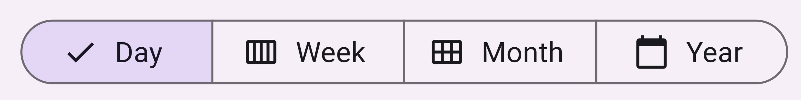 This figure shows a SegmentedButton, each segment with an icon and text representing its value.
Chip
Chip is a compact way of representing an attribute, text, entity, or action for a specific context. Specialized Chip widgets exist for specific use cases:
- InputChip represents a complex piece of information, such as an entity (person, place, or thing), or conversational text, in a compact form.
- ChoiceChip allows a single selection from a set of options. Choice chips contain related descriptive text or categories.
- FilterChip uses tags or descriptive words to filter content.
- ActionChip represents an action related to primary content.
Every Chip widget requires a label. It can optionally have an avatar (such as an icon or a user's profile picture) and an onDeleted callback, which shows a delete icon that when triggered, deletes the chip. A Chip widget's appearance can also be customized by setting a number of optional parameters such as shape, color, and iconTheme.
You will typically use Wrap, a widget that displays its children in multiple horizontal or vertical runs, to make sure your chips wrap and don't get cut off at the edge of your app.
dart
@override
Widget build(BuildContext context) {
  return const SizedBox(
    width: 500,
    child: Wrap(
      alignment: WrapAlignment.center,
      spacing: 8,
      runSpacing: 4,
      children: [
        Chip(
          avatar: CircleAvatar(
              backgroundImage: AssetImage('assets/images/dash_chef.png')),
          label: Text('Chef Dash'),
        ),
        Chip(
          avatar: CircleAvatar(
              backgroundImage:
                  AssetImage('assets/images/dash_firefighter.png')),
          label: Text('Firefighter Dash'),
        ),
        Chip(
          avatar: CircleAvatar(
              backgroundImage: AssetImage('assets/images/dash_musician.png')),
          label: Text('Musician Dash'),
        ),
        Chip(
          avatar: CircleAvatar(
              backgroundImage: AssetImage('assets/images/dash_artist.png')),
          label: Text('Artist Dash'),
        ),
      ],
    ),
  );
}
content_copy
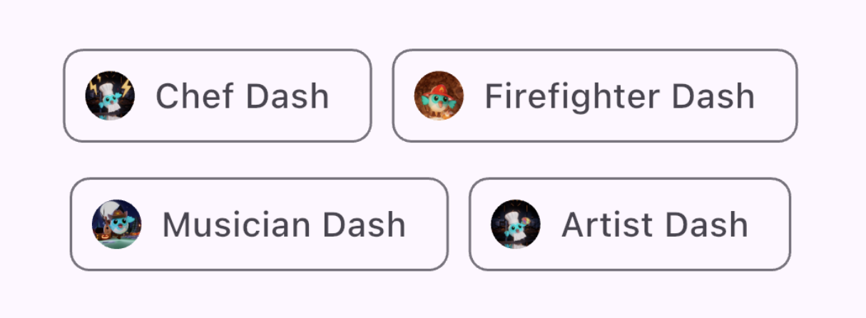 This figure shows two rows of Chip widgets, each containing a circular leading profile image and content text.
DropdownMenu
A DropdownMenu allows users to select a choice from a menu of options and places the selected text into a TextField. It also allows users to filter the menu items based on the text input.
Configuration parameters include the following:
dropdownMenuEntriesprovides a list ofDropdownMenuEntrys that describes each menu item. The menu might contain information such as a text label, and a leading or trailing icon. (This is also the only required parameter.)TextEditingControllerallows programmatically controlling theTextField.- The
onSelectedcallback triggers when the user selects an option. initialSelectionallows you to configure the default value.- Additional parameters are also available for customizing the widget's look and behavior.
dart
enum ColorLabel {
  blue('Blue', Colors.blue),
  pink('Pink', Colors.pink),
  green('Green', Colors.green),
  yellow('Orange', Colors.orange),
  grey('Grey', Colors.grey);

  const ColorLabel(this.label, this.color);
  final String label;
  final Color color;
}

// StatefulWidget...
@override
Widget build(BuildContext context) {
  return DropdownMenu<ColorLabel>(
    initialSelection: ColorLabel.green,
    controller: colorController,
    // requestFocusOnTap is enabled/disabled by platforms when it is null.
    // On mobile platforms, this is false by default. Setting this to true will
    // trigger focus request on the text field and virtual keyboard will appear
    // afterward. On desktop platforms however, this defaults to true.
    requestFocusOnTap: true,
    label: const Text('Color'),
    onSelected: (ColorLabel? color) {
      setState(() {
        selectedColor = color;
      });
    },
    dropdownMenuEntries: ColorLabel.values
      .map<DropdownMenuEntry<ColorLabel>>(
          (ColorLabel color) {
            return DropdownMenuEntry<ColorLabel>(
              value: color,
              label: color.label,
              enabled: color.label != 'Grey',
              style: MenuItemButton.styleFrom(
                foregroundColor: color.color,
              ),
            );
      }).toList(),
  );
}
content_copy
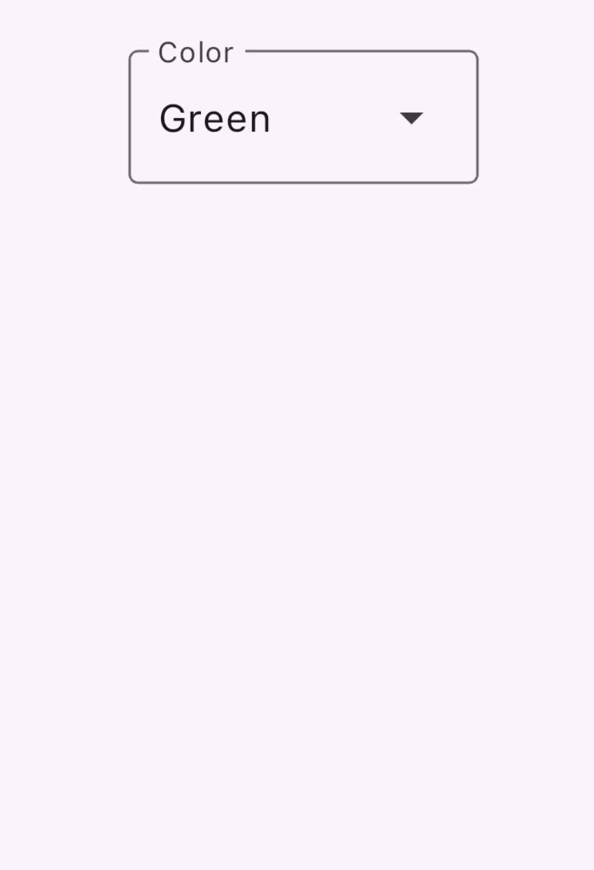 This figure shows a DropdownMenu widget with 5 value options. Each option's text color is styled to represent the color value.
slideshow Video: DropdownMenu (Widget of the Week)
Slider
The Slider widget lets a user adjust a value by moving an indicator, such as a volume bar.
Configuration parameters for the Slider widget:
valuerepresents the slider's current valueonChangedis the callback that gets triggered when the handle is movedminandmaxestablish minimum and maximum values allowed by the sliderdivisionsestablishes a discrete interval with which the user can move the handle along the track.
dart
double _currentVolume = 1;

@override
Widget build(BuildContext context) {
  return Slider(
    value: _currentVolume,
    max: 5,
    divisions: 5,
    label: _currentVolume.toString(),
    onChanged: (double value) {
      setState(() {
        _currentVolume = value;
      });
    },
  );
}
content_copy
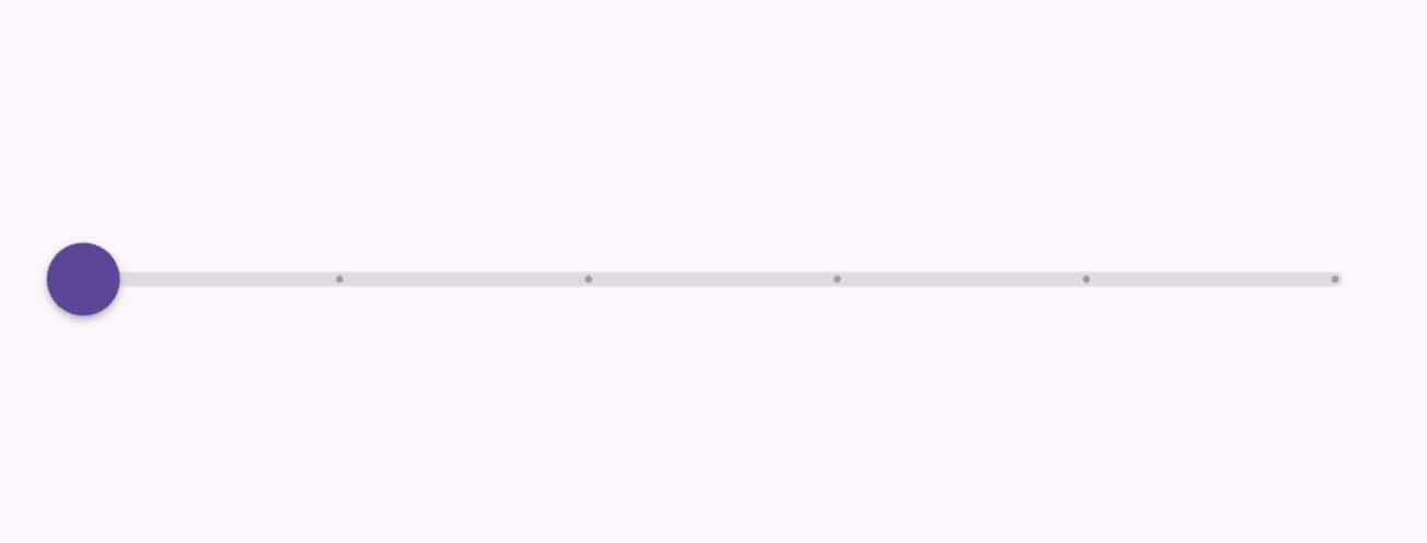 This figure shows a slider widget with a value ranging from 0.0 to 5.0 broken up into 5 divisions. It shows the current value as a label as the dial is dragged.
slideshow Video: Slider, RangeSlider, CupertinoSlider (Widget of the Week)
menu_book API Docs: SegmentedButton • DropdownMenu • Slider • Chip
Toggle between values
There are several ways that your UI can allow toggling between values.
Checkbox, Switch, and Radio
Provide an option to toggle a single value on and off. The functional logic behind these widgets are the same, as all 3 are built on top of ToggleableStateMixin, though each provides slight presentation differences.:
Checkboxis a container that is empty when false or filled with a checkmark when true.Switchhas a handle that is on the left when false and slides to the right when true.Radiois similar to aCheckboxin that it's a container that is empty when false, but filled in when true.
The configuration for Checkbox and Switch contain:
- a
valuethat istrueorfalse - and an
onChangedcallback which is triggered when the user toggles the widget
Checkbox
dart
bool isChecked = false;

@override
Widget build(BuildContext context) {
  return Checkbox(
    checkColor: Colors.white,
    value: isChecked,
    onChanged: (bool? value) {
      setState(() {
        isChecked = value!;
      });
    },
  );
}
content_copy
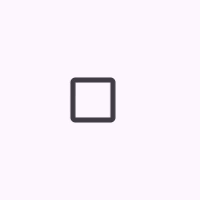 This figure shows a checkbox being checked and unchecked.
Switch
dart
bool light = true;

@override
Widget build(BuildContext context) {
  return Switch(
    // This bool value toggles the switch.
    value: light,
    activeColor: Colors.red,
    onChanged: (bool value) {
      // This is called when the user toggles the switch.
      setState(() {
        light = value;
      });
    },
  );
}
content_copy
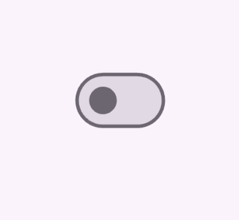 This figure shows a Switch widget that is toggled on and off.
Radio
A group of Radio buttons that allows the user to select between mutually exclusive values. When the user selects a radio button in a group, the other radio buttons are unselected.
- A particular
Radiobutton'svaluerepresent that button's value, - The selected value for a group of radio buttons is identified by the
groupValueparameter. Radioalso has anonChangedcallback that gets triggered when users click it, likeSwitchandCheckbox
dart
enum Character { musician, chef, firefighter, artist }

class RadioExample extends StatefulWidget {
  const RadioExample({super.key});

  @override
  State<RadioExample> createState() => _RadioExampleState();
}

class _RadioExampleState extends State<RadioExample> {
  Character? _character = Character.musician;

  void setCharacter(Character? value) {
    setState(() {
      _character = value;
    });
  }

  @override
  Widget build(BuildContext context) {
    return Column(
      children: <Widget>[
        ListTile(
          title: const Text('Musician'),
          leading: Radio<Character>(
            value: Character.musician,
            groupValue: _character,
            onChanged: setCharacter,
          ),
        ),
        ListTile(
          title: const Text('Chef'),
          leading: Radio<Character>(
            value: Character.chef,
            groupValue: _character,
            onChanged: setCharacter,
          ),
        ),
        ListTile(
          title: const Text('Firefighter'),
          leading: Radio<Character>(
            value: Character.firefighter,
            groupValue: _character,
            onChanged: setCharacter,
          ),
        ),
        ListTile(
          title: const Text('Artist'),
          leading: Radio<Character>(
            value: Character.artist,
            groupValue: _character,
            onChanged: setCharacter,
          ),
        ),
      ],
    );
  }
}
content_copy
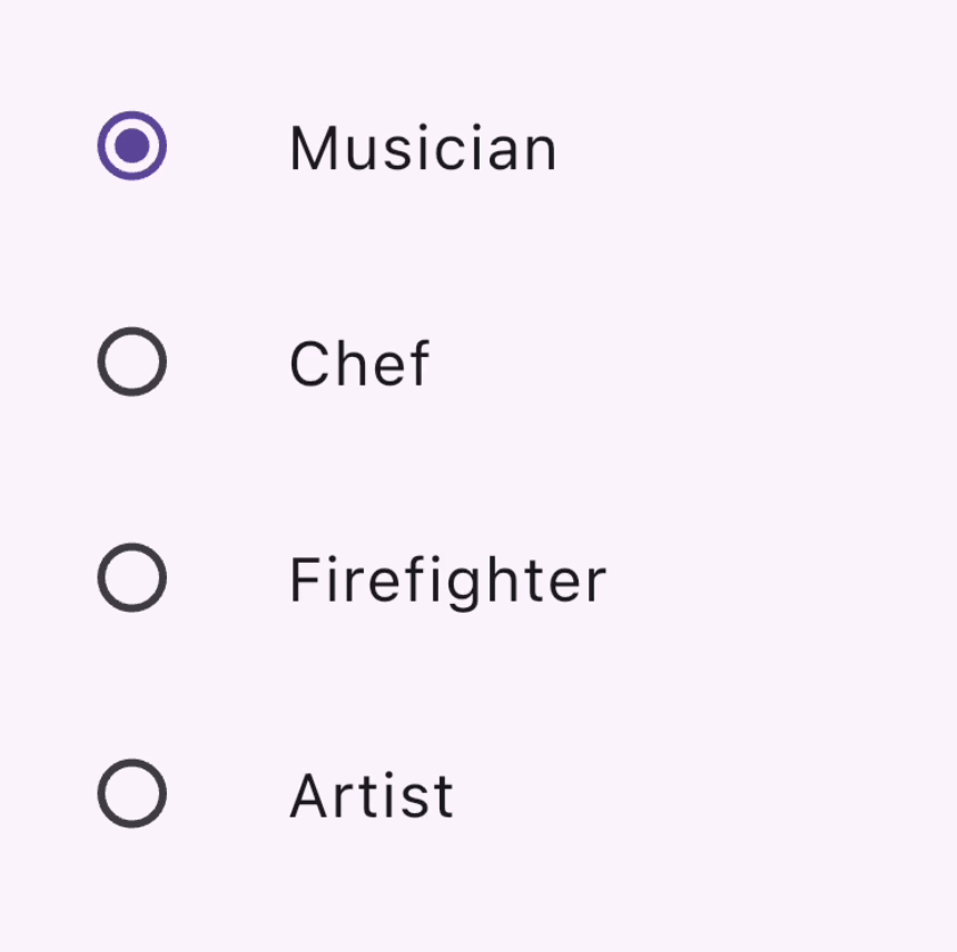 This figure shows a column of ListTiles containing a radio button and label, where only one radio button can be selected at a time.
Bonus: CheckboxListTile & SwitchListTile
These convenience widgets are the same checkbox and switch widgets, but support a label (as a ListTile).
dart
double timeDilation = 1.0;
bool _lights = false;

@override
Widget build(BuildContext context) {
  return Column(
    children: [
      CheckboxListTile(
        title: const Text('Animate Slowly'),
        value: timeDilation != 1.0,
        onChanged: (bool? value) {
          setState(() {
            timeDilation = value! ? 10.0 : 1.0;
          });
        },
        secondary: const Icon(Icons.hourglass_empty),
      ),
      SwitchListTile(
        title: const Text('Lights'),
        value: _lights,
        onChanged: (bool value) {
          setState(() {
            _lights = value;
          });
        },
        secondary: const Icon(Icons.lightbulb_outline),
      ),
    ],
  );
}
content_copy
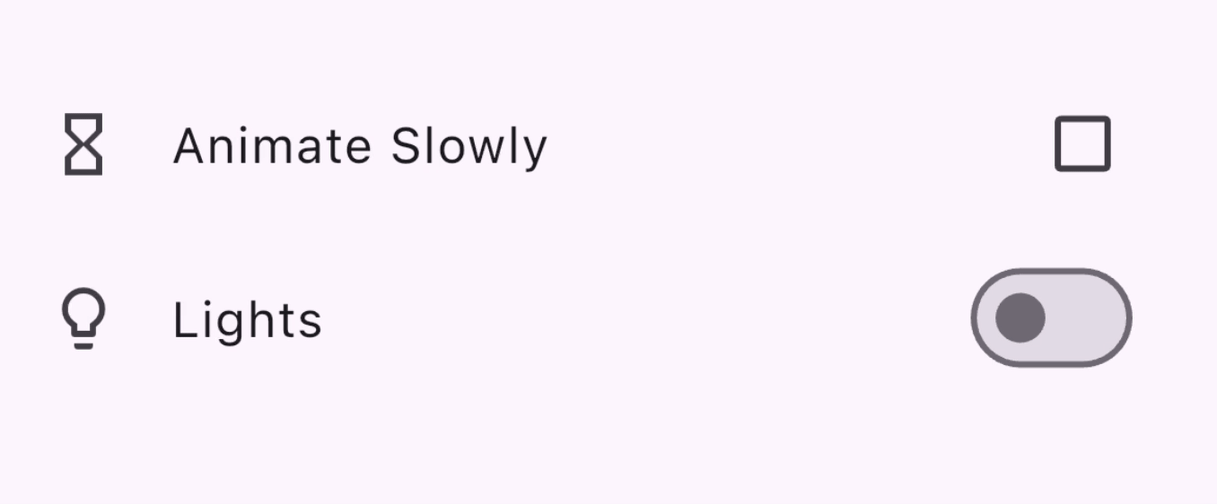 This figure shows a column containing a CheckboxListTile and a SwitchListTile being toggled.
slideshow Video: CheckboxListTile (Widget of the Week)
slideshow Video: SwitchListTile (Widget of the Week)
menu_book API Docs: Checkbox • CheckboxListTile • Switch • SwitchListTile • Radio
Select a date or time
Widgets are provided so the user can select a date and time.
There is a set of dialogs that enable users to select a date or time, as you'll see in the following sections. With the exception of differing date types - DateTime for dates vs TimeOfDay for time - these dialogs function similarly, you can configure them by providing:
- a default
initialDateorinitialTime - or an
initialEntryModethat determines the picker UI that's displayed.
DatePickerDialog
This dialog allows the user to select a date or a range of dates. Activate by calling the showDatePicker function, which returns a Future<DateTime>, so don't forget to await the asynchronous function call!
dart
DateTime? selectedDate;

@override
Widget build(BuildContext context) {
  var date = selectedDate;

  return Column(children: [
    Text(
      date == null
          ? "You haven't picked a date yet."
          : DateFormat('MM-dd-yyyy').format(date),
    ),
    ElevatedButton.icon(
      icon: const Icon(Icons.calendar_today),
      onPressed: () async {
        var pickedDate = await showDatePicker(
          context: context,
          initialEntryMode: DatePickerEntryMode.calendarOnly,
          initialDate: DateTime.now(),
          firstDate: DateTime(2019),
          lastDate: DateTime(2050),
        );

        setState(() {
          selectedDate = pickedDate;
        });
      },
      label: const Text('Pick a date'),
    )
  ]);
}
content_copy
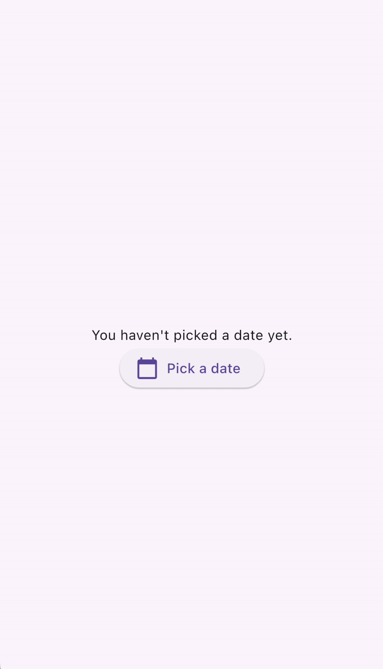 This figure shows a DatePicker that is displayed when the "Pick a date" button is clicked.
TimePickerDialog
TimePickerDialog is a dialog that presents a time picker. It can be activated by calling the showTimePicker() function. Instead of returning a Future<DateTime>, showTimePicker instead returns a Future<TimeOfDay>. Once again, don't forget to await the function call!
dart
TimeOfDay? selectedTime;

@override
Widget build(BuildContext context) {
  var time = selectedTime;

  return Column(children: [
    Text(
      time == null ? "You haven't picked a time yet." : time.format(context),
    ),
    ElevatedButton.icon(
      icon: const Icon(Icons.calendar_today),
      onPressed: () async {
        var pickedTime = await showTimePicker(
          context: context,
          initialEntryMode: TimePickerEntryMode.dial,
          initialTime: TimeOfDay.now(),
        );

        setState(() {
          selectedTime = pickedTime;
        });
      },
      label: const Text('Pick a date'),
    )
  ]);
}
content_copy
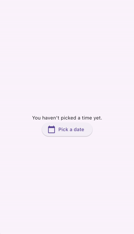 This figure shows a TimePicker that is displayed when the "Pick a time" button is clicked.
lightbulb小提示
Calling showDatePicker() and showTimePicker() is equivalent to calling showDialog() with DatePickerDialog() and TimePickerDialog(), respectively. Internally, both functions use the showDialog() function with their respective Dialog widgets. To enable state restoration, you can also push DatePickerDialog() and TimePickerDialog() directly on to the Navigator stack.
menu_book API Docs: showDatePicker • showTimePicker
Swipe & slide
Dismissible
A Dismissible is a widget that enables users to dismiss it by swiping. It has a number of configuration parameters, including:
- A
childwidget - An
onDismissedcallback that is triggered when the user swipes - Styling parameters such as
background - It's important to include a
keyobject as well so that they can be uniquely identified from siblingDismissiblewidgets in the widget tree.
dart
List<int> items = List<int>.generate(100, (int index) => index);

@override
Widget build(BuildContext context) {
  return ListView.builder(
    itemCount: items.length,
    padding: const EdgeInsets.symmetric(vertical: 16),
    itemBuilder: (BuildContext context, int index) {
      return Dismissible(
        background: Container(
          color: Colors.green,
        ),
        key: ValueKey<int>(items[index]),
        onDismissed: (DismissDirection direction) {
          setState(() {
            items.removeAt(index);
          });
        },
        child: ListTile(
          title: Text(
            'Item ${items[index]}',
          ),
        ),
      );
    },
  );
}
content_copy
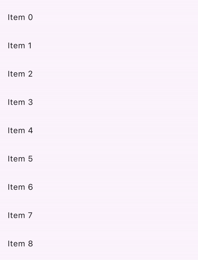 This figure shows a list of Dismissible widgets that each contain a ListTile. Swiping across the ListTile reveals a green background makes the tile disappear.
slideshow Video: Dismissible (Widget of the Week)
star Checkpoint: Complete this tutorial on how to implement swipe to dismiss using the dismissible widget.
menu_book API Docs: Dismissible
Looking for more widgets?
This page features just a few of the common Material widgets that you can use for handling user input in your Flutter app. Check out the Material Widget library and Material Library API docs for a full list of widgets.
flutter Demo: See Flutter's Material 3 Demo for a curated sample of user input widgets available in the Material library.
If the Material and Cupertino libraries don't have a widget that does what you need, check out pub.dev to find Flutter & Dart community-owned and maintained packages. For example, the flutter_slidable package provides a Slidable widget that is more customizable than the Dismissible widget described in the previous section.
slideshow Video: flutter_slidable (Package of the Week)
Build interactive widgets with GestureDetector
Have you scoured the widget libraries, pub.dev, asked your coding friends, and still can't find a widget that fits the user interaction that you're looking for? You can build your own custom widget and make it interactive using GestureDetector.
star Checkpoint: Use this recipe as a starting point to create your own custom button widget that can handle taps.
slideshow Video: GestureDetector (Widget of the Week)
menu_book Reference: Check out Taps, drags, and other gestures which explains how to listen for, and respond to, gestures in Flutter.
slideshow Bonus Video: Curious how Flutter's
GestureArenaturns raw user interaction data into human recognizable concepts like taps, drags, and pinches? Check out this video: GestureArena (Decoding Flutter)
Don't forget about accessibility!
If you're building a custom widget, annotate its meaning with the Semantics widget. It provides descriptions and metadata to screen readers and other semantic analysis-based tools.
slideshow Video: Semantics (Flutter Widget of the Week)
menu_book API Docs: GestureDetector • Semantics
Testing
Once you have finished building user interactions into your app, don't forget to write tests to ensure that everything works as expected!
These tutorials walk you through writing tests that simulate user interactions in your app:
star Checkpoint: Follow this tap, drag, and enter text cookbook article and learn how to use
WidgetTesterto simulate and test user interactions in your app.
bookmark Bonus Tutorial: The handle scrolling cookbook recipe shows you how to verify that lists of widgets contain the expected content by scrolling through the lists using widget tests.
Next: Networking
This page was an introduction to handling user input. Now that you know how to handle input from app users, you can make your app even more interesting by adding external data. In the next section, you'll learn now to fetch data for your app over a network, how to convert data to and from JSON, authentication, and other networking features.
Feedback
As this section of the website is evolving, we welcome your feedback!

 浙公网安备 33010602011771号