
Load Required Modules
import seaborn as sns
import pandas as pd
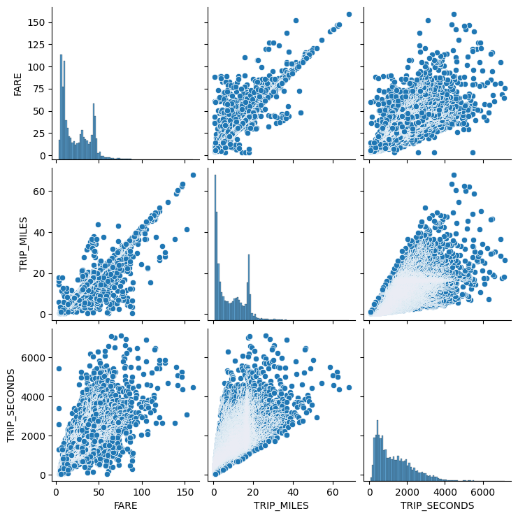
from Pandas备忘录(持续更新) import training_dfOne way to visualize relationships between features in a dataset is with a pair plot. A pair plot generates a grid of pairwise plots to visualize the relationship of each feature with all other features all in one place.
View Pairplots
sns.pairplot(training_df, x_vars=["FARE", "TRIP_MILES", "TRIP_SECONDS"], y_vars=["FARE", "TRIP_MILES", "TRIP_SECONDS"])<seaborn.axisgrid.PairGrid at 0x7ad09ea619f0>

 浙公网安备 33010602011771号