[CSS3] Create Viewport Responsive Layout Spacing Using CSS Clamp
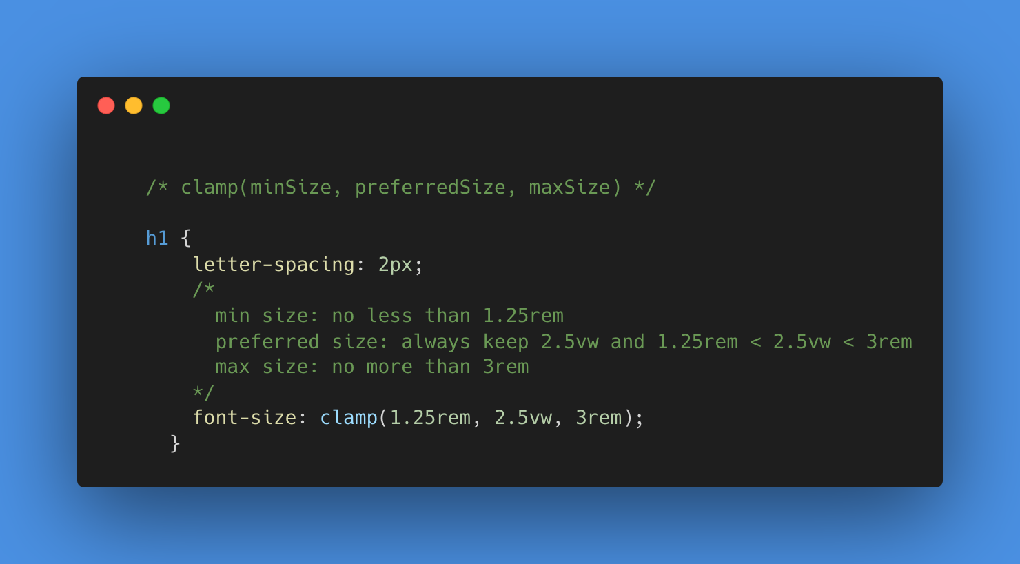
Learn how to use the modern CSS property clamp() to create responsive layout sizing that adjusts to the viewport size without the use of media queries. Instead, use a CSS variable to set the base unit size and combine it with calc() and viewport units to define minimum, preferred, and maximum values within clamp().
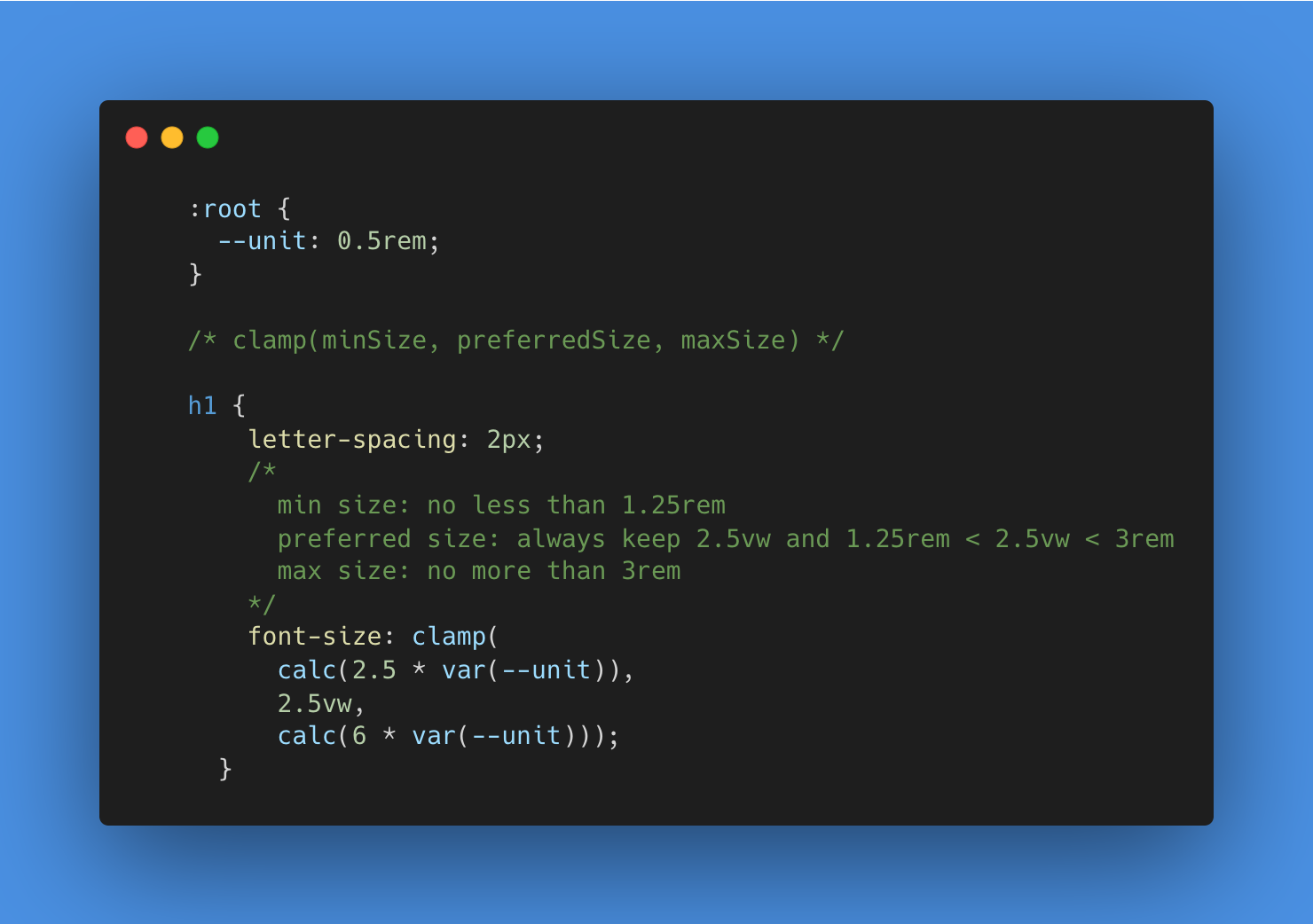
:root {
  --unit: 0.5rem;
}

article {
  /* margin: calc(2 * var(--unit)); */

  margin:
    /* min, preferred, max */
    clamp(
      calc(2 * var(--unit)),
      5vh,
      calc(5 * var(--unit))
    )

    clamp(
      calc(4 * var(--unit)),
      5vw,
      calc(8 * var(--unit))
    )
}

 浙公网安备 33010602011771号