
Bootstrap-v3-css样式-表单
表单
1、基本实例
单独的表单控件会被自动赋予一些全局样式。所有设置了 .form-control 类的 <input>、<textarea> 和 <select> 元素都将被默认设置宽度属性为 width: 100%;。 将 label 元素和前面提到的控件包裹在 .form-group 中可以获得最好的排列。
    <!-- 基本实例 -->
    <form>
      <div class="form-group">
        <label for="email">电子邮箱</label>
        <input type="text" class="form-control" id="email" placeholder="请输入电子邮箱">
      </div>
      <div class="form-group">
        <label for="pswd">密码</label>
        <input type="password" class="form-control" id="pswd" placeholder="请输入密码">
      </div>
      <div class="form-group">
        <label for="file">上传文件</label>
        <input type="file" id="file">
        <p class="help-block">点击上传文件</p>
      </div>
      <div class="checkbox">
        <label for="ckbx">
          <input type="checkbox">我同意加入
        </label>
      </div>
      <button type="submit" class="btn btn-default">提交</button>
    </form>
注意:不要将表单组直接和输入框组混合使用。建议将输入框组嵌套到表单组中使用。
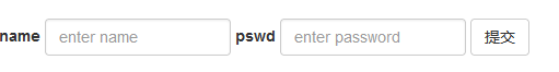
2、内联表单
为 <form> 元素添加 .form-inline 类可使其内容左对齐并且表现为 inline-block 级别的控件。只适用于视口(viewport)至少在 768px 宽度时(视口宽度再小的话就会使表单折叠)。
    <!-- 内联表单 -->
    <form class="form-inline">
      <div class="form-group">
        <label for="name">name</label>
        <input type="text" id="name" class="form-control" placeholder="enter name">
      </div>
      <div class="form-group">
        <label for="name">pswd</label>
        <input type="password" id="pswd" class="form-control" placeholder="enter password">
      </div>
      <button type="submit" class="btn btn-default">提交</button>
    </form>
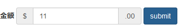
输入框组<input-group>和<input-group-addon>的使用
    <!-- 表单组 -->
    <form class="form-inline">
      <div class="form-group">
        <label for="money">金额</label>
        <div class="input-group">
          <div class="input-group-addon">$</div>
          <input type="text" id="money" class="form-control" placeholder="5000">
          <div class="input-group-addon">.00</div>
        </div>
      </div>
      <button class="btn btn-primary">submit</button>
    </form>
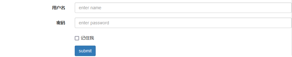
3、水平排列的表单
通过为表单添加 .form-horizontal 类,并联合使用 Bootstrap 预置的栅格类,可以将 label 标签和控件组水平并排布局。这样做将改变 .form-group 的行为,使其表现为栅格系统中的行(row),因此就无需再额外添加 .row 了。
    <!-- 水平排列的表单 -->
    <form class="form-horizontal">
      <div class="form-group">
        <label for="name" class="col-sm-3 control-label">用户名</label>
        <div class="col-sm-9">
          <input type="text" class="form-control" placeholder="enter name" >
        </div>
      </div>
      <div class="form-group">
        <label for="name" class="col-sm-3 control-label">密码</label>
        <div class="col-sm-9">
          <input type="text" class="form-control" placeholder="enter password" >
        </div>
      </div>
      <div class="form-group">
        <div class="col-sm-9 col-sm-offset-3">
          <div class="checkbox">
            <label for="chek">
              <input type="checkbox">记住我
            </label>
          </div>
        </div>
      </div>
      <div class="form-group">
        <div class="col-sm-9 col-sm-offset-3">
          <button class="btn btn-primary">submit</button>
        </div>
      </div>
    </form>
4、被支持的控件
表单布局实例中展示了其所支持的标准表单控件。包括:
4.1 输入框
包括大部分表单控件、文本输入域控件,还支持所有 HTML5 类型的输入控件: text、password、datetime、datetime-local、date、month、time、week、number、email、url、search、tel 和 color。
<input type="text" class="form-control" placeholder="Text input">
4.2 文本域
支持多行文本的表单控件。可根据需要改变 rows 属性。
<textarea class="form-control" rows="3"></textarea>
4.3 多选和单选框
多选框(checkbox)用于选择列表中的一个或多个选项,而单选框(radio)用于从多个选项中只选择一个。
-
默认外观(堆叠在一起)
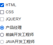
    <!-- 单选和多选按钮 -->
    <div class="checkbox">
      <label>
        <input type="checkbox" checked>HTML
      </label>
    </div>
    <div class="checkbox">
      <label>
        <input type="checkbox">CSS
      </label>
    </div>
    <div class="checkbox disabled">
      <label>
        <input type="checkbox" disabled>JQUERY
      </label>
    </div>

    <div class="radio">
      <label>
        <input type="radio" name="optionsRadios" checked>产品经理
      </label>
    </div>
    <div class="radio">
      <label>
        <input type="radio" name="optionsRadios" >前端开发工程师
      </label>
    </div>
    <div class="radio disabled">
      <label>
        <input type="radio" name="optionsRadios" disabled>JAVA开发工程师
      </label>
    </div>
-
内联单选和多选框
通过将 .checkbox-inline 或 .radio-inline 类应用到一系列的多选框(checkbox)或单选框(radio)控件上,可以使这些控件排列在一行。

    <!-- 内联单选和多选框 -->
    <label class="checkbox-inline">
      <input type="checkbox" checked>HTML
    </label>
    <label class="checkbox-inline">
      <input type="checkbox">CSS
    </label>
    <label class="checkbox-inline disabled">
      <input type="checkbox" disabled>BOOTSTRAP
    </label>

    <label class="radio-inline">
      <input type="radio" name="radio1" checked>产品经理
    </label>
    <label class="radio-inline">
      <input type="radio" name="radio1" >前端开发工程师
    </label>
    <label class="radio-inline disabled">
      <input type="radio" name="radio1" disabled>JAVA开发工程师
    </label>
-
不带label文本的Checkbox 和 radio
如果需要 <label> 内没有文字,输入框(input)正是你所期望的。 目前只适用于非内联的 checkbox 和 radio。 请记住,仍然需要为使用辅助技术的用户提供某种形式的 label(例如,使用 aria-label)。

    <!-- 不带label文本的Checkbox 和 radio -->
    <div class="checkbox">
      <label>
        <input type="checkbox" aria-label=''>
      </label>
    </div>
    <div class="radio">
      <label>
        <input type="radio" aria-label=''>
      </label>
    </div>
4.4 下拉列表
注意,很多原生选择菜单 - 即在 Safari 和 Chrome 中 - 的圆角是无法通过修改 border-radius 属性来改变的。
单选下拉列表

    <!-- 下拉列表 -->
    <select class="form-control">
      <option value="HTML">HTML</option>
      <option value="CSS">CSS</option>
      <option value="JAVASCRIPT">JAVASCRIPT</option>
    </select>
多选下拉列表
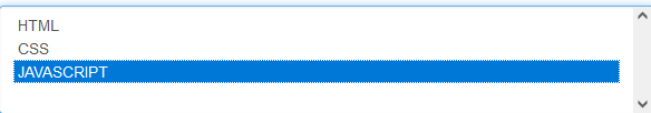
    <!-- 下拉列表 -->
    <select multiple class="form-control">
      <option value="HTML">HTML</option>
      <option value="CSS">CSS</option>
      <option value="JAVASCRIPT">JAVASCRIPT</option>
    </select>
5、静态控件
如果需要在表单中将一行纯文本和 label 元素放置于同一行,为 <p> 元素添加 .form-control-static 类即可。

    <!-- 静态控件 -->
    <!-- 水平排列的表单 -->
    <form class="form-horizontal">
      <div class="form-group">
        <label class="col-sm-3 control-label">电子邮箱</label>
        <div class="col-sm-9">
          <p class="form-control-static">email@example.com</p>
        </div>
        <div class="form-group">
          <label class="col-sm-3 control-label">密码</label>
          <div class="col-sm-9">
            <input type="text" class="form-control" placeholder="请输入密码">
          </div>
        </div>
      </div>
    </form>
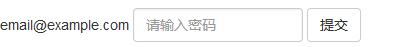
    <!-- 静态控件 -->
    <!-- 内联表单 -->
    <form class="form-inline">
      <div class="form-group">
        <label class="sr-only">电子邮箱</label>
        <p class="form-control-static">email@example.com</p>
      </div>
      <div class="form-group">
        <label for="inputPassword2" class="sr-only">Password</label>
        <input type="password" class="form-control" id="inputPassword2" placeholder="请输入密码">
      </div>
      <button type="submit" class="btn btn-default">提交</button>
    </form>
6、焦点状态
我们将某些表单控件的默认 outline 样式移除,然后对 :focus 状态赋予 box-shadow 属性。

7、禁用状态
为输入框设置 disabled 属性可以禁止其与用户有任何交互(焦点、输入等)。被禁用的输入框颜色更浅,并且还添加了 not-allowed 鼠标状态。
    <!-- 禁用状态 -->
    <input class="form-control" id="disabledInput" type="text" placeholder="该文本框已禁用" disabled>
被禁用的 fieldset
为<fieldset> 设置 disabled 属性,可以禁用 <fieldset> 中包含的所有控件。(<a> 标签的链接功能不受影响)
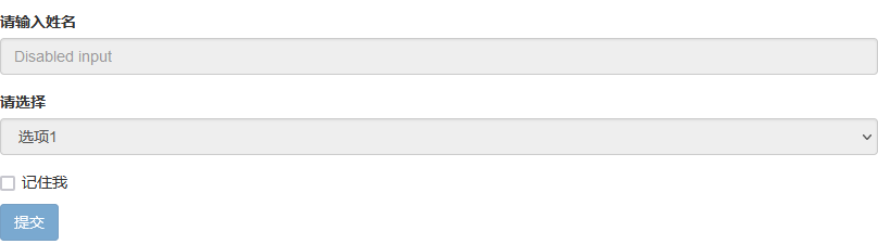
    <form>
    <fieldset disabled>
      <div class="form-group">
        <label for="disabledTextInput">请输入姓名</label>
        <input type="text" id="disabledTextInput" class="form-control" placeholder="Disabled input">
      </div>
      <div class="form-group">
        <label for="disabledSelect">请选择</label>
        <select id="disabledSelect" class="form-control">
          <option>选项1</option>
        </select>
      </div>
      <div class="checkbox">
        <label>
          <input type="checkbox">记住我
        </label>
      </div>
      <button type="submit" class="btn btn-primary">提交</button>
    </fieldset>
  </form>
8、只读状态
为输入框设置 readonly 属性可以禁止用户修改输入框中的内容。处于只读状态的输入框颜色更浅(就像被禁用的输入框一样),但是仍然保留标准的鼠标状态。
<input class="form-control" type="text" placeholder="Readonly input here…" readonly>
9、帮助文本
  <!-- 帮助性文本 -->
  <label for="inputHelpBlock">根据帮助文本输入</label>
  <input type="text" id="inputHelpBlock" class="form-control" aria-describedby="helpBlock">
  <span id="helpBlock" class="help-block">A block of help text that breaks onto a new line and may extend beyond one line.</span>
10、校验状态
10.1 基础校验状态
Bootstrap 对表单控件的校验状态,如 error、warning 和 success 状态,都定义了样式。使用时,添加 .has-warning、.has-error 或 .has-success 类到这些控件的父元素即可。任何包含在此元素之内的 .control-label、.form-control 和 .help-block 元素都将接受这些校验状态的样式。
<div class="form-group has-success">
  <label class="control-label" for="inputSuccess1">Input with success</label>
  <input type="text" class="form-control" id="inputSuccess1" aria-describedby="helpBlock2">
  <span id="helpBlock2" class="help-block">A block of help text that breaks onto a new line and may extend beyond one line.</span>
</div>
<div class="form-group has-warning">
  <label class="control-label" for="inputWarning1">Input with warning</label>
  <input type="text" class="form-control" id="inputWarning1">
</div>
<div class="form-group has-error">
  <label class="control-label" for="inputError1">Input with error</label>
  <input type="text" class="form-control" id="inputError1">
</div>
<div class="has-success">
  <div class="checkbox">
    <label>
      <input type="checkbox" id="checkboxSuccess" value="option1">
      Checkbox with success
    </label>
  </div>
</div>
<div class="has-warning">
  <div class="checkbox">
    <label>
      <input type="checkbox" id="checkboxWarning" value="option1">
      Checkbox with warning
    </label>
  </div>
</div>
<div class="has-error">
  <div class="checkbox">
    <label>
      <input type="checkbox" id="checkboxError" value="option1">
      Checkbox with error
    </label>
  </div>
</div>
10.2 添加额外的图标
你还可以针对校验状态为输入框添加额外的图标。只需设置相应的 .has-feedback 类并添加正确的图标即可。
<div class="form-group has-success has-feedback">
  <label class="control-label" for="inputSuccess2">Input with success</label>
  <input type="text" class="form-control" id="inputSuccess2" aria-describedby="inputSuccess2Status">
  <span class="glyphicon glyphicon-ok form-control-feedback" aria-hidden="true"></span>
  <span id="inputSuccess2Status" class="sr-only">(success)</span>
</div>
<div class="form-group has-warning has-feedback">
  <label class="control-label" for="inputWarning2">Input with warning</label>
  <input type="text" class="form-control" id="inputWarning2" aria-describedby="inputWarning2Status">
  <span class="glyphicon glyphicon-warning-sign form-control-feedback" aria-hidden="true"></span>
  <span id="inputWarning2Status" class="sr-only">(warning)</span>
</div>
<div class="form-group has-error has-feedback">
  <label class="control-label" for="inputError2">Input with error</label>
  <input type="text" class="form-control" id="inputError2" aria-describedby="inputError2Status">
  <span class="glyphicon glyphicon-remove form-control-feedback" aria-hidden="true"></span>
  <span id="inputError2Status" class="sr-only">(error)</span>
</div>
<div class="form-group has-success has-feedback">
  <label class="control-label" for="inputGroupSuccess1">Input group with success</label>
  <div class="input-group">
    <span class="input-group-addon">@</span>
    <input type="text" class="form-control" id="inputGroupSuccess1" aria-describedby="inputGroupSuccess1Status">
  </div>
  <span class="glyphicon glyphicon-ok form-control-feedback" aria-hidden="true"></span>
  <span id="inputGroupSuccess1Status" class="sr-only">(success)</span>
</div>
11、控制尺寸
通过 .input-lg 类似的类可以为控件设置高度,通过 .col-lg-* 类似的类可以为控件设置宽度。
11.1 高度尺寸
创建大一些或小一些的表单控件以匹配按钮尺寸。
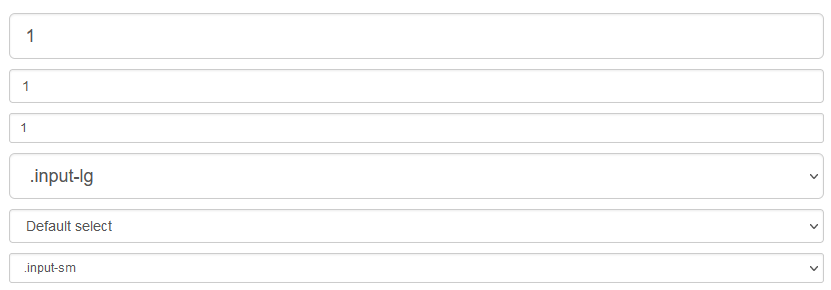
<input class="form-control input-lg" type="text" placeholder=".input-lg">
<input class="form-control" type="text" placeholder="Default input">
<input class="form-control input-sm" type="text" placeholder=".input-sm">

<select class="form-control input-lg">...</select>
<select class="form-control">...</select>
<select class="form-control input-sm">...</select>
11.2 水平排列的表单组的尺寸
通过添加 .form-group-lg 或 .form-group-sm 类,为 .form-horizontal 包裹的 label 元素和表单控件快速设置尺寸。
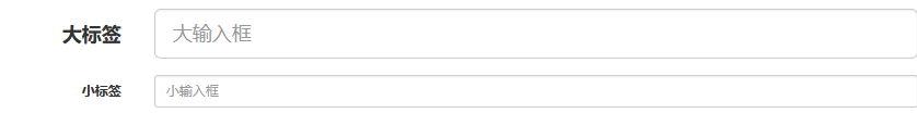
<form class="form-horizontal">
  <div class="form-group form-group-lg">
    <label class="col-sm-2 control-label" for="formGroupInputLarge">Large label</label>
    <div class="col-sm-10">
      <input class="form-control" type="text" id="formGroupInputLarge" placeholder="Large input">
    </div>
  </div>
  <div class="form-group form-group-sm">
    <label class="col-sm-2 control-label" for="formGroupInputSmall">Small label</label>
    <div class="col-sm-10">
      <input class="form-control" type="text" id="formGroupInputSmall" placeholder="Small input">
    </div>
  </div>
</form>
11.3 调整列(column)尺寸
用栅格系统中的列(column)包裹输入框或其任何父元素,都可很容易的为其设置宽度。

<div class="row">
  <div class="col-xs-2">
    <input type="text" class="form-control" placeholder="请输入内容">
  </div>
  <div class="col-xs-3">
    <input type="text" class="form-control" placeholder="请输入内容">
  </div>
  <div class="col-xs-4">
    <input type="text" class="form-control" placeholder="请输入内容">
  </div>
</div>

 浙公网安备 33010602011771号