CSS3 吃豆豆
实现代码:
  1 <!DOCTYPE html>
  2 <html lang="en">
  3
  4 <head>
  5   <meta charset="UTF-8">
  6   <meta name="viewport" content="width=device-width, initial-scale=1.0">
  7   <title>吃豆豆</title>
  8 </head>
  9
 10 <style>
 11
 12 /* up */
 13   @-webkit-keyframes up {
 14   0%, 100% {    transform: rotate(0);
 15   }
 16   50% {
 17       /*咬合张开的角度*/
 18     transform: rotate(-30deg);
 19   }
 20 }
 21 @-moz-keyframes up {
 22   0%, 100% {
 23     transform: rotate(0);
 24   }
 25   50% {
 26     transform: rotate(-30deg);
 27   }
 28 }
 29 @-o-keyframes up {
 30   0%, 100% {
 31     transform: rotate(0);
 32   }
 33   50% {
 34     transform: rotate(-30deg);
 35   }
 36 }
 37 @keyframes up {
 38   0%, 100% {
 39     transform: rotate(0);
 40   }
 41   50% {
 42     transform: rotate(-30deg);
 43   }
 44 }
 45
 46 /* down */
 47 @-webkit-keyframes down {
 48   0%, 100% {
 49     transform: rotate(0);
 50   }
 51   50% {
 52     transform: rotate(30deg);
 53   }
 54 }
 55 @-moz-keyframes down {
 56   0%, 100% {
 57     transform: rotate(0);
 58   }
 59   50% {
 60     transform: rotate(30deg);
 61   }
 62 }
 63 @-o-keyframes down {
 64   0%, 100% {
 65     transform: rotate(0);
 66   }
 67   50% {
 68     transform: rotate(30deg);
 69   }
 70 }
 71 @keyframes down {
 72   0%, 100% {
 73     transform: rotate(0);
 74   }
 75   50% {
 76     transform: rotate(30deg);
 77   }
 78 }
 79
 80 /* r-to-l */
 81 @-webkit-keyframes r-to-l {
 82   100% {
 83     margin-left: -1px;
 84   }
 85 }
 86 @-moz-keyframes r-to-l {
 87   100% {
 88     margin-left: -1px;
 89   }
 90 }
 91 @-o-keyframes r-to-l {
 92   100% {
 93     margin-left: -1px;
 94   }
 95 }
 96 @keyframes r-to-l {
 97   100% {
 98     margin-left: -1px;
 99   }
100 }
101
102 body {
103   background: #d44747;
104   overflow: hidden;
105   margin: 0;
106 }
107 body .pacman:before, body .pacman:after {
108   content: '';
109   position: absolute;
110   background: #fb07ff;
111   width: 100px;
112   height: 50px;
113   /*保持居中位置*/
114   left: 50%;
115   top: 50%;
116   /*保持居中位置*/
117   margin-left: -50px;
118   margin-top: -50px;
119   /*上半圆效果*/
120   border-radius: 50px 50px 0 0;
121   /*动画*/
122   -webkit-animation: up 0.6s infinite;  /* 0.6s 动画的速度,越大越慢  infinite --- 无限循环 */
123   -moz-animation: up 0.6s infinite;
124   -o-animation: up 0.6s infinite;
125   animation: up 0.6s infinite;
126 }
127 body .pacman:after {
128   /*为了使两个半圆咬合时不出现缝隙*/
129   margin-top: -1px;
130   /*下半圆效果*/
131   border-radius: 0 0 50px 50px;
132   -webkit-animation: down 0.6s infinite;
133   -moz-animation: down 0.6s infinite;
134   -o-animation: down 0.6s infinite;
135   animation: down 0.6s infinite;
136 }
137 body .dot {
138   position: absolute;
139   left: 50%;
140   top: 50%;
141   width: 12px;
142   height: 12px;
143   margin-top: -5px;
144   margin-left: 30px;
145   border-radius: 50%;
146   background: #02ec2a;
147   /*层级关系 越大越在上层*/
148   z-index: -1;
149   /*实际上只有一个圆点,用了box-shadow的阴影属性。 颜色自定义*/
150   box-shadow: 30px 0 0 #02ec2a, 60px 0 0 #02ec2a, 90px 0 0 #02ec2a, 120px 0 0 #02ec2a, 150px 0 0 #02ec2a;
151   -webkit-animation: r-to-l 0.6s infinite;
152   -moz-animation: r-to-l 0.6s infinite;
153   -o-animation: r-to-l 0.6s infinite;
154   animation: r-to-l 0.6s infinite;
155 }
156 </style>
157 <body>
158
159   <div class="demo">
160     <div class="pacman"></div>
161     <div class="dot"></div>
162   </div>
163
164 </body>
165
166 </html>
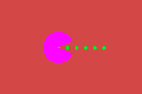
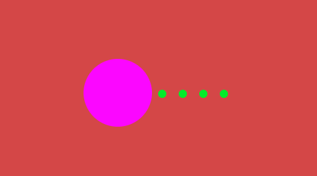
效果图:
1、张开状态
2、闭合状态

 浙公网安备 33010602011771号