
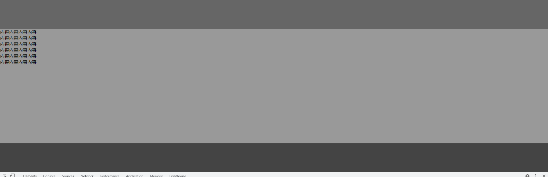
实现自适应位置的 footer。页面内容较少时,footer 需要紧贴浏览器底部
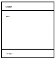
main的height很小时,footer能紧贴浏览器底部;
main的height很大时,footer在页面最后;
<html lang="en">

<head>
    <meta charset="UTF-8">
    <meta http-equiv="X-UA-Compatible" content="IE=edge">
    <meta name="viewport" content="width=device-width, initial-scale=1.0">
    <title>Document</title>
</head>
<style>
    * {
        margin: 0;
        padding: 0;
    }

    html,
    body {
        height: 100%;
    }

    #wrapper {
        height: 100%;
    }

    header {
        height: 100px;
        background-color: #666;
    }

    #main {
        min-height: 100%;
        background-color: #999;
    }

    footer {
        height: 100px;
        background-color: #444;
        margin-top: -100px;
    }
</style>

<body>
    <div id="wrapper">
        <div id="main">
            <header></header>
            <p>内容内容内容内容</p>
            <p>内容内容内容内容</p>
            <p>内容内容内容内容</p>
            <p>内容内容内容内容</p>
            <p>内容内容内容内容</p>
            <p>内容内容内容内容</p>

        </div>
        <footer></footer>
    </div>
</body>

</html>

 浙公网安备 33010602011771号