01、python数据分析与机器学习实战——Python数据可视化库-Matplotlib
Matplotlib介绍
Matplotlib 是一个 Python 的 2D绘图库,它以各种硬拷贝格式和跨平台的交互式环境生成出版质量级别的图形。
Matplotlib基础
1.折线图绘制
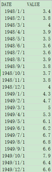
假设,我们要将下面的文件绘制成折线图:
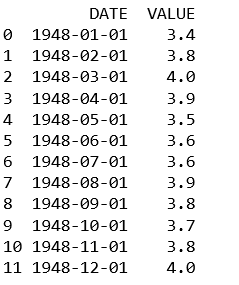
由于文件里日期的格式不是标准格式,所以要先将日期转换:
import pandas as pd
unrate = pd.read_csv('unrate.csv')
unrate['DATE'] = pd.to_datetime(unrate['DATE'])
print(unrate.head(12))
导入库:
import matplotlib.pyplot as plt
先绘制一个简单的折线图:
first_twelve = unrate[0:12]
plt.plot(first_twelve['DATE'], first_twelve['VALUE'])
plt.show()
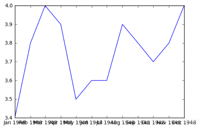
这个图,简直丑陋无比,而且只能表示一年的数据,一般绘制完折线图之后要根据实际情况进行美化:
fig = plt.figure(figsize=(10,6))
colors = ['red', 'blue', 'green', 'orange', 'black']
for i in range(5):
    start_index = i*12
    end_index = (i+1)*12
    subset = unrate[start_index:end_index]
    label = str(1948 + i)
    plt.plot(subset['MONTH'], subset['VALUE'], c=colors[i], label=label)
plt.legend(loc='upper left')
plt.xlabel('Month, Integer')
plt.ylabel('Unemployment Rate, Percent')
plt.title('Monthly Unemployment Trends, 1948-1952')

plt.show()
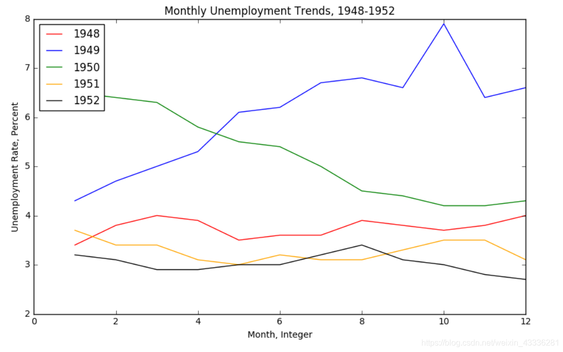 这样就可以绘制出一个不错的折线图了。
2.子图操作
有的时候需要将几张图在一起对比,这就需要用到子图操作了:
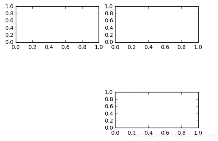
创建一个二维3行2列的子图数组:
import matplotlib.pyplot as plt
fig = plt.figure()
ax1 = fig.add_subplot(3,2,1)
ax2 = fig.add_subplot(3,2,2)
ax2 = fig.add_subplot(3,2,6)
plt.show()
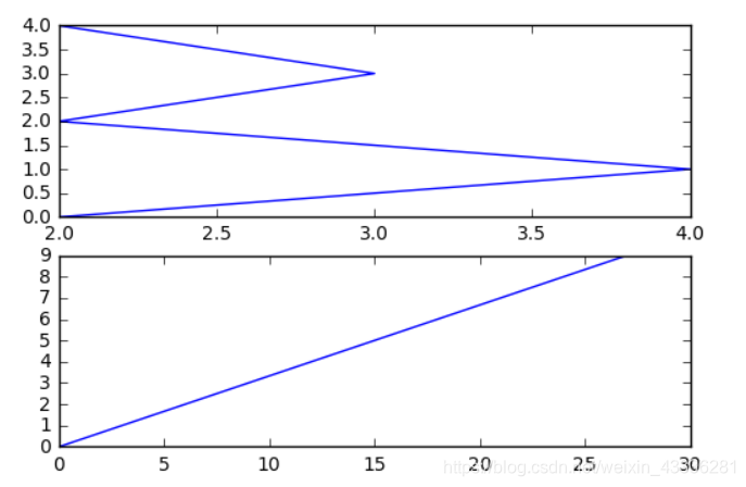
创建两个子图,并设置随机值:
import numpy as np
fig = plt.figure()
#fig = plt.figure(figsize=(3, 3))
ax1 = fig.add_subplot(2,1,1)
ax2 = fig.add_subplot(2,1,2)

ax1.plot(np.random.randint(1,5,5), np.arange(5))
ax2.plot(np.arange(10)*3, np.arange(10))
plt.show()
3.条形图与散点图
假设有如下数据,要将其绘制成条形图:

首先读入数据,并将其中几列存储起来:
import pandas as pd
reviews = pd.read_csv('fandango_scores.csv')
cols = ['FILM', 'RT_user_norm', 'Metacritic_user_nom', 'IMDB_norm', 'Fandango_Ratingvalue', 'Fandango_Stars']
norm_reviews = reviews[cols]
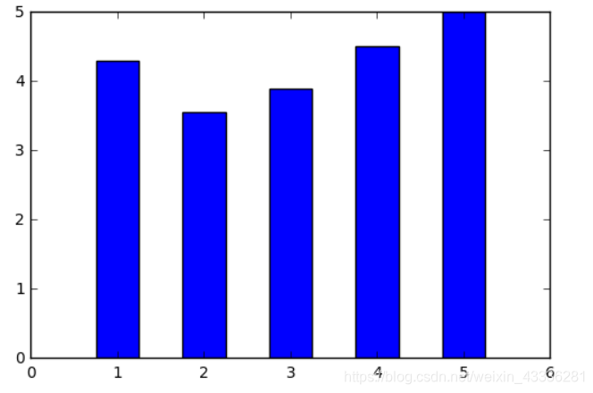
然后用bar创建条形图:
import matplotlib.pyplot as plt
from numpy import arange
#The Axes.bar() method has 2 required parameters, left and height.
#We use the left parameter to specify the x coordinates of the left sides of the bar.
#We use the height parameter to specify the height of each bar
num_cols = ['RT_user_norm', 'Metacritic_user_nom', 'IMDB_norm', 'Fandango_Ratingvalue', 'Fandango_Stars']

bar_heights = norm_reviews.ix[0, num_cols].values
#print bar_heights
bar_positions = arange(5) + 0.75
#print bar_positions
fig, ax = plt.subplots()
ax.bar(bar_positions, bar_heights, 0.5)
plt.show()
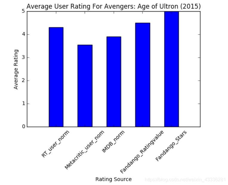
同理,创建完简单的条形图之后要对其进行美化处理:
num_cols = ['RT_user_norm', 'Metacritic_user_nom', 'IMDB_norm', 'Fandango_Ratingvalue', 'Fandango_Stars']
bar_heights = norm_reviews.ix[0, num_cols].values
bar_positions = arange(5) + 0.75
tick_positions = range(1,6)
fig, ax = plt.subplots()

ax.bar(bar_positions, bar_heights, 0.5)
ax.set_xticks(tick_positions)
ax.set_xticklabels(num_cols, rotation=45)

ax.set_xlabel('Rating Source')
ax.set_ylabel('Average Rating')
ax.set_title('Average User Rating For Avengers: Age of Ultron (2015)')
plt.show()
当然,还有横向条形图:
import matplotlib.pyplot as plt
from numpy import arange
num_cols = ['RT_user_norm', 'Metacritic_user_nom', 'IMDB_norm', 'Fandango_Ratingvalue', 'Fandango_Stars']

bar_widths = norm_reviews.ix[0, num_cols].values
bar_positions = arange(5) + 0.75
tick_positions = range(1,6)
fig, ax = plt.subplots()
ax.barh(bar_positions, bar_widths, 0.5)

ax.set_yticks(tick_positions)
ax.set_yticklabels(num_cols)
ax.set_ylabel('Rating Source')
ax.set_xlabel('Average Rating')
ax.set_title('Average User Rating For Avengers: Age of Ultron (2015)')
plt.show()

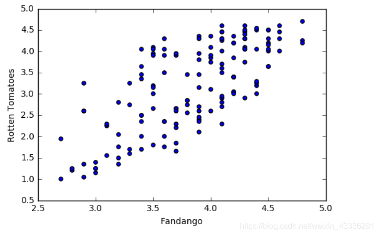
还可以创建散点图:
fig, ax = plt.subplots()
ax.scatter(norm_reviews['Fandango_Ratingvalue'], norm_reviews['RT_user_norm'])
ax.set_xlabel('Fandango')
ax.set_ylabel('Rotten Tomatoes')
plt.show()
两张图对比:
fig = plt.figure(figsize=(5,10))
ax1 = fig.add_subplot(2,1,1)
ax2 = fig.add_subplot(2,1,2)
ax1.scatter(norm_reviews['Fandango_Ratingvalue'], norm_reviews['RT_user_norm'])
ax1.set_xlabel('Fandango')
ax1.set_ylabel('Rotten Tomatoes')
ax2.scatter(norm_reviews['RT_user_norm'], norm_reviews['Fandango_Ratingvalue'])
ax2.set_xlabel('Rotten Tomatoes')
ax2.set_ylabel('Fandango')
plt.show()

在这里遇到了一个错误:
UnicodeDecodeError: 'utf-8' codec can't decode byte 0x80 in position 21: invalid start byte
我猜测是因为前边的操作将源文件的编码方式改变了,所以后来不能正常读取,但是,我不会改过来啊,5555。
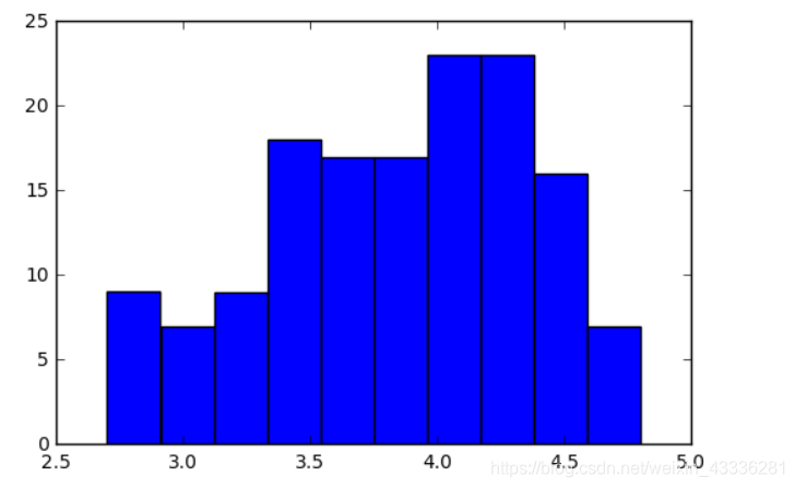
4.柱形图与盒图
柱形图与条形图类似
import pandas as pd
import matplotlib.pyplot as plt
reviews = pd.read_csv('fandango_scores.csv')
cols = ['FILM', 'RT_user_norm', 'Metacritic_user_nom', 'IMDB_norm', 'Fandango_Ratingvalue']
norm_reviews = reviews[cols]

fandango_distribution = norm_reviews['Fandango_Ratingvalue'].value_counts()
fandango_distribution = fandango_distribution.sort_index()

imdb_distribution = norm_reviews['IMDB_norm'].value_counts()
imdb_distribution = imdb_distribution.sort_index()

fig, ax = plt.subplots()
ax.hist(norm_reviews['Fandango_Ratingvalue'])
#ax.hist(norm_reviews['Fandango_Ratingvalue'],bins=20)
#ax.hist(norm_reviews['Fandango_Ratingvalue'], range=(4, 5),bins=20)
plt.show()
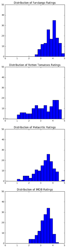
将四幅图在一起对比:
fig = plt.figure(figsize=(5,20))
ax1 = fig.add_subplot(4,1,1)
ax2 = fig.add_subplot(4,1,2)
ax3 = fig.add_subplot(4,1,3)
ax4 = fig.add_subplot(4,1,4)
ax1.hist(norm_reviews['Fandango_Ratingvalue'], bins=20, range=(0, 5))
ax1.set_title('Distribution of Fandango Ratings')
ax1.set_ylim(0, 50)

ax2.hist(norm_reviews['RT_user_norm'], 20, range=(0, 5))
ax2.set_title('Distribution of Rotten Tomatoes Ratings')
ax2.set_ylim(0, 50)

ax3.hist(norm_reviews['Metacritic_user_nom'], 20, range=(0, 5))
ax3.set_title('Distribution of Metacritic Ratings')
ax3.set_ylim(0, 50)

ax4.hist(norm_reviews['IMDB_norm'], 20, range=(0, 5))
ax4.set_title('Distribution of IMDB Ratings')
ax4.set_ylim(0, 50)

plt.show()
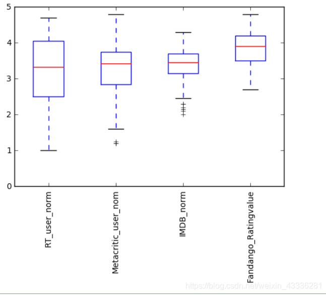
还有一种盒图,它显示的是数据的中间值、四分之一值、四分之三值:
num_cols = ['RT_user_norm', 'Metacritic_user_nom', 'IMDB_norm', 'Fandango_Ratingvalue']
fig, ax = plt.subplots()
ax.boxplot(norm_reviews[num_cols].values)
ax.set_xticklabels(num_cols, rotation=90)
ax.set_ylim(0,5)
plt.show()
总结
用Matplotlib画图其实很简单,只要用相应的方法加上数据就可以,必要的美化如果不是前端不须那么在意。

 浙公网安备 33010602011771号