CSS
一、入门基础
1.1、语法
选择器{
声明1;
声明2;
}
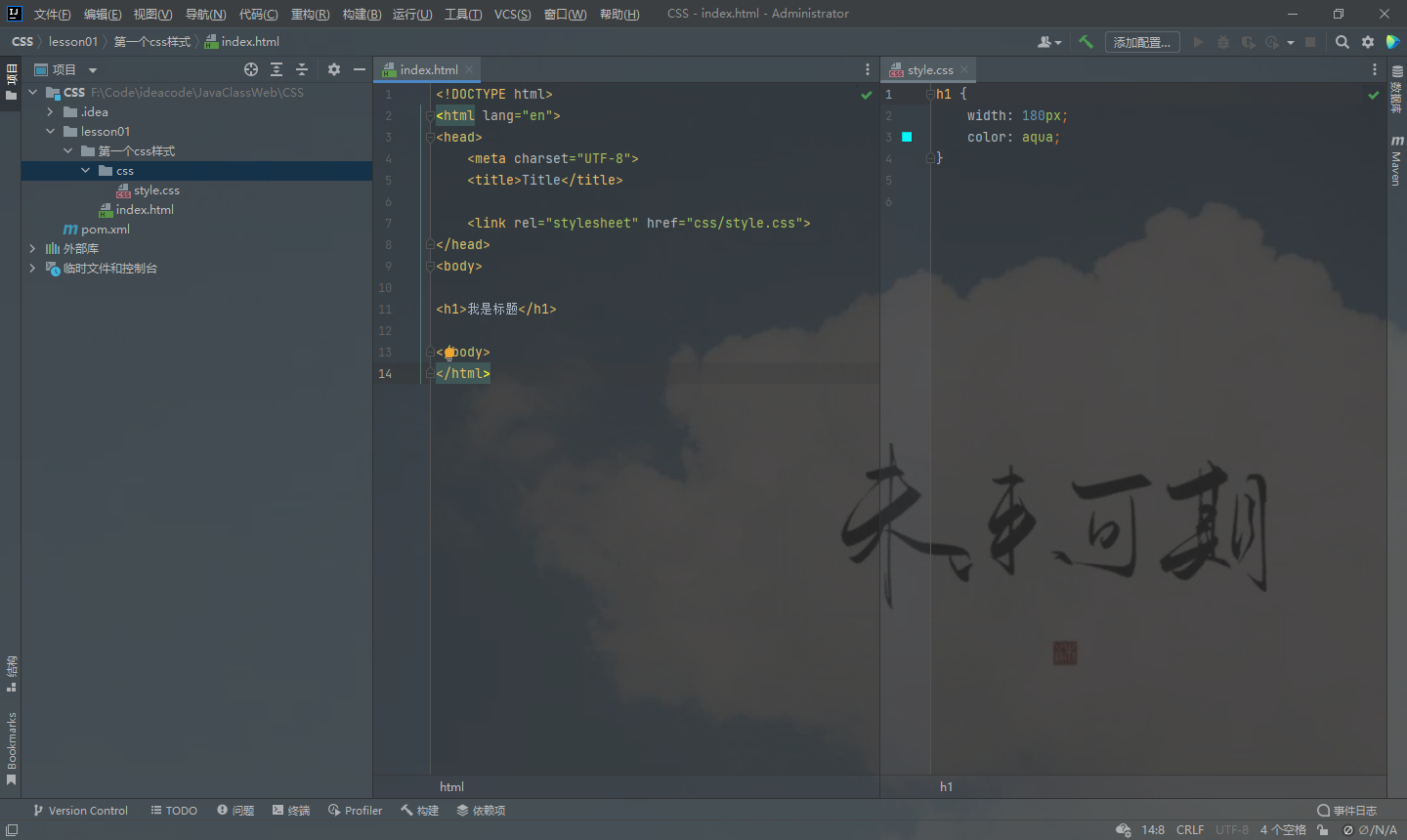
<!DOCTYPE html>
<html lang="en">
<head>
    <meta charset="UTF-8">
    <title>Title</title>

    <style>
        h1{
            width: 180px;
            color: aqua;
        }

    </style>

</head>
<body>

<h1>我是标题</h1>

</body>
</html>
建议这种规范
CSS的优势:
1、内容和表现分离
2、网页结构表现统一,可以实现复用3、样式十分的丰富
4、建议使用独立于html的css文件
5、利用SEO,容易被搜索引擎收录!
1.2、CSS的3种导入方式
样式优先级:就近原则
链接式:
html中
<link rel="stylesheet" href="css/style.css">
导入式:(了解即可)
style{
@import url("css/style.css");
}
二、选择器
2.1、基本选择器
优先级:id > class > 标签
1、标签选择器︰选择一类标签 标签{}
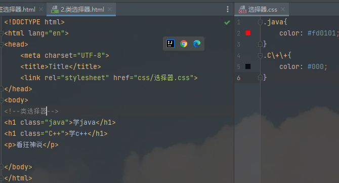
2、类选择器class:选择所有class属性一致的标签,跨标签 .类名{}
.java{
    color: #fd0101;
}
.C\+\+{
    color: #000;
}
3、ld选择器:全局唯一! #id名{ }
2.2、层次选择器
-
后代选择器
body p{ background: red; } -
子选择器,一代
body>p{ background: red; } -
相邻兄弟选择器,同辈(只向下)
.(class定义的名字) + p{ background: red; } -
通用选择器向下所有
.(class定义的名字) ~ p{
    background: red;
}
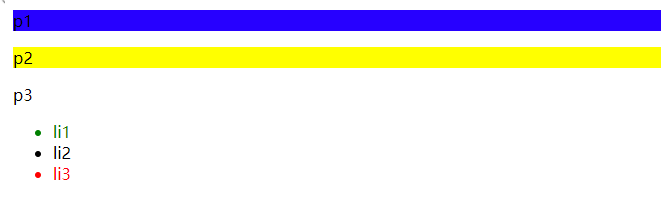
2.3、结构伪类选择构造器
<!DOCTYPE html>
<html lang="en">
    <head>
        <meta charset="UTF-8">
        <title>Title</title>
        <!--避免使用.class,id选择器-->
        <style>
            ul li:first-child{
                color: green;
            }

            ul li:last-child{
                color: #fd0101;
            }
            /*选中p1 :定位到父元素,选择当前的第一个元素
            选择当前p元素的父级元素,选中父级元素的第一个,并且是当前元素才生效!  顺序*/
            p:nth-child(1) {
                lbackground: #2700ff;
            }

            /*选中父元素,下的p元素的第二个,类型*/
            p:nth-of-type(2) {
                background: yellow;
            }

        </style>

    </head>
    <body>

        <p>p1</p>
        <p>p2</p>
        <p>p3</p>
        <ul>
            <li>li1</li>
            <li>li2</li>
            <li>li3</li>
        </ul>


    </body>
</html>
2.4、属性选择器
id+class结合:
属性名,属性名=属性值(正则)
= 绝对等于
*= 包含这个元素
^= 以这个开头
$= 以这个结尾
.active + p{
}
.active ~ p{
}....
三、美化网页元素
3.1、为什么要美化网页
1、有效的传递页面信息
2、美化网页,页面漂亮,才能吸引用户
3、凸显页面的主题
4、提高用户的体验
3.2、伪类练习
<!DOCTYPE html>
<html lang="en">
<head>
	<meta charset="UTF-8">
	<title>Title</title>
	<link rel="stylesheet" href="css/index.css">
</head>
<body>

<a href="#">
	<img src="image/a.jpg" alt="">
</a>
<p>
	<a href="#">码出高效:Java开发手册</a>
</p>
<p>
	<a href="">作者:孤尽老师</a>
</p>
<p id="price">
	¥99
</p>
</body>
</html>
a{
    text-decoration: none;
    color: #000;
}
/*鼠标悬浮状态*/
a:hover{
    color: skyblue;
}
/*鼠标按住未释放*/
a:active{
    color: chartreuse;
}
#price{
    /*text-shadow:阴影颜色水平偏移,垂直偏移,阴影半径*/
    text-shadow: aqua 10px 10px 2px;
}
3.3、列表
<!DOCTYPE html>
<html lang="en">
<head>
<meta charset="UTF-8">
<title>Title</title>
<link rel="stylesheet" href="css/style.css" type="text/css">
</head>
<body>
<div id="nav">
<h2 class="title">全部商品分类</h2>
<ul>
<li><a href="#">图书</a> <a href="#">音像</a> <a href="#">数字商品</a></li>
<li><a href="#">家用电器</a> <a href="#">手机</a> <a href="#">数码</a></li>
<li><a href="#">电脑</a> <a href="#">办公</a></li>
<li><a href="#">家居</a> <a href="#">家装</a> <a href="#">厨具</a></li>
<li><a href="#">服饰鞋帽</a> <a href="#">个护化妆</a></li>
<li><a href="#">礼品箱包</a> <a href="#">钟表</a> <a href="#">珠宝</a></li>
<li><a href="#">食品饮料</a> <a href="#">保健食品</a></li>
<li><a href="#">彩票</a> <a href="#">旅行 </a> <a href="#">充值</a> <a href="#">票务</a>
</li>
</ul>
</div>
</body>
</html>
#nav{
    width: 300px;
}

.title{
    font-family: 楷体;
    font-size: 18px;
    font-weight: bold;
    text-indent: 1em;
    line-height: 35px;
    background: #fd0101;
    border-radius: 10px;
}

ul{
    background: #e7e7e7;
}

ul li{
    height: 35px;
    list-style: none;
    text-indent: 1em;
}

a{
    font-family: 微软雅黑;
    text-decoration: none;
    size: 14px;
    color: #000;
}
a:hover{
    color: orange;
    text-decoration: underline;
}
3.4、背景
<!DOCTYPE html>
<html lang="en">
<head>
	<meta charset="UTF-8">
	<title>Title</title>

	<style>
        div {
            width: 1000px;
            height: 700px;
            border: 1px solid red;
            background-image: url("image/a.jpg");
        }

        .div1 {
            background-repeat: no-repeat;
        }

        .div2 {
            background-repeat: repeat-x;
        }

        .div3 {
            background-repeat: repeat-y;
        }

	</style>
</head>
<body>
<div class="div1"></div>
<div class="div2"></div>
<div class="div3"></div>
</body>
</html>
3.5、渐变
<!DOCTYPE html>
<html lang="en">
<head>
	<meta charset="UTF-8">
	<title>Title</title>
	<!--径向渐变,圆形渐变-->
	<style>
		body{
            background-color: #85FFBD;
            background-image: -webkit-linear-gradient(59deg, #85FFBD 0%, #FFFB7D 100%);
            background-image: -moz-linear-gradient(59deg, #85FFBD 0%, #FFFB7D 100%);
            background-image: -o-linear-gradient(59deg, #85FFBD 0%, #FFFB7D 100%);
            background-image: linear-gradient(59deg, #85FFBD 0%, #FFFB7D 100%);

        }

	</style>
</head>
<body>

</body>
</html>
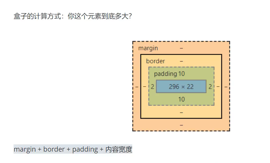
四、盒子模型
、
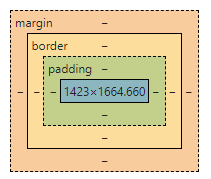
margin:外边距
padding:内边距
border:边框
4.1、边框
1、边框的粗细
2、边框的样式
3、边框的颜色
	<style>
		body{
			margin: 0;
		}
		/*border:粗细,样式,颜色*/
		#box{
			width: 300px;
			border:1px  solid red;
		}

		h2{
            color: white;
			font-size: 16px;
			text-align: center;
			line-height: 30px;
            background-color: #85FFBD;
            background-image: -webkit-linear-gradient(59deg, #85FFBD 0%, #FFFB7D 100%);
            background-image: -moz-linear-gradient(59deg, #85FFBD 0%, #FFFB7D 100%);
            background-image: -o-linear-gradient(59deg, #85FFBD 0%, #FFFB7D 100%);
            background-image: linear-gradient(59deg, #85FFBD 0%, #FFFB7D 100%);
		}

		form{
			background: #85FFBD;
		}

		div:nth-of-type(1) input{
			border: 3px solid black;
		}
        div:nth-of-type(2) input{
            border: 3px dashed #f6ff02;
        }
        div:nth-of-type(3) input{
            border: 3px dashed #ff0000;
        }

	</style>
4.2、外边距
4.3、圆角边框
四个角
div{
    border-radius:10px;
}
五、浮动
块级元素:独占一行
行内元素:不独占一行
5.1、display
display: block;/* 变成块级元素*/
display: inline-block;/*是块元素,但是可以内联 变成一行元素*/
5.2、float
左右浮动
float:right
float:left
5.3、父级边框塌陷的问题
/*左右侧不允许有浮动*/
clear:right
clear:left

/*两侧都不允许浮动*/
clear:both
解决
1、增加父级元素的高度
height:800px;
2、增加一个空的div
<div class="clear"></div>
.clear{
    clear:both;
    margin:0;
    padding:0;

}
3、overflow
overflow:scroll/*滚动条*/
overflow:hidden/*固定位置*/
4、父类增加一个伪类:after
目前市面上最认同的方法
#father:after{
    content:'';
    display:block;
    clear:both;
}
小结
- 浮动元素后面增加空div简单,代码中尽量避免空div
2.设置父元素的高度
简单,元素假设有了固定的高度,就会被限制
3.overflow
简单,下拉的一些场景避免使用
4.父类添加一个伪类:after(推荐)
写法稍微复杂一点,但是没有副作用,推荐使用!
5.4、对比
-
display
方向不可以控制
-
float
浮动起来的话会脱离标准文档流,所以要解决父级边框塌陷的问题~
六、定位
6.1、相对定位
<!DOCTYPE html>
<html lang="en">
<head>
	<meta charset="UTF-8">
	<title>相对定位</title>
	<style>
		body{
			padding: 20px;
		}

        div {
            margin: 10px;
            padding: 5px;
            font-size: 12px;
            line-height: 25px;
        }

        #father{
	        border: 1px solid #666;
	        padding: 0;
        }

        #first{
	        background: #fd0101;
            border: 1px dashed #ff0000;

            position: relative;/*相对定位*/
	        top: -20px;
            left: 20px;
        }

        #second{
	        background: #0048ff;
            border: 1px dashed #0048ff;

        }

        #third{
	        background: #85FFBD;
            border: 1px dashed #00ffa2;
            position: relative;
	        bottom: -10px;
	        right: 20px;
        }


	</style>
</head>
<body>

<div id="father">
	<div id="first">第一个盒子</div>
	<div id="second">第二个盒子</div>
	<div id="third">第三个盒子</div>

</div>

</body>
</html>
相对定位: position: relative;
相对于原来的位置,进行指定的偏移,相对定位的话,仍然保留在标准文档流中,原来的位置会被保留
top: -20px;
left: 20px;
bottom: -10px;
right: 20px;
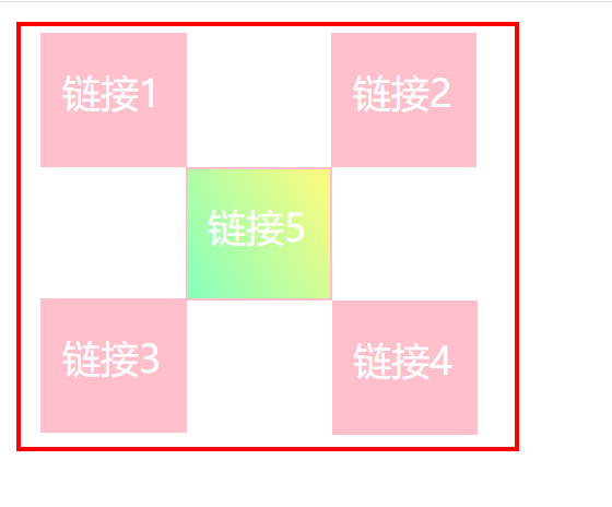
练习
<!DOCTYPE html>
<html lang="en">
<head>
	<meta charset="UTF-8">
	<title>Title</title>
	<style>
        #father {
            padding: 3px;
            border: 2px solid red;
            width: 200px;
            height: 170px;
            background: white;
        }

        div:nth-of-type(1) {
            border: 1px solid pink;
            position: relative;
            right: -5px;
        }

        div:nth-of-type(2) {
            border: 1px solid pink;
            position: relative;
            top: 56px;
        }

        div:nth-of-type(3) {
            border: 1px solid pink;
            display: inline-block;
            position: relative;
            right: 5px;
        }

        div:nth-of-type(4) {
            border: 1px solid pink;
            position: relative;
            top: 55px;
            right: -5px;
        }

        div:nth-of-type(5) {
            border: 1px solid pink;
            position: relative;
	        top: 56px;
            right: -61px;
        }

        div {
            background: pink;
            padding: 2px;
            width: 55px;
            height: 50px;
            display: inline-block;
        }

        div:hover{
            background-color: #85FFBD;
            background-image: -webkit-linear-gradient(59deg, #85FFBD 0%, #FFFB7D 100%);
            background-image: -moz-linear-gradient(59deg, #85FFBD 0%, #FFFB7D 100%);
            background-image: -o-linear-gradient(59deg, #85FFBD 0%, #FFFB7D 100%);
            background-image: linear-gradient(59deg, #85FFBD 0%, #FFFB7D 100%);
        }

        a {
	        color: white;
            text-decoration: none;
            position: relative;
	        right: -6px;
	        top: 11px;
        }
	</style>

</head>
<body>

<div id="father">

	<div>
		<a href="#">链接1</a>
	</div>
	<div>
		<a href="#">链接5</a>
	</div>


	<div>
		<a href="#">链接2</a>
	</div>
	<div>

		<a href="#">链接3</a>
	</div>
	<div>
		<a href="#">链接4</a>
	</div>

</div>


</body>
</html>
6.2、绝对定位
定位:基于xxx定位,上下左右~
1、没有父级元素定位的前提下,相对于浏览器定位
2、假设父级元素存在定位,我们通常会相对于父级元素进行偏移
3、在父级元素范围内移动
相对于父级或浏览器的位置,进行指定的偏移,绝对定位的话,它不在在标准文档流中,原来的位置不会被保留
<!DOCTYPE html>
<html lang="en">
<head>
	<meta charset="UTF-8">
	<title>Title</title>
	<style>
        div {
            margin: 10px;
            padding: 5px;
            font-size: 12px;
            line-height: 25px;
        }

        #father{
	        border: 1px solid #666;
	        padding: 0;
            position: absolute;
        }

        #first{
	        background: #fd0101;
            border: 1px dashed #ff0000;
        }

        #second{
	        background: #0048ff;
            border: 1px dashed #0048ff;
            position: absolute;
	        left: 100px;
        }

        #third{
	        background: #85FFBD;
            border: 1px dashed #00ffa2;
        }


	</style>
</head>
<body>

<div id="father">
	<div id="first">第一个盒子</div>
	<div id="second">第二个盒子</div>
	<div id="third">第三个盒子</div>

</div>

</body>
</html>
6.3、固定定位fixed
<!DOCTYPE html>
<html lang="en">
<head>
	<meta charset="UTF-8">
	<title>Title</title>

	<style>
		body{
			height: 1000px;
		}

		div:nth-of-type(1){/*绝对定位,没有父级相对于浏览器*/
            width: 100px;
            height: 100px;
			background: red;
			position: absolute;
            right: 0;
            bottom: 0;

		}
        div:nth-of-type(2){
            width: 100px;
            height: 100px;
            background: #ffea00;
            position: fixed;
            right: 0;
            bottom: 0;
        }

	</style>
</head>
<body>

<div>div1</div>
<div>div2</div>

</body>
</html>
6.3、z-index
最低是0,最高是999
<!DOCTYPE html>
<html lang="en">
<head>
	<meta charset="UTF-8">
	<title>Title</title>
	<link rel="stylesheet" href="css/index.css">
</head>
<body>
<div id="content">
	<ul>
		<li><img src="image/a.jpg" alt=""></li>
		<li class="tipText">学习微服务,找狂神</li>
		<li class="tipBg"></li>
		<li>时间:2099-01-01</li>
		<li>地点:月球一号基地</li>
	</ul>
</div>

</body>
</html>
透明度: opacity: 0.5;/背景透明度/
#content {
    width: 380px;
    padding: 0px;
    margin: 0px;
    overflow: hidden;
    font-size: 12px;
    line-height: 25px;
    border: 1px #000 solid;
}

ul, li {
    padding: 0px;
    margin: 0px;
    list-style: none;
}

#content ul {
    position: relative;
}

.tipText, .tipBg {
    position: absolute;
    width: 380px;
    height: 25px;
    top: 216px;
}
.tipText{
    color: white;
    z-index: 999;
}

.tipBg{
    opacity: 0.5;/*背景透明度*/
    background: #85FFBD;
}

 浙公网安备 33010602011771号