APICloud AVM 封装验证码输入框组件
AVM(Application-View-Model)前端组件化开发模式基于标准 Web Components 组件化思想,提供包含虚拟 DOM 和 Runtime 的编程框架 avm.js 以及多端统一编译工具,完全兼容 Web Components 标准,同时兼容 Vue 和 React 语法糖编写代码,编译工具将 Vue 和 React 相关语法糖编译转换为 avm.js 代码。
基于标准 Web Components 组件化思想,兼容 Vue / React 语法特性,通过一次编码,分别编译为 App、小程序代码,实现多端开发。
组件功能介绍
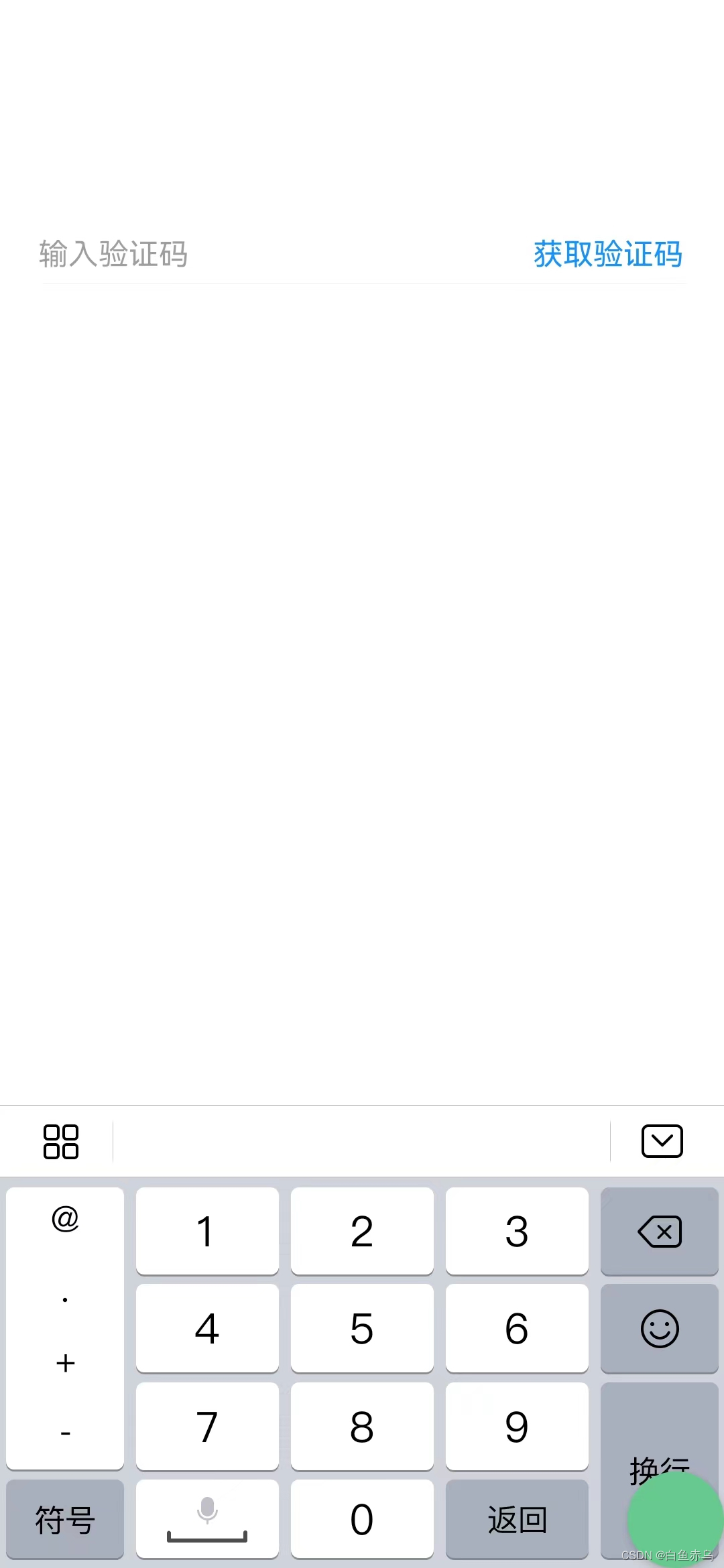
验证码输入框组件,可自定义下次点击等待时长,自定义验证码长度,可根据自定义的验证码长度进行输入内容的验证。
组件示例

组件开发
组件文件
verification-code-input.stml
<template>
	<view class="verification-code">
		<input class="code-input" placeholder="输入验证码" keyboard-type="number" oninput="getCode"/>
		<text v-show="show" class="code-btn" @click="sendCode">获取验证码</text>
		<text v-show="!show" class="code-btn">{count}s</text>
	</view>
</template>
<script>
	export default {
		name: 'verification-code-input',
		installed(){

		},
		props:{
			limitSecond:Number,
			limitCode:Number
		},
		data() {
			return{
				show:true,
				count: 0,
				timer:null
			}
		},
		methods: {
			sendCode(){
				//正则验证手机号码
				const TIME_COUNT = this.props.limitSecond;
				if (!this.data.timer) {
					this.data.count = TIME_COUNT;
					this.data.show = false;
					this.data.timer = setInterval(() => {
					if (this.data.count > 0 && this.data.count <= TIME_COUNT) {
							this.data.count--;
						} else {
							this.data.show = true;
							clearInterval(this.data.timer);
							this.data.timer = null;
						}
					}, 1000)
				}
				/**
				 * 进行发送短信验证码的操作
				 */
			},
			getCode(e){
				//对验证码进行校验 符合位置和规则进行输出
				if(e.detail.value.length == this.props.limitCode){
					let reg= /^[0-9]*$/;
					if(reg.test(e.detail.value)){
						this.fire('setCode',e.detail.value);
					}
					else{
						api.toast({
							msg:'请输入有效的验证码!'
						})
					}
				}
				else if(e.detail.value.length > this.props.limitCode){
					api.toast({
						msg:'请输入'+this.props.limitCode+"位验证码!"
					})
				}
			}
		}
	}
</script>
<style>
	.verification-code{
		flex-flow: row nowrap;
		margin: 10px 20px;
		justify-content: space-between;
		border-bottom: 0.5px solid #f0f0f0;
		align-items: center;
	}
	.code-input{
		width: auto;
		border: none;
		font-size: 18px;
	}
	.code-btn{
		color: #1492ff;
		font-size: 18px;
	}
</style>
组件使用说明
本组件是基于 AVM.js 开发的多端组件,通常同时适配 Android、iOS、小程序、H5 , 具体支持情况还要看每个组件的说明文档。
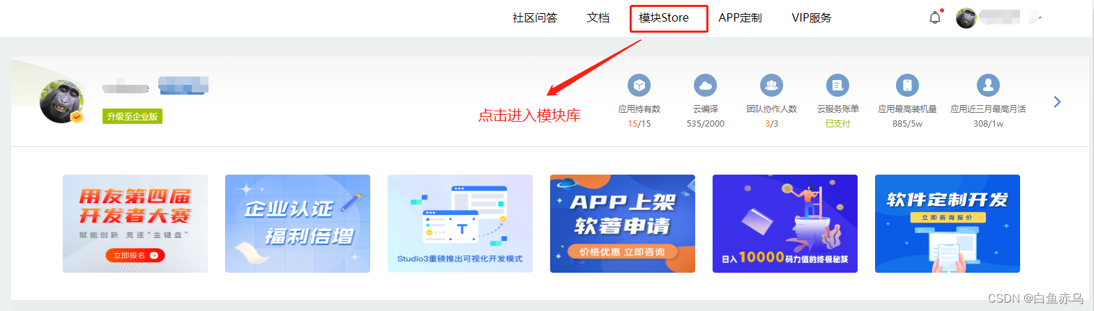
首先需要登录开发平台,http://www.apicloud.com。 通过控制平台右上方的模块 Store 进入,然后选择 AVM 组件。

找到对应模块进入
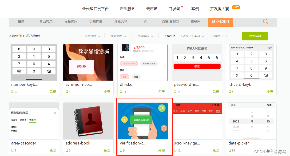
也可通过搜索栏,通过组件名称关键字进行检索
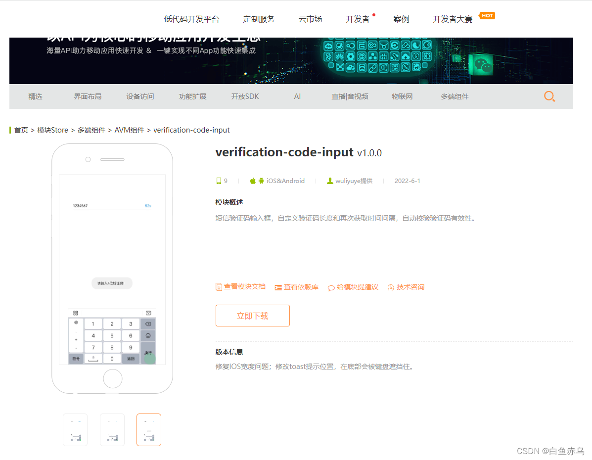
进入模块详情,点击立即下载下载完整的组件安装包。
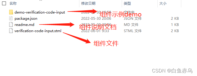
组件压缩包的文件目录如下
也可通过查看模块文档 来了解模块的具体参数,引用的原生模块,注意事项等。
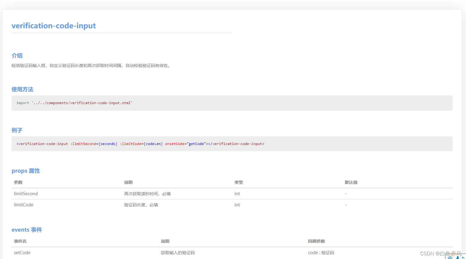
具体在项目中的使用步骤是,第一步将压缩文件中的 verification-code-input.stml 文件拷贝到项目的 components 目录,通过阅读 readme.md 文档和查看 demo 示例文件 demo-verification-code-input.stml 在需要开发的 stml 文件中,引入组件文件,完成页面的开发。
demo-verification-code-input.stml
<template>
	<view class="page">
		<safe-area></safe-area>
		<verification-code-input limitSecond={seconds} limitCode={codeLen} onsetCode="getCode"></verification-code-input>
	</view>
</template>
<script>
	import '../../components/verification-code-input.stml'
	export default {
		name: 'demo-verification-code-input',
		apiready(){

		},
		data() {
			return{
				code:'',
				seconds:60,
				codeLen:4
			}
		},
		methods: {
			getCode(e){
				console.log(JSON.stringify(e.detail));
				this.data.code = e.detail;
			}
		}
	}
</script>
<style>
	.page {
		height: 100%;
		background-color: #ffffff;
		padding-top: 100px;
	}
	.verification-code{
		flex-flow: row nowrap;
		margin: 10px 20px;
		justify-content: space-between;
		border-bottom: 0.5px solid #f0f0f0;
		align-items: center;
	}
	.code-input{
		width: auto;
		border: none;
		font-size: 15px;
		flex: 1;
	}
	.code-btn{
		color: #1492ff;
		font-size: 15px;
	}
</style>
如果在 AVM 组件库中,没有找到实际项目中需要的组件,可以自己尝试封装组件。


 浙公网安备 33010602011771号