flex大容器内容flex-direction用法
1,如何让盒子元素横轴排列
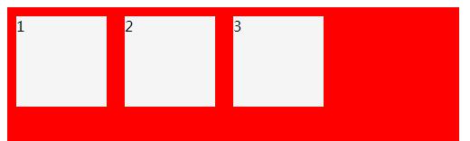
flex-direction: row //默认是横轴
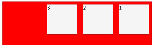
flex-direction: row-reverse
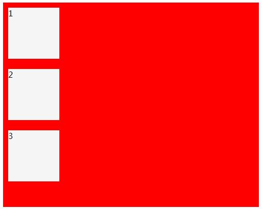
flex-direction: column
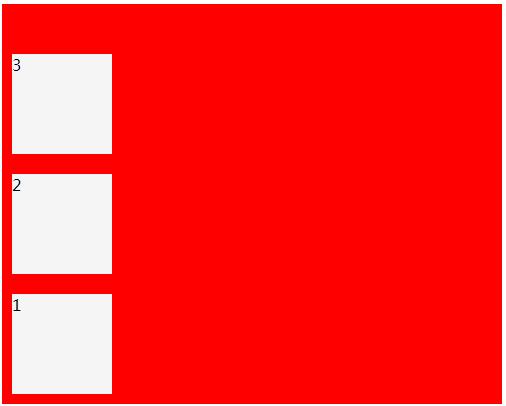
flex-direction: column-reverse
<style type="text/css">
.bigbox{
width: 500px;
height: 400px;
background:#ff0000;
display: flex;
flex-direction: column;
}
.smallbox{
width: 100px;
height: 100px;
background: #f5f5f5;
margin: 10px;
}
</style>
</head>
<body>
<div class="bigbox">
<div class="smallbox">1</div>
<div class="smallbox">2</div>
<div class="smallbox">3</div>
</div>
</body>
</html>
文章来自 www.96net.com.cn

 浙公网安备 33010602011771号