
bokeh
一 基本操作
import numpy as np
import pandas as pd
import matplotlib.pyplot as plt
% matplotlib inline

# 在notebook中创建绘图空间

from bokeh.plotting import figure,show,output_file
# 导入图表绘制、图标展示模块

from bokeh.io import output_notebook
# 导入notebook绘图模块

#output_notebook()
# notebook绘图命令

#output_file("line.html")
# notebook绘图命令,创建html文件
# 运行后会弹出html窗口

p = figure(plot_width=400, plot_height=400)   # 创建图表,设置宽度、高度
p.circle([1, 2, 3, 4, 5], [6, 7, 2, 4, 5], size=20, color="navy", alpha=0.5)
# 创建一个圆形散点图

show(p)
# 绘图


# 创建图表工具
# figure()

df = pd.DataFrame(np.random.randn(100,2),columns = ['A','B'])
# 创建数据

p = figure(plot_width=600, plot_height=400,    # 图表宽度、高度
           tools = 'pan,wheel_zoom,box_zoom,save,reset,help',  # 设置工具栏,默认全部显示
           toolbar_location='above',     # 工具栏位置:"above","below","left","right"
           x_axis_label = 'A', y_axis_label = 'B',    # X,Y轴label
           x_range = [-3,3], y_range = [-3,3],        # X,Y轴范围
           title="测试图表"                       # 设置图表title
          )
# figure创建图表,设置基本参数
# tool参考文档:https://bokeh.pydata.org/en/latest/docs/user_guide/tools.html

p.title.text_color = "white"
p.title.text_font = "times"
p.title.text_font_style = "italic"
p.title.background_fill_color = "black"
# 设置标题:颜色、字体、风格、背景颜色

p.circle(df['A'], df['B'], size=20,  alpha=0.5)
show(p)


# 创建散点图
# 这里.circle()是figure的一个绘图方法

# 颜色设置

p = figure(plot_width=600, plot_height=400)
# 创建绘图空间

p.circle(df.index, df['A'], color = 'green', size=10,  alpha=0.5)
p.circle(df.index, df['B'], color = '#FF0000', size=10,  alpha=0.5)
show(p)


# 颜色设置
# ① 147个CSS颜色,参考网址:http://www.colors.commutercreative.com/grid/
# ② RGB颜色值,参考网址:https://coolors.co/87f1ff-c0f5fa-bd8b9c-af125a-582b11

# 图表边框线参数设置

p = figure(plot_width=600, plot_height=400)
p.circle(df.index, df['A'], color = 'green', size=10,  alpha=0.5)
p.circle(df.index, df['B'], color = '#FF0000', size=10,  alpha=0.5)
# 绘制散点图

p.outline_line_width = 7         # 边框线宽
p.outline_line_alpha = 0.3       # 边框线透明度
p.outline_line_color = "navy"    # 边框线颜色
# 设置图表边框

show(p)


# 设置绘图空间背景

p = figure(plot_width=600, plot_height=400)
p.circle(df.index, df['A'], color = 'green', size=10,  alpha=0.5)
p.circle(df.index, df['B'], color = '#FF0000', size=10,  alpha=0.5)
# 绘制散点图

p.background_fill_color = "beige"    # 绘图空间背景颜色
p.background_fill_alpha = 0.5        # 绘图空间背景透明度
# 背景设置参数

show(p)


# 设置外边界背景

p = figure(plot_width=600, plot_height=400)
p.circle(df.index, df['A'], color = 'green', size=10,  alpha=0.5)
p.circle(df.index, df['B'], color = '#FF0000', size=10,  alpha=0.5)
# 绘制散点图

p.border_fill_color = "whitesmoke"    # 外边界背景颜色
p.min_border_left = 80                # 外边界背景 - 左边宽度
p.min_border_right = 80               # 外边界背景 - 右边宽度
p.min_border_top = 10                 # 外边界背景 - 上宽度
p.min_border_bottom = 10              # 外边界背景 - 下宽度

show(p)


# Axes - 轴线设置
# 轴线标签、轴线线宽、轴线颜色
# 字体颜色、字体角度

p = figure(plot_width=400, plot_height=400)
p.circle([1,2,3,4,5], [2,5,8,2,7], size=10)
# 绘制图表

p.xaxis.axis_label = "Temp"
p.xaxis.axis_line_width = 3
p.xaxis.axis_line_color = "red"
# 设置x轴线:标签、线宽、轴线颜色

p.yaxis.axis_label = "Pressure"
p.yaxis.major_label_text_color = "orange"
p.yaxis.major_label_orientation = "vertical"
# 设置y轴线:标签、字体颜色、字体角度

p.axis.minor_tick_in = 5      # 刻度往绘图区域内延伸长度
p.axis.minor_tick_out = 3   # 刻度往绘图区域外延伸长度
# 设置刻度

p.xaxis.bounds = (2, 4)
# 设置轴线范围

show(p)


# Axes - 轴线设置
# 标签设置

p = figure(plot_width=400, plot_height=400)
p.circle([1,2,3,4,5], [2,5,8,2,7], size=10)

p.xaxis.axis_label = "Lot Number"
p.xaxis.axis_label_text_color = "#aa6666"
p.xaxis.axis_label_standoff = 30
# 设置标签名称、字体颜色、偏移距离

p.yaxis.axis_label = "Bin Count"
p.yaxis.axis_label_text_font_style = "italic"
# 设置标签名称、字体

show(p)


# Grid - 格网设置
# 线型设置

p = figure(plot_width=600, plot_height=400)
p.circle(df.index, df['A'], color = 'green', size=10,  alpha=0.5)
p.circle(df.index, df['B'], color = '#FF0000', size=10,  alpha=0.5)
# 绘制散点图

p.xgrid.grid_line_color = None
# 颜色设置,None时则不显示

p.ygrid.grid_line_alpha = 0.8
p.ygrid.grid_line_dash = [6, 4]
# 设置透明度,虚线设置
# dash → 通过设置间隔来做虚线

p.xgrid.minor_grid_line_color = 'navy'
p.xgrid.minor_grid_line_alpha = 0.1
# minor_line → 设置次轴线

show(p)


# Grid - 格网设置
# 颜色填充

p = figure(plot_width=600, plot_height=400)
p.circle(df.index, df['A'], color = 'green', size=10,  alpha=0.5)
p.circle(df.index, df['B'], color = '#FF0000', size=10,  alpha=0.5)
# 绘制散点图

p.xgrid.grid_line_color = None
# 设置颜色为空

p.ygrid.band_fill_alpha = 0.1
p.ygrid.band_fill_color = "navy"
# 设置颜色填充,及透明度

#p.grid.bounds = (-1, 1)
# 设置填充边界

show(p)


# Legend - 图例设置
# 设置方法 → 在绘图时设置图例名称 + 设置图例位置

p = figure(plot_width=600, plot_height=400)
# 创建图表

x = np.linspace(0, 4*np.pi, 100)
y = np.sin(x)
# 设置x,y

p.circle(x, y, legend="sin(x)")
p.line(x, y, legend="sin(x)")
# 绘制line1,设置图例名称

p.line(x, 2*y, legend="2*sin(x)",line_dash=[4, 4], line_color="orange", line_width=2)
# 绘制line2,设置图例名称

p.square(x, 3*y, legend="3*sin(x)", fill_color=None, line_color="green")
p.line(x, 3*y, legend="3*sin(x)", line_color="green")
# 绘制line3,设置图例名称

p.legend.location = "bottom_left"
# 设置图例位置:"top_left"、"top_center"、"top_right" (the default)、"center_right"、"bottom_right"、"bottom_center"
# "bottom_left"、"center_left"、"center"

p.legend.orientation = "vertical"
# 设置图例排列方向:"vertical" (默认)or "horizontal"

p.legend.label_text_font = "times"
p.legend.label_text_font_style = "italic"  # 斜体
p.legend.label_text_color = "navy"
p.legend.label_text_font_size = '12pt'
# 设置图例:字体、风格、颜色、字体大小

p.legend.border_line_width = 3
p.legend.border_line_color = "navy"
p.legend.border_line_alpha = 0.5
# 设置图例外边线:宽度、颜色、透明度

p.legend.background_fill_color = "gray"
p.legend.background_fill_alpha = 0.2
# 设置图例背景:颜色、透明度

show(p)


总结一下:
Line Properties → 线设置
Fill Properties → 填充设置
Text Properties → 字体设置

1、Line Properties → 线设置
(1)line_color,设置颜色
(2)line_width,设置宽度
(3)line_alpha,设置透明度
(4)line_join,设置连接点样式:'miter' miter_join,'round' round_join,'bevel' bevel_join
(5)line_cap,设置线端口样式,'butt' butt_cap,'round' round_cap,'square' square_cap
(6)line_dash,设置线条样式,'solid','dashed','dotted','dotdash','dashdot',或者整型数组方式(例如[6,4])

2、Fill Properties → 填充设置
(1)fill_color,设置填充颜色
(2)fill_alpha,设置填充透明度

3、Text Properties → 字体设置
(1)text_font,字体
(2)text_font_size,字体大小,单位为pt或者em( '12pt', '1.5em')
(3)text_font_style,字体风格,'normal' normal text,'italic' italic text,'bold' bold text
(4)text_color,字体颜色
(5)text_alpha,字体透明度
(6)text_align,字体水平方向位置,'left', 'right', 'center'
(7)text_baseline,字体垂直方向位置,'top','middle','bottom','alphabetic','hanging'

4、可见性
p.xaxis.visible = False
p.xgrid.visible = False
基本参数中都含有.visible参数,设置是否可见
二 图标辅助参数设置
课程5.3】  图表辅助参数设置

辅助标注、注释、矢量箭头

参考官方文档:https://bokeh.pydata.org/en/latest/docs/user_guide/annotations.html#color-bars

import numpy as np
import pandas as pd
import matplotlib.pyplot as plt
% matplotlib inline

import warnings
warnings.filterwarnings('ignore')
# 不发出警告

from bokeh.io import output_notebook
output_notebook()
# 导入notebook绘图模块

from bokeh.plotting import figure,show
# 导入图表绘制、图标展示模块


# 辅助标注 - 线

from bokeh.models.annotations import Span
# 导入Span模块

x = np.linspace(0, 20, 200)
y = np.sin(x)
# 创建x,y数据

p = figure(y_range=(-2, 2))
p.line(x, y)
# 绘制曲线

upper = Span(location=1,           # 设置位置,对应坐标值
             dimension='width',    # 设置方向,width为横向,height为纵向
             line_color='olive', line_width=4   # 设置线颜色、线宽
            )
p.add_layout(upper)
# 绘制辅助线1

lower = Span(location=-1, dimension='width', line_color='firebrick', line_width=4)
p.add_layout(lower)
# 绘制辅助线2

show(p)


# 辅助标注 - 矩形

from bokeh.models.annotations import BoxAnnotation
# 导入BoxAnnotation模块

x = np.linspace(0, 20, 200)
y = np.sin(x)
# 创建x,y数据

p = figure(y_range=(-2, 2))
p.line(x, y)
# 绘制曲线

upper = BoxAnnotation(bottom=1, fill_alpha=0.1, fill_color='olive')
p.add_layout(upper)
# 绘制辅助矩形1

lower = BoxAnnotation(top=-1, fill_alpha=0.1, fill_color='firebrick')
p.add_layout(lower)
# 绘制辅助矩形2

center = BoxAnnotation(top=0.6, bottom=-0.3, left=7, right=12,  # 设置矩形四边位置
                       fill_alpha=0.1, fill_color='navy'        # 设置透明度、颜色
                      )
p.add_layout(center)
# 绘制辅助矩形3

show(p)


# 绘图注释

from bokeh.models.annotations import Label
# 导入Label模块,注意是annotations中的Label

p = figure(x_range=(0,10), y_range=(0,10))
p.circle([2, 5, 8], [4, 7, 6], color="olive", size=10)
# 绘制散点图

label = Label(x=5, y=7,       # 标注注释位置
              x_offset=12,    # x偏移,同理y_offset
              text="Second Point",      # 注释内容
              text_font_size="12pt",    # 字体大小
              border_line_color="red", background_fill_color="gray", background_fill_alpha = 0.5   # 背景线条颜色、背景颜色、透明度
             )
p.add_layout(label)
# 绘制注释

show(p)


# 注释箭头

from bokeh.models.annotations import Arrow
from bokeh.models.arrow_heads import OpenHead, NormalHead, VeeHead   # 三种箭头类型
# 导入相关模块

p = figure(plot_width=600, plot_height=600)
p.circle(x=[0, 1, 0.5], y=[0, 0, 0.7], radius=0.1, color=["navy", "yellow", "red"], fill_alpha=0.1)
# 创建散点图

p.add_layout(Arrow(end=OpenHead(line_color="firebrick", line_width=4),  # 设置箭头类型,及相关参数:OpenHead, NormalHead, VeeHead
                   x_start=0, y_start=0, x_end=1, y_end=0))   # 设置箭头矢量方向
# 绘制箭头1

p.add_layout(Arrow(end=NormalHead(fill_color="orange"),
                   x_start=1, y_start=0, x_end=0.5, y_end=0.7))
# 绘制箭头2

p.add_layout(Arrow(end=VeeHead(size=35), line_color="red",
                   x_start=0.5, y_start=0.7, x_end=0, y_end=0))
# 绘制箭头3

show(p)


# 调色盘
# 颜色参考文档:http://bokeh.pydata.org/en/latest/docs/reference/palettes.html
# ColorBrewer:http://colorbrewer2.org/#type=sequential&scheme=BuGn&n=3

import bokeh.palettes as bp
from bokeh.palettes import brewer

print('所有调色板名称:\n',bp.__palettes__)
print('-------')
# 查看所有调色板名称

print('蓝色调色盘颜色:\n',bp.Blues)
print('-------')
# 查看蓝色调色盘颜色

n = 8
colori = brewer['YlGn'][n]
print('YlGn调色盘解析为%i个颜色,分别为:\n' % n, colori)
# 调色盘解析 → 不同颜色解析最多颜色有限
三 散点图
s = pd.Series(np.random.randn(80))
# 创建数据

p = figure(plot_width=600, plot_height=400)
p.circle(s.index, s.values,                  # x,y值,也可以写成:x=s.index, y = s.values
         size=25, color="navy", alpha=0.5,   # 点的大小、颜色、透明度(注意,这里的color是线+填充的颜色,同时线和填充可以分别上色,参数如下)
         fill_color = 'red',fill_alpha = 0.6, # 填充的颜色、透明度
         line_color = 'black',line_alpha = 0.8,line_dash = 'dashed',line_width = 2,   # 点边线的颜色、透明度、虚线、宽度
         # 同时还有line_cap、line_dash_offset、line_join参数
         legend = 'scatter-circle',    # 设置图例
         #radius = 2   # 设置点的半径,和size只能同时选一个
        )
# 创建散点图,基本参数
# bokeh对line和fill是同样的设置方法

p.legend.location = "bottom_right"
# 设置图例位置

show(p)

# 2、散点图不同 颜色上色/散点大小 的方法
# ① 数据中有一列专门用于设置颜色 / 点大小

from bokeh.palettes import brewer

rng = np.random.RandomState(1)
df = pd.DataFrame(rng.randn(100,2)*100,columns = ['A','B'])
# 创建数据,有2列随机值

df['size'] = rng.randint(10,30,100)
# 设置点大小字段

colormap1 = {1: 'red', 2: 'green', 3: 'blue'}
df['color1'] = [colormap1[x] for x in rng.randint(1,4,100)]           # 调色盘1
print(df)
n = 8
colormap2 = brewer['Blues'][n]
df['color2'] = [colormap2[x] for x in rng.randint(0,n,100)]           # 调色盘2
# 设置颜色字段
# 通过字典/列表,识别颜色str
# 这里设置了两个调色盘,第二个为蓝色渐变

p = figure(plot_width=600, plot_height=400)
p.circle(df['A'], df['B'],       # 设置散点图x,y值
         line_color = 'white',   # 设置点边线为白色
         fill_color = df['color2'],fill_alpha = 0.5,   # 设置内部填充颜色,这里用到了颜色字段
         size = df['size']       # 设置点大小,这里用到了点大小字段
        )

show(p)
这个感觉没什么用啊,这颜色就是 随机出来的 呀
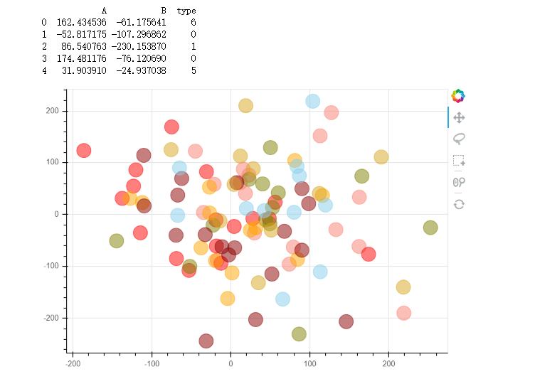
# 2、散点图不同 颜色上色/散点大小 的方法
# ② 遍历数据分开做图

rng = np.random.RandomState(1)
df = pd.DataFrame(rng.randn(100,2)*100,columns = ['A','B'])
df['type'] = rng.randint(0,7,100)
print(df.head())
# 创建数据

colors = ["red", "olive", "darkred", "goldenrod", "skyblue", "orange", "salmon"]
# 创建颜色列表

p = figure(plot_width=600, plot_height=400,tools = "pan,wheel_zoom,box_select,lasso_select,reset")
for t in df['type'].unique():
    p.circle(df['A'][df['type'] == t], df['B'][df['type'] == t],       # 设置散点图x,y值 。这里对布尔型索引理解的还不够深,应用还不够熟练。!!
             size = 20,alpha = 0.5,
             color = colors[t])
# 通过分类设置颜色

show(p)
这个感觉应用场景比较多,因为按照类别分类很常见。
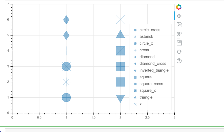
# 3、不同符号的散点图
# asterisk(), circle(), circle_cross(), circle_x(), cross(), diamond(), diamond_cross(), inverted_triangle()
# square(), square_cross(), square_x(), triangle(), x()

p = figure(plot_width=600, plot_height=400,x_range = [0,3], y_range = [0,7])

p.circle_cross(1, 1, size = 30, alpha = 0.5, legend = 'circle_cross')
p.asterisk(1, 2, size = 30, alpha = 0.5, legend = 'asterisk')
p.circle_x(1, 3, size = 30, alpha = 0.5, legend = 'circle_x')
p.cross(1, 4, size = 30, alpha = 0.5, legend = 'cross')
p.diamond(1, 5, size = 30, alpha = 0.5, legend = 'diamond')
p.diamond_cross(1, 6, size = 30, alpha = 0.5, legend = 'diamond_cross')
p.inverted_triangle(2, 1, size = 30, alpha = 0.5, legend = 'inverted_triangle')
p.square(2, 2, size = 30, alpha = 0.5, legend = 'square')
p.square_cross(2, 3, size = 30, alpha = 0.5, legend = 'square_cross')
p.square_x(2, 4, size = 30, alpha = 0.5, legend = 'square_x')
p.triangle(2, 5, size = 30, alpha = 0.5, legend = 'triangle')
p.x(2, 6, size = 30, alpha = 0.5, legend = 'x')

p.legend.location = "bottom_right"
# 设置图例位置

show(p)
# 详细参数可参考文档:http://bokeh.pydata.org/en/latest/docs/reference/plotting.html#bokeh.plotting.figure.Figure.circle
选择合适的散点
四 直线图和面积图
这里引入了bokeh的数据类型 ColumnColumnDataSource
折线图 p.line / p.multi_line
面积图 p.patch / p.paches 这个轮子可用,不用自己再造


from bokeh.models import ColumnDataSource
# 导入ColumnDataSource模块
# 将数据存储为ColumnDataSource对象
# 参考文档:http://bokeh.pydata.org/en/latest/docs/user_guide/data.html
# 可以将dict、Dataframe、group对象转化为ColumnDataSource对象

df = pd.DataFrame({'value':np.random.randn(100).cumsum()})
# 创建数据

df.index.name = 'index'
source = ColumnDataSource(data = df)
# 转化为ColumnDataSource对象
# 这里注意了,index和columns都必须有名称字段

p = figure(plot_width=600, plot_height=400)
p.line(x='index',y='value',source = source,     # 设置x,y值, source → 数据源
       line_width=1, line_alpha = 0.8, line_color = 'black',line_dash = [10,4])   # 线型基本设置
# 绘制折线图
p.circle(x='index',y='value',source = source,
         size = 2,color = 'red',alpha = 0.8)
# 绘制折点

show(p)


# 1、折线图 - 多线图
# ① multi_line

df = pd.DataFrame({'A':np.random.randn(100).cumsum(),"B":np.random.randn(100).cumsum()})
# 创建数据

p = figure(plot_width=600, plot_height=400)
p.multi_line([df.index, df.index], [df['A'], df['B']],   # 注意x,y值的设置 → [x1,x2,x3,..], [y1,y2,y3,...]
             color=["firebrick", "navy"],    # 可同时设置 → color= "firebrick"
             alpha=[0.8, 0.6],     # 可同时设置 → alpha = 0.6
             line_width=[2,1],     # 可同时设置 → line_width = 2
            )
# 绘制多段线
# 这里由于需要输入具体值,故直接用dataframe,或者dict即可

show(p)


# 1、折线图 - 多线图
# ② 多个line

x = np.linspace(0.1, 5, 100)
# 创建x值

p = figure(title="log axis example", y_axis_type="log",y_range=(0.001, 10**22))
# 这里设置对数坐标轴

p.line(x, np.sqrt(x), legend="y=sqrt(x)",
       line_color="tomato", line_dash="dotdash")
# line1

p.line(x, x, legend="y=x")
p.circle(x, x, legend="y=x")
# line2,折线图+散点图

p.line(x, x**2, legend="y=x**2")
p.circle(x, x**2, legend="y=x**2",fill_color=None, line_color="olivedrab")
# line3

p.line(x, 10**x, legend="y=10^x",line_color="gold", line_width=2)
# line4

p.line(x, x**x, legend="y=x^x",line_dash="dotted", line_color="indigo", line_width=2)
# line5

p.line(x, 10**(x**2), legend="y=10^(x^2)",line_color="coral", line_dash="dashed", line_width=2)
# line6

p.legend.location = "top_left"
p.xaxis.axis_label = 'Domain'
p.yaxis.axis_label = 'Values (log scale)'
# 设置图例及label

show(p)


# 2、面积图 - 单维度面积图

s = pd.Series(np.random.randn(100).cumsum())
s.iloc[0] = 0
s.iloc[-1] = 0
# 创建数据
# 注意设定起始值和终点值为最低点

p = figure(plot_width=600, plot_height=400)
p.patch(s.index, s.values,     # 设置x,y值
        line_width=1, line_alpha = 0.8, line_color = 'black',line_dash = [10,4],   # 线型基本设置
        fill_color = 'black',fill_alpha = 0.2
        )
# 绘制面积图
# .patch将会把所有点连接成一个闭合面

p.circle(s.index, s.values,size = 5,color = 'red',alpha = 0.8)
# 绘制折点

show(p)


# 2、面积图 - 面积堆叠图

from bokeh.palettes import brewer
# 导入brewer模块

N = 20
cats = 10
rng = np.random.RandomState(1)
df = pd.DataFrame(rng.randint(10, 100, size=(N, cats))).add_prefix('y')
# 创建数据,shape为(20,10)

df_top = df.cumsum(axis=1)   # 每一个堆叠面积图的最高点
df_bottom = df_top.shift(axis=1).fillna({'y0': 0})[::-1]    # 每一个堆叠面积图的最低点,并反向
df_stack = pd.concat([df_bottom, df_top], ignore_index=True)   # 数据合并,每一组数据都是一个可以围合成一个面的散点集合
# 得到堆叠面积数据

colors = brewer['Spectral'][df_stack.shape[1]]    # 根据变量数拆分颜色
x = np.hstack((df.index[::-1], df.index))         # 得到围合顺序的index,这里由于一列是20个元素,所以连接成面需要40个点

p = figure(x_range=(0, N-1), y_range=(0, 700))
p.patches([x] * df_stack.shape[1],                       # 得到10组index
          [df_stack[c].values for c in df_stack],     # c为df_stack的列名,这里得到10组对应的valyes
          color=colors, alpha=0.8, line_color=None)   # 设置其他参数

show(p)

 浙公网安备 33010602011771号