Flex4 自定义RadioButton的Skin
Radiobutton自带的皮肤中,圈太小,不方便用户点击,需要自定义皮肤,google了N久,找到前面两篇资料,然后自己重新写了一个Skin,终于搞定了,哈哈哈~
我的SkinRadio.mxml的源码:
<?xml version="1.0" encoding="utf-8"?>
<!--
ADOBE SYSTEMS INCORPORATED
Copyright 2008 Adobe Systems Incorporated
All Rights Reserved.
NOTICE: Adobe permits you to use, modify, and distribute this file
in accordance with the terms of the license agreement accompanying it.
-->
<!--- The default skin class for a Spark RadioButton component.
@see spark.components.RadioButton
@see spark.components.RadioButtonGroup
@langversion 3.0
@playerversion Flash 10
@playerversion AIR 1.5
@productversion Flex 4
-->
<s:SparkSkin xmlns:fx="http://ns.adobe.com/mxml/2009" xmlns:s="library://ns.adobe.com/flex/spark"
xmlns:fb="http://ns.adobe.com/flashbuilder/2009" alpha.disabledStates="0.5">
<fx:Metadata>
<![CDATA[
/**
* @copy spark.skins.spark.ApplicationSkin#hostComponent
*/
[HostComponent("spark.components.RadioButton")]
]]>
</fx:Metadata>
<fx:Script fb:purpose="styling">
/* Define the skin elements that should not be colorized.
For button, the graphics are colorized but the label is not. */
static private const exclusions:Array = ["labelDisplay", "dot"];
/**
* @private
*/
override public function get colorizeExclusions():Array {return exclusions;}
/* Define the symbol fill items that should be colored by the "symbolColor" style. */
static private const symbols:Array = ["dotFill"];
/**
* @private
*/
override public function get symbolItems():Array {return symbols};
/**
* @private
*/
override protected function initializationComplete():void
{
useChromeColor = true;
super.initializationComplete();
}
</fx:Script>
<fx:Script>
<![CDATA[
/**
* @private
*/
private static const focusExclusions:Array = ["labelDisplay"];
/**
* @private
*/
override public function get focusSkinExclusions():Array { return focusExclusions;};
]]>
</fx:Script>
<s:states>
<s:State name="up" />
<s:State name="over" stateGroups="overStates" />
<s:State name="down" stateGroups="downStates" />
<s:State name="disabled" stateGroups="disabledStates" />
<s:State name="upAndSelected" stateGroups="selectedStates" />
<s:State name="overAndSelected" stateGroups="overStates, selectedStates" />
<s:State name="downAndSelected" stateGroups="downStates, selectedStates" />
<s:State name="disabledAndSelected" stateGroups="disabledStates, selectedStates" />
</s:states>
<s:Group verticalCenter="0" width="25" height="25">
<!-- drop shadow -->
<s:Ellipse left="0" top="0" right="-1" bottom="-1">
<s:stroke>
<s:LinearGradientStroke rotation="90" weight="1">
<s:GradientEntry color="0x000000"
color.downStates="0x00FF00"
alpha="0.011"
alpha.downStates="0" />
<s:GradientEntry color="0x000000"
color.downStates="0xFFFFFF"
alpha="0.121"
alpha.downStates="0.57" />
</s:LinearGradientStroke>
</s:stroke>
</s:Ellipse>
<!-- fill -->
<s:Ellipse left="1" top="1" right="1" bottom="1">
<s:fill>
<s:LinearGradient rotation="90">
<s:GradientEntry color="0xFFFFFF"
color.overStates="0xBBBDBD"
color.downStates="0xAAAAAA"
alpha="0.85" />
<s:GradientEntry color="0xD8D8D8"
color.overStates="0x9FA0A1"
color.downStates="0x929496"
alpha="0.85" />
</s:LinearGradient>
</s:fill>
</s:Ellipse>
<!-- fill highlight -->
<s:Path data="M 1 6 Q 2 2 6 1 Q 11 2 12 6 h -9">
<s:fill>
<s:SolidColor color="0xEEEEEE" alpha="0.33" />
</s:fill>
</s:Path>
<!-- layer 6: highlight stroke (all states except down) -->
<s:Ellipse left="1" right="1" top="1" bottom="1">
<s:stroke>
<s:LinearGradientStroke rotation="90" weight="1">
<s:GradientEntry color="0xFFFFFF" color.downStates="0x939393" alpha.overStates="0.22" />
<s:GradientEntry color="0xD8D8D8" color.downStates="0xB1B1B1" alpha.overStates="0.22" />
</s:LinearGradientStroke>
</s:stroke>
</s:Ellipse>
<s:Rect left="5" top="1" right="5" height="1">
<s:fill>
<s:SolidColor color="0xEEEEEE"
color.downStates="0x939393"
alpha.overStates="0.22" />
</s:fill>
</s:Rect>
<!-- border - put on top of the fill so it doesn't disappear when scale is less than 1 -->
<s:Ellipse left="0" top="0" right="0" bottom="0">
<s:stroke>
<s:LinearGradientStroke rotation="90" weight="1">
<s:GradientEntry color="0x000000" alpha="0.70" />
<s:GradientEntry color="0x000000" alpha="0.80" />
</s:LinearGradientStroke>
</s:stroke>
</s:Ellipse>
<!-- dot -->
<!--- Defines the appearance of the RadioButton's dot. To customize the appearance of the dot, create a custom RadioButtonSkin class. -->
<s:Path left="2" top="2" includeIn="selectedStates" id="dot" itemCreationPolicy="deferred"
data="M 2 13 C 2 7 7 2 13 2 C 18 2 23 7 23 13 C 23 18 18 23 13 23 C 7 23 2 18 2 13 Z ">
<s:fill>
<!--- @private
Defines the appearance of the dot's fill. The default color is 0x000000. The default alpha is .9. -->
<s:SolidColor id="dotFill" color="0x02881e" alpha="0.9" />
</s:fill>
</s:Path>
</s:Group>
<!-- Label -->
<!--- @copy spark.components.supportClasses.ButtonBase#labelDisplay -->
<s:Label id="labelDisplay"
textAlign="start"
verticalAlign="middle"
maxDisplayedLines="1"
left="40" right="0" top="3" bottom="3" verticalCenter="2" />
</s:SparkSkin>
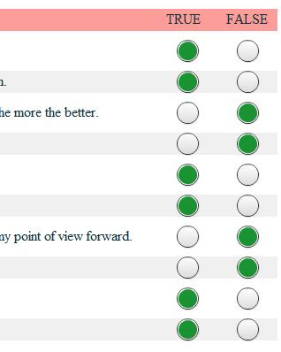
看下效果:

 浙公网安备 33010602011771号