

绘制数据分析图
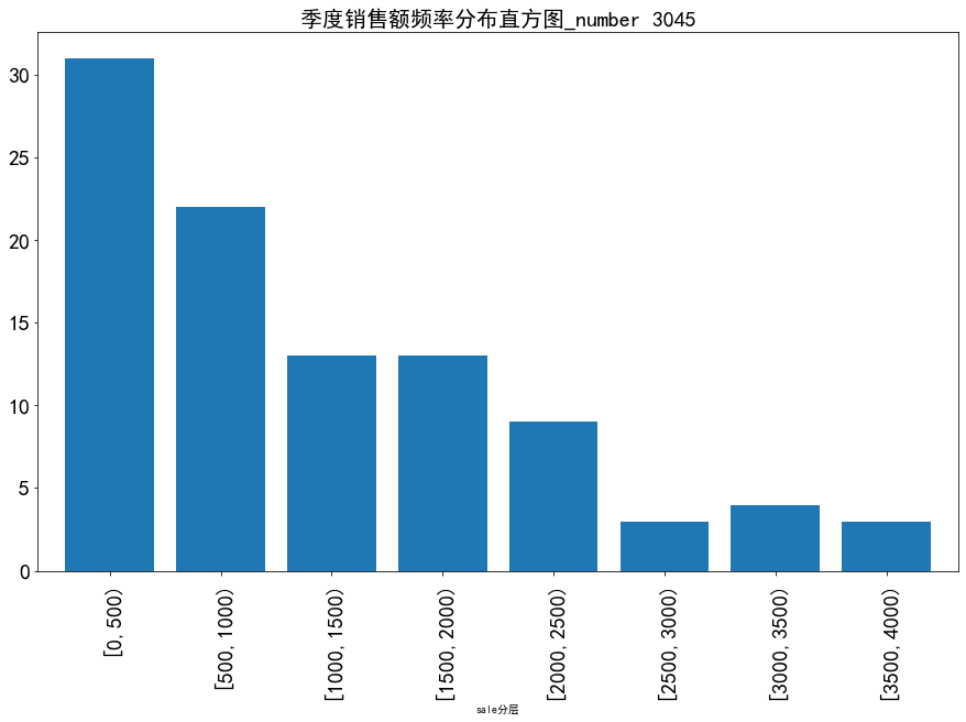
绘制直方图
import pandas as pd
import numpy as np
catering_sale = 'E:\python数据分析\catering_fish_congee(1).xls'  # 餐饮数据
data = pd.read_excel(catering_sale,names=['date','sale'])  # 读取数据,指定“日期”列为索引

bins = [0,500,1000,1500,2000,2500,3000,3500,4000]
labels = ['[0,500)','[500,1000)','[1000,1500)','[1500,2000)',
       '[2000,2500)','[2500,3000)','[3000,3500)','[3500,4000)']

data['sale分层'] = pd.cut(data.sale, bins, labels=labels)
#aggResult = data.groupby(by=['sale分层'])['sale'].agg({'sale': np.size})
aggResult = data.groupby(by=['sale分层'])['sale'].agg([("sale",np.size)])

pAggResult = round(aggResult/aggResult.sum(), 2, ) * 100

import matplotlib.pyplot as plt
plt.figure(figsize=(15,9))  # 设置图框大小尺寸
pAggResult['sale'].plot(kind='bar',width=0.8,fontsize=20)  # 绘制频率直方图
plt.rcParams['font.sans-serif'] = ['SimHei']  # 用来正常显示中文标签
plt.title('季度销售额频率分布直方图_number 3045',fontsize=20)
plt.show()
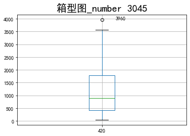
绘制箱型图
import pandas as pd
import matplotlib.pyplot as plt

plt.rcParams['font.sans-serif'] = ['SimHei']
plt.rcParams['axes.unicode_minus'] = False
plt.figure()

url = r"E:\python数据分析\catering_fish_congee(1).xls"
data = pd.read_excel(url)

p = data.boxplot(return_type=('dict'))
x = p['fliers'][0].get_xdata()
y = p['fliers'][0].get_ydata()
y.sort()
for i in range(len(x)):
    if i > 0:
        plt.annotate(y[i], xy=(x[i], y[i]), xytext=(x[i] + 0.05 - 0.8 / (y[i] - y[i - 1]), y[i]))
    else:
        plt.annotate(y[i], xy=(x[i], y[i]), xytext=(x[i] + 0.08, y[i]))
    plt.rcParams['font.sans-serif'] = ['SimHei']  # 用来正常显示中文标签
plt.title('箱型图_number 3045',fontsize=20)
plt.show()
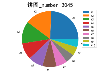
绘制饼图
import pandas as pd
import matplotlib.pyplot as plt
catering_dish_profit = 'E:\python数据分析\catering_dish_profit(1).xls'
data = pd.read_excel(catering_dish_profit)
print(data)
x= data['盈利']
labels=data['菜品名']
plt.pie(x,labels=labels)
plt.rcParams['font.sans-serif'] = 'SimHei'  # 用来正常显示中文标签
plt.title('饼图_number 3045',fontsize=20)
plt.axis('equal')
plt.legend()
plt.show()
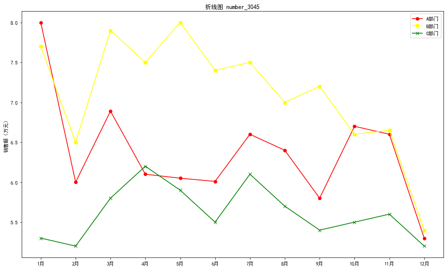
绘制折线图
import pandas as pd
data=pd.read_excel('E:\python数据分析\dish_sale(1).xls')
print(data)
import matplotlib.pyplot as plt
plt.figure(figsize=(15,9))
font1={'weight':60,'size':50}
plt.plot(data['月份'],data['A部门'],color='red',label='A部门',marker='o')
plt.plot(data['月份'],data['B部门'],color='yellow',label='B部门',marker='s')
plt.plot(data['月份'],data['C部门'],color='green',label='C部门',marker='x')
plt.legend()
plt.ylabel('销售额(万元)')
plt.title('折线图 number_3045')

 浙公网安备 33010602011771号