
CSS3—2D转换模块—旋转、缩放、平移
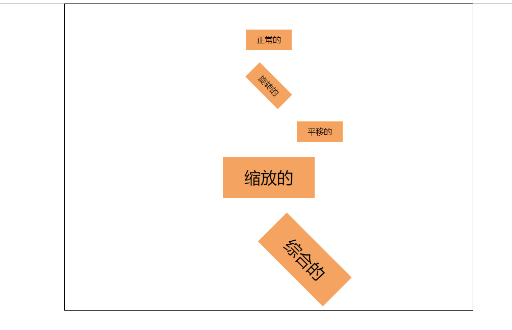
<!DOCTYPE html>
<html lang="en">
<head>
    <meta charset="UTF-8">
    <title>Title</title>
    <style>
        *{
            margin: 0;
            padding: 0;
        }
        ul{
            border: 1px solid #000;
            width: 800px;
            height: 600px;
            list-style: none;
            margin: 0 auto;

        }
        li{
            text-align: center;
            line-height: 40px;
            width: 90px;
            background-color: sandybrown;
            margin: 0 auto;
            margin-top: 50px;
        }
        li:nth-of-type(2){
            /*旋转45度,默认以元素左上角为中心点旋转*/
            transform:rotate(45deg);
            /*自定义旋转中心点,取值:
                                transform-origin: center center;
                                transform-origin: 0px  0px;
                                transform-origin: left bottom;
                                transform-origin: 10% 20%;*/
            transform-origin: right top;
        }
        li:nth-of-type(3){
            /*向右平移100px 垂直方向不动*/
            transform: translate(100px,0px);
        }
        li:nth-of-type(4){
            /*横向放大2倍,竖向放大2倍,默认取值为1,没有变化,
               取值小于1表示缩小,如果两个取值一样就可以简写为一个数字*/
            transform:scale(2,2);
        }
        li:nth-of-type(5){
            /*如果有多个转换模块,可以连写,空格隔开即可*/
            transform: rotate(45deg) translate(100px,0px) scale(2,2);
        }
    </style>
</head>
<body>
<ul>
    <li>正常的</li>
    <li>旋转的</li>
    <li>平移的</li>
    <li>缩放的</li>
    <li>综合的</li>
</ul>
</body>
</html>
效果图:

 浙公网安备 33010602011771号