
css3如何实现圆角边框
圆角边框是css3新增属性,在圆角边框出现之前,前端开发有的采用整块的圆角图片作为背景,有的采用小的圆角图片分别放在元素的四角,非常麻烦,灵活性差,也达到降低了网站的整体性能,而圆角边的出现则降低了开发和维护的难度。
css3实现圆角边框
圆角边框(boder-radius)的基本用法:
圆角边框的最基本用法就是设置四个相同弧度的圆角
boder-top-left-radius:30px;      //左上角

boder-top-right-radius:30px;   //右上角

boder-bottom-left-radius:30px;  //右下角

boder-bottom-right-radius:30px; //左下角
如果这四个弧度的圆角相同,可以写成:
border-radius:30px;
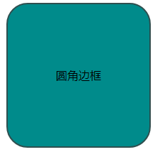
例子:
css部分:
.demo{
    margin:0 auto;
    background: darkcyan;
    width:200px;
    height:200px;
    border:2px solid darkslategray;
    border-radius:30px;
    text-align: center;
    line-height: 200px;
}
html部分:
<div class="demo">圆角边框</div>
效果如图:
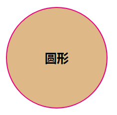
圆形
圆角边框也可以使用百分比作为单位,比如:将一个正方形的圆角边框设置为50%,那么就会形成一个圆,不过使用百分比与像素并不能等效。
注意:百分比大于50%后,形状就不会再变化了,圆角的半径不能超过宽/高的一半
例子:
css部分:
.demo{
	width:200px;
	height:200px;
	margin: 30px auto;
	border: 2px solid #e4007e;
	text-align: center;
	line-height: 200px;
	font-weight: bold;
	font-size: 24px;
	background: burlywood;
	border-radius: 50%;//圆角百分比
}
html部分:
<div class="demo">圆形</div>
效果如图:
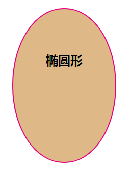
椭圆
既然使用圆角边框可以绘制出一个圆,同样也可以绘制出一个椭圆。
例子:
css部分:
.demo{
	width:200px;
	height:300px;
	margin: 30px auto;
	border: 2px solid #e4007e;
	text-align: center;
	line-height: 200px;
	font-weight: bold;
	font-size: 24px;
	background: burlywood;
	border-radius: 100px/150px;
}
html部分:
<div class="demo">椭圆形</div>
效果如图:
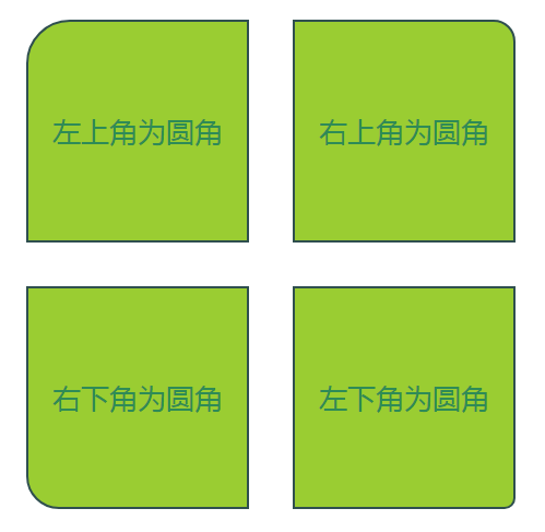
设置不同弧度的圆角
例子:
css部分:
#box{
    width:500px;
    position: relative;
    margin:30px auto;
}

.demo1,.demo2,.demo3,.demo4{
    width:200px;
    height:200px;
    text-align: center;
    color:seagreen;
    font-size: 26px;
    line-height: 200px;
    background: yellowgreen;
    border:2px solid darkslategray;
    float:left;
    margin:20px;
}

.demo1{border-top-left-radius: 40px;}
.demo2{border-top-right-radius: 20px;}
.demo3{border-bottom-left-radius: 30px;}
.demo4{border-bottom-right-radius: 10px;}
HTML部分:
<div id="box">
    <div class="demo1">左上角为圆角</div>
    <div class="demo2">右上角为圆角</div>
    <div class="demo3">右下角为圆角</div>
    <div class="demo4">左下角为圆角</div>
</div>
效果如图:
ok,是不是很好看的样式~


 浙公网安备 33010602011771号