
数据分析作业
-
import pandas as pd
-
import numpy as np
-
import matplotlib.pyplot as plt
-
import seaborn as sns
-
import scipy.stats as stats
-
%matplotlib inline
-
plt.style.use('ggplot')
-
import plotly.express as px
-
import plotly.graph_objs as go
-
from plotly.offline import iplot, init_notebook_mode
-
import plotly.figure_factory as ff
-
from plotly import subplots
-
from plotly.subplots import make_subplots
-
init_notebook_mode(connected=True)
-
from datetime import datetime, date, timedelta
-
from fbprophet import Prophet
-
import warnings
-
warnings.filterwarnings('ignore')
-
pd.set_option('display.max_columns', 100)
-
pd.set_option('display.max_rows', 100)
-
import os
-
for dirname, _, filenames in os.walk('/kaggle/input'):
- print(os.path.join(dirname, filename)
- fig = px.bar(df, x='Date', y='Confirmed', hover_data=['Province/State', 'Deaths', 'Recovered'], color='Country')
- annotations = []
- annotations.append(dict(xref='paper', yref='paper', x=0.0
- xanchor='left', yanchor='bottom',
- text='Confirmed bar plot for each country'
- font=dict(family='Arial')
- size=30
- color='rgb(37,37,37)')
- showarrow=False))
- fig.update_layout(annotations=annotations)
![]() fig.show()
fig.show()
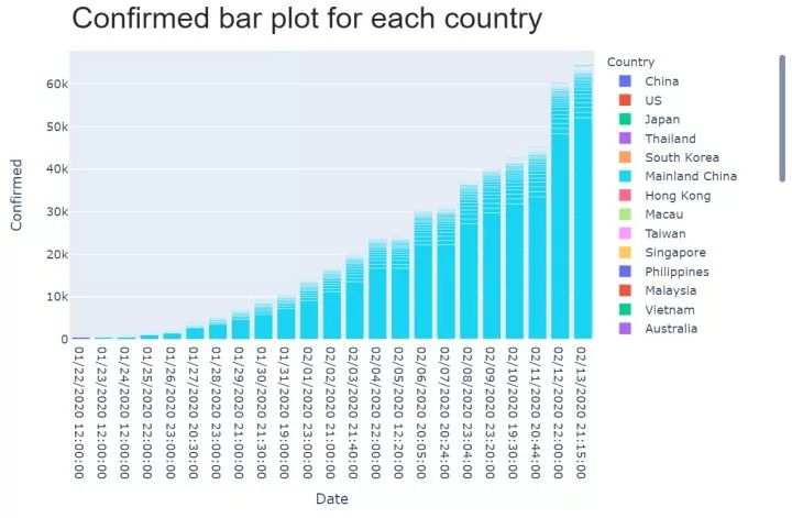 fig.show()
 浙公网安备 33010602011771号