HTML
1.基本
<!DOCTYPE html>
<html>
<head>
    <title>标题</title>
</head>
<body>
  <!-- 内容 -->
</body>
</html>
<!-- 注释内容 -->
2.标签类别
<meta charset="UTF-8">
<title>我的HTML页面</title>
3.标签头<head>
<title>我是导航栏标题</title>
<style>
	/* css.. */
</style>

<!-- 外部引入资源 -->
<link rel="stylesheet" href="commons.css" />
<link rel="shortcut icon" href="commons.ico" />

<!-- 外部引入js -->
<script src='commons.js'></script>
<script> /*JavaScript代码*/ </script>
<!-- 编码: -->
	<meta http-equiv="content-type" content="text/html;charset=utf-8">
<!-- 刷新和跳转: -->
	<meta http-equiv="refresh" Content="10">
	<meta http-equiv="refresh" Content="5;Url=baidu.com"/>
<!-- 搜索关键字: -->
	<meta name="keywords" content="关键字1;关键字2;关键字3">
<!-- 页面描述: -->
	<meta name="description" content="页面描述........">
4.标签身体<body>
<!-- 块级标签: -->
	<div></div>
<!-- 行内标签: -->
	<span></span>
<!-- H系列标签 -->
	<h1></h1><h?></h?>
<!-- 段落(有间距) -->
	<p></p>
<!-- 换行 -->
	<br/>
<!-- 水平线 -->
	<hr/>
<a href="www.baidu.com">当前页面跳转</a>
<a href="www.baidu.com" target="_blank">新建一个页面跳转</a>
<a href="#某个标签的id">锚(位置跳转)</a>
<img src="URL" title="描述" alt="替换文本">
| HTML源代码 |
符号 |
| |
不断行的空白 |
| < |
< |
| > |
> |
| & |
& |
| " |
" |
| ® |
® |
| © |
® |
| ™ |
™ |
<table>
    <thead>
        <tr>
            <th></th>
        </tr>
    </thead>
    <tbody>
        <tr>
        	<td></td>
        </tr>
    </tbody>
</table>

<!--横向合并单元格:colspan = '2' -->
<!--纵向合并单元格:rowspan = '2' -->
<!-- 无序列表 -->
<ol>
    <li></li>
</ol>

<!-- 有序列表 -->
<ul>
    <li></li>
</ul>
	<!--
	PS:
	type="A"大写字母
	type="a"小写字母
	type="I"罗马数字
	type="i"小写罗马数字
	-->

<!-- 自定义列表 -->
<dl>
    <dt>标题1</dt>
    <dd>描述描述描述</dd>

    <dt>标题2</dt>
    <dd>描述描述描述</dd>
</dl>
<form action='提交的地址' methed='提交方式(GET/POST)'>
	<!-- 表单 -->
	<input type='submit'>
</form>

	<!--
		GET:http://dddddd?q=值&b=值
		POST:放在报表里面传输
	-->
<input type='text' name="后端" value='默认值/显示'>
| 功能 |
代码 |
说明 |
| 文本框 |
type='text' |
|
| 密码框 |
type='password' |
|
| 提交按钮 |
type='submit' |
|
| 普通按钮 |
type='button' |
|
| 单选按钮 |
type='radio' |
互斥选项,name相同,得到选中的value |
| 复选按钮 |
type='checkbox' |
name相同,得到选中的个value |
| 文件上传按钮 |
type='file' |
依赖form属性:enctype="multipart/form-data" |
| 重置按钮 |
type='reset' |
重置当前页面所有按钮 |
<!-- 多行输入框 -->
<textarea name="后端">(默认值)</textarea>

<!-- 下拉选择框 -->
<select name="后端" >
	<option value="1">1</option>
	<option value="2" selected="selected">2</option>
	<option value="3">3</option>
</select>

<!-- 下拉框分组 -->
<optgroup label="分组名称">
	<option value="1">1</option>
	<option value="2">2</option>
	<option value="3">3</option>
</optgroup>

<!-- label标签(点击文字关联的控件获得光标 ) -->
<label for="username">用户名:</label>
<input id="username" type="text" name="user" />

<!-- 控件分组框 -->
<fieldset>
	<legend>长度设置</legend>
    height: <input type="text" />
    weight: <input type="text" />
</fieldset>
css
1.基本
选择器{
	属性1: 值;
    属性2: 值;
    ...
}
/* 注释 */
2.选择器
<标签 class="mcls" id="mid"></标签>
#mid{
    /* 样式... */
}
.mcls{
    /* 样式... */
}
div{
	/* 样式... */
}
input[type='text']{ width:100px;height:200px; }
.cl[n='alex']{ width:100px;height:200px; }
.c1,.c2,div{
	样式..
}
.c1 .c2 div{
	样式..
}
/*子元素选择器、相邻兄弟选择器、普通兄弟选择器*/
.c1>.c2
.c1+.c2
.c1~.c2
3.伪选择器
a:link 		{color:#000000;} 		/* 未访问链接*/
a:visited 	{color:#00FF00;} 		/* 已访问链接 */
a:hover 	{color:#FF00FF;} 		/* 鼠标移动到链接上 */
a:active 	{color:#0000FF;} 		/* 鼠标点击后链接 */
a:hover:not(.active) {color:#555;}	/* 鼠标移动到链接上,并且没有被点击 */
:active 	/* 选择正在活动链接 */
:hover 		/* 把鼠标放在链接上的状态 */
:checked 	/* 选择所有选中的表单元素 */
:disabled 	/* 选择所有禁用的表单元素 */
:before 	/* 在每个 块 元素之前插入内容 */
:after 		/* 在每个 块 元素之后插入内容 */
4.文字
color: red;				/* 颜色 */
line-height: 70%;		/* 行高 */
text-align: right;		/* 对齐(right,center,left,justify) */
text-decoration: none;	/* 删除修饰、上划线、删除线、下划线 (none/overline/line-through/underline) */
text-decoration: none;	/* (主要用于删除链接的下划线) */

text-indent: 50px;		/* 文本缩进 */
letter-spacing: 2px;	/* 字距 */
word-spacing: 30px;		/* 字距(字之间空白距离) */
font-size: 40px;			/* 大小(16px=1em) */
font-family: "华文新魏";	 /* 字体 */
font-style: italic;     	/* 斜体(normal,italic,oblique) */
font-weight: bold;			/* 粗细(normal,lighter,bold,100px) */
5.表格
/* 表格背景和字体颜色等属性参照其他 */
border-collapse:collapse;	/* 折叠边框 */
vertical-align:bottom;		/* 文字上下对齐 */
visibility:collapse;		/* 隐藏表格 */
6.背景
background-color:red;			/* 背景颜色 */
background-image:url('URL');	/* 背景图片 */

background-repeat:none;			/* 重复图片(no-repeat,repeat-x,repeat-y) */
background-position:right top;	/* 起始位置 */
background-position-x/y:;		/* 单独设置 */
background:#ffffff url('URL') no-repeat right top;	/* 简写 */
opacity:0.5;		/* 透明度 */
z-index:1;			/* 层级顺序 */
7.盒子模型
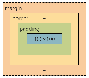
height:100px;					/* 高度(像素和百分比) */
width:100px;					/* 宽度(像素和百分比) */
max-(height/width):100px;		/* 最大高宽 */
min-(height/width):100px;		/* 最小高宽 */
/* 外边距 */
margin:auto 0;
margin-{top/right/bottom/left}:5px;

/* 内边距 */
padding:auto 0;
padding-{top/right/bottom/left}:5px;

/* 方框 */
border-radius:50%;			/* 圆角,50%为⚪ */
border:1px solid red;		/* 边框:solid,dotted,dashed,double,groove,ridge,inset,outset */
border-{top/bottom/left/right}-{style/width/color}:;	/* 边框属性 */
display: inline;		/* 块独占一行/不独占一行(none,inline,block,inline-block) */
visibility: hidden;		/* 块隐藏/不隐藏(hidden,visible) */
8.布局
position: static;	/* 流水布局(默认定位) */
position: fixed;		/* 固定定位(固定在页面的某个位置)*/
position: absolute;	/* 绝对定位(第一次定位,可以在指定位置,滚轮滚动时就不在了) */
position: sticky;	/* 粘性定位 -webkit-sticky(Safari)(top:0)(滚动后黏在顶部) */
position: relative; + position: absolute;		/* 相对定位(相对于块的某个位置) */
Overflow: hidden;	/* 内容会被修剪,其余内容不可见 */
Overflow: scroll;	/* 内容会被修剪,显示滚动条查看其余内容 */
Overflow: auto;		/* 如果内容被修剪,则浏览器显示滚动条查看其余内容。 */
Overflow: visible;	/* 内容不会被修剪,会呈现在元素框之外(默认值) */
float: left;				/* 在文字中浮动(right,left) */
float: left;overflow: auto;	/* 元素浮动布局,指定元素是否可以浮动 */
clear: both;				/* 清除浮动,指定元素不允许元素周围有浮动元素(clear:both/right/left) */
9.对齐
padding: 0 0;		/* 水平垂直居中 */

/* 水平居中 */
margin: auto;			/* 元素居中(元素需置宽度) */
text-align: center;		/* 文本居中 */

/* 垂直居中 */
line-height:100px;		/* 这个100px要=元素的高 */
top: 50%;left: 50%;-ms-transform: translate(-50%, -50%);transform: translate(-50%, -50%); /*这个元素必须要相对定位*/

/* 左右对齐 */
position: absolute;right: 50px;	/* 左右浮动(right,left) */
float: left;overflow: auto;		/* 左右浮动(right,left) */
10.补充
background-color: red !important; /* 增加样式权重!important */
css3
1.边框
/* 圆角 */
border-radius:50%;
border-top-left-radius;		/* top,bottom,left,right */

/* 盒阴影 */
box-shadow:10px 10px 5px #888888;

/* 卡片效果 */
box-shadow: 0 4px 8px 0 rgba(0, 0, 0, 0.2), 0 6px 20px 0 rgba(0, 0, 0, 0.19);

/* 轮廓 */
outline:2px solid red;
outline-offset:15px;
2.背景
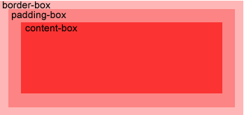
background-size:100% 100%;		/* 背景图片大小 */
background-origin:content-box;	/* 定位背景图片(content-box,padding-box,border-box) */
background-image:url(img_flwr.gif),url(img_tree.gif);	/* 多个背景图 */

filter: grayscale(100%);		/* 图片滤镜 */
3.渐变
/* (to bottom、to top、to right、to left、to bottom right) */
background-image: linear-gradient(#e66465, #9198e5);			/* 从上到下 */
background-image: linear-gradient(to right,red,yellow);			/* 从左到右 */
background-image: linear-gradient(to bottom right,red,yellow);	/* 到对角 */
background-image: linear-gradient(-90deg, red, yellow);			/* 带角度渐变 */

background-image: linear-gradient(red, yellow, green,...);		/* 多颜色节点 */
background-image: linear-gradient(to right, rgba(255,0,0,0), rgba(255,0,0,1));	/* 带有透明度 */
 background-image: repeating-linear-gradient(red, yellow 10%, green 20%);		/* 重复的线性渐变 */
background-image: radial-gradient(red, yellow, green);				/* 均匀分布的径向渐变 */
background-image: radial-gradient(red 5%, yellow 15%, green 60%);	/* 不均匀分布的径向渐变 */
background-image: repeating-radial-gradient(red, yellow 10%, green 15%);

/* 设置形状,circle 表示圆形,ellipse 表示椭圆形 */
background-image: radial-gradient(circle, red, yellow, green);		/* 重复的径向渐变 */
4.文本
text-shadow: 5px 5px 5px #FF0000;		/* 文本阴影 */
word-wrap:break-word;					/* 长文本换行 */
word-break: keep-all;					/* 单词拆分 */
5.2D变换
/* 浏览器支持(-ms-transform(IE 9)、-webkit-transform(Safari and Chrome)) */
transform-origin:20% 40%;			/* 设置原点 */

/* 以下参数可单独设置X或Y轴数值,如:transform: scaleX(2) */
transform: scale(2,3);				/* 缩放 */
transform: rotate(30deg);			/* 旋转 */
transform: translate(50px,100px);	/* 平移 */
transform: skew(30deg,20deg);		/* 倾斜 */

transform:matrix(0.866,0.5,-0.5,0.866,0,0);	/* 综合,使用六个值的矩阵。 */
6.3D变换
transform-origin:20% 40% 40%;			/* 设置原点 */

/* 旋转 */
transform: rotateX(120deg);
transform: rotateY(130deg);
transform: rotateZ(130deg);
transform: rotate3d(x,y,z,angle);

transform: scale3d(2,3);				/* 缩放 */
transform: translate3d(x,y,z);			/* 平移 */

/* 透视效果 */
transform: perspective:150px;				/* 距离屏幕的透视距离 */
transform: perspective-origin: center 10%;	/* 在父元素上设置观察点(top,right,left,bottom,center,10px,50%) */

transform-style:preserve-3d;			/* 元素在2d或3d模式下呈现(flat,preserve-3d) */
7.过渡
transition:width 2s;							/* 一个属性改变,持续时间2s */
transition: width 2s, height 2s, transform 2s;	/* 多个属性改变,持续时间2s */

/* 宽度改变,持续1s,线性时间,延长2s改变 */
transition-property: width;
transition-duration: 1s;
transition-timing-function: linear;
transition-delay: 2s;

/* 同上的简写 */
transition: width 1s linear 2s;
| 函数名 |
说明 |
| linear |
规定以相同速度开始至结束的过渡效果(等于 cubic-bezier(0,0,1,1)) |
| ease |
规定慢速开始,然后变快,然后慢速结束的过渡效果(cubic-bezier(0.25,0.1,0.25,1)) |
| ease-in |
规定以慢速开始的过渡效果(等于 cubic-bezier(0.42,0,1,1)) |
| ease-out |
规定以慢速结束的过渡效果(等于 cubic-bezier(0,0,0.58,1)) |
| ease-in-out |
规定以慢速开始和结束的过渡效果(等于 cubic-bezier(0.42,0,0.58,1)) |
| cubic-bezier(n,n,n,n) |
在 cubic-bezier 函数中定义自己的值。可能的值是 0 至 1 之间的数值 |
8.动画
/* -moz-(Firefox),-webkit-(Safari and Chrome),-o-(Opera) */
{
	background:red;
	animation:myAnimation 5s;		/* 指定动画,规定持续时长 */
}

/* 动画过渡 */
@keyframes myAnimation
{
	0%   {background:red;}
	25%  {background:yellow;}
	50%  {background:blue;}
	100% {background:green;}
}
/* -webkit-(Safari 与 Chrome) */

/* 动画属性 */
animation-name: myAnimation;			/* 指定动画 */
animation-duration: 5s;					/* 动画持续时长 */
animation-timing-function: linear;		/* 动画时间曲线,用法同"7.过渡" */
animation-delay: 2s;					/* 动画延迟时长 */
animation-iteration-count: infinite;	/* 动画播放次数(0,1,2,3,...,无限次infinite)*/

/* 动画是否在下一周期逆向地播放 */
animation-direction: alternate;			/* (normal,reverse,基正偶逆播放alternate,基逆偶正播alternate-reverse) */
animation-play-state: running;			/* 动画现在是否播放(running,paused) */

/* 同上的简写 */
animation: myfirst 5s linear 2s infinite alternate;
9.多媒体查询
@media not|only mediatype and (expressions) {
    ...{
    	/* CSS 代码...; */
    }
}

/* 可视窗口尺寸小于 480 像素的设备上修改背景颜色 */
@media screen and (max-width: 480px) {
    body {
        background-color: lightgreen;
    }
}
| 名称 |
说明 |
| not |
用来排除掉某些特定的设备的 |
| only |
用来定某种特别的媒体类型 |
| all |
所有设备 |
<link rel="stylesheet" media="mediatype and|not|only (expressions)" href="print.css">
| 名称 |
说明 |
| all |
用于所有多媒体类型设备 |
| print |
用于打印机 |
| screen |
用于电脑屏幕,平板,智能手机等。 |
| speech |
用于屏幕阅读器 |
工具

 浙公网安备 33010602011771号