变形平移
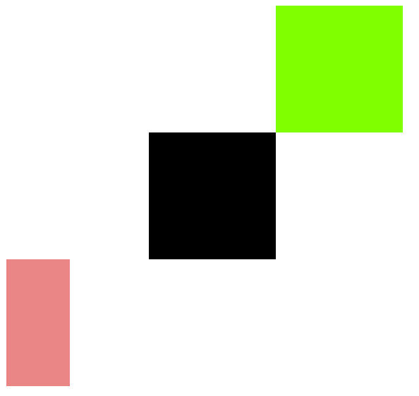
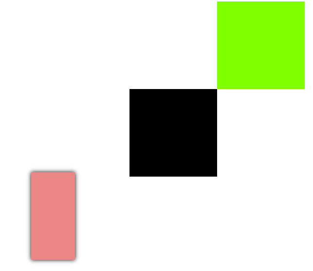
<!DOCTYPE html>
<html lang="en">
  <head>
    <meta charset="UTF-8" />
    <meta http-equiv="X-UA-Compatible" content="IE=edge" />
    <meta name="viewport" content="width=device-width, initial-scale=1.0" />
    <title>Document</title>
  </head>
  <style>
    #div1 {
      background-color: chartreuse;
      width: 200px;
      height: 200px;
      margin: 0 auto;
      margin-top: 200px;
      /* 平移是根据自身的长宽计算的 */
      /* x轴是左右平移 */
      transform: translateX(100%);
      /* y轴是上下平移 */
      transform: rotateY(100%);
    }
    #div2 {
      width: 200px;
      height: 200px;
      background-color: black;
      margin: 0 auto;
    }
变形:
    #div3 {
      width: 100px;
      height: 200px;
      margin: 0 200px;
      float: left;
      transform: rotateX(0px);
      transform: rotateY(0px);
      background-color: rgb(235, 134, 134);
      /* transition: all 3s; */
    }
    #div3:hover {
      /* transform: translateX(-10px); */
      transform: translateY(-10px);
      box-shadow: 0 0 10px black;
    }
  </style>
  <body>
    <div id="div1"></div>
    <div id="div2"></div>
    <div id="div3"></div>
  </body>
</html>


 浙公网安备 33010602011771号