

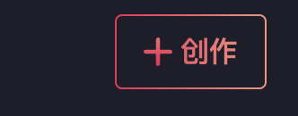
el-button 实现渐变边框 + 渐变文字
<div class="create-btn-wrap">
    <div class='border-bg'></div>
<el-button class="create-button">
    <el-image :src="require('@/assets/images/icons/plus.svg')"/>创作</el-button>
</div>
.create-btn-wrap {
border: 1px solid transparent;
border-radius: 4px;
position: relative;
background-color: #1e1d2b;
background-clip: padding-box; /*important*/
.border-bg {
position: absolute;
top: 0;
right: 0;
left: 0;
bottom: 0;
z-index: -1;
margin: -1px;
border-radius: inherit; /*important*/
background: linear-gradient(to right, #EE2457, #F39480);
}
.create-button {
font-size: 16px;
height: 100%;
line-height: 100%;
background: linear-gradient(to right, #EE2457, #F39480);
-webkit-background-clip: text;
color: transparent;
border: none;
border-radius: 4px;
padding: 9px 15px;
.el-image {
height: 16px;
vertical-align: top;
}
}
}最终效果:

 浙公网安备 33010602011771号