flex布局简介
一、概述
浮动在移动布局中不再重要,flex盒模型越来越重要。
flexbox经历过三个版本,主要区别是2009年到2012年之间的语法变化。

最新的语法和现在规范是同步的(例display:flex和“flex-{*}”属性)。
在这之间的语法是2011年出现的非官方语法,只能被IE识别(例display:flexbox;display: -ms-flexbox)。
最老的语法产生于2009年(例display: box;或者“box-{*}”属性)
- W3C 2009年第1次草案:[display:box;](https://www.w3.org/TR/2009/WD-css3-flexbox-20090723/)
- W3C 2011年第2次草案:[display:flexbox | inline-flexbox;](https://www.w3.org/TR/2011/WD-css3-flexbox-20110322/)
- W3C 2012年第5次草案及以后的候选推荐标准:[display:flex | inline-flex;](https://www.w3.org/TR/2012/WD-css3-flexbox-20120612/)
- W3C 2011年第2次草案:[display:flexbox | inline-flexbox;](https://www.w3.org/TR/2011/WD-css3-flexbox-20110322/)
- W3C 2012年第5次草案及以后的候选推荐标准:[display:flex | inline-flex;](https://www.w3.org/TR/2012/WD-css3-flexbox-20120612/)
二、flex常用属性
1、用于父元素的样式
-webkit-box模型【旧】
- display:-webkit-box 该属性会将此元素及其直系子代加入弹性框模型中。
- box-orient:horizontal|vertical|inline-axis|block-axis|inherit;该属性定义父元素中的子元素是如何排列的。horizontal对父元素的宽度分配划分。
- box-pack:start|end|center|justify;box-pack表示父容器里面子容器的水平对齐方式
- box-align:start|end|center|baseline|stretch;表示父容器里面子容器的垂直对齐方式。
flex模型 【新】
- display:flex; flexbox模型只适用于直系子代
- flex-direction: row | row-reverse | column | column-reverse;子元素是如何排列
- justify-content: flex-start | flex-end | center | space-between | space-around | space-evenly;子元素水平排列方式
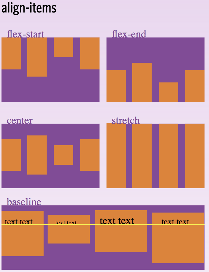
- align-items: flex-start | flex-end | center | baseline | stretch;子元素垂直排列方式
- flex-wrap: nowrap | wrap | wrap-reverse;
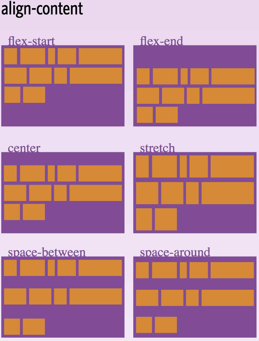
- align-content: flex-start | flex-end | center | space-between | space-around | stretch;
2、用于子元素的样式
【旧】box-flex:0|任意数字;该属性让子容器针对父容器的宽度按一定规则进行划分。
【新】flex: none | [ <'flex-grow'> <'flex-shrink'>? || <'flex-basis'> ],默认值 0 1 auto。

三、快速入门demo
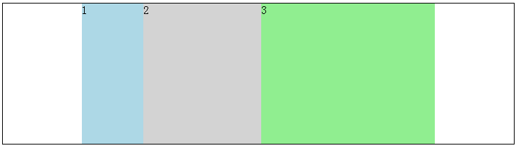
1、子元素水平排列,按比例分割父元素宽度
.parent宽度500px,其子元素水平排列,child-one占1/6,child-two占2/6,child-three占了3/6。
<!DOCTYPE html>
<html lang="en">
<head>
    <meta charset="UTF-8">
    <meta name="viewport" content="width=device-width, initial-scale=1.0">
    <meta http-equiv="X-UA-Compatible" content="ie=edge">
    <title>Document</title>
    <style>
        .parent{
            width: 500px;
            height: 200px;
            display: flex;
            flex-direction: row;/* 虽然默认的排列方式是水平的,但是为了区分起见,加上该属性 */
        }
        .child-one{
            background: lightblue;
            flex: 1;
        }
        .child-two{
            background: lightgray;
            flex: 2;
        }
        .child-three{
            background: lightgreen;
            flex: 3;
        }
    </style>
</head>
<div style="display:flex;flex-direction:row;justify-content:center;border: 1px solid #000;"><!---box-pack:center让.parent水平居中-->
    <div class="parent">
        <div class="child-one">1</div>
        <div class="child-two">2</div>
        <div class="child-three">3</div>
    </div>
</div>
</body>
</html>
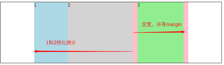
2、子元素水平排列,一个子元素定宽,剩余子元素按比例分割


<!DOCTYPE html>
<html lang="en">
<head>
    <meta charset="UTF-8">
    <meta name="viewport" content="width=device-width, initial-scale=1.0">
    <meta http-equiv="X-UA-Compatible" content="ie=edge">
    <title>Document</title>
    <style>
        .parent{
            width: 500px;
            height: 200px;
            display: flex;
            background-color:pink;
            flex-direction: row;/* 虽然默认的排列方式是水平的,但是为了区分起见,加上该属性 */
        }
        .child-one{
            background: lightblue;
            flex: 1;
        }
        .child-two{
            background: lightgray;
            flex: 2;
        }
        .child-three{
            background: lightgreen;
            /*定宽,并加上左右margin,父元素加上粉色背景色更好理解*/
            width:150px;
            margin:0 15px;
        }
    </style>
</head>
<div style="display: flex;justify-content: center;border: 1px solid #000;"><!--justify-content:center让.parent水平居中-->
    <div class="parent">
        <div class="child-one">1</div>
        <div class="child-two">2</div>
        <div class="child-three">3</div>
    </div>
</div>
</body>
</html>
3、子元素垂直排列,分割父元素高度
.parent中的子元素垂直排列,所以每个子元素宽度占100%。
<!DOCTYPE html>
<html lang="en">
<head>
    <meta charset="UTF-8">
    <meta name="viewport" content="width=device-width, initial-scale=1.0">
    <meta http-equiv="X-UA-Compatible" content="ie=edge">
    <title>Document</title>
    <style>
        .parent{
            width: 400px;
            height: 600px;
            display: flex;
            background-color:pink;
            flex-direction: column;/*子元素垂直排列 */
        }
        .child-one{
            background: lightblue;
            flex: 1;
        }
        .child-two{
            background: lightgray;
           flex: 2;
        }
        .child-three{
            background: lightgreen;
            /*定高,有上下margin,父元素加上粉色背景色更好理解*/
            height:200px;
            margin:15px 0;
        }
    </style>
</head>
<body>
<div style="display: flex;justify-content: center;border: 1px solid #000;"><!---webkit-box-pack:center让.parent水平居中-->
    <div class="parent">
        <div class="child-one">1</div>
        <div class="child-two">2</div>
        <div class="child-three">3</div>
    </div>
</div>
</body>
</html>

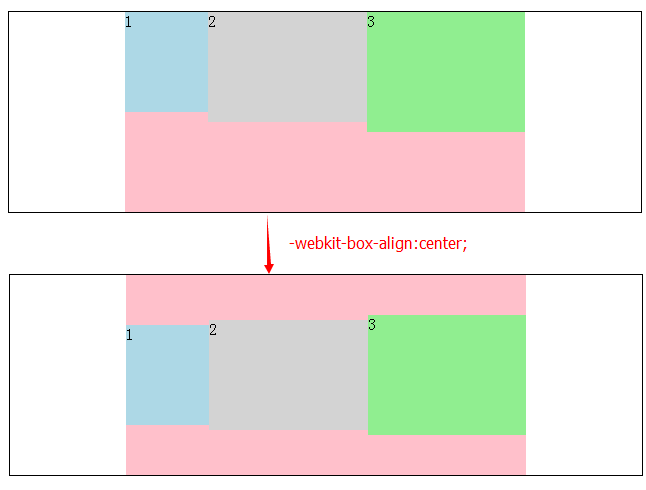
4、子元素水平排列,定高垂直方向居中对齐
父元素中子元素水平排列,子元素定高时设置垂直方向对齐方式为居中对齐。
重点:align-item:center,以前布局用box-align:center;
<!DOCTYPE html>
<html lang="en">
<head>
    <meta charset="UTF-8">
    <meta name="viewport" content="width=device-width, initial-scale=1.0">
    <meta http-equiv="X-UA-Compatible" content="ie=edge">
    <title>Document</title>
    <style>
        .parent{
            width: 400px;
            height: 200px;
            display: flex;
            background-color:pink;
            flex-direction: row;
            align-items: center;
        }
        .child-one{
            background: lightblue;
            flex: 1;
            height:100px;
        }
        .child-two{
            background: lightgray;
            flex: 2;
            height:110px;
        }
        .child-three{
            background: lightgreen;
            flex: 2;
            height:120px;
        }
    </style>
</head>
<body>
<div style="display: flex;justify-content: center;border: 1px solid #000;"><!--justify-content:center让.parent水平居中-->
    <div class="parent">
        <div class="child-one">1</div>
        <div class="child-two">2</div>
        <div class="child-three">3</div>
    </div>
</div>
</body>
</html>
四、经典布局
flexbox经典的布局应用是垂直等高,水平均分,按比例划分,水平垂直居中,还可以实现移动端的弹窗。
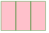
1、垂直等高,水平均分,按比例划分
.parent{display: -webkit-box; display: -webkit-flex; display: flex;}
.child{-webkit-box-flex: 1; -webkit-flex: 1; flex: 1;}
完整代码
<!DOCTYPE html>
<html lang="en">
<head>
    <meta charset="UTF-8">
    <meta name="viewport" content="width=device-width, initial-scale=1.0">
    <meta http-equiv="X-UA-Compatible" content="ie=edge">
    <title>Document</title>
    <style>
        .parent{
        display: flex;
        height:100px;
        width:150px;
        background-color:pink;}
        .child{
        flex: 1;
        border:1px solid green;
        }
    </style>
    <div class="parent">
      <div class="child"></div>
      <div class="child"></div>
      <div class="child"></div>
    </div>
</body>
</html>
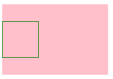
2、水平居中
.parent{display: -webkit-box; display: -webkit-flex; display: flex; -webkit-box-pack: center; -webkit-justify-content: center; justify-content: center;}
完整demo:
<style>
    .parent{display: -webkit-box; display: -webkit-flex; display: flex; -webkit-box-pack: center;
    -webkit-justify-content: center; justify-content: center;
    height:100px;
    width:150px;
    background-color:pink;}
    .child{
    width:50px;
    height:50px;
    border:1px solid green;
    }
</style>
<div class="parent">
  <div class="child"></div>
</div>
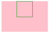
3、垂直居中
.parent{display: -webkit-box; display: -webkit-flex; display: flex; -webkit-box-align: center; -webkit-align-items: center; align-items: center;}
完整demo
<style>
    .parent{display: -webkit-box; display: -webkit-flex; display: flex; -webkit-box-align: center;
    -webkit-align-items: center; align-items: center;
    height:100px;
    width:150px;
    background-color:pink;}
    .child{
    width:50px;
    height:50px;
    border:1px solid green;
    }
</style>
</head>
<body>
<div class="parent">
  <div class="child"></div>
</div>
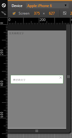
4、移动端弹窗
现在移动端很多弹窗组件使用flexbox来实现,直接嵌套div.overlay>div.pop。
<style>
    .overlay{
    /*flex style*/
    display:-webkit-box;
    -webkit-box-orient:horizontal;
    -webkit-box-pack:center;
    -webkit-box-align:center;

    display:-moz-box;
    -moz-box-orient:horizontal;
    -moz-box-pack:center;
    -moz-box-align:center;

    display:-o-box;
    -o-box-orient:horizontal;
    -o-box-pack:center;
    -o-box-align:center;

    display:-ms-box;
    -ms-box-orient:horizontal;
    -ms-box-pack:center;
    -ms-box-align:center;

    display:box;
    box-orient:horizontal;
    box-pack:center;
    box-align:center;

    display: -webkit-flex;
    -webkit-align-items: center;
    -webkit-justify-content: center;

    display: flex;
    align-items: center;
    justify-content: center;
    /*other style*/
    width:100%;
    max-width:750px;
    height:100%;
    position:fixed;
    top:0;
    left:0;
    background:rgba(0,0,0,0.5);
    }
    .popup{
    width:90%;
    max-width:650px;
    border:1px solid green;
    padding:20px 4% 4% 4%;
    box-sizing:border-box;
    height:auto;
    background:#fff;
    border-radius:4px;
    position:relative;
    }
    .popup-close{
    width:15px;
    height:14px;
    background:url(image/close.png) no-repeat;
    background-size:100% 100%;
    position:absolute;
    top:8px;
    right:8px;
    }
</style>
主页面的文字
<div class="overlay">
  <div class="popup">
  <a href="javascript:;" class="popup-close"></a>
  弹层的文字
  </div>
</div>
五、兼容性
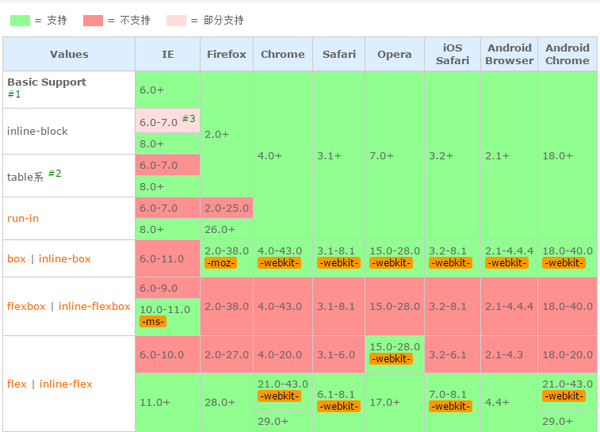
PC端:
- 无前缀:Chrome 29+, Firefox 28+, IE 11+, Opera 17+
- 需要前缀:Chrome 21+, Safari 6.1+, Opera 15+需要前缀
-webkit-
提示:旧版本的Firefox(22-27)支持除了flex-wrap和flex-flow之外的新语法。Opera (12.1+ - 17+)使用flex可以没有私有前缀,但是中间的15和16版本需要私有前缀。
移动端:
- 无前缀:Android 4.4+, Opera mobile 12.1+, BlackBerry 10+, Chrome for Android 39+, Firefox for Android 33+, IE 11+ mobile
- 需要前缀:iOS 7.1+需要前缀
-webkit-
六、资源链接
本文作者starof,因知识本身在变化,作者也在不断学习成长,文章内容也不定时更新,为避免误导读者,方便追根溯源,请诸位转载注明出处:http://www.cnblogs.com/starof/p/4894140.html有问题欢迎与我讨论,共同进步。
如果觉得本文对您有帮助~可以微信支持一下:


 浙公网安备 33010602011771号