SVG动画
动画原理
SVG动画,就是元素的属性值关于时间的变化。 如下图来说,元素的某个属性值的起始值(from)到结束值(to)在一个时间段(duration)根据时间函数(timing-function)计算出每一帧(frame)的插值(interpolation)作为变换的行为。
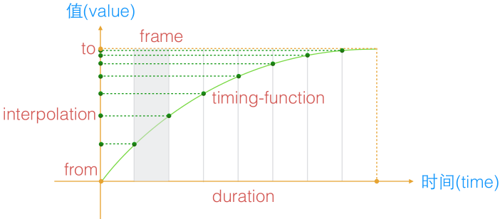
PS:SVG动画是帧动画,在SVG里也就是每秒设置多少个value值。
SVG动画语法
SVG动画是基于SMIL(Synchronized Multimedia Integration Language)语言的,全称是同步多媒体集成语言。
SVG动画使用
SVG元素使用动画有两种方式:
1. 被xlink:href引用
<animate xlink:href="url(#rect1)"></animate>
2. 包含在目标元素里
<rect  x="0"  ...>
     <animate></animate>
</rect>
<animate>标签
该标签用于基本动画。
| 参数 | 描述 |
| attributeName | 要变化属性名称 1.可以是元素直接暴露的属性 2.可以是CSS属性 |
| attributeType | 用来表明attributeName属性值的类型 支持三个固定参数,CSS/XML/auto,默认值auto。 例如:x、 y以及transform就属于XML, opacity就属于CSS。 |
| from | 起始值 起始值与元素的默认值是一样的,该参数可省略。 |
| to | 结束值 |
| by | 相对from的变化值 PS:当有to值时,该值无效。 |
| values | 动画的多个关键值,用分号分隔。 |
| dur | 持续时间 取值:常规时间值 | "indefinite" |
| repeatCount | 动画执行次数 取值:合法数值或者“indefinite” |
| fill | 动画间隙的填充方式 取值:freeze | remove(默认值)。 remove:表示动画结束直接回到开始的地方。 freeze:表示动画结束后保持了动画结束之后的状态。 |
| calcMode | 控制动画的快慢 取值:discrete | linear(默认值) | paced | spline. 中文意思分别是:“离散”|“线性”|“踏步”|“样条”。 另外,该参数要结合keyTimes、keySplines使用,数值的是对应values的, 所以如果没有设置values和keyTime或keySplines,是没有效果的。 |
| begin | 动画开始的时机,取值: time-value | offset-value | syncbase-value | event-value | repeat-value | accessKey-value | media-marker-value | wallclock-sync-value | "indefinite" 1. time-value:动画开始时间,可传多个值,分号分隔。 2. syncbase-value:[元素的id].begin/end +/- 时间值(offset-value) 某个动画效果开始或结束触发此动画的,可加上偏移量。 3. event-value:事件触发 4. repeat-value:指某animation重复多少次开始。 语法为:[元素的id].repeat(整数) +/- 时间值 |
| end | end与begin除了名字和字面含义不一样,其值的种类与表意都是一模一样的。 |
PS:只列出常用参数,其他请查阅参考文献。
例子:
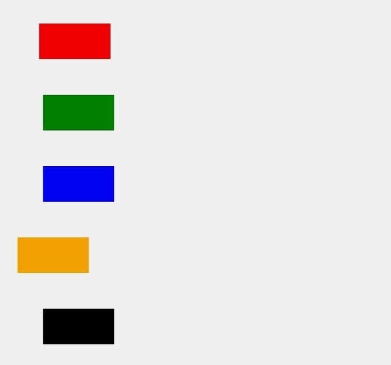
<svg version="1.1" xmlns="http://www.w3.org/2000/svg">
     <rect x="50" y ="50" width="100" height="50" fill="red">
          <animate attributeType="XML"
               attributeName="x"
               from="50"
               to="400"
               dur="5s"
               fill="freeze">
          </animate>
     </rect>
     <rect x="50" y ="150" width="100" height="50" fill="green">
          <animate attributeType="XML"
               attributeName="x"
               from="50"
               by="400"
               dur="5s"
               fill="freeze">
          </animate>
     </rect>
     <rect x="50" y ="250" width="100" height="50" fill="blue">
          <animate attributeType="XML"
               attributeName="x"
               values="50;450;50"
               dur="10s"
               >
          </animate>
     </rect>
     <rect x="50" y ="350" width="100" height="50" fill="orange">
          <animate attributeType="XML"
               attributeName="x"
               dur="10s"
               values="50;450;50"
               calcMode="spline"
               keySplines=".5 0 .5 1; 0 0 1 1"
               fill="freeze"
               >
          </animate>
     </rect>
     <rect x="50" y ="450" width="100" height="50" fill="black">
          <animate attributeType="XML"
               attributeName="x"
               from="50"
               by="400"
               dur="5s"
               calcMode="spline"
               keySplines=".5 0 .5 1; 0 0 1 1"
               fill="freeze"
               >
          </animate>
     </rect>
</svg>
效果:
begin例子:
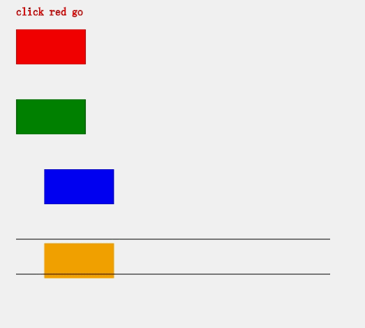
<svg version="1.1" xmlns="http://www.w3.org/2000/svg">
     <text x="50" y="30" id="t" stroke="red">click red go</text>
     <rect x="50" y ="50" width="100" height="50" fill="red">
          <animate attributeType="XML"
               attributeName="x"
               begin="t.click"
               from="50"
               to="400"
               dur="5s"
               fill="freeze">
          </animate>
     </rect>
     <rect x="50" y ="150" width="100" height="50" fill="green">
          <!--表示的是3s之后动画开始,10s时候动画再开始一次
               (如果之前动画没走完,会立即停止从头开始)-->
          <animate attributeType="XML"
               attributeName="x"
               begin="3s;10s"
               from="50"
               to="400"
               dur="5s"
               fill="freeze">
          </animate>
     </rect>
     <rect x="50" y ="250" width="100" height="50" fill="blue">
          <animate id="goleft" attributeType="XML"
               attributeName="x"
               from="50"
               to="400"
               dur="5s"
               fill="freeze"
               >
          </animate>
          <!--注意begin的id是animate的id,不是元素的-->
          <animate attributeType="XML"
               attributeName="y"
               begin="goleft.end"
               to="350"
               dur="2s"
               fill="freeze"
               >
          </animate>
     </rect>
     <rect x="50" y ="350" width="100" height="50" fill="orange">
          <animate id="goleft" attributeType="XML"
               attributeName="x"
               from="50"
               to="400"
               dur="5s"
               fill="freeze"
               >
          </animate>
          <!--注意begin的id是animate的id,不是元素的-->
          <animate attributeType="XML"
               attributeName="y"
               to="400"
               dur="5s"
               fill="freeze"
               >
          </animate>
     </rect>
     <line stroke='black' x1="50" y1="350" x2="500" y2="350"/>
     <line stroke='black' x1="50" y1="400" x2="500" y2="400"//>
</svg>
效果:
注意:
1. 多个animate是可以叠加的。
<animateTransform>标签
该标签用于变换动画,animateTransform也有animate的参数,额外的是type。
| 参数 | 描述 |
| type | 变换的类型,取值:translate、scale、rotate、skewX、skewY |
例子:
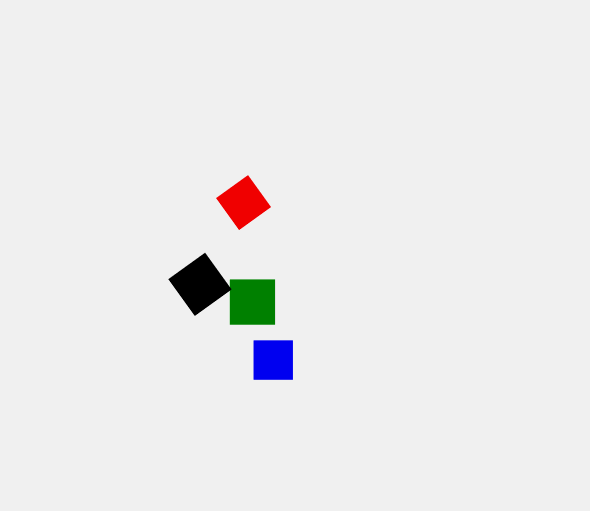
<svg version="1.1" xmlns="http://www.w3.org/2000/svg" viewBox="-200 -200 800 800">
     <rect x="50" y ="50" width="50" height="50" fill="red">
          <animateTransform attributeName="transform"
               attributeType="XML"
               type="rotate"
               from="0 75 75"
               to="360 75 75"
               dur="2"
               repeatCount="indefinite"/>
     </rect>
     <!--x、y都放大了-->
     <rect x="50" y ="150" width="50" height="50" fill="green">
          <animateTransform attributeName="transform"
               attributeType="XML"
               type="scale"
               from="1"
               to="2"
               dur="2"
               fill="freeze"/>
     </rect>
     <rect x="50" y ="250" width="50" height="50" fill="blue">
          <animateTransform attributeName="transform"
               attributeType="XML"
               type="translate"
               to="250 0"
               dur="2"
               fill="freeze"/>
     </rect>
     <rect x="50" y ="150" width="50" height="50" fill="black">
          <animateTransform attributeName="transform"
               attributeType="XML"
               type="rotate"
               from="0 75 125"
               to="360 75 125"
               dur="2"
               repeatCount="indefinite" additive="sum"/>
          <animateTransform attributeName="transform"
               attributeType="XML"
               type="scale"
               from="1"
               to="2"
               dur="2"
               fill="freeze" additive="sum"/>
     </rect>
</svg>
效果:
注意:
1. animateTransform也是可以叠加的,不过要加上additive="sum",否则后面的无效了。
<animateMotion>标签
这个标签让元素在路径(Path)上滑动。
例子:
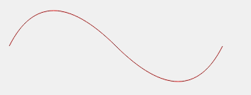
<svg version="1.1" xmlns="http://www.w3.org/2000/svg">
     <path d="M100,400Q150,300 250,400 T400,400" stroke="red" fill="none"/>
     <rect width="20" height="20" fill="red">
          <animateMotion
               path="M100,400Q150,300 250,400 T400,400"
               rotate="auto"
               dur="3s"
               fill="freeze">
          </animateMotion>
     </rect>
</svg>
效果:
注意:
1. 设置rotate="auto",可以让元素根据路径的切线方向做旋转。
脚本动画
SVG的requestAnimationFrame函数可以让我们用js来做动画,浏览器对requestAnimationFrame调用的频率是每秒60次逐帧动画。
例子:
<svg version="1.1" xmlns="http://www.w3.org/2000/svg">
     <rect id="rect" x="50" y="50" width="100" height="100" fill="green" />
</svg>
<script>
    var cur = 0;
    var rect=document.getElementById("rect");
    var frames = window.requestAnimationFrame(doAnim);
    function doAnim(){
        if(cur>=360){
            //取消帧动画
            window.cancelAnimationFrame(frames);
            return;
        }
        cur++;
        rect.setAttribute("transform", "rotate(" + cur + ",100, 100)");
        frames = window.requestAnimationFrame(doAnim);
    }
</script>
PS:效果就是正方形旋转360°后停止。
参考视频
1. SVG课程(慕课网)
参考文献
本文为原创文章,转载请保留原出处,方便溯源,如有错误地方,谢谢指正。

 浙公网安备 33010602011771号