WPF基础到企业应用系列6——布局全接触
2010-08-02 05:21 圣殿骑士 阅读(18815) 评论(93) 收藏 举报 这篇文章主要是对WPF布局系统做一个较简单的介绍,大家都知道:UI是做好一个软件很重要的因素,如果没有一个漂亮的UI,在强大的功能也会显得这个软件很脆弱且没有投资价值。本文以总分总的形式展开介绍:首先对WPF Panel做一个总体认识、然后讲解各Panel基本用法、布局综合应用、自定义布局控件以及最后的总结,希望对大家有所帮助。
一. 摘要
首先很高兴这个系列能得到大家的关注和支持,这段时间一直在研究Windows Azure,所以暂缓了更新,同时也本着想把它写好、宁缺毋滥的精神,在速度上自然也就慢了下来,这篇文章拖拖拉拉也经历了十多天才发布出来(每天写一点),不过请大家放心,这个系列一定会继续写下去。由于自己才疏学浅且是对这些技术的使用总结和心得体会,错误之处在所难免,怀着技术交流的心态,在这里发表出来,所以希望大家能够多多指点,这样在使一部分人受益的同时也能纠正我的错误观点,以便和各位共同提高。
这篇文章主要是对WPF布局系统做一个较简单的介绍,大家都知道:UI是做好一个软件很重要的因素,如果没有一个漂亮的UI,再怎么强大的功能也会显得这个软件很脆弱且没有投资价值。本文以总分总的形式展开介绍:首先对WPF Panel做一个总体认识、然后讲解各Panel基本用法(分别用XAML和C#两种方式实现同一个功能,便于大家学习)、布局综合应用、自定义布局控件以及最后的总结,希望对大家有所帮助。
二. 本文提纲
· 1.摘要
· 2.本文提纲
· 3.总体介绍
· 4.
Canvas· 5.
StackPanel· 6.
WrapPanel· 7.
DockPanel· 8.
Grid· 9.UniformGrid
· 10.ViewBox
· 11.Border
· 12.ScrollViewer
· 13.布局综合应用
· 14.自定义布局控件
· 15.本文总结
· 16.系列进度
· 17.相关代码
三. 总体介绍
WPF的布局控件都在System.Windows.Controls.Panel这个基类下面,使用 Panel 元素在WPF应用程序中放置和排列子对象。它具体包括哪些布局控件以及如何使用这些布局控件(分别用XAML和C#两种方式实现同一个功能)、如何开发自定义的布局控件,也就是本文所要讨论的范畴:

Panel具体继承关系详见下面类图:

如上图,公共属性太多了,就简单介绍几个常见的属性:Margin是元素与其他元素的外边距;Padding是指在本元素内部的元素内容与边缘的距离;前面这两个元素基本和ASP.NE中的Margin和Padding类似,只是定义大小的设置不同而已; FlowDirection属性标示元素的内容显示方向;Panel.ZIndex是相对于显示屏的Z轴坐标,用于调整层叠元素的显示先后;RenderTransform和LayoutTransform用来将缩放和旋转的变换应用到某个元素上。
一个Panel 的呈现是测量和排列Children子元素、然后在屏幕上绘制它们的过程。所以在布局的过程中会经过一系列的计算,那么Children 越多,执行的计算次数就越多。如果不需要较为复杂的 Panel(如 Grid和自定义复杂的Panel),则可以使用构造相对简单的布局(如 Canvas、UniformGrid等),这种布局可带来更好的性能。 如果有可能,我们应尽量避免不必要地调用 UpdateLayout方法。
每当Panel内的子元素改变其位置时,布局系统就可能触发一个新的处理过程。对此,了解哪些事件会调用布局系统就很重要,因为不必要的调用可能导致应用程序性能变差。
换句话说,布局是一个递归系统,实现在屏幕上对元素进行大小调整、定位和绘制,然后进行呈现。具体如下图,要实现控件0的布局,那么先要实现0的子控件01,02...的布局,要实现01的布局,那么得实现01的子控件001,002...的布局,如此循环直到子控件的布局完成后,再完成父控件的布局,最后递归回去直到递归结束,这样整个布局过程就完成了.

布局系统为 Children 集合的每个成员完成两个处理过程:测量处理过程(Measure)和排列处理过程(Arrange)。每个子 Panel 均提供自己的 MeasureOverride 和 ArrangeOverride 方法,以实现自己特定的布局行为。
四. Canvas
Canvas比较简单,只是一个存储元素的容器,它不会自动调整内部元素的排列及大小。不指定元素位置,元素将默认显示在画布的左上方。Canvas的主要用途是用来画图。Canvas默认不会自动裁减超过自身范围的内容,即溢出的内容会显示在Canvas外面,这是因为默认 ClipToBounds="False";我们可以通过设置ClipToBounds="True来裁剪多出的内容。

要实现的效果如下图(用XAML和C#实现同一效果):

XAML代码实现:
<Window
    xmlns="http://schemas.microsoft.com/winfx/2006/xaml/presentation"
    xmlns:x="http://schemas.microsoft.com/winfx/2006/xaml"
    x:Class="WPFLayoutDemo.CanvasDEMO"
    x:Name="Window"
    Title="CanvasDEMO"
    WindowStartupLocation="CenterScreen"
    Width="640" Height="480">
        <Canvas Margin="0,0,0,0" Background="White">
            <Rectangle Fill="Red"
                Stroke="Azure"
                Width="209"
                Height="159"
                Canvas.Left="310" Canvas.Top="181"/>
            <Ellipse Fill="Azure"
                Stroke="Green"
                Width="258" Height="97"
                Panel.ZIndex="1"
                Canvas.Left="165" Canvas.Top="145"/>
        </Canvas>
</Window>
C#代码实现:
namespace WPFLayoutDemo
{
    public partial class CanvasDEMOCodeBehind
    {
        public CanvasDEMOCodeBehind()
        {
            this.InitializeComponent();
            Canvas canv = new Canvas();
            //把canv添加为窗体的子控件
              this.Content = canv;
            canv.Margin = new Thickness(0, 0, 0, 0);
            canv.Background = new SolidColorBrush(Colors.White);

            //Rectangle
            Rectangle r = new Rectangle();
            r.Fill = new SolidColorBrush(Colors.Red);
            r.Stroke = new SolidColorBrush(Colors.Red);
            r.Width = 145;
            r.Height = 126;
            r.SetValue(Canvas.LeftProperty, (double)124);
            r.SetValue(Canvas.TopProperty, (double)122);
            canv.Children.Add(r);
            //Ellipse
            Ellipse el = new Ellipse();
            el.Fill = new SolidColorBrush(Colors.Azure);
            el.Stroke = new SolidColorBrush(Colors.Azure);
            el.Width = 121;
            el.Height = 100;
            el.SetValue(Canvas.ZIndexProperty, 1);
            el.SetValue(Canvas.LeftProperty, (double)195);
            el.SetValue(Canvas.TopProperty, (double)191);
            canv.Children.Add(el);
        }
    }
}
五. StackPanel
StackPanel就是将子元素按照堆栈的形式一一排列,通过设置面板的Orientation属性设置了两种排列方式:横排(Horizontal默认的)和竖排(Vertical)。纵向的StackPanel默认每个元素宽度与面板一样宽,反之横向亦然。如果包含的元素超过了面板空间,它只会截断多出的内容。 元素的Margin属性用于使元素之间产生一定得间隔,当元素空间大于其内容的空间时,剩余空间将由HorizontalAlignment和VerticalAlignment属性来决定如何分配。其他属性,大家可以看看如下类图:

要实现的效果如下图(用XAML和C#实现同一效果):

XAML代码实现:
<Window
    xmlns="http://schemas.microsoft.com/winfx/2006/xaml/presentation"
    xmlns:x="http://schemas.microsoft.com/winfx/2006/xaml"
    x:Class="WPFLayoutDemo.StackPanelDEMO"
    x:Name="Window"
    Title="StackPanelDEMO"
    WindowStartupLocation="CenterScreen"
    Width="640" Height="480">
    <StackPanel Margin="0,0,0,0" Background="White" Orientation="Vertical">
        <Button Content="Top of Stack"/>
        <Button Content="Middle of Stack"/>
        <Button Content="Bottom Of Stack"/>
    </StackPanel>
</Window>
C#代码实现:
namespace WPFLayoutDemo
{
    public partial class StackPanelDEMOCodeBehind
    {
        public StackPanelDEMOCodeBehind()
        {
            this.InitializeComponent();
            StackPanel sp = new StackPanel();
            //把sp添加为窗体的子控件
            this.Content = sp;
            sp.Margin = new Thickness(0, 0, 0, 0);
            sp.Background = new SolidColorBrush(Colors.White);
            sp.Orientation = Orientation.Vertical;
            //Button1
            Button b1 = new Button();
            b1.Content = "Top of Stack";
            sp.Children.Add(b1);

            //Button2
            Button b2 = new Button();
            b2.Content = "Middle of Stack";
            sp.Children.Add(b2);

            //Button3
            Button b3 = new Button();
            b3.Content = "Bottom of Stack";
            sp.Children.Add(b3);
        }
    }
}
六. WrapPanel
WrapPanel是一个非常简单的面板,从左至右按顺序位置定位子元素,如果排满断开至下一行。后续排序按照从上至下或从右至左的顺序进行。WrapPanel面板也提供了 Orientation属性设置排列方式,这跟上面的StackPanel基本相似。不同的是WrapPanel会根据内容自动换行。

要实现的效果如下图(用XAML和C#实现同一效果):

XAML代码实现:
<Window
    xmlns="http://schemas.microsoft.com/winfx/2006/xaml/presentation"
    xmlns:x="http://schemas.microsoft.com/winfx/2006/xaml"
    x:Class="WPFLayoutDemo.WrapPanelDEMO"
    x:Name="Window"
    Title="WrapPanelDEMO"
    WindowStartupLocation="CenterScreen"
    Width="640" Height="480">
        <WrapPanel Margin="0,0,0,0" Background="White">
            <Rectangle Margin="10,10,10,10" Fill ="Azure" Width="60" Height="60"/>
            <Rectangle Margin="10,10,10,10" Fill ="Azure" Width="60" Height="60"/>
            <Rectangle Margin="10,10,10,10" Fill ="Azure" Width="60" Height="60"/>
            <Rectangle Margin="10,10,10,10" Fill ="Azure" Width="60" Height="60"/>
            <Rectangle Margin="10,10,10,10" Fill ="Azure" Width="60" Height="60"/>
            <Rectangle Margin="10,10,10,10" Fill ="Azure" Width="60" Height="60"/>
            <Rectangle Margin="10,10,10,10" Fill ="Azure" Width="60" Height="60"/>
            <Rectangle Margin="10,10,10,10" Fill ="Azure" Width="60" Height="60"/>
            <Rectangle Margin="10,10,10,10" Fill ="Azure" Width="60" Height="60"/>
            <Rectangle Margin="10,10,10,10" Fill ="Azure" Width="60" Height="60"/>
            <Rectangle Margin="10,10,10,10" Fill ="Azure" Width="60" Height="60"/>
    </WrapPanel>
</Window>
C#代码实现:
namespace WPFLayoutDemo
{
    public partial class WrapPanelDEMOCodeBehind
    {
        public WrapPanelDEMOCodeBehind()
        {
            this.InitializeComponent();
            WrapPanel wp = new WrapPanel();
            //把wp添加为窗体的子控件
            this.Content = wp;
            wp.Margin = new Thickness(0, 0, 0, 0);
            wp.Background = new SolidColorBrush(Colors.White);
            //遍历增加Rectangles
            Rectangle r;
            for (int i = 0; i <= 10; i++)
            {
                r = new Rectangle();
                r.Fill = new SolidColorBrush(Colors.Azure);
                r.Margin = new Thickness(10, 10, 10, 10);
                r.Width = 60;
                r.Height = 60;
                wp.Children.Add(r);
            }
        }
    }
}
七. DockPanel
DockPanel定义一个区域,在此区域中,您可以使子元素通过描点的形式排列。停靠面板其实就是在WinForm类似于Dock属性的元素。DockPanel会对每个子元素进行排序,并停靠在面板的一侧,多个停靠在同侧的元素则按顺序排序,最后一个元素填充这个Panel(这个需要设置LastChildFill属性为 True)。对于在DockPanel中的元素的停靠属性可以通过Panel.Dock的附加属性来设置.

要实现的效果如下图(用XAML和C#实现同一效果):

XAML代码实现:
<Window
    xmlns="http://schemas.microsoft.com/winfx/2006/xaml/presentation"
    xmlns:x="http://schemas.microsoft.com/winfx/2006/xaml"
    x:Class="WPFLayoutDemo.DockPanelDEMO"
    x:Name="Window"
    Title="DockPanelDEMO"
    WindowStartupLocation="CenterScreen"
    Width="640" Height="480">

    <DockPanel Width="Auto" Height="Auto" LastChildFill="True">
        <Rectangle Fill="Beige" Stroke="BlanchedAlmond" Height="180" DockPanel.Dock="Top"/>
        <Rectangle Fill="Azure" Stroke="Orange"  />
    </DockPanel>
</Window>
C#代码实现:
namespace WPFLayoutDemo
{
    public partial class DockPanelDEMOCodeBehind
    {
        public DockPanelDEMOCodeBehind()
        {
            this.InitializeComponent();

            DockPanel dp = new DockPanel();
            dp.LastChildFill = true;
            dp.Width = Double.NaN;    //这个就相当于在XAML中设置Width="Auto"
            dp.Height = Double.NaN;   //这个就相当于在XAML中设置Height="Auto"
            //把dp添加为窗体的子控件
            this.Content = dp;
            //添加Rectangles
            Rectangle rTop = new Rectangle();
            rTop.Fill = new SolidColorBrush(Colors.BlanchedAlmond);
            rTop.Stroke = new SolidColorBrush(Colors.BlanchedAlmond);
            rTop.Height = 180;
            dp.Children.Add(rTop);
            rTop.SetValue(DockPanel.DockProperty,Dock.Top);
            Rectangle rFill = new Rectangle();
            rFill.Fill = new SolidColorBrush(Colors.Azure);
            rFill.Stroke = new SolidColorBrush(Colors.Azure);
            dp.Children.Add(rFill);
        }
    }
}
八. Grid
Grid和其他各个Panel比较起来,功能最多也最为复杂,它由<Grid.ColumnDefinitions>列元素集和<Grid.RowDefinitions>行元素集合两种元素组成。而放置在Grid面板中的控件元素都必须显示采用附加属性语法定义其放置所在的行和列,否则元素均默认放置在第0行第0列。由于Grid的组成并非简单的添加属性标记来区分行列,这也使得用户在实际应用中可以具体到某一单元格中,所以布局起来就很精细了。
Grid的列宽与行高可采用固定、自动、按比列三种方式定义
<Grid>
    <Grid.RowDefinitions>
        <RowDefinition Height="Auto" />
        <RowDefinition Height="Auto" />
        <RowDefinition Height="*" />
        <RowDefinition Height="40" />
    </Grid.RowDefinitions>
    <Grid.ColumnDefinitions>
        <ColumnDefinition Width="Auto" />
        <ColumnDefinition Width="300" />
    </Grid.ColumnDefinitions>
</Grid>
第一种,固定长度——宽度不够,会裁剪,不好用。单位pixel。
第二种,自动长度——自动匹配列中最长元素的宽度。
第三种,比例长度——*表示占用剩余的全部宽度;两行都是*,将平分剩余宽度;像上面的一个2*,一个*,表示前者2/3宽度。
跨越多行和多列
<Rectangle Fill="Silver" Grid.Column="1" Grid.ColumnSpan="3"/>
使用Grid.ColumnSpan和Grid.RowSpan附加属性可以让相互间隔的行列合并,所以元素也可以跨越多个单元格。
使用GridSplit分割
<GridSplitter Height="6" VerticalAlignment="Stretch" HorizontalAlignment="Stretch"
               Grid.Row="2" Grid.Column="2"></GridSplitter>
使用GridSplit控件结合Grid控件实现类似于WinForm中SplitContainer的功能,这个大家在WinForm当中经常用到,我们也不多做介绍。

要实现的效果如下图(用XAML和C#实现同一效果):

XAML代码实现:
<Window
    xmlns="http://schemas.microsoft.com/winfx/2006/xaml/presentation"
    xmlns:x="http://schemas.microsoft.com/winfx/2006/xaml"
    x:Class="WPFLayoutDemo.GridDEMO"
    x:Name="Window"
    Title="GridDEMO"
    WindowStartupLocation="CenterScreen"
    Width="640" Height="480">
    <Grid Width="Auto" Height="Auto" >
        <Grid.ColumnDefinitions>
            <ColumnDefinition Width="139"/>
            <ColumnDefinition Width="184*"/>
            <ColumnDefinition Width="45*" />
            <ColumnDefinition Width="250*"/>
        </Grid.ColumnDefinitions>

        <Rectangle Fill="Azure" Grid.ColumnSpan="2" Margin="0,0,21,0" />
        <Rectangle Fill="Silver" Grid.Column="1" Grid.ColumnSpan="3"/>

    </Grid>
</Window>
C#代码实现:
namespace WPFLayoutDemo
{
    public partial class GridDEMOCodeBehind
    {
        public GridDEMOCodeBehind()
        {
            this.InitializeComponent();
            Grid grid = new Grid();
            grid.Width = Double.NaN;    //这个就相当于在XAML中设置Width="Auto"
            grid.Height = Double.NaN;   //这个就相当于在XAML中设置Height="Auto"
            //把grid添加为窗体的子控件
            this.Content = grid;

            //列一
            ColumnDefinition cd1 = new ColumnDefinition();
            cd1.Width = new GridLength(139);
            grid.ColumnDefinitions.Add(cd1);
            //列二
            ColumnDefinition cd2 = new ColumnDefinition();
            cd2.Width = new GridLength(1, GridUnitType.Star);
            grid.ColumnDefinitions.Add(cd2);
            //列三
            ColumnDefinition cd3 = new ColumnDefinition();
            cd3.Width = new GridLength(2, GridUnitType.Star);
            grid.ColumnDefinitions.Add(cd3);
            //把单元格添加到grid中
            Rectangle r1c1 = new Rectangle();
            r1c1.Fill = new SolidColorBrush(Colors.Azure);
            r1c1.SetValue(Grid.ColumnProperty, 0);
            r1c1.SetValue(Grid.RowProperty, 0);
            grid.Children.Add(r1c1);

            Rectangle r1c23 = new Rectangle();
            r1c23.Fill = new SolidColorBrush(Colors.Silver);
            r1c23.SetValue(Grid.ColumnProperty, 1);
            r1c23.SetValue(Grid.ColumnSpanProperty, 2);
            grid.Children.Add(r1c23);
        }
    }
}
九 UniformGrid
介绍了前面的Grid,接下来的这个UniformGrid 就太简单了,均布网格的是Grid的简化版本,每个单元格的大小相同,不用在定义行列集合。均布网格每个单元格只能容纳一个元素,将自动按照定义在其内部的元素个数,自动创建行列,并通常保持相同的行列数。

要实现的效果如下图(用XAML和C#实现同一效果):

XAML代码实现:
<Window x:Class="WPFLayoutDemo.UniformGridDEMO"
    xmlns="http://schemas.microsoft.com/winfx/2006/xaml/presentation"
    xmlns:x="http://schemas.microsoft.com/winfx/2006/xaml"
    Title="UniformGridDEMO" Height="300" Width="300">
    <UniformGrid Columns="2" Rows="2" Name="uniformGrid1" >
        <Rectangle Margin="10,10,10,10" Fill ="Gray"/>
        <Rectangle Margin="10,10,10,10" Fill ="Gray" />
        <Rectangle Margin="10,10,10,10" Fill ="Gray" />
        <Rectangle Margin="10,10,10,10" Fill ="Gray" />
    </UniformGrid>
</Window>
C#代码实现:
namespace WPFLayoutDemo
{
    public partial class UniformGridDEMOCodeBehind : Window
    {
        public UniformGridDEMOCodeBehind()
        {
            InitializeComponent();

            UniformGrid wp = new UniformGrid();
            //把wp添加为窗体的子控件
              this.Content = wp;
            wp.Margin = new Thickness(0, 0, 0, 0);
            wp.Background = new SolidColorBrush(Colors.White);
            //遍历增加Rectangles
            Rectangle r;
            for (int i = 0; i <= 10; i++)
            {
                r = new Rectangle();
                r.Fill = new SolidColorBrush(Colors.Gray);
                r.Margin = new Thickness(10, 10, 10, 10);
                wp.Children.Add(r);
            }
        }
    }
}
十. ViewBox
ViewBox这个控件通常和其他控件结合起来使用,是WPF中非常有用的控制。定义一个内容容器,该容器可拉伸和缩放单个子元素以填满可用空间。一个 Viewbox 只能具有一个 Child。如果添加一个附加 Child,会导致一个运行时 ArgumentException错误。我们用得最多的首先是Stretch属性,然后是StrctchDirection属性,关于这两个元素,大家可以运行我们的代码,然后改变设置就可以看到效果。

要实现的效果如下图(用XAML和C#实现同一效果):

XAML代码实现:
<Window x:Class="WPFLayoutDemo.ViewBoxDemo"
    xmlns="http://schemas.microsoft.com/winfx/2006/xaml/presentation"
    xmlns:x="http://schemas.microsoft.com/winfx/2006/xaml"
    Title="ViewBoxDemo" Height="342" Width="535">
    <Viewbox Stretch="Uniform">
        <Button Content="Hello,Knights Warrior" />
    </Viewbox>
</Window>
C#代码实现:
namespace WPFLayoutDemo
{
    public partial class ViewBoxDEMOBehind : Window
    {
        public ViewBoxDEMOBehind()
        {
            this.InitializeComponent();
            Viewbox vb = new Viewbox();
            vb.Stretch = Stretch.Uniform ;
            //把vb添加为窗体的子控件
            this.Content = vb;

            //Button1
            Button b1 = new Button();
            b1.Content = "Hello,Knights Warrior";
            vb.Child=b1;
        }
    }
}
十一. Border
Border 是一个装饰的控件,此控件绘制边框及背景,在 Border 中只能有一个子控件(这个子控件又可以包含多个子控件)。Border 的几个重要属性:Background:用用一个 Brush 对象来绘制背景 ;BorderBrush:用一个Brush 对象来绘制边框 ;BorderThickness:此属性设置 Border 边框的大小;CornerRadius:此属性设置 Border 的每一个角圆的半径;Padding:此r属性设置 Border 里的内容与边框的之间的间隔。
要实现的效果如下图(用XAML和C#实现同一效果):

XAML代码实现:
<Window x:Class="WPFLayoutDemo.BorderDEMO"
    xmlns="http://schemas.microsoft.com/winfx/2006/xaml/presentation"
    xmlns:x="http://schemas.microsoft.com/winfx/2006/xaml"
    Title="BorderDEMO" Height="300" Width="300">
    <Border
    BorderThickness="5"
    BorderBrush="Green"
    CornerRadius="10"
    Background="LightGray"
    HorizontalAlignment="Left"
    VerticalAlignment="Top"
    Width="270"
    Height="250">
        <Canvas Background="LightCyan" >
            <Rectangle
            Canvas.Left="30" Canvas.Top="20"
            Height="200" Width="200"
            Stroke="Black" StrokeThickness="10" Fill="Red" />
        </Canvas>
    </Border>
</Window>
C#代码实现:
namespace WPFLayoutDemo
{
    public partial class BorderDEMOCodeBehind : Window
    {
        public BorderDEMOCodeBehind()
        {
            InitializeComponent();

            Border border = new Border();
            border.Background = new SolidColorBrush(Colors.LightGray);
            border.BorderThickness = new Thickness(5);
            border.BorderBrush = new SolidColorBrush(Colors.Green);
            border.CornerRadius = new CornerRadius(15);
            border.Width = 270;
            border.Height = 250;
            Canvas cnvas = new Canvas();
            Rectangle rect = new Rectangle();
            rect.Width = 200;
            rect.Height = 200;
            rect.Fill = new SolidColorBrush(Colors.Black);
            rect.StrokeThickness = 10d;
            cnvas.Children.Add(rect);
            border.Child = cnvas;
            this.Content = border;
        }
    }
}
十二. ScrollViewer
通常用户界面中的内容比计算机屏幕的显示区域大,大出的部分就会破坏原有的布局。利用 ScrollViewer 控件可以方便地使应用程序中的内容具备滚动功能。这样大出的部分就可以正常显示出来了。常用属性、事件和继承关系见下面类图:

要实现的效果如下图(用XAML和C#实现同一效果):

XAML代码实现:
<Window x:Class="WPFLayoutDemo.ScrollViewerDEMO"
    xmlns="http://schemas.microsoft.com/winfx/2006/xaml/presentation"
    xmlns:x="http://schemas.microsoft.com/winfx/2006/xaml"
    Title="ScrollViewerDEMO" Height="300" Width="300">
    <Grid>
        <ScrollViewer>
            <Rectangle Width="500" Height="500" Fill="Gray"></Rectangle>
        </ScrollViewer>
    </Grid>
</Window>
C#代码实现:
namespace WPFLayoutDemo
{
    public partial class ScrollViewerDEMOCodeBehind : Window
    {
        public ScrollViewerDEMOCodeBehind()
        {
            InitializeComponent();

            ScrollViewer myScrollViewer = new ScrollViewer();
            myScrollViewer.HorizontalScrollBarVisibility = ScrollBarVisibility.Auto;

            Rectangle myRectangle = new Rectangle();
            myRectangle.Fill = Brushes.Gray;
            myRectangle.Width = 500;
            myRectangle.Height = 500;

            myScrollViewer.Content = myRectangle;

            this.Content = myScrollViewer;

        }
    }
}
十三.布局综合应用
前面通过十多个小节讲了一些常用Panel的基本用法,那我们这里就简单做一个综合的小例子,通过这个例子,旨在巩固前面的内容,也可以当做一个举一反三的过程。要实现的效果如下图:

XAML代码实现:
<Window x:Class="WPFLayoutDemo.PuttingItAllTogether"
    xmlns="http://schemas.microsoft.com/winfx/2006/xaml/presentation"
    xmlns:x="http://schemas.microsoft.com/winfx/2006/xaml"
    WindowStartupLocation="CenterScreen"
    Title="布局综合运用" Width="640" Height="480" >

    <DockPanel Width="Auto" Height="Auto" LastChildFill="True">
        <!--Top Menu Area-->
        <Menu Width="Auto" Height="20" Background="LightGray" DockPanel.Dock="Top">
            <!-- File Menu -->
            <MenuItem Header="文件">
                <MenuItem Header="保存"/>
                <Separator/>
                <MenuItem Header="退出"/>
            </MenuItem>
            <!-- About Menu -->
            <MenuItem Header="帮助">
                <MenuItem Header="关于本产品"/>
            </MenuItem>
        </Menu>

        <!--State -->
        <StackPanel Width="Auto" Height="31" Background="LightGray" Orientation="Horizontal" DockPanel.Dock="Bottom">
            <Label Width="155" Height="23" Content="状态栏" FontFamily="Arial" FontSize="10"/>
        </StackPanel>

        <!--Left-->
        <StackPanel Width="136" Height="Auto" Background="Gray">
            <Button Margin="5,5,5,5" Width="Auto" Height="26" Content="导航栏"/>
            <Button Width="126" Height="26" Content="导航栏" Margin="5,5,5,5"/>
            <Button Width="126" Height="26" Content="导航栏" Margin="5,5,5,5"/>
        </StackPanel>


        <!--Right-->
        <Grid Width="Auto" Height="Auto" Background="White">

            <Grid.ColumnDefinitions>
                <ColumnDefinition Width="*"/>
                <ColumnDefinition Width="*"/>
            </Grid.ColumnDefinitions>

            <Grid.RowDefinitions>
                <RowDefinition Height="*"/>
                <RowDefinition Height="*"/>
            </Grid.RowDefinitions>

            <Rectangle Fill="Gray" Margin="10,10,10,10" Grid.Row="0" Grid.Column="0"/>
            <Rectangle Fill="Gray" Margin="10,10,10,10" Grid.Row="0" Grid.Column="1"/>
            <Rectangle Fill="Gray" Margin="10,10,10,10" Grid.Row="1" Grid.Column="0"/>
            <Rectangle Fill="Gray" Margin="10,10,10,10" Grid.Row="1" Grid.Column="1"/>
        </Grid>

    </DockPanel>
</Window>
其实用熟练上面的各个布局控件以后,你会发现布局UI是一件非常容易的事,遇到一个新的UI,你会发现任意一个Panel都可以实现你的需求。当然对于较复杂且对要求很高的UI,我们也会自定义一些Panel,在下面我们就简单介绍一下自定义布局控件。
十四.自定义布局控件
讲到自定义布局控件,我们必须得先谈一下在WPF中自定义控件,在WPF自定义控件你可以选择下图的一些基类作为继承对象,你也可以继承自已有的一些控件,这个就看你的需要了。其实开发WPF自定义控件和开发WinForm、ASP.NET自定义控件基本类似,只是要注意一些特别的地方,比如依赖属性的处理、路由事件、视觉树和逻辑树等等。

于今天只是讲如何开发一个自定义的Panel,所以在清楚了基类的前提下,首先得了解它有哪些属性和事件,这样就可以确定哪些是不需要单独写、哪些是需要override。下图就是Panel和基类FrameworkElement 的类图:

在清楚了上面这张图以后,我们就可以着手开始写了,我们知道布局系统的工作原理是先测量后排列,测量就是确定面板需要多大空间,排列则是定义其面板内子元素的排列规则。自定义面板要继承自Panel类并重写MeasureOverride和rrangeOverride方法即可,如下便是一个简单的自定义Panel:
namespace WPFLayoutDemo
{
    public class PlotPanel : Panel
    {
        public PlotPanel()
            : base()
        {
        }

        //重写默认的Measure方法
        protected override Size MeasureOverride(Size availableSize)
        {
            Size panelDesiredSize = new Size();
            foreach (UIElement child in InternalChildren)
            {
                child.Measure(availableSize);
                panelDesiredSize = child.DesiredSize;
            }

            return panelDesiredSize;
        }

        //重写默认的Arrange方法
        protected override Size ArrangeOverride(Size finalSize)
        {
            foreach (UIElement child in InternalChildren)
            {
                double x = 50;
                double y = 50;

                child.Arrange(new Rect(new Point(x, y), child.DesiredSize));
            }
            return finalSize;
        }
    }
}
控件的最终大小和位置是由该控件和父控件共同完成的,父控件会先给子控件提供可用空间(availableSize),子控件再反馈给父控件一个自己的期望值(DesiredSize),父控件最后根据自己所拥有的空间大小与子控件的期望值分配一定的空间给子控件并返回自己的大小.那么这个过程就是通过MeasureOverride 和ArrangeOverride这两个方法来完成(注意父控件的availableSize是减去Margin、padding等的值)。
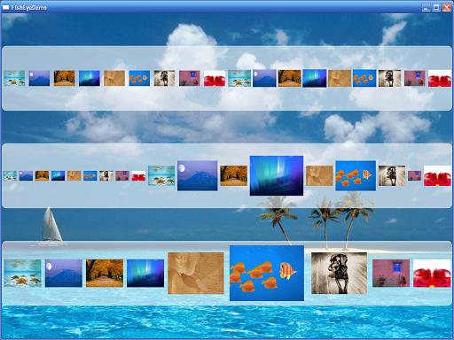
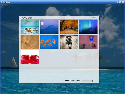
本来想自己开发一个较复杂的Panel控件放上来,但一搜网络,发现已经有很多很好的Panel控件,所以在这里我也不写那么多了,大家可以研究一下这些控件,我也研究了几个,觉得最好理解且最美观的当属“FishEyePanel & FanPanel, Paul Tallett, codeproject ”,大家可以根据链接过去看一下,Paul Tallett讲解得非常的细致。
- TreeMapPanel, Kevin Moore (see bag-o-tricks for code)
- AnimatingTilePanel, Kevin Moore (see bag-o-tricks for code)
- Disposing Virtualizing Stack Panel, Aaron, WiredPrairie.us
- TimeLinePanel, Rob Zelt, robzelt.com (with credit to Robert Ingebretsen and Lauren Lavoie)
- Chart and Lens Panel by John Stewien (code available?)
- DiagonalPanel
- FishEyePanel & FanPanel, Paul Tallett, codeproject
- RadiaPanel & ItemsRadialPanel, Rhett log (Henry Hahn posted a Radial panel in 2005, but I'm not sure if it runs or not?)
- DisclaimerPanel, Chaz
- SpanningStackPanel, Nick Theusen
- PlotPanel, Windows SDK Sample
- CollapsiblePanel, Thomas Lebrun
- CornerStacker, Nick Thuesen
- StickyPanel, Unni, Blend PM
- ItemSkimmingPanel, Pavan Podila
顺便也链接两幅图:
讲到这里,我们也顺便提一下写WPF自定义控件的几个步骤,以后在讲到这一节的时候会详细讲解:
- 首先你得清楚你的自定义控件是干什么用的(能解决什么问题)?公用到什么程度(其他项目也可以用、本项目用、项目当中一个模块用、只有一个地方用)?是继承已有的控件还是从头写?对设计时是否支持?样式和模板的定义等。
- 确定好了上面的步骤后,我们就可以建立项目的结构,类和资源文件等该放在什么位置也就在这一步确定。
- 选择要继承的基类(UIElement、FrameworkElement 、Control 、ContentControl 、HeaderedContentControl 、ItemsControl 、Selector 、RangeBase还是已有的一些控件)。
- 重写默认的样式和新建一些样式并附默认值。
- 由于WPF的属性基本都是依赖属性,所以我们也要新建一些依赖属性。
- 逻辑树和视觉树的一些处理以及事件等。
十五.本文总结
今天我们主要讲了WPF布局系统,对整个布局系统的原理、各个Panel的基本用法(分别用XAML和C#两种方式实现同一个功能,便于大家学习)以及自定义布局控件做了一些介绍,由于内容太多,我只是力所能及的做一些相关的介绍和演示,所以只能给大家提供一个参考,如果大家想了解更多,还需要去看专门的教材,同时有些知识也只是个人的一些见解,所以大家只能将就着看了。写篇文章也是怀着技术交流的心态发布出来,由于是自己对这些技术的使用总结和心得体会,错误之处在所难免,所以希望大家能够多多指点,这样也能纠正我的错误观点,以便和各位共同提高!
最后如果大家感兴趣,可以关注WPF 基础到企业应用系列索引这个系列文章,我也会不定期的逐渐更新,谢谢各位的关注,也欢迎和各位交流讨论。
十六.系列进度
前篇
· 5. WPF 基础到企业应用系列5——WPF千年轮回 续前缘
· 7. WPF 基础到企业应用系列7——深入剖析依赖属性(核心篇)
· 8. WPF 基础到企业应用系列8——依赖属性之“风云再起”
· 9. WPF 基础到企业应用系列9——深入剖析WPF事件机制 (核心篇)
·10. WPF 基础到企业应用系列10——WPF事件机制之“刨根问底”
·11. WPF 基础到企业应用系列11——深入剖析WPF命令机制 (核心篇)
·12. WPF 基础到企业应用系列12——WPF命令之“庖丁解牛”
·13. WPF 基础到企业应用系列13——WPF Binding全接触 (核心篇)
·14. WPF 基础到企业应用系列14——WPF Binding之“面面俱到”
中篇
· 1. 资源、样式、模板
· 2. 尺寸缩放、定位与变换元素
· 3. WPF控件分类介绍与使用技巧
· 4. 用户控件和自定义控件开发
· 5. 多语言、皮肤和主题
· 6. 2D图形
· 7. 3D图形
· 8. 动画(几种动画的应用)
· 9. 音频、视频、语音
· 10. 文档、打印、报表
后篇
· 1. Win32、Windows Form以及ActiveX之间的互用性
· 2. 构建并部署应用程序(ClickOnce部署、微软setup /InstallShield+自动更新组件)
· 3. MVC、MVP、MVVM全解析
· 4. WPF的模式讲解及实例(MVC Demo)
· 5. WPF的模式讲解及实例(MVP Demo)
· 6. WPF的模式讲解及实例(MVVM Demo)
· 7. 性能优化(WPF项目的瓶颈)
· 8.一个完整WPF项目(普通架构版)
· 9. 一个完整WPF项目(MVVM架构版)
· 10. WPF 4.0新功能
十七.相关代码
最后也附上代码结构图和代码下载:

下载链接:WPFLayoutDemo.zip
作者:圣殿骑士
出处:http://www.cnblogs.com/KnightsWarrior/
关于作者:专注于微软平台项目架构、管理和企业解决方案。自认在面向对象, 面向服务以及微服务领域有一定的造诣,熟悉设计模式、TDD、极限编程、领域驱动、架构设计、敏捷开发和项目管理。现主要从事.NET/.NET Core, Go, JavaScript/TypeScript, Azure/AWS等云计算方面的项目开发、架构、管理和企业培训工作。如有问题或建议,请多多赐教!
本文版权归作者和博客园共有,欢迎转载,但未经作者同意必须保留此段声明,且在文章页面明显位置给出原文连接。如有问题,可以邮件:KnightsWarrior(at)msn(dot)com
微博:圣殿骑士微博 联系我,非常感谢。

 浙公网安备 33010602011771号