
CSS梳理
梳理思路
一、CSS基础
1. 盒模型
2. 选择器
二、CSS布局
1. block
2. flex
3. grid
4. BFC、IFC、GFC、RFC、TFC
三、CSS渲染流程以及优化
四、工作中常见的CSS问题解决方案
基础之盒模型
width height、padding、border、margin
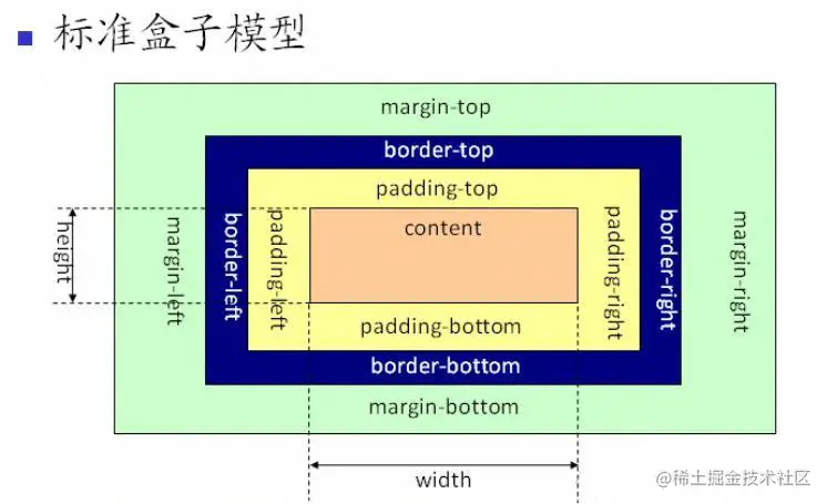
box-sizing: content-box表示标准盒模型(默认值)
box-sizing: border-box表示IE盒模型(怪异盒模型) width height包含border 包含 padding
一般通过border内外 去区分使用padding margin
基础之选择器
| 选择器 | 格式 | 优先级权重 |
|---|---|---|
| id选择器 | #id | 100 |
| 类选择器 | .classname | 10 |
| 属性选择器 | a[ref=“eee”] | 10 |
| 伪类选择器 | li:last-child | 10 |
| 伪元素选择器 | li:after | 1 |
| 标签选择器 | div | 1 |
| 相邻兄弟选择器 | h1+p | 0 |
| 子选择器 | ul>li | 0 |
| 后代选择器 | li a | 0 |
| 通配符选择器 | * | 0 |
ps:选择器用的比较多的
id选择器(优先级最高 权重100 常用于功能比较复杂的组件,考虑唯一标识),
类选择器(优先级10 一般参考css规范 基本都是以类为主),
内联样式(优先级1000,小H5项目改bug专用)

// CSS 预处理器 经常会使用到嵌套的css样式,编译之后的css文件其实是后代选择器


比较容易混淆的是伪类和伪元素用的不多 但是优先级不一样,这里再做一个梳理

伪类 是指定元素的某一个状态 优先级更高,(只能使用单冒号)
伪元素 还是被当作一个元素,例如li:after(单冒号双冒号都可以)
JS 操作选择器相关代码 (考虑样式的维护性,一般都不会频繁使用JS去改变样式)
// JS获取元素
document.getElementById()
document.getElementsByClassName() // 返回node数组

document.querySelector() // #id .classname div
document.querySelectorAll() // 返回node数组

// js操作样式
const element = document.getElementById('myElement');

element.style.color = 'blue'; // 设置文本颜色
element.style.fontSize = '20px'; // 设置字体大小
element.style.backgroundColor = 'lightyellow'; // 设置背景颜色
可继承属性 不改变盒子大小的属性(字体、文本、可见、光标)
CSS布局
display的属性值及其作用
| display的属性值 | 作用 |
|---|---|
| none | |
| block | 块类型。默认宽度为父元素宽度,可设置宽高,换行显示 |
| inline | 行内元素类型。默认宽度为内容宽度,不可设置宽高,同行显示 |
| inline-block | 默认宽度为内容宽度,可以设置宽高,同行显示 |
| list-item | 与block类似 |
| table | 块级表格 |
| inherit | 规定应该从父元素继承display属性的值 |
小结:block 独占一行、inline是行内一部分不设宽高、inline-block是行内一部分设宽高
项目中用的比较多的flex布局、以及热度挺高的Grid布局着重梳理一下
flex布局常用于一行多个元素去进行空间分配
.parnet{
  display: flex;
  // 元素之间的间隔
  justify-content: flex-start; //(默认) 常用于自动堆叠 不定的数据展示
  justify-content: space-between; // 常用于默认占满一整行 已经设计好的数据展示

  // 通用写法  计算属性 算出宽度
  justify-content: space-between;
  flex-wrap: wrap;
  .son{
    flex: 0 1 calc(25% - 10px); // 0 表示不放大。1 表示可以缩小。calc(25% - 10px) 用于确保元素的宽度在容器中适应并留出间隔。
  }
}
.parnet .son{
  // 元素本身占比
  flex: 1; //自适应
}
.parnet .son{
  // 元素本身占比
  width: 200px; //定宽
}
比较火的grid布局
gird 布局用于处理二维布局比较多,像刚刚的例子就比较适合grid
grid同时处理行列布局,flex适用于处理单轴线,平常项目里还需要用子元素的宽度去进行限制
// grid 布局的属性
display: grid; // 将容器设置为 Grid。
grid-template-rows 和 grid-template-columns // 定义行和列的大小。
grid-gap:// 设置行和列之间的间距。
grid-area:// 定义每个项目在网格中的位置。
justify-items 和 align-items:// 控制项目在单元格内的对齐方式。
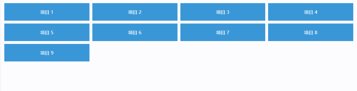
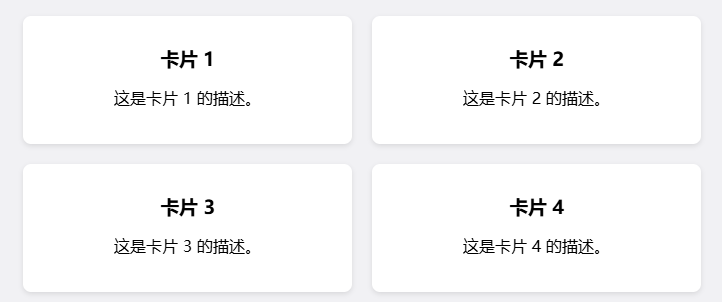
// 案例1
.grid-container {
display: grid;
grid-template-columns: repeat(auto-fill, minmax(250px, 1fr)); /* 自适应列 */
gap: 20px; /* 列与行之间的间距 */
padding: 20px;
}
.card {
background-color: white;
border-radius: 8px;
box-shadow: 0 2px 5px rgba(0, 0, 0, 0.1);
overflow: hidden;
}
grid-template-rows 和 grid-template-column属性 梳理
// 有限列数 例如4列
grid-template-column : repeat(4, 1fr);
// 有定制 一列200px  2个1份 最后一个500px
grid-template-column : 200px repeat(2, 1fr) 500px;

/* 第一列最小 100px,最大 1fr,后两列固定 200px */
grid-template-columns: minmax(100px, 1fr) repeat(2, 200px);

// repeat 相当于一个创建item的函数 把他理解成多个item就好了
// minmax 相当于一个创建item的函数 用于设置item的最小值和最大值 比较复杂的item

// grid-template-rows也一样  用于控制行之间的关系
接下来是grid的究极魔法,grid-area,不用这玩意 你只能画个行列自控的表格
点击查看代码
<!DOCTYPE html>
<html lang="en">
<head>
    <meta charset="UTF-8">
    <meta name="viewport" content="width=device-width, initial-scale=1.0">
    <title>Grid Area 示例</title>
    <style>
        .grid-container {
            display: grid;
            grid-template-areas:
                "header header"
                "sidebar content"
                "footer footer";
            grid-template-columns: 1fr 3fr; /* 第一列 1fr,第二列 3fr */
            grid-template-rows: auto 1fr auto; /* 行高自动,第二行均分剩余空间 */
            gap: 10px; /* 行与列之间的间距 */
            height: 100vh; /* 使容器占满视口高度 */
        }
        .header {
            grid-area: header;
            background-color: #3498db;
            color: white;
            padding: 20px;
            text-align: center;
        }
        .sidebar {
            grid-area: sidebar;
            background-color: #2ecc71;
            color: white;
            padding: 20px;
        }
        .content {
            grid-area: content;
            background-color: #e74c3c;
            color: white;
            padding: 20px;
        }
        .footer {
            grid-area: footer;
            background-color: #f39c12;
            color: white;
            padding: 20px;
            text-align: center;
        }
    </style>
</head>
<body>
    <div class="grid-container">
        <div class="header">头部</div>
        <div class="sidebar">侧边栏</div>
        <div class="content">内容区</div>
        <div class="footer">底部</div>
    </div>
</body>
</html>
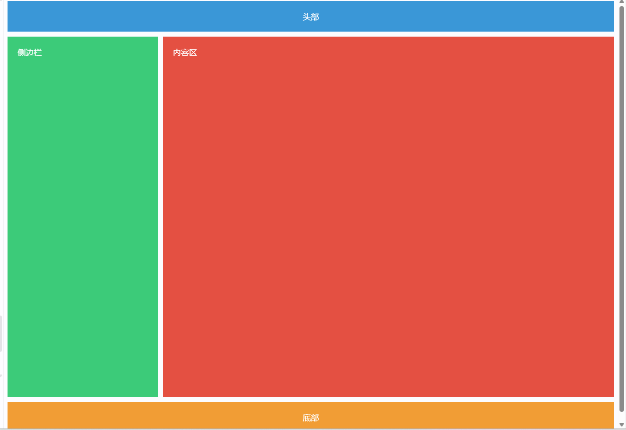
// 核心代码
grid-template-areas:
    "header header"
    "sidebar content"
    "footer footer";
// 这里 两个header不是代表有两个header元素 而是header元素占据两个空间
// 他是从什么元素占据多少空间这个角度来的
// 与之配套使用的 grid-area表明当前元素是什么area
布局梳理完,就是更抽象的底层机制 理解为主
BFC、IFC、GFC、RFC、TFC
Block Formatting Context:块级格式化上下文,影响块级元素的布局。
Inline Formatting Context:行内格式化上下文,处理行内元素的布局,触发关键词 display: inline-block;。
Flex Formatting Context:灵活格式化上下文,使用 Flexbox 进行灵活布局,触发关键词 display:flex;。
Grid Formatting Context:网格格式化上下文,使用 Grid 布局创建复杂布局,触发关键词 display:grid;。
Ruby Formatting Context:处理 Ruby 注释的格式化上下文,触发关键词 注释元素 <ruby>。
Table Formatting Context:表格格式化上下文,用于处理表格元素的布局,触发关键词 表格元素 <table>。
重点理解一下BFC,IFC
BFC触发方式
- 根元素: 标签
- 浮动元素:设置 float 属性(不为 none)
- 绝对定位元素:设置 position 属性为 absolute 或 fixed
- overflow 属性:设置 overflow 属性为 auto、scroll、hidden,而不是 visible
- display 属性:设置 display 为 flow-root、table、inline-block 等
触发了BFC的元素能享受的待遇
- 清除浮动(BFC可以包含浮动子元素的高度,可以使用overflow:hidden来触发BFC从而清除浮动)
- 独立的布局(不影响外部)
- 处理边距重叠(默认两个div边距重叠的时候,取最大的,触发BFC则同时保留)
- 防止元素重叠 (正常流布局)
ps:现在有了flex布局 浮动这一块确实见的比较少了,一般改老代码的时候偷懒用float会见到这个问题
IFC
行内元素:如 <span>、<a>、<img> 等。
块级元素:当它们被设置为 display: inline、display: inline-block 或 display: flex(如果在行内上下文中)时。
- 水平间距:
行内元素的水平边距(如 margin-left 和 margin-right)会影响相邻的行内元素之间的距离。例如,如果一个行内元素有 margin-right,那么这个边距将会在该元素和下一个行内元素之间造成额外的间距。 - 垂直对齐:
行内元素的高度和垂直对齐方式(如 vertical-align)会影响与之同行的其他行内元素的排列。例如,一个行内元素的高度较大时,可能会导致其他行内元素在垂直方向上偏移,影响整体的对齐。 - 文本溢出:
如果一个行内元素(如<span> 或 <img>)的内容超出其容器的宽度,可能会导致文本换行,从而影响其他行内元素的布局。行内元素通常会在一行中排列,如果空间不足,它们可能会被推到下一行。
这个有点难以理解了,行内元素水平间距会叠加,垂直会相互牵连,文本换行会到下一行
CSS加载顺序 渲染流程梳理
- 在
<head>中使用<link>引入外部样式表:
外部 CSS 文件通常通过<link>标签在 HTML 文档的<head>部分引入。浏览器在解析 HTML 时,会遇到<link>标签,然后开始下载 CSS 文件。
这种方式可以确保在 DOM 树构建之前,CSS 样式已被加载,从而避免 FOUC(Flash of Unstyled Content)。 - 在
<head>中使用<style>标签定义内部样式:
如果使用<style>标签定义样式,浏览器会在解析到<style>标签时立即应用样式。由于它位于<head>中,样式会在 DOM 构建之前加载。 - 内联样式:
内联样式使用元素的 style 属性直接定义。浏览器在解析 HTML 时会立即应用这些样式,因此它们的优先级最高。内联样式加载时机是即时的。 - 使用 @import 导入样式:
@import 语句通常放在 CSS 文件的顶部。使用 @import 导入的样式表会在主样式表加载后再加载,因此可能会导致额外的请求和延迟。
由于 @import 语句的加载是顺序的,引用的样式表会在主样式表之后加载,这可能影响页面的渲染时间。
渲染流程补充梳理:重绘repaint与回流reflow 动画优化
repaint开销小、reflow开销大
触发回流的操作
- 添加、删除 DOM 元素:例如,插入或删除一个元素会影响文档的整体布局。
- 修改元素的大小:例如,改变元素的 width、height、padding、margin 等属性。
- 改变元素的位置:例如,改变元素的 position 属性或使用 CSS 的 top、left、right、bottom 属性。
- 改变字体:例如,修改字体大小或字体系列。
- 窗口大小变化:浏览器窗口的大小变化会导致整个页面的重新布局
批量修改dom优化
const fragment = document.createDocumentFragment(); // 创建文档片段
for (let i = 0; i < 100; i++) {
    const newElement = document.createElement('div');
    newElement.textContent = `元素 ${i + 1}`;
    fragment.appendChild(newElement); // 将新元素添加到片段
}

document.body.appendChild(fragment); // 一次性添加到文档中
窗口大小变化 会频繁触发reflow 60hz电脑 则是一秒触发60次reflow,一般使用 requestAnimationFrame优化
也会使用防抖节流优化
还能使用css动画
// requestAnimationFrame优化
let lastTime = 0;

function animate(time) {
    const deltaTime = time - lastTime;
    lastTime = time;

    // 这里可以根据 deltaTime 更新动画状态
    // 例如,每秒更新 60 次
    if (deltaTime >= 16.67) { // 1000ms / 60 ≈ 16.67ms
        // 更新动画状态
    }

    requestAnimationFrame(animate);
}

requestAnimationFrame(animate);

function debounce(func, wait) {
    let timeout;
    return function(...args) {
        clearTimeout(timeout);
        timeout = setTimeout(() => func.apply(this, args), wait);
    };
}

// 使用防抖处理窗口大小变化
window.addEventListener('resize', debounce(() => {
    console.log('防抖处理:窗口大小已改变');
}, 200));

function throttle(func, limit) {
    let lastFunc;
    let lastRan;
    return function(...args) {
        const context = this;
        if (!lastRan) {
            func.apply(context, args);
            lastRan = Date.now();
        } else {
            clearTimeout(lastFunc);
            lastFunc = setTimeout(() => {
                if (Date.now() - lastRan >= limit) {
                    func.apply(context, args);
                    lastRan = Date.now();
                }
            }, limit - (Date.now() - lastRan));
        }
    };
}

// 使用节流处理窗口大小变化
window.addEventListener('resize', throttle(() => {
    console.log('节流处理:窗口大小已改变');
}, 200));
CSS动画、CSS媒体查询(优势在于减少JS代码的复杂度,是否触发reflow 会依据具体的动画、媒体查询的样式来定,从这个角度来说并不算特别优化)
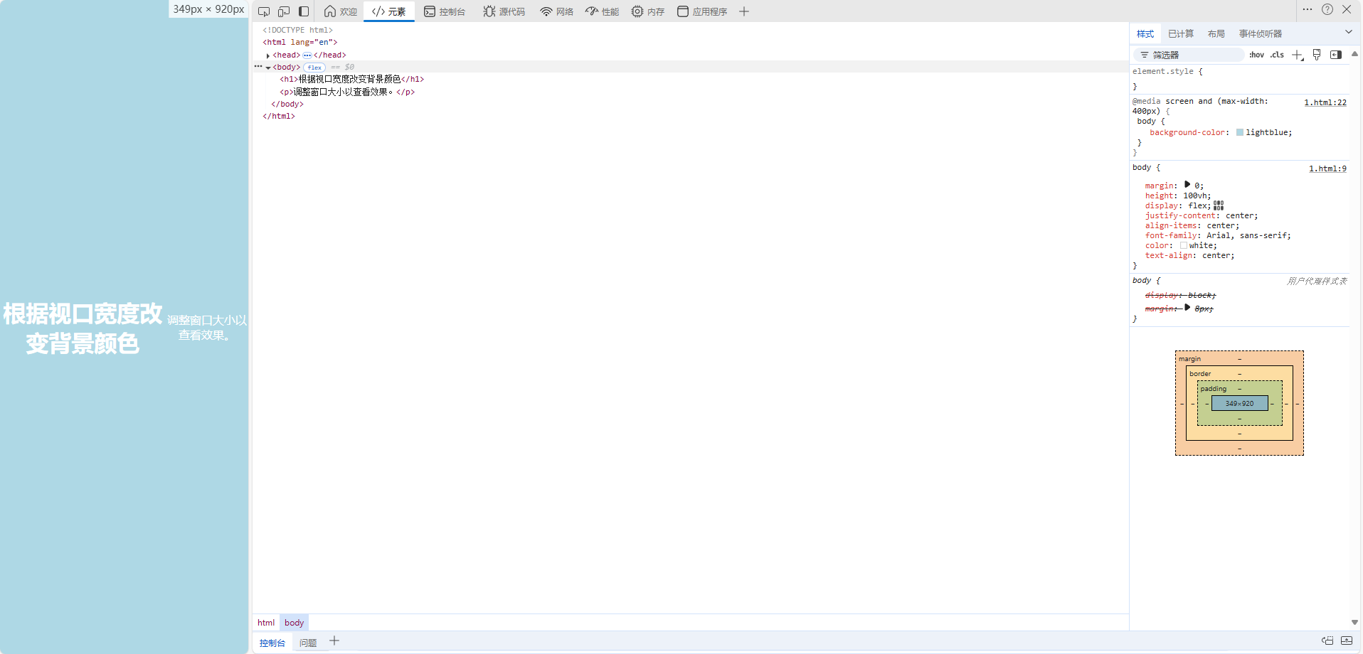
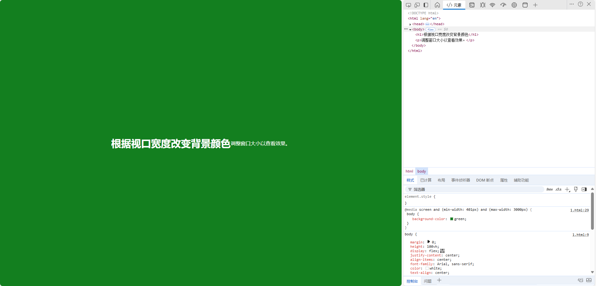
媒体查询案例
点击查看代码
<!DOCTYPE html>
<html lang="en">
<head>
    <meta charset="UTF-8">
    <meta name="viewport" content="width=device-width, initial-scale=1.0">
    <title>媒体查询示例</title>
    <style>
        /* 默认样式 */
        body {
            margin: 0;
            height: 100vh; /* 使页面充满视口高度 */
            display: flex;
            justify-content: center;
            align-items: center;
            font-family: Arial, sans-serif;
            color: white;
            text-align: center;
        }

        /* 视口宽度 0-100px */
        @media screen and (max-width: 400px) {
            body {
                background-color: lightblue; /* 浅蓝色 */
            }
        }

        /* 视口宽度 100px-300px */
        @media screen and (min-width: 401px) and (max-width: 3000px) {
            body {
                background-color: green; /* 绿色 */
            }
        }

        /* 视口宽度 300px 以上 */
        @media screen and (min-width: 3001px) {
            body {
                background-color: yellow; /* 黄色 */
            }
        }
    </style>
</head>
<body>
    <h1>根据视口宽度改变背景颜色</h1>
    <p>调整窗口大小以查看效果。</p>
</body>
</html>
核心代码 通过设置 min-width max-width 去定义区间
/* 视口宽度 0-100px */
@media screen and (max-width: 400px) {
    body {
        background-color: lightblue; /* 浅蓝色 */
    }
}

/* 视口宽度 100px-300px */
@media screen and (min-width: 401px) and (max-width: 3000px) {
    body {
        background-color: green; /* 绿色 */
    }
}

/* 视口宽度 300px 以上 */
@media screen and (min-width: 3001px) {
    body {
        background-color: yellow; /* 黄色 */
    }
}
常用的媒体查询特性
宽度和高度:
min-width:视口的最小宽度。
max-width:视口的最大宽度。
min-height:视口的最小高度。
max-height:视口的最大高度。
设备特性:
orientation:设备的方向(portrait 或 landscape)。
resolution:设备的分辨率(如 dpi 或 dppx)。
其他特性:
hover:指示设备是否可以悬停(如触摸屏)。
pointer:指示输入设备的精确度(如粗略或精确)。

// 书写思路就是 默认样式 媒体描述-媒体样式
CSS动画
点击查看代码
<!DOCTYPE html>
<html lang="en">
<head>
    <meta charset="UTF-8">
    <meta name="viewport" content="width=device-width, initial-scale=1.0">
    <title>CSS 动画示例</title>
    <style>
        body {
            display: flex;
            justify-content: center;
            align-items: center;
            height: 100vh;
            background-color: #f0f0f0; /* 背景颜色 */
        }

        .box {
            width: 100px; /* 方块宽度 */
            height: 100px; /* 方块高度 */
            background-color: blue; /* 方块颜色 */
            animation-name: move; /* 动画名称 */
            animation-duration: 2s; /* 动画持续时间 */
            animation-timing-function: ease-in-out; /* 动画速度曲线 */
            animation-iteration-count: infinite; /* 无限循环 */
        }

        @keyframes move {
            0% {
                transform: translateX(0); /* 初始位置 */
            }
            50% {
                transform: translateX(300px); /* 移动到右侧 300px */
            }
            100% {
                transform: translateX(0); /* 返回初始位置 */
            }
        }
    </style>
</head>
<body>
    <div class="box"></div>
</body>
</html>
关健帧 @keyframe
动画 (名称、持续时间、动画曲线、动画次数)
通过transform描述位置 描述动画曲线 就能够完成动画
推荐使用transform 以及opacity 这两个属性可以利用gpu加速 不会触发reflow
比ppt复杂一点 需要写一些专有名词
关于视口 没有设置视口 浏览器会默认视口宽度980px (反正能用)
这样就可以把视口宽度调整为设备宽度
CSS常见的应用场景及解决方案
响应式设计
px:绝对单位,页面按精确像素展示(精确到像素点的表示方法,过于精确,所以到移动端会有兼容问题,设置800px到移动端375px则会过长)
em:相对单位,基准点为父节点字体的大小,如果自身定义了font-size按自身来计算,整个页面内1em不是一个固定的值()
rem:相对单位,rem 是 CSS3 新增的相对长度单位,是指相对于根元素 html 的 font-size 计算值的大小。
vh、vw:主要用于页面视口大小布局,在页面布局上更加方便简单(前期移动端并不兼容,所以会用一些框架去解决问题)
我用到的是autoprefixer,postcss-pxtorem
import autoprefixer from 'autoprefixer' // 补充css浏览器前缀
import postCssPxToRem from 'postcss-pxtorem' // 将px转化为rem
import 'lib-flexible/flexible'// 引入淘宝rem 确定rem大小
瀑布流
column-count 多栏布局
点击查看代码
<!DOCTYPE html>
<html lang="zh">
<head>
    <meta charset="UTF-8">
    <meta name="viewport" content="width=device-width, initial-scale=1.0">
    <title>瀑布流布局</title>
    <style>
        body {
            font-family: Arial, sans-serif;
            background-color: #f4f4f4;
            margin: 0;
            padding: 20px;
        }

        .masonry {
            column-count: 3; /* 初始列数 */
            column-gap: 10px; /* 列间距 */
            padding: 10px;
        }

        .item {
            /* break-inside: avoid; 防止内容断裂 */
            border: 1px solid #999;
            margin-bottom: 10px;
            background-color: white;
            box-shadow: 0 2px 5px rgba(0, 0, 0, 0.1);
            padding: 10px;
        }

        img {
            width: 100%; /* 图片宽度自适应 */
            vertical-align: middle;
        }

        .title {
            display: block;
            margin-top: 5px;
        }
    </style>
</head>
<body>

    <div class="masonry">
        <div class="item">
            <span class="title">卡片 1卡片 1卡片 1卡片 1卡片 1卡片 1卡片 1卡片 1卡片 1卡片 1卡片 1卡片 1卡片 1卡片 1卡片 1卡片 1卡片 1</span>
        </div>
        <div class="item">
            <span class="title">卡片 2卡片 2卡片 2卡片 2卡片 2卡片 2卡片 2卡片 2卡片 2卡片 2卡片 2卡片 2卡片 2卡片 2卡片 2卡片 2卡片 2卡片 2卡片 2卡片 2卡片 2卡片 2卡片 2卡片 2卡片 2卡片 2卡片 2卡片 2卡片 2卡片 2卡片 2卡片 2卡片 2卡片 2卡片 2卡片 2卡片 2卡片 2卡片 2卡片 2卡片 2卡片 2卡片 2卡片 2卡片 2卡片 2卡片 2卡片 2卡片 2卡片 2卡片 2卡片 2卡片 2</span>
        </div>
        <div class="item">
            <span class="title">卡片 3</span>
        </div>
        <div class="item">
            <span class="title">卡片 4</span>
        </div>
        <div class="item">
            <span class="title">卡片 1卡片 1卡片 1卡片 1卡片 1卡片 1卡片 1卡片 1卡片 1卡片 1卡片 1卡片 1卡片 1卡片 1卡片 1卡片 1卡片 1</span>
        </div>
        <div class="item">
            <span class="title">卡片 2卡片 2卡片 2卡片 2卡片 2卡片 2卡片 2卡片 2卡片 2卡片 2卡片 2卡片 2卡片 2卡片 2卡片 2卡片 2卡片 2卡片 2卡片 2卡片 2卡片 2卡片 2卡片 2卡片 2卡片 2卡片 2卡片 2卡片 2卡片 2卡片 2卡片 2卡片 2卡片 2卡片 2卡片 2卡片 2卡片 2卡片 2卡片 2卡片 2卡片 2卡片 2卡片 2卡片 2卡片 2卡片 2卡片 2卡片 2卡片 2卡片 2卡片 2卡片 2卡片 2</span>
        </div>
        <div class="item">
            <span class="title">卡片 5</span>
        </div>
        <div class="item">
            <span class="title">卡片 1卡片 1卡片 1卡片 1卡片 1卡片 1卡片 1卡片 1卡片 1卡片 1卡片 1卡片 1卡片 1卡片 1卡片 1卡片 1卡片 1</span>
        </div>
        <div class="item">
            <span class="title">卡片 2卡片 2卡片 2卡片 2卡片 2卡片 2卡片 2卡片 2卡片 2卡片 2卡片 2卡片 2卡片 2卡片 2卡片 2卡片 2卡片 2卡片 2卡片 2卡片 2卡片 2卡片 2卡片 2卡片 2卡片 2卡片 2卡片 2卡片 2卡片 2卡片 2卡片 2卡片 2卡片 2卡片 2卡片 2卡片 2卡片 2卡片 2卡片 2卡片 2卡片 2卡片 2卡片 2卡片 2卡片 2卡片 2卡片 2卡片 2卡片 2卡片 2卡片 2卡片 2卡片 2</span>
        </div>
        <div class="item">
            <span class="title">卡片 6</span>
        </div>
        <div class="item">
            <span class="title">卡片 7</span>
        </div>
        <div class="item">
            <span class="title">卡片 8</span>
        </div>
        <div class="item">
            <span class="title">卡片 1卡片 1卡片 1卡片 1卡片 1卡片 1卡片 1卡片 1卡片 1卡片 1卡片 1卡片 1卡片 1卡片 1卡片 1卡片 1卡片 1</span>
        </div>
        <div class="item">
            <span class="title">卡片 2卡片 2卡片 2卡片 2卡片 2卡片 2卡片 2卡片 2卡片 2卡片 2卡片 2卡片 2卡片 2卡片 2卡片 2卡片 2卡片 2卡片 2卡片 2卡片 2卡片 2卡片 2卡片 2卡片 2卡片 2卡片 2卡片 2卡片 2卡片 2卡片 2卡片 2卡片 2卡片 2卡片 2卡片 2卡片 2卡片 2卡片 2卡片 2卡片 2卡片 2卡片 2卡片 2卡片 2卡片 2卡片 2卡片 2卡片 2卡片 2卡片 2卡片 2卡片 2卡片 2</span>
        </div>
        <div class="item">
            <span class="title">卡片 3</span>
        </div>
        <div class="item">
            <span class="title">卡片 4</span>
        </div>
        <div class="item">
            <span class="title">卡片 1卡片 1卡片 1卡片 1卡片 1卡片 1卡片 1卡片 1卡片 1卡片 1卡片 1卡片 1卡片 1卡片 1卡片 1卡片 1卡片 1</span>
        </div>
        <div class="item">
            <span class="title">卡片 2卡片 2卡片 2卡片 2卡片 2卡片 2卡片 2卡片 2卡片 2卡片 2卡片 2卡片 2卡片 2卡片 2卡片 2卡片 2卡片 2卡片 2卡片 2卡片 2卡片 2卡片 2卡片 2卡片 2卡片 2卡片 2卡片 2卡片 2卡片 2卡片 2卡片 2卡片 2卡片 2卡片 2卡片 2卡片 2卡片 2卡片 2卡片 2卡片 2卡片 2卡片 2卡片 2卡片 2卡片 2卡片 2卡片 2卡片 2卡片 2卡片 2卡片 2卡片 2卡片 2</span>
        </div>
        <div class="item">
            <span class="title">卡片 5</span>
        </div>
        <div class="item">
            <span class="title">卡片 6</span>
        </div>
        <div class="item">
            <span class="title">卡片 7</span>
        </div>
        <div class="item">
            <span class="title">卡片 8</span>
        </div>
        <div class="item">
            <span class="title">卡片 1卡片 1卡片 1卡片 1卡片 1卡片 1卡片 1卡片 1卡片 1卡片 1卡片 1卡片 1卡片 1卡片 1卡片 1卡片 1卡片 1</span>
        </div>
        <div class="item">
            <span class="title">卡片 2卡片 2卡片 2卡片 2卡片 2卡片 2卡片 2卡片 2卡片 2卡片 2卡片 2卡片 2卡片 2卡片 2卡片 2卡片 2卡片 2卡片 2卡片 2卡片 2卡片 2卡片 2卡片 2卡片 2卡片 2卡片 2卡片 2卡片 2卡片 2卡片 2卡片 2卡片 2卡片 2卡片 2卡片 2卡片 2卡片 2卡片 2卡片 2卡片 2卡片 2卡片 2卡片 2卡片 2卡片 2卡片 2卡片 2卡片 2卡片 2卡片 2卡片 2卡片 2卡片 2</span>
        </div>
        <div class="item">
            <span class="title">卡片 3</span>
        </div>
        <div class="item">
            <span class="title">卡片 4</span>
        </div>
        <div class="item">
            <span class="title">卡片 5</span>
        </div>
        <div class="item">
            <span class="title">卡片 6</span>
        </div>
        <div class="item">
            <span class="title">卡片 7</span>
        </div>
        <div class="item">
            <span class="title">卡片 8</span>
        </div>
    </div>

</body>
</html>
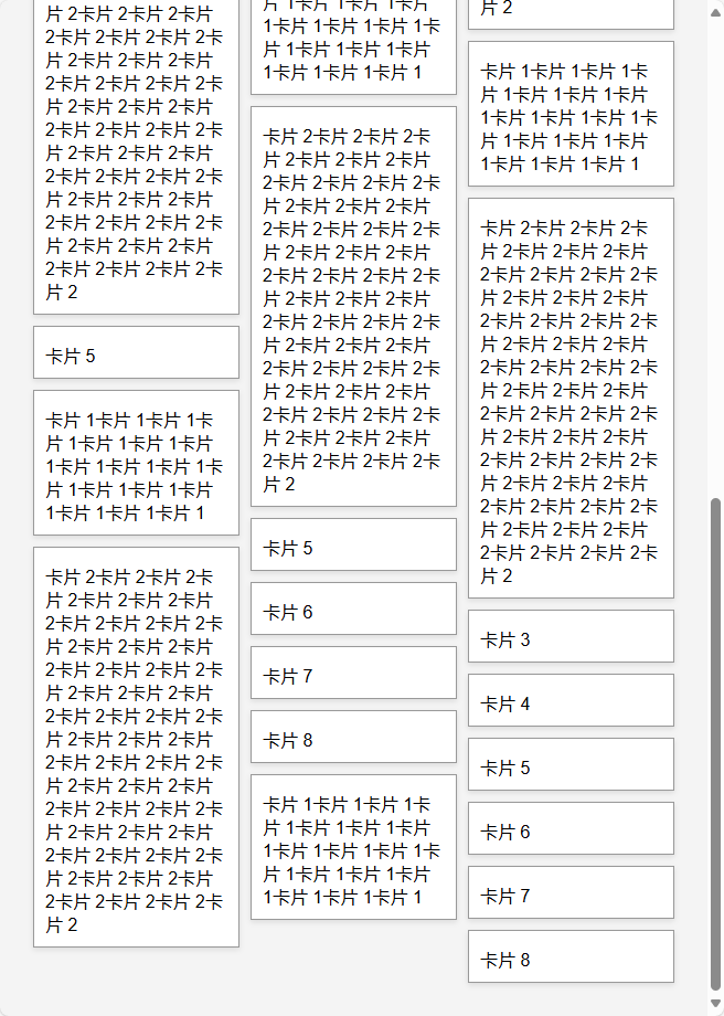
核心代码
.masonry {
    column-count: 3; /* 初始列数 */
    column-gap: 10px; /* 列间距 */
    padding: 10px;
}

 浙公网安备 33010602011771号