09*:Flutter之AppBar、工具栏、导航栏
问题
目录
1:参数详解
预备
Flutter AppBar组件是应用的工具栏,是由多个组件组成。下面详细介绍appBar使用方法、TabBar使用方法、去掉头部的appBar、仿美团发现AppBar(可滚动TabBar)
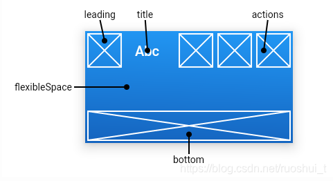
官方常用属性图文简要说明:
正文
1:参数详解
AppBar
| 属性 | 说明 |
| leading |
在标题前面显示的一个控件,在首页通常显示应用的 logo或菜单; 在其他界面通常显示为返回按钮 |
| automaticallyImplyLeading |
默认true leading为null,并且堆栈中存在页面,则自动推导为BackButton。 leading不为null,则此参数无效
为false时不会推导,使中间/标题拉伸 |
| title | 标题,通常显示为当前界面的标题文字,可以放组件 |
| actions | 通常使用 IconButton 来表示,可以放按钮组 |
| flexibleSpace | 可伸展、折叠部件 |
| bottom | 通常放 tabBar,标题下面显示一个 Tab 导航栏 |
| elevation | 阴影高度 |
| shape | 形状 |
| backgroundColor | 导航背景颜色 |
| brightness | 亮度 |
| iconTheme | 图标样式 |
| actionsIconTheme | actions样式 |
| textTheme | 文字样式 |
| primary | 默认true |
| centerTitle | 标题是否居中显示 |
| titleSpacing | 默认NavigationToolbar.kMiddleSpacing |
| toolbarOpacity | 应用工具栏透明度 |
| bottomOpacity | 应用栏底部透明度 |
下表面对bottom做简单介绍
bottom 通常放 tabBar,标题下面显示一个 Tab 导航栏
Scaffold外层为DefaultTabController组件(嵌套),有三个属性length(TabBar个数)、initialIndex(默认显示tabbar下标)、child(子组件)。
注意事项:必须给定length属性、bottom中子组件个数与TabBarView中子组件个数相对应(不明白可以看示例代码)。
| 属性 | 说明 |
| tabs | 子组件集合 |
| controller | tab控制器 |
| isScrollable | 是否可滚动。默认false |
| indicatorColor | 指示器颜色 |
| indicatorWeight | 指示器高度。默认2.0 |
| indicatorPadding | 指示器内边距。默认EdgeInsets.zero |
| indicator | 指示器装饰/样式 |
| indicatorSize | 指示器大小计算方式,TabBarIndicatorSize.label 跟文字等宽,TabBarIndicatorSize.tab 跟每个 tab 等宽 |
| labelColor | 选中label文字颜色 |
| labelStyle | 选中label字样式 |
| labelPadding | label内边距 |
| unselectedLabelColor | 未选中label文字颜色 |
| unselectedLabelStyle | 未选中label字样式 |
| dragStartBehavior | 默认DragStartBehavior.start |
代码示例
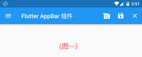
1:appBar的基本用法:
return MaterialApp(
      //去掉debug标签
      debugShowCheckedModeBanner: false,
      home: Scaffold(
        appBar: AppBar(
          title: Text('Flutter AppBar 组件'),
          //标题不居中
          centerTitle: false,
          leading: IconButton(
            icon: Icon(Icons.menu),
            onPressed: () {
              print('我是leading按钮');
            },
          ),
          actions: <Widget>[
            IconButton(
              icon: Icon(Icons.add_a_photo),
              onPressed: () {
                print('我是右3按钮');
              },
            ),
            IconButton(
              icon: Icon(Icons.save),
              onPressed: () {
                print('我是右2按钮');
              },
            ),
            IconButton(
              icon: Icon(Icons.close),
              onPressed: () {
                print('我是右1按钮');
              },
            ),
          ],
        ),
      ),
    );
效果
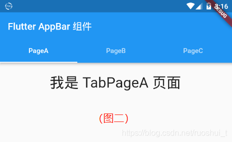
2:appBar中Bottom使用方法:
return MaterialApp(
      home: DefaultTabController(
        //指定tabbar个数
        length: 3,
        initialIndex:0,
        child: Scaffold(
          appBar: AppBar(
            title: Text('Flutter AppBar 组件'),

            bottom: TabBar(
              tabs: <Widget>[
                Tab(text: 'PageA',),
                Tab(text: 'PageB',),
                Tab(text: 'PageC',),
              ],
            ),
          ),

          body: TabBarView(
            children: <Widget>[
              TabPageA(),
              TabPageB(),
              TabPageC(),
            ],
          ),
        ),
      ),
    );
  }
}
效果图
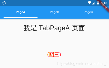
3:去掉头部的appBar :
//去掉头部的appBar(其实就是将TabBar组件放在了title中)
return MaterialApp(
      home: DefaultTabController(
        //指定tabbar个数
        length: 3,
        initialIndex:0,
        child: Scaffold(
          appBar: AppBar(
            title: TabBar(
              tabs: <Widget>[
                Tab(text: 'PageA',),
                Tab(text: 'PageB',),
                Tab(text: 'PageC',),
              ],
            ),
          ),

          body: TabBarView(
            children: <Widget>[
              TabPageA(),
              TabPageB(),
              TabPageC(),
            ],
          ),
        ),
      ),
    );
效果图
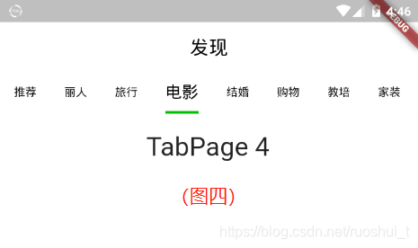
4:仿 美团 发现 AppBar:
  return MaterialApp(
      home: DefaultTabController(
        //指定tabbar个数
        length: 9,
        initialIndex:0,
        child: Scaffold(
          appBar: AppBar(
            title: Text('发现',style: TextStyle(fontSize: 22,color: Color(0xff000000)),),
            centerTitle: true,
            backgroundColor:Color(0xffffffff),
            elevation: 0,
            bottom: TabBar(
              labelColor: Color(0xff000000),
              labelStyle: TextStyle(fontSize: 19),
              unselectedLabelColor: Color(0xff000000),
              unselectedLabelStyle: TextStyle(fontSize: 13),
              isScrollable: true,
              indicatorColor: Color(0xff00BF00),
              indicatorSize:TabBarIndicatorSize.label,
              indicatorWeight:3.0,
              tabs: <Widget>[
                Tab(text: '推荐',),
                Tab(text: '丽人',),
                Tab(text: '旅行',),
                Tab(text: '电影',),
                Tab(text: '结婚',),
                Tab(text: '购物',),
                Tab(text: '教培',),
                Tab(text: '家装',),
                Tab(text: '亲子',),
              ],
            ),
          ),

          body: TabBarView(
            children: <Widget>[

              //  Widgets ......

              ),
            ],
          )
        ),
      ),
    );
注意


 浙公网安备 33010602011771号