Python绘制Excel图表
今天讲解下如何使用Python绘制各种Excel图表,下面我们以绘制饼状图、柱状图、水平图、气泡图、2D面积图、3D面积图为例来说明。
import openpyxl
from openpyxl import Workbook
from openpyxl.chart import (
    Reference,
    Series,
    PieChart,
    BarChart,
    BubbleChart,
    AreaChart,
    AreaChart3D
)
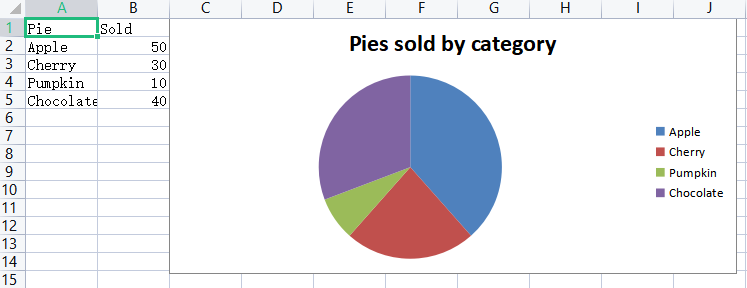
绘制饼图
wb = openpyxl.Workbook()
ws = wb.active
ws.title = 'pieChart'
rows = [
    ['Pie', 'Sold'],
    ['Apple', 50],
    ['Cherry', 30],
    ['Pumpkin', 10],
    ['Chocolate', 40]
]
# for循环写入Excel
for row in rows:
    ws.append(row)

# 创建一个饼图对象
pie = PieChart()
# 定义标签和数据范围
labels = Reference(ws, min_col=1, min_row=2, max_row=5)
data = Reference(ws, min_col=2, min_row=2, max_row=5)

# 添加数据和标签
pie.add_data(data)
pie.set_categories(labels)

# 设置饼图标题
pie.title = 'Pies sold by category'

# 设置饼图的位置
ws.add_chart(pie, 'C1')
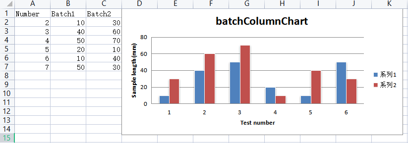
绘制柱形图
ws = wb.create_sheet('columnChart')
rows = [
    ('Number', 'Batch1', 'Batch2'),
    (2, 10, 30),
    (3, 40, 60),
    (4, 50, 70),
    (5, 20, 10),
    (6, 10, 40),
    (7, 50, 30)
]
for row in rows:
    ws.append(row)
# 创建一个柱形图对象
columnChart = BarChart()
columnChart.type = 'col'
columnChart.style = 10  # 这种风格,色彩对比很鲜明
columnChart.title = 'batchColumnChart'

# 定义横纵坐标的标题
columnChart.x_axis.title = 'Test number'
columnChart.y_axis.title = 'Sample length(mm)'

# 定义category和data范围
categories = Reference(ws, min_col=1, min_row=2, max_row=7)
data = Reference(ws, min_col=2, max_col=3, min_row=2, max_row=7)

# 添加category和data
columnChart.set_categories(categories)
columnChart.add_data(data)

# 设置柱形图的位置
ws.add_chart(columnChart, 'D1')
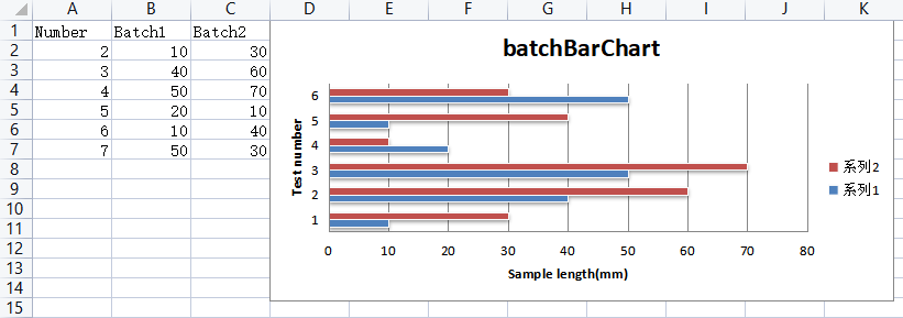
绘制水平图
ws = wb.create_sheet('barChart')
rows = [
    ('Number', 'Batch1', 'Batch2'),
    (2, 10, 30),
    (3, 40, 60),
    (4, 50, 70),
    (5, 20, 10),
    (6, 10, 40),
    (7, 50, 30)
]
for row in rows:
    ws.append(row)
# 创建一个水平图对象
barChart = BarChart()
barChart.type = 'bar'
barChart.style = 10  # 这种风格,色彩对比很鲜明
barChart.title = 'batchBarChart'

# 定义横纵坐标的标题
barChart.y_axis.title = 'Sample length(mm)'
barChart.x_axis.title = 'Test number'
# 注意:对于柱形图变成水平图,x和y轴的标题不用改变。

# 定义category和data范围
categories = Reference(ws, min_col=1, min_row=2, max_row=7)
data = Reference(ws, min_col=2, max_col=3, min_row=2, max_row=7)

# 添加category和data
barChart.set_categories(categories)
barChart.add_data(data)

# 设置水平图的位置
ws.add_chart(barChart, 'D1')
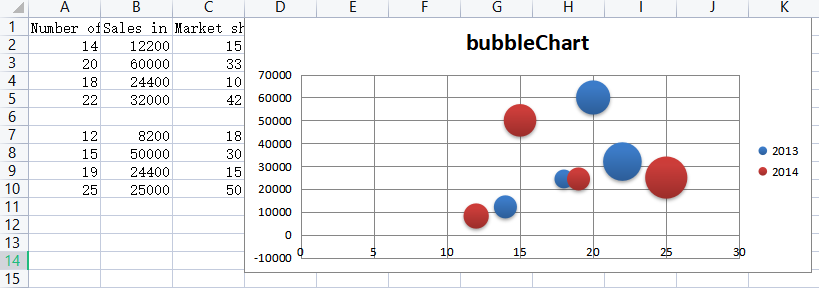
绘制气泡图
ws = wb.create_sheet('bubbleChart')
rows = [
    ('Number of products', 'Sales in USA', 'Market share'),
    (14, 12200, 15),
    (20, 60000, 33),
    (18, 24400, 10),
    (22, 32000, 42),
    (),
    (12, 8200, 18),
    (15, 50000, 30),
    (19, 24400, 15),
    (25, 25000, 50)
]
for row in rows:
    ws.append(row)
# 创建一个气泡图对象
bubbleChart = BubbleChart()
bubbleChart.style = 18  # 这种风格,色彩对比很鲜明
bubbleChart.title = 'bubbleChart'

# 添加第一组数据
xValues = Reference(ws, min_col=1, min_row=2, max_row=5)
yValues = Reference(ws, min_col=2, min_row=2, max_row=5)
size = Reference(ws, min_col=3, min_row=2, max_row=5)
series = Series(values=yValues, xvalues=xValues, zvalues=size, title=2013)
bubbleChart.series.append(series)

# 添加第二组数据
xValues = Reference(ws, min_col=1, min_row=7, max_row=10)
yValues = Reference(ws, min_col=2, min_row=7, max_row=10)
size = Reference(ws, min_col=3, min_row=7, max_row=10)
series = Series(values=yValues, xvalues=xValues, zvalues=size, title=2014)
bubbleChart.series.append(series)

# 设置气泡图的位置
ws.add_chart(bubbleChart, 'D1')
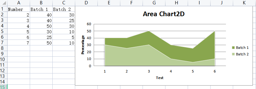
绘制2D面积图
wb = Workbook()
ws = wb.active
ws.title = 'areaChart2D'

rows = [
    ['Number', 'Batch 1', 'Batch 2'],
    [2, 40, 30],
    [3, 40, 25],
    [4, 50, 30],
    [5, 30, 10],
    [6, 25, 5],
    [7, 50, 10],
]

for row in rows:
    ws.append(row)

chart = AreaChart()
chart.title = 'Area Chart2D'
chart.style = 13
chart.x_axis.title = 'Test'
chart.y_axis.title = 'Percentage'
cats = Reference(ws, min_col=1, min_row=1, max_row=7)
data = Reference(ws, min_col=2, max_col=3, min_row=1, max_row=7)
chart.set_categories(cats)
chart.add_data(data, titles_from_data=True)
ws.add_chart(chart, 'D1')
绘制3D面积图
wb = Workbook()
ws = wb.active
ws.title = 'areaChart3D'

rows = [
    ['团队名称', 'Q1', 'Q2', 'Q3'],
    ['精英队', 1200, 1800, 2200],
    ['王者队', 1500, 2000, 2500],
    ['野战队', 1000, 2200, 3000],
    ['虎狼队', 1100, 1650, 2550],
    ['战狼队', 1150, 1700, 2650],
    ['金牌队', 1200, 1950, 3150],
    ['无敌队', 1050, 1700, 2730]
]

for row in rows:
    ws.append(row)

chart = AreaChart3D()
chart.title = '各团队每季度销售业绩3D对比图(单位:万元)'
chart.style = 10
chart.x_axis.title = 'Team name'  # 团队名称
chart.y_axis.title = 'Sales volume'  # 销售业绩
# chart.z_axis.title = 'quarter'  # 季度
# chart.y_axis.scaling.min = 0  # y轴最小值
# chart.y_axis.majorUnit = 500  # 间距
# chart.y_axis.scaling.max = 3500  # y轴最大值
chart.width = 20  # 默认15
chart.height = 13  # 默认7.5
chart.legend = None  # 颜色区域说明

cats = Reference(ws, min_col=1, min_row=1, max_row=8)
data = Reference(ws, min_col=2, max_col=4, min_row=1, max_row=8)
chart.set_categories(cats)
chart.add_data(data, titles_from_data=True)
ws.add_chart(chart, 'F1')

# 保存工作簿
wb.save('charts.xlsx')
运行程序结果如下:
需要注意的一点是:实测使用WPS不支持该方法创建三维面积图!!!
最后,觉得有用的朋友麻烦点赞,推荐一下,更多精彩内容持续更新中!也欢迎大家评论区留言、交流,共同学习进步。

 浙公网安备 33010602011771号