
[Vue]基于AntV组件的变色进度条封装
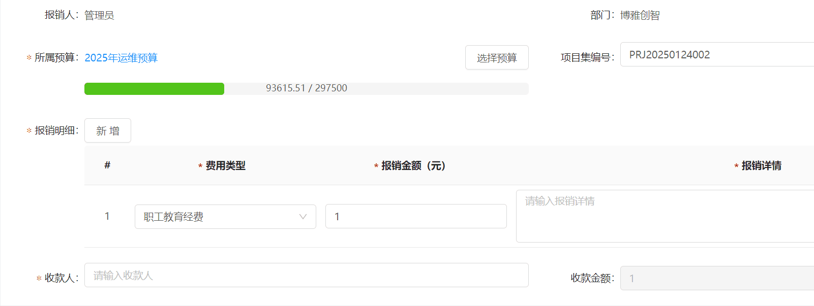
效果
代码
这是vue2版本
<template>
  <div class="progress-container">
    <!-- 进度条 -->
    <a-progress
      :percent="computedPercent"
      :stroke-color="getProgressColor(computedPercent)"
      :show-info="false"
      class="progress-bar"
    />
    <!-- 自定义的文本 -->
    <div
      class="progress-text"
      :style="{ color: getTextColor(computedPercent) }"
    >
      {{ customText || `${computedPercent}%` }}
    </div>
  </div>
</template>

<script>
export default {
  name: "CustomProgress",
  props: {
    maxValue: {
      type: Number,
      required: true,
    },
    currentValue: {
      type: Number,
      required: true,
    },
    customGetProgressColor: {
      type: Function,
      default: null, // 允许外部覆盖默认的颜色逻辑
    },
    customGetProgressTextColor: {
      type: Function,
      default: null, // 允许外部覆盖默认的颜色逻辑
    },
    customText: {
      type: String,
      default: "", // 允许用户传入自定义文本,默认为空字符串
    },
  },
  computed: {
    computedPercent() {
      if (this.maxValue === 0) return 0;
      const percent = (this.currentValue / this.maxValue) * 100;
      return isNaN(percent) ? 0 : parseFloat(percent.toFixed(2));
    },
  },
  methods: {
    getProgressColor(percent) {
      const percentR = percent / 100; // 去掉百分号后的值
      // 如果有自定义的颜色逻辑,则优先使用;否则使用默认逻辑
      if (this.customGetProgressColor) {
        return this.customGetProgressColor(percentR);
      }
      return percentR < 0.5 ? "#52C41A" : percentR < 0.75 ? "#FAAD14" : "#FF4D4F";
    },
    getTextColor(percent) {
      const percentR = percent / 100;
      // 如果有自定义的文字颜色逻辑,则优先使用;否则使用默认逻辑
      if (this.customGetProgressTextColor) {
        return this.customGetProgressTextColor(percentR);
      }
      return percentR > 0.75 ? "#ffffff" : "#000000A6";
    },
  },
};
</script>

<style scoped lang="less">
.progress-container {
  width: 100%;
  position: relative; /* 设置相对定位 */
  /deep/ .ant-progress-inner {
    height: 16px;
    border-radius: 4px;
  }
  /deep/ .ant-progress-bg {
    height: 100% !important;
    border-radius: 4px !important; // 参考 UI组件 按钮的圆角
  }
}

.progress-text {
  position: absolute;
  top: 50%; /* 垂直居中 */
  left: 50%; /* 水平居中 */
  transform: translate(-50%, -50%); /* 调整位置使其完全居中 */
  font-size: 12px; /* 根据需要调整字体大小 */
}
</style>
自定义进度条组件(CustomProgress)使用说明文档
组件简介
CustomProgress 是一个基于 Ant Design Vue 的自定义进度条组件,支持动态计算进度百分比、颜色渐变、文本显示等功能。它允许用户通过传入自定义函数或参数来灵活控制进度条的表现形式。
功能特性
- 动态计算进度:根据传入的最大值和当前值自动计算进度百分比。
- 颜色定制:支持默认颜色逻辑,同时允许用户通过自定义函数覆盖颜色。
- 文本显示:支持自定义文本,或者默认显示进度百分比。
- 文字颜色调整:根据进度百分比自动调整文字颜色,确保可读性。
- 样式优化:内置圆角和居中样式,兼容 Ant Design Vue 的设计规范。
属性说明
| 属性名 | 类型 | 必填 | 默认值 | 说明 |
|---|---|---|---|---|
maxValue |
Number | 是 | - | 进度条的最大值,用于计算进度百分比。 |
currentValue |
Number | 是 | - | 当前值,用于计算进度百分比。 |
customGetProgressColor |
Function | 否 | null |
用户自定义的进度条颜色逻辑函数,优先级高于默认逻辑。 |
customGetProgressTextColor |
Function | 否 | null |
用户自定义的文字颜色逻辑函数,优先级高于默认逻辑。 |
customText |
String | 否 | "" |
自定义显示文本,默认为空字符串,若未设置则显示进度百分比。 |
默认颜色逻辑
- 进度条颜色:
- 百分比 < 50%:绿色 (
#52C41A) - 50% ≤ 百分比 < 75%:黄色 (
#FAAD14) - 百分比 ≥ 75%:红色 (
#FF4D4F)
- 百分比 < 50%:绿色 (
- 文字颜色:
- 百分比 > 75%:白色 (
#ffffff) - 其他情况:深灰色 (
#000000A6)
- 百分比 > 75%:白色 (
事件和方法
方法
-
getProgressColor(percent)
根据进度百分比返回进度条的颜色。如果用户传入了customGetProgressColor函数,则优先调用该函数。 -
getTextColor(percent)
根据进度百分比返回文字的颜色。如果用户传入了customGetProgressTextColor函数,则优先调用该函数。
计算属性
computedPercent
动态计算进度百分比,值范围为[0, 100]。
样式定制
组件内置了一些基础样式,用户可以通过覆盖以下样式类来自定义外观:
| 样式类名 | 描述 |
|---|---|
.progress-container |
包裹进度条和文本的容器,默认宽度为 100%。 |
.progress-bar |
Ant Design 的进度条组件,可通过 /deep/ 修改内部样式。 |
.progress-text |
显示在进度条中心的文本,默认字体大小为 12px。 |
使用示例
基础用法
<template>
  <CustomProgress :maxValue="100" :currentValue="50" />
</template>

<script>
import CustomProgress from "./components/CustomProgress.vue";

export default {
  components: { CustomProgress },
};
</script>
自定义颜色逻辑
<template>
  <CustomProgress
    :maxValue="100"
    :currentValue="80"
    :customGetProgressColor="customProgressColor"
  />
</template>

<script>
import CustomProgress from "./components/CustomProgress.vue";

export default {
  components: { CustomProgress },
  methods: {
    customProgressColor(percent) {
      return percent < 0.6 ? "#1890FF" : "#FF4D4F";
    },
  },
};
</script>
自定义文本
<template>
  <CustomProgress
    :maxValue="100"
    :currentValue="30"
    customText="加载中..."
  />
</template>

<script>
import CustomProgress from "./components/CustomProgress.vue";

export default {
  components: { CustomProgress },
};
</script>
完全自定义颜色和文本
<template>
  <CustomProgress
    :maxValue="100"
    :currentValue="90"
    :customGetProgressColor="customProgressColor"
    :customGetProgressTextColor="customTextColor"
    customText="完成!"
  />
</template>

<script>
import CustomProgress from "./components/CustomProgress.vue";

export default {
  components: { CustomProgress },
  methods: {
    customProgressColor(percent) {
      return percent < 0.8 ? "#52C41A" : "#FF4D4F";
    },
    customTextColor(percent) {
      return percent < 0.8 ? "#000000A6" : "#FFFFFF";
    },
  },
};
</script>
注意事项
-
数值校验:
- 确保
maxValue和currentValue为有效数字,且maxValue不为零。 - 如果
maxValue为零,进度将始终为0%。
- 确保
-
自定义函数:
- 自定义函数的参数为去掉百分号后的值,例如
0.5表示 50%。
- 自定义函数的参数为去掉百分号后的值,例如
-
Ant Design 版本:
- 本组件依赖于 Ant Design Vue,请确保项目中已安装并正确配置 Ant Design Vue。
-
样式冲突:
- 如果项目中存在全局样式冲突,建议使用
scoped或module来隔离样式。
- 如果项目中存在全局样式冲突,建议使用
以上为 CustomProgress 组件的详细使用说明。如有任何问题或建议,请自己思考,不要联系萌狼蓝天
版 权 声 明
作者:萌狼蓝天
QQ:3447902411(仅限技术交流,添加请说明方向)
转载请注明原文链接:https://www.cnblogs.com/zwj/p/18840352/vue-component-bar-antv-0422

 浙公网安备 33010602011771号