
学习了一个月了,决定对博客的内容进行重新排版。之前的太零碎了。确实是每一天都在学习的,还是按照阶段性的总结一篇比较好!
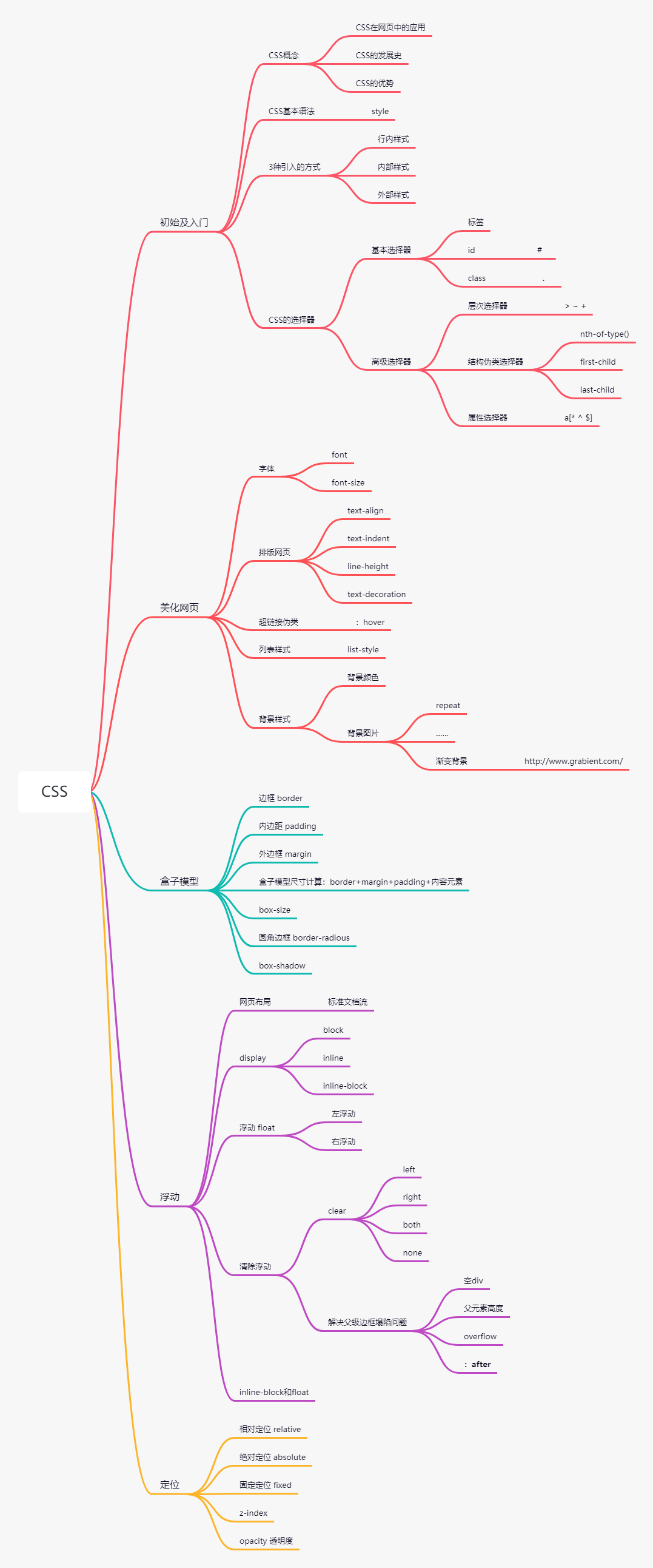
HTML+CSS+JavaScript
主要思路
如何学习
-
CSS是什么
-
CSS怎么用(快速入门)
-
CSS选择器(重点+难点)
-
美化网页(文字、阴影、超链接、列表、渐变……)
-
盒子模型
-
浮动
-
定位
-
网页动画(特效效果)
什么是CSS
Cascading Style Sheet层叠级联样式表
CSS:表现(美化网页)
字体、颜色、边距、高度、宽度、背景图片、网页定位、网页浮动……
发展史
CSS1.0
CSS2.0 DIV(块)+CSS,HTML与CSS结构分离的思想,网页变得简单
CSS2.1 浮动、定位
CSS3.0 圆角、阴影、动画...
快速入门
CSS的优势
-
内容和表现分离
-
网页结构表现统一,可以实现复用
-
样式丰富
-
建议使用独立于html的css文件
-
利用SEO,容易被搜索引擎收录
CSS是一门弱语言,出现问题不会报错,只是无法显示出效果
CSS导入方式
行内样式
<h1 style="color:red">一级标题</h1>
内部样式效果:
<style>
    h1{
        color:red;
    }
</style>
<h1>
    一级标题
</h1>
一级标题
扩展:外部样式两种写法
链接式(外部样式):
<link rel="stylesheet" href="第一个CSS程序/style.css">
导入样式@import url(...css)用的比较少,是CSS2.1特有的
1 <style> 2 @import url(第一个CSS程序/style.css) 3 </style> 4 5 6 <!-- 内部样式--> 7 <style> 8 h1{ 9 color:red; 10 } 11 </style> 12 <h1> 13 一级标题 14 </h1>
选择器
作用:选择页面上的某一个或者某一类元素
基本选择器
-
标签选择器,选择一类标签
-
类选择器class,选择所有class属性一直的标签,可跨标签 .类名{}
-
ID选择器,全局唯一 #id名{}
优先级:id>class>标签
层次选择器
-
后代选择器:在某个元素的后面都变 祖爷爷、爷爷、爸爸、你
/*后代选择器,body后的所有p标签*/
body p{
    background:red;
}
-
子选择器,一代,儿子
/*子选择器,同一代*/
body>p{
    background:#3cbda6;
}
-
相邻兄弟选择器,同辈”+“(i++)
/*相邻兄弟选择器,只有一个相邻(向下)的,相邻的下一个同辈*/
.active + p{
    background:#a13d30;
}
-
通用选择器“~“(范围)
/*通用兄弟选择器,当前选中元素的向下的所有兄弟元素*/
.active~p{
    background:#02ff00;
}
完整代码:
 1 <!DOCTYPE html>
 2 <html lang="en">
 3 <head>
 4     <meta charset="UTF-8">
 5     <title>Title</title>
 6     <style>
 7         p{
 8             color:#02ff00;
 9         }
10         /*后代选择器,body后的所有p标签*/
11         body p{
12             background:red;
13         }
14         /*子选择器,同一代*/
15         body>p{
16             background:#3cbda6;
17         }
18         /*相邻兄弟选择器,只有一个,相邻(向下)*/
19         .active + p{
20             background:#a13d30;
21         }
22         /*通用兄弟选择器,当前选中元素的向下的所有兄弟元素*/
23         .active~p{
24             background:#02ff00;
25         }
26     </style>
27 </head>
28 <body>
29     <p>p0</p>
30     <p class="active">p1</p>
31     <p>p2</p>
32     <p>p3</p>
33     <ul>
34         <li>
35             <p>p4</p>
36         </li>
37         <li>
38             <p>p5</p>
39         </li>
40         <li>
41             <p>p6</p>
42         </li>
43     </ul>
44     <p class="active">p7</p>
45     <p>p8</p>
46 </body>
47 </html>
显示效果: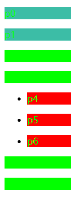
结构伪类选择器
 1 <!DOCTYPE html>
 2 <html lang="en">
 3 <head>
 4     <meta charset="UTF-8">
 5     <title>Title</title>
 6 <!--    避免使用class、id选择器-->
 7     <style>
 8         /*ul的第一个子元素*/
 9         ul li:first-child{
10             background: #56ff36;
11         }
12         /*ul的最后一个子元素*/
13         ul li:last-child{
14             background: #ff3454;
15         }
16         /*选择当前p元素的父级元素,选中父级元素的第一个开始检索,对应第几行并且是当前p元素类型的才生效
17         与顺序、位置有关,直接从第一个父类开始数第几行,到第二个父类之前结束检索*/
18         p:nth-child(4){
19             background: #3fffc1;
20         }
21         /*选中父元素,下边的子类p元素的第2个,与类型有关,直接从第一个同类开始数第几个*/
22         p:nth-of-type(2){
23             background: yellow;
24         }
25         a:hover{
26             background: #191919;
27         }
28     </style>
29 </head>
30 <body>
31 <a href="">123456</a>
32     <h1>h1.1</h1>
33     <h1>h1.2</h1>
34     <p>p1</p>
35     <p>p2</p>
36     <p>p3</p>
37     <ul>
38         <li>li1</li>
39         <li>li2</li>
40         <li>li3</li>
41     </ul>
42     <p class="active">p7</p>
43     <p>p8</p>
44 </body>
45 </html>
展示效果: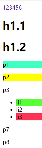
如果作用在同一个区域,按照覆盖的原则,以最后一个修改的为准
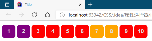
属性选择器(重要,常用)
实现id+class的结合
 1 <!DOCTYPE html>
 2 <html lang="en">
 3 <head>
 4     <meta charset="UTF-8">
 5     <title>Title</title>
 6     <style>
 7         .demo a{    /*通用修改*/
 8             float: left;
 9             display: block;
10             height: 50px;
11             width: 50px;
12             border-radius: 10px;
13             background: #1d28ff;
14             text-align: center;     /*居中*/
15             color: gainsboro;
16             text-decoration: none;      /*下划线*/
17             margin-right: 5px;          /*外边距*/
18             font: bold 20px/50px Arial;     /*font:粗体 字体大小/行高 字体类型*/
19             line-height: 50px;      /*行高*/
20         }
21         /*选用存在id属性的元素   a[]{}*/
22         a[id]{
23             background: yellow;
24         }
25         /*属性名 =属性值(正则)*/
26         /*id=first的元素*/
27         a[id=first]{
28             background: green;
29         }
30         /*class中有links的元素*/
31         /*  = 绝对等于*/
32         /*  *= 包含*/
33         /*  ^= 以这个开头*/
34         /*  $= 以这个结尾*/
35         a[class*="links"]{
36             background: red;
37         }
38         /*选中href中以http开头的元素*/
39         a[href^="http"]{
40             background: purple;
41         }
42         /*选中href中以http结尾的元素*/
43         a[href$="pdf"]{
44             background: orange;
45         }
46     </style>
47 </head>
48 <body>
49 <p class="demo">
50     <a href="http://www.baidu.com" class="links item first" id="first">1</a>
51     <a href="http://www.taobao.com" class="links item active" target="_blank" title="test">2</a>
52     <a href="images/123.html" class="links item">3</a>
53     <a href="images/123.png" class="links item">4</a>
54     <a href="images/123.jpg" class="links item">5</a>
55     <a href="abc" class="links item">6</a>
56     <a href="a.pdf" class="links item">7</a>
57     <a href="abc.pdf" class="links item">8</a>
58     <a href="abc.doc" class="links item">9</a>
59     <a href="abcd.doc" class="links item last">10</a>
60 </p>
61 </body>
62 </html>
显示效果 :
选择器将在CSS、JavaScript、JQuery、Vue中使用
美化网页元素
为什么要美化网页
-
有效地传递页面信息
-
美化网页,页面漂亮,才能吸引用户
-
凸显页面的主体
-
提高用户体验
突出样式
约定span标签:重点要突出的字使用span标签括起来
<!DOCTYPE html>
<html lang="en">
<head>
    <meta charset="UTF-8">
    <title>Title</title>
    <style>
        #title1{        /*使用#锁定id*/
            font-size: 50px;
        }
    </style>
</head>
<body>
欢迎学习
<span id="title1">Java</span>
</body>
</html>
显示效果: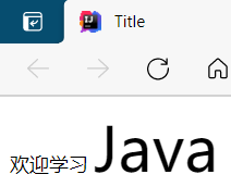
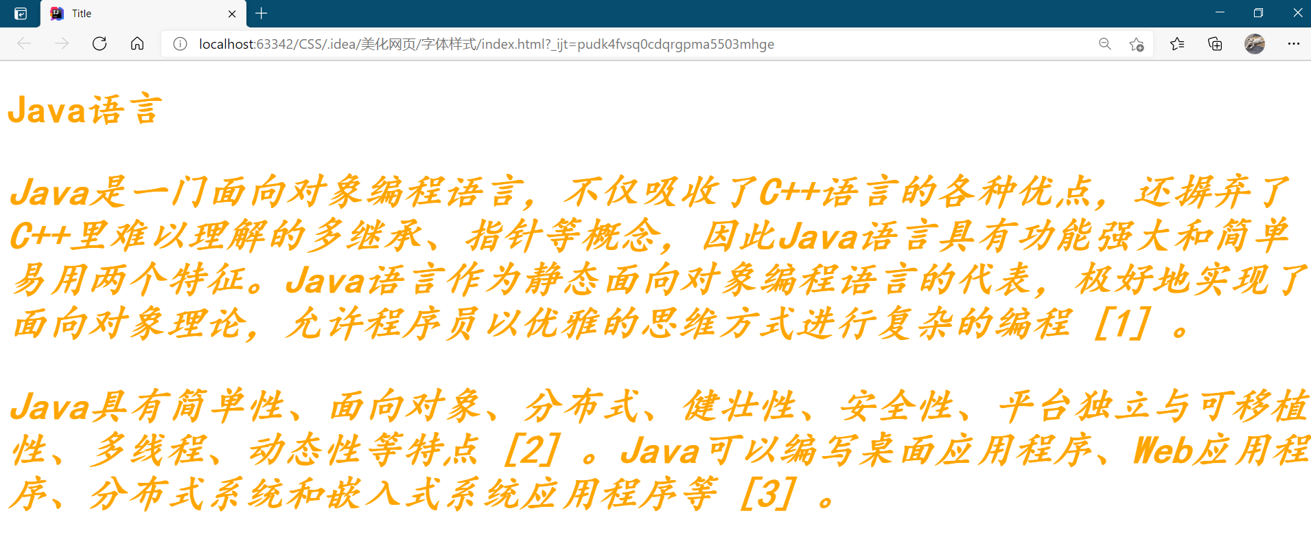
字体样式
 1 <!DOCTYPE html>
 2 <html lang="en">
 3 <head>
 4     <meta charset="UTF-8">
 5     <title>Title</title>
 6 <!--    font-family:字体
 7         font-size:字体大小
 8         font-weight:字体粗细bold加粗
 9         color:颜色-->
10     <style>
11         body{
12             font-family: 楷体, "Times New Roman";/*可以中英文混搭*/
13             color: orange;
14         }
15         h1{
16             font-size: 50px;
17         }
18         p{
19             font: oblique bolder 50px "楷体";/*斜体 加粗 大小 (前边加修饰)字体类型*/
20         }
21         .p1{
22             font-weight: bold;
23         }
24     </style>
25 </head>
26 <body>
27 <h1>Java语言</h1>
28 <p class="p1">
29     Java是一门面向对象编程语言,不仅吸收了C++语言的各种优点,还摒弃了C++里难以理解的多继承、指针等概念,因此Java语言具有功能强大和简单易用两个特征。Java语言作为静态面向对象编程语言的代表,极好地实现了面向对象理论,允许程序员以优雅的思维方式进行复杂的编程 [1]  。
30 </p>
31 <p>
32     Java具有简单性、面向对象、分布式、健壮性、安全性、平台独立与可移植性、多线程、动态性等特点 [2]  。Java可以编写桌面应用程序、Web应用程序、分布式系统和嵌入式系统应用程序等 [3]  。
33 </p>
34 </body>
35 </html>
显示效果:
文本样式
-
颜色 color rgb rgba
-
文本对齐的方式 text-align = center 居中对齐(水平方向)
-
首行缩进 text-indent: 2em
-
行高 line-height 单行文字上下居中需要line-height=height
-
装饰 text-decoration
-
文本,图片vertical-align:middle 居中对齐(垂直方向)
 1 <!DOCTYPE html>
 2 <html lang="en">
 3 <head>
 4     <meta charset="UTF-8">
 5     <title>Title</title>
 6     <!--        水平对齐需要参照物-->
 7     <style>
 8         img,span{
 9             vertical-align: middle;
10         }
11         a{
12             text-decoration: none;  /*超链接去下划线*/
13         }
14     </style>
15 </head>
16 <body>
17 <p>
18     <img src="../../../CSS.assets/Java.jpg" alt="" height="168" width="268"/>
19     <span>JavaJavaJavaJavaJavaJavaJavaJava</span>
20 </p>
21 <p>
22     <a href="">123</a>
23 </p>
24 </body>
25 </html>
显示效果: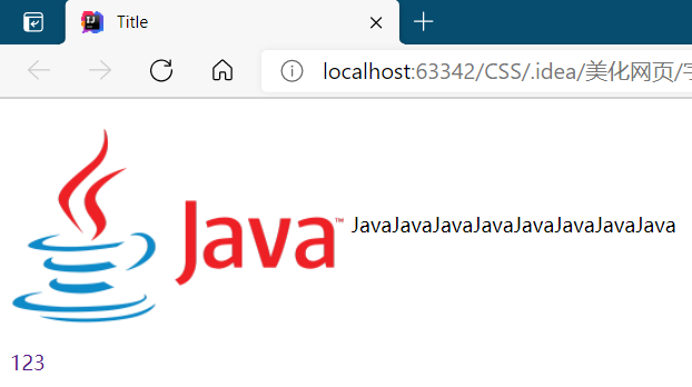
超链接伪类
重点:默认、hover
 1 <!DOCTYPE html>
 2 <html lang="en">
 3 <head>
 4     <meta charset="UTF-8">
 5     <title>Title</title>
 6     <style>
 7         /*默认颜色*/
 8         a{
 9             text-decoration: none;
10             color: black;
11         }
12         /*鼠标悬浮的状态*/
13         a:hover{
14             color: orange;
15             font-size: 50px;
16         }
17         /*鼠标按住未释放的状态*/
18         a:active{
19             color: green;
20         }
21         /*未访问的链接*/
22         a:link{
23             color: grey;
24         }
25         /*已访问的链接,再刷新时仍然保存*/
26         a:visited{
27             color: red;
28         }
29         /*阴影颜色,水平偏移(向右为正),垂直偏移(向下为正),偏移半径*/
30         #CSS{
31             text-shadow: blue 10px 10px 2px;
32         }
33     </style>
34 </head>
35 <body>
36 <a href="">
37     <img src="../../../CSS.assets/Java.jpg" alt="" height="168" width="268"/>
38 </a>
39 <p>
40     <a href="#">Java</a>
41 </p>
42 <p id="CSS">
43     CSS
44 </p>
45 </body>
46 </html>
阴影效果示例:
后续显示效果比较简单的就不再用代码展示。
列表样式
div标签 边框 属性:width、height、border、background-image(默认平铺背景图,需要url)
ul li 清单
list-style:none无 circle空心圆 decimal 数字 square正方形
背景
背景颜色background-color:red
背景图片background-image:url
合成写法background:颜色 图片 图片位置(x轴 y轴) 平铺方式
分开写法:
background-image:url
background-repeat:repeat-x(只水平(y为垂直)平铺)、no repeat不平铺,就一张
background-position:x轴、y轴
渐变效果:
径向渐变、圆形渐变……
linear-gradient(deg度数,A颜色 ?%,B颜色 ?%占比)
radial-gradient
盒子模型及边框使用

margin:外边距
padding:内边距
border:边框
盒子的计算公式:元素的大小:总长度:margin+border+padding+内容宽度
 1 <!DOCTYPE html>
 2 <html lang="en">
 3 <head>
 4     <meta charset="UTF-8">
 5     <title>Login</title>
 6     <style>
 7         /*body总有一个默认的外、内边距,不需要的时候需要置零*/
 8         h1,ul,li,a,body{
 9             margin: 0;
10             padding: 0;
11             text-decoration: none;
12         }
13         /*border:粗细、样式、颜色*/
14         #box{
15             width: 300px;
16             border: 1px solid red;
17             padding: 0 0 0 0/*顺序为上右下左*/
18             margin: 0 auto;/*上下为0,左右自动调整,主要作用是居中,要求:块元素,有固定的宽度*/
19         }
20         form{
21             background: #37ffa1;
22         }
23         input{
24             border: 1px solid black;
25         }
26         h2{
27             font-size: 16px;
28             background: #6a5f11;
29             line-height: 30px;
30             color: white;
31         }
32         div:nth-of-type(1) input{
33             border: 3px solid black;
34             padding: 10px,5px;/*上下 左右*/
35         }
36         div:nth-of-type(2) input{
37             border: 3px dashed #216a32;/*solid实线 dashed虚线*/
38         }
39         div:nth-of-type(3) input{
40             border: 2px dashed #272e6a;
41         }
42     </style>
43 </head>
44 <body>
45 <div id="box">
46     <h2>会员登录</h2>
47     <form action="#">
48         <div>
49             <span>用户名:</span>
50             <input type="text">
51         </div>
52         <div>
53             <span>密码:</span>
54             <input type="password">
55         </div>
56         <div>
57             <span>邮箱:</span>
58             <input type="email">
59         </div>
60     </form>
61 </div>
62 </body>
63 </html>
显示效果: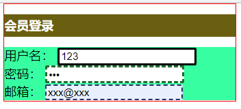
圆角边框
border-radius:左上 右上 右上 左下
盒子阴影
box-shadow:x轴偏移、y轴偏移、模糊半径、颜色
可用模板:element-ui、vue-admin-element、飞冰ice.work、模版之家
可以选择模板下载后,对内容进行增删改
浮动
标准文档流
块级元素:独占一行
h1~h6、p、div、列表
行内元素:不独占一行
span、a、img、strong
行内元素可以被包含在块级元素中,反之则不可以
display、float
display:
-
block块元素,有对应的宽度width高度height
-
inline行内元素,内联,与内部文字大小有关
-
inline-block保留块元素的性质,但可以写在一行,可把块元素变为行元素,写在同一行
-
none消失
float:left、right向左向右浮动,保持在窗口范围内
对比:
display方向不可以控制
float浮动起来会脱离标准文档流,解决父级边框塌陷的问题,display不用考虑
 1 <!DOCTYPE html>
 2 <html lang="en">
 3 <head>
 4     <meta charset="UTF-8">
 5     <title>Display</title>
 6     <style>
 7         div{
 8             width: 100px;
 9             height: 100px;
10             border: 1px solid red;
11             display: inline-block;
12             float: right;
13         }
14         span{
15             width: 100px;
16             height: 100px;
17             border: 1px solid red;
18             display: inline-block;
19         }
20     </style>
21 </head>
22 <body>
23 <div>div块元素</div>
24 <span>span行内元素</span>
25 </body>
26 </html>
显示效果: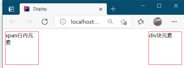
div向右浮动
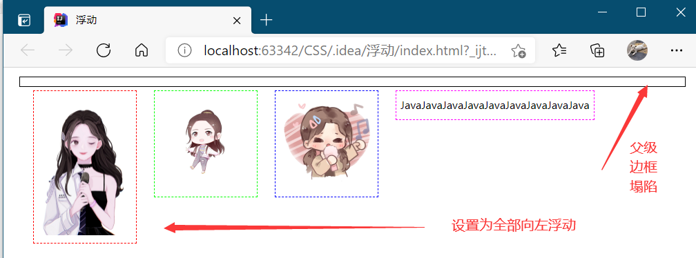
父级边框塌陷问题
 1 <!DOCTYPE html>
 2 <html lang="en">
 3 <head>
 4     <meta charset="UTF-8">
 5     <title>浮动</title>
 6     <link rel="stylesheet" href="style.css" type="text/css">
 7 </head>
 8 <body>
 9 <div id="father">
10     <div class="layer01"><img src="../../CSS.assets/img-6f81ec44f62c481098f5c450c5c20629.jpg" height="162" width="108" alt=""/></div>
11     <div class="layer02"><img src="../../CSS.assets/img-80b5c3ab30254608f8bf4c0916ba4554.jpg" height="108" width="108"/></div>
12     <div class="layer03"><img src="../../CSS.assets/img-e0e0727e0716f8bb84245bae8ea7d391.jpg" height="108" width="108"/></div>
13     <div class="layer04">
14         JavaJavaJavaJavaJavaJavaJavaJavaJava
15     </div>
16 </div>
17 </body>
18 </html>
原有CSS文件:
 1 div{
 2     margin: 10px;
 3     padding: 5px;
 4 }
 5 #father{
 6     border: 1px #000 solid;
 7 }
 8 .layer01{
 9     border: 1px #F00 dashed;
10     display: inline-block;
11     float: left;
12 }
13 .layer02{
14     border: 1px #0F0 dashed;
15     display: inline-block;
16     float: left;
17 }
18 .layer03{
19     border: 1px #00F dashed;
20     display: inline-block;
21     float: left;
22 }
23 .layer04{
24     border: 1px #F0F dashed;
25     font-size: 12px;
26     line-height: 23px;
27     display: inline-block;
28     float: left;
29 }
显示效果:
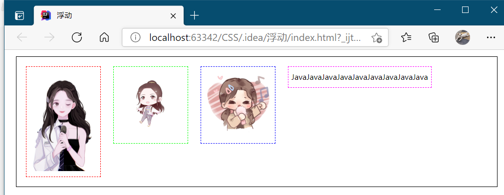
解决方案:
-
增加父级元素的高度(边框将元素全部装下,但元素假设有了固定的高度,就会被设置)
-
增加一个空的div标签,使用clear清除浮动
简单。但代码中尽量避免空div
clear:left 左侧不允许有浮动元素
clear:right 右侧不允许有浮动元素
clear:both 两侧不允许有浮动元素
clear:none
div内增加一个clear标签
<div class="clear"></div>
CSS内增加说明
.clear{
    clear: both;
    margin: 0;
    padding: 0;
}
显示效果:
-
overflow
在父级元素内增加一个overflow:hidden
简单,但下拉的一些场景避免使用
#father{
    border: 1px #000 solid;
    overflow: hidden;/*无高度,高度由layer块内容撑起*/
}
-
父类增加一个伪类after(符合编程的思想,只增加了一个CSS样式,不需要在html内增加内容,无副作用,推荐)
#father.after{
    content: '';/*设置空内容*/
    display: block;/*设置为块元素*/
    clear: both;
}
Overflow
hidden将边框范围以外部分隐藏(类似于裁剪);scroll为提供滚动条
 1 <!DOCTYPE html>
 2 <html lang="en">
 3 <head>
 4     <meta charset="UTF-8">
 5     <title>Overflow</title>
 6     <style>
 7         #content{
 8             width: 200px;
 9             height: 150px;
10             border: 1px solid red;
11             overflow: hidden;/*hidden将边框范围以外部分隐藏;scroll为提供滚动条*/
12         }
13     </style>
14 </head>
15 <body>
16 <div id="content">
17     <img src="../../CSS.assets/img-e0e0727e0716f8bb84245bae8ea7d391.jpg" height="108" width="108"/>
18     <p>
19         JavaJavaJavaJavaJavaJavaJavaJavaJavaJavaJavaJavaJavaJava
20     </p>
21 </div>
22 </body>
23 </html>
显示效果:
hidden: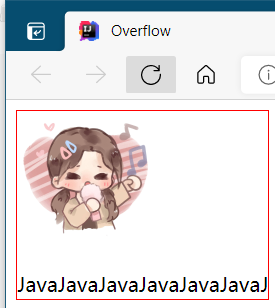
scroll: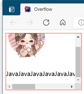
定位 position
偏移时可以移出文档流(div框)范围
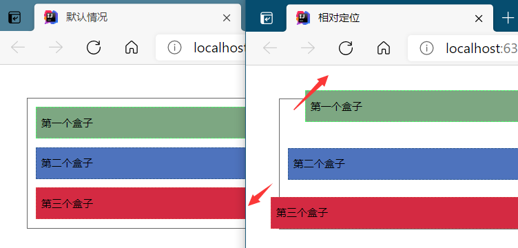
相对定位 relative
相对于自己原来的位置进行指定的偏移,原来的位置仍然保留。
 1 <!DOCTYPE html>
 2 <html lang="en">
 3 <head>
 4     <meta charset="UTF-8">
 5     <title>相对定位</title>
 6     <style>
 7         body{
 8             padding: 20px;
 9         }
10         div{
11             margin: 10px;
12             padding: 5px;
13             font-size: 12px;
14             line-height: 25px;
15         }
16         #father{
17             border: 1px solid #666;
18             padding: 0;
19         }
20         #first{
21             background-color: #7da782;
22             border: 1px dashed #43ff65;
23             position: relative;/*相对定位:上下左右*/
24             top: -20px;/*到顶部的距离减少20个像素点*/
25             left: 20px;/*到左边的距离增加20个像素点*/
26         }
27         #second{
28             background-color: #4e73bd;
29             border: 1px dashed #305a90;
30         }
31         #third{
32             background-color: #d42a42;
33             border: 1px dashed #db4444;
34             position: relative;
35             bottom: -10px;
36             right: 20px;
37         }
38     </style>
39 </head>
40 <body>
41 <div id="father">
42     <div id="first">第一个盒子</div>
43     <div id="second">第二个盒子</div>
44     <div id="third">第三个盒子</div>
45 </div>
46 </body>
47 </html>
显示效果:
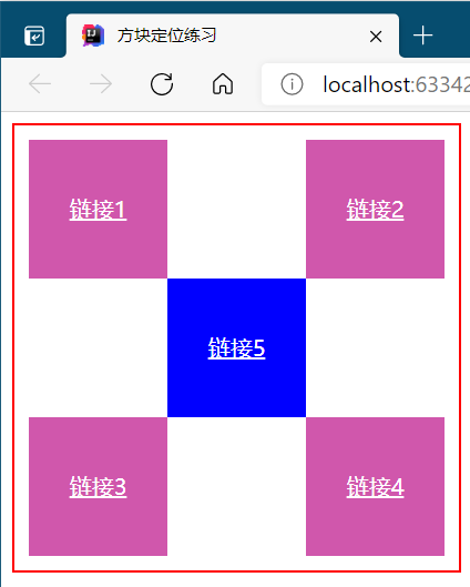
举例:
 1 <!DOCTYPE html>
 2 <html lang="en">
 3 <head>
 4     <meta charset="UTF-8">
 5     <title>方块定位练习</title>
 6     <style>
 7         #box{
 8             width: 300px;
 9             height: 300px;
10             border: 2px solid red;
11             padding: 10px;
12         }
13         a{
14             width: 100px;
15             height: 100px;
16             background-color: #d057ac;
17             line-height: 100px;
18             text-align: center;
19             color: white;
20             display: block;
21         }
22         a:hover{
23             background-color: blue;/*鼠标移动到该部分的变化*/
24         }
25         .a2,.a4{
26             position: relative;
27             left: 200px;
28             top: -100px;
29         }
30         .a5{
31             position: relative;
32             left: 100px;
33             top: -300px;
34         }
35     </style>
36 </head>
37 <body>
38 <div id="box">
39     <a class="a1" href="#">链接1</a>
40     <a class="a2" href="#">链接2</a>
41     <a class="a3" href="#">链接3</a>
42     <a class="a4" href="#">链接4</a>
43     <a class="a5" href="#">链接5</a>
44 </div>
45 </body>
46 </html>
显示效果:
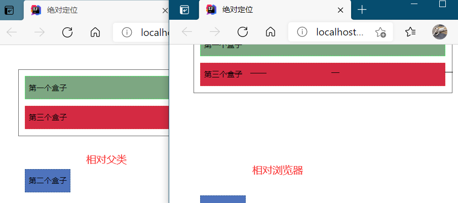
绝对定位 absolute
定位在整个页面上的某个位置,滚动条滚动时仍然会在显示界面上移动
基于xxx定位,分上下左右。原来的位置不被保留。xxx:
-
没有父级元素定位的前提下,相对于浏览器定位,此时若超出范围则产生滚动条
此时父级元素为
#father{
    border: 1px solid #666;
    padding: 0;
}
-
假设父级元素存在定位,通常会相对于父级元素进行偏移
#father{
    border: 1px solid #666;
    padding: 0;
    position: relative;
}
 1 <!DOCTYPE html>
 2 <html lang="en">
 3 <head>
 4     <meta charset="UTF-8">
 5     <title>绝对定位</title>
 6     <style>
 7         body{
 8             padding: 20px;
 9         }
10         div{
11             margin: 10px;
12             padding: 5px;
13             font-size: 12px;
14             line-height: 25px;
15         }
16         #father{
17             border: 1px solid #666;
18             padding: 0;
19             position: relative;/*决定偏移是相对浏览器还是父类*/
20         }
21         #first{
22             background-color: #7da782;
23             border: 1px dashed #43ff65;
24         }
25         #second{
26             background-color: #4e73bd;
27             border: 1px dashed #305a90;
28             position: absolute;
29             bottom: -100px;
30         }
31         #third{
32             background-color: #d42a42;
33             border: 1px dashed #db4444;
34         }
35     </style>
36 </head>
37 <body>
38 <div id="father">
39     <div id="first">第一个盒子</div>
40     <div id="second">第二个盒子</div>
41     <div id="third">第三个盒子</div>
42 </div>
43 </body>
44 </html>
显示效果:
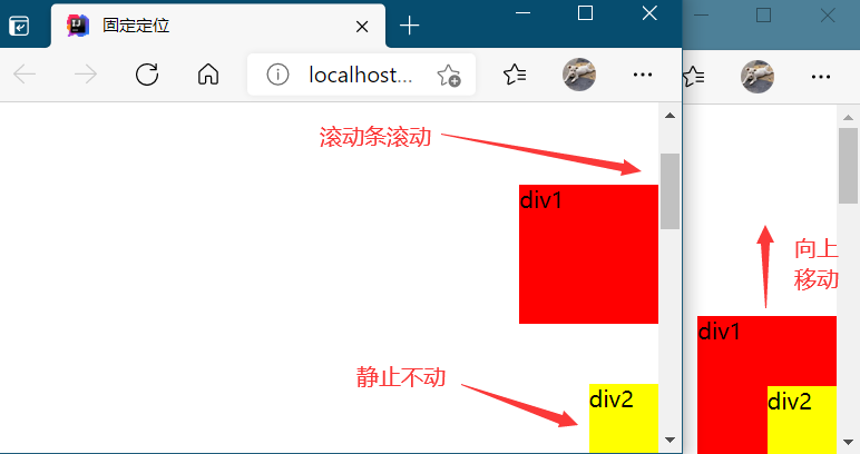
固定定位 fixed
不随滚动条滚动而移动,固定在浏览器界面的一个位置
 1 <!DOCTYPE html>
 2 <html lang="en">
 3 <head>
 4     <meta charset="UTF-8">
 5     <title>固定定位</title>
 6     <style>
 7         body{
 8             height: 1000px;
 9         }
10         div:nth-of-type(1){
11             width: 100px;
12             height: 100px;
13             background-color: red;
14             position: absolute;/*绝对定位,相对于浏览器的初始位置*/
15             right: 0;
16             bottom: 0;
17         }
18         div:nth-of-type(2){/*覆盖顺序:后生成的盖住先生成的*/
19             width: 50px;
20             height: 50px;
21             background-color: yellow;
22             position: fixed;/*固定定位,永久固定*/
23             right: 0;
24             bottom: 0;
25         }
26     </style>
27 </head>
28 <body>
29 <div>div1</div>
30 <div>div2</div>
31 </body>
32 </html>
显示效果:
z-index
层级的概念(图层)z-index:层数,默认是0,最高无限~999
opacity:0~1背景透明度 0.5 =
filter:Alpha(opacity=50);
总结

 浙公网安备 33010602011771号