
HTML+css 小组件
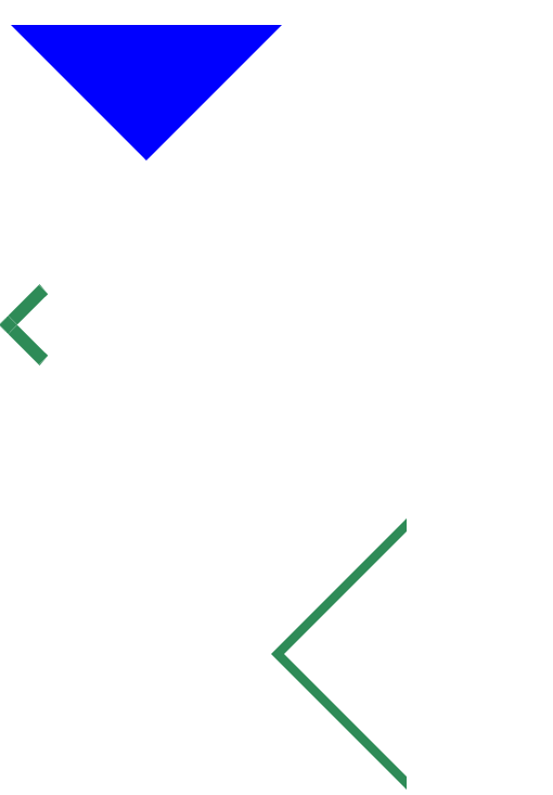
1.三角
代码
<!DOCTYPE html>
<html>
	<head>
		<meta charset="utf-8">
		<title></title>
		<style type="text/css">
			#sj{
				width: 0px;
				border:100px solid transparent;
				border-top: 100px solid #0000FF;

			}
			#sj1{
				width: 0px;
				border: 100px solid transparent;
				border-right: 100px solid #2E8B57;
				top: 455px;
				left:100px ;
				position: absolute;
			}
			#nei{
				width: 0px;
				border: 99px solid transparent;
				border-right: 99px solid white;
				top: 457px;
				left:111px ;
				position: absolute;
			}
			#sj2{
				width: 32px;
				height: 32px;
				border: 1px solid transparent;
				border-left: 10px solid #2E8B57;
				border-top: 10px solid #2E8B57;
				transform: rotate(-45deg);
			}
			#nei2{
				width: 29px;
				height: 29px;
				background-color: white;
			}
		</style>
	</head>
	<body>
		<br><br><br><br>
		<!-- 实心三角 -->
		<div id="sj"></div>
		<!-- 斜三角1 -->
		<div id="sj2"><div id="nei2"></div></div>
		<!-- 斜三角2 -->
		<div id="sj1"></div>
		<div id="nei"></div>
	</body>
</html>
效果
2.导航栏(上端有其他颜色)
代码1(利用margin):
<!DOCTYPE html>
<html>
	<head>
		<meta charset="utf-8">
		<title></title>
		<style type="text/css">
			#bg{
			width: 1000px;
			height: 80px;
			border: 1px solid transparent;
			background-color: #2E8B57;
			color: #255E95;
			margin: 0 auto;
			text-align: center;
			}
			.lb{
				margin-top: 10PX;
				width: 20%;
				height: 70px;
				background-color: #2E8B57;
				color: red;
				float: left;
				line-height:60px ;
			}
			.lb:hover{
				margin-top: 0px;
				background-color:  #327CD1;
				color: #333333;
				border-top: 10px solid red;
				cursor: pointer;
			}
			</style>>
	</head>
	<body>
		<div id="bg">
			<div class="lb">春节</div>
			<div class="lb">中秋节</div>
			<div class="lb">清明节</div>
			<div class="lb">端午节</div>
			<div class="lb">重阳节</div>
		</div>
	</body>
</html>
代码2(利用边框属性):
<!DOCTYPE html>
<html>
	<head>
		<meta charset="utf-8">
		<title></title>
		<style type="text/css">
			#nav{
				margin: 0 auto;
				width: 1000px;
				height: 60px;
				border: 1px solid black;
			}
			#nav div{
				width: 250px;
				height: 60px;
				border-top: 2px solid transparent;/* 上边框设置透明 */
				text-align: center;
				float: left;
				line-height:56px ;/* 行高计算  行间距 = line-height – font-size */
			}
			#nav div:hover{
				border-top: 2px solid red;/* 上边框设置颜色 */
				cursor: pointer;
				background-color: #0000FF;
				color: white;
			}
		</style>
	</head>
	<body>
		<div id="nav">
			<div>chunjie</div>
			<div>chunjie</div>
			<div>春节</div>
			<div>春节</div>
		</div>
	</body>
</html>
3.搜索框
<!DOCTYPE html>
<html>
	<head>
		<meta charset="utf-8">
		<title></title>
		<style type="text/css">
			#aa{
				width: 100px;
				height: 60px;
				border: 1px solid grey;
				border-radius: 8px;/* 圆角 */
				text-align: center;
				line-height: 60px;
			}
			#aa:hover{
				background-color: #2E8B57;
				cursor: pointer;
				/* box-shadow: 5px 5px darkgray; *//* 设置阴影 */
				/* box-shadow: 5px 5px  10px darkgray; */
				box-shadow: 5px 5px  10px darkgray inset;
				/* box-shadow: 5px 5px darkgray; */
			}
		</style>
	</head>
	<body>
		<div id="aa">
			搜素
		</div>
	</body>
</html>
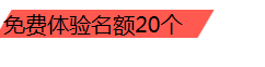
4.标签框
代码:
<!DOCTYPE html>
<html>
	<head>
		<meta charset="utf-8">
		<title></title>
		<style type="text/css">
			.b11{width:148px;
				background-color:#FF5950;
				transform:skew(-30deg,0deg);
				margin:15px 0px 0px -6px;
			}
			.b11 div{
				transform:skew(30deg,0deg);
			}
		</style>
	</head>
	<body>
		<div class="b11">
			<div>免费体验名额20个</div>
		</div>
	</body>
</html>
效果
5.圆形标签
代码
<!DOCTYPE html>
<html>
	<head>
		<meta charset="utf-8">
		<title></title>
		<style type="text/css">
			.aa{
				height:24px ;
				width: 24px;
				background-color: skyblue;
				color:white;
				font-size: 12px;
				border-radius:50%;
				border: 1px solid red;
				text-align: -moz-center;
				line-height: 24px;
			}
		</style>
	</head>
	<body>
		<div class="aa">
			1
		</div>
	</body>
</html>


 浙公网安备 33010602011771号