css进度条
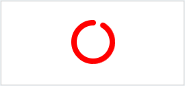
1.环形进度条
源码

<!DOCTYPE html>
<html>
<head>
    <meta charset="UTF-8">
    <title>环形进度条</title>
    <style>
        .wrapper {
            position: absolute;
            top: 0;
            right: 0;
            bottom: 0;
            left: 0;
            width: 4em;
            height: 4em;
            margin: auto;
        }
        .container {
            position: absolute;
            top: 0;
            bottom: 0;
            width: 2em;
            overflow: hidden;
        }
        .halfCir {
            width: 2em;
            height: 4em;
            background: red;
        }
        .container1 {
            left: 2em;
        }
        .container1 .halfCir {
            left: 0;
            border-radius: 0 4em 4em 0;
            transform-origin: 0 50%;
            animation: halfCir1 4s infinite linear;
        }
        .container2 {
            left: 0;
        }
        .container2 .halfCir {
            border-radius: 4em 0 0 4em;
            transform-origin: 2em 2em;
            animation: halfCir2 4s infinite linear;
        }
        @keyframes halfCir1 {
            50%, 100% {
                transform: rotateZ(180deg);
            }
        }
        @keyframes halfCir2 {
            0%, 50% {
                transform: rotateZ(0);
            }
            100% {
                transform: rotateZ(180deg);
            }
        }
        .wrapper::after {
            position: absolute;
            top: 0.5em;
            left: 0.5em;
            width: 3em;
            height: 3em;
            background: #fff;
            border-radius: 50%;
            content: "";
        }
        .cir {
            position: absolute;
            top: 0;
            right: 0;
            left: 0;
            width: 0.5em;
            height: 0.5em;
            margin: auto;
            background: red;
            border-radius: 50%;
        }
        .cir2 {
            transform-origin: 50% 2em;
            animation: cir2 4s infinite linear;
        }
        @keyframes cir2 {
            100% {
                transform: rotateZ(360deg);
            }
        }
    </style>
</head>
<body>
    <div class="wrapper">
        <div class="container container1">
            <div class="halfCir"></div>
        </div>
        <div class="container container2">
            <div class="halfCir"></div>
        </div>
        <div class="cir cir1"></div>
        <div class="cir cir2"></div>
    </div>
</body>
</html>
2.顶部进度条
源码
<!Doctype html>
<html>
<head>
    <title>页面顶部显示的进度条效果</title>
    <meta http-equiv=Content-Type content="text/html;charset=utf-8">
</head>
<body>
    <div id="web_loading"><div></div></div>
    <script src="https://files.cnblogs.com/ningvsban/jquery1.8.3.min.js" type="text/javascript"></script>
    <script type="text/javascript">
        jQuery(document).ready(function () {
            jQuery("#web_loading div").animate({ width: "100%" }, 800, function () {
                setTimeout(function () {
                    jQuery("#web_loading div").fadeIn(500);
                });
            });
        });
    </script>
    <style>
        #web_loading {
            z-index: 99999;
            width: 100%;
        }

            #web_loading div {
                width: 0;
                height: 5px;
                background: #FF9F15;
            }
    </style>
</body>
</html>

 浙公网安备 33010602011771号