
三栏布局的几种方式
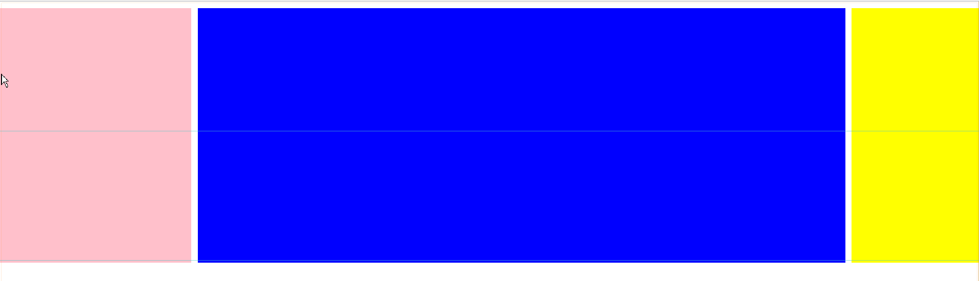
这里介绍几种三栏布局的实现方式,最终目的都是左右两边固定宽度,中间的自适应。
最终效果如下:
一、流式布局
<!DOCTYPE html>
<html lang="en">
<head>
  <meta charset="UTF-8">
  <title>流式布局</title>
  <style>
    * {
      margin: 0;
    }
    div.wrap {
      margin-top: 10px;
      width: 100%;
    }
    div.left {
      float: left;
      width: 300px;
      height: 400px;
      background: pink;
    }
    div.right {
      float: right;
      width: 200px;
      height: 400px;
      background: yellow;
    }
    div.main {
      height: 400px;
      margin: 0 210px 0 310px;
      background: blue;
    }
  </style>
</head>
<body>
    <div class="wrap">
      <div class="left"></div>
      <div class="right"></div>
      <div class="main"></div>
    </div>
</body>
</html>
优点:这是比较正常的思路,两边浮动,中间利用margin。
缺点:主题部分不能优先加载,体验不好。
2、 BFC三栏布局
利用BFC元素不和浮动元素重叠的原理。
<!DOCTYPE html>
<html lang="en">
<head>
  <meta charset="UTF-8">
  <title>BFC三栏布局</title>
  <style>
  * {
    margin: 0;
  }
  div.wrap {
    margin-top: 10px;
    width: 100%;
  }
  div.left {
    float: left;
    width: 300px;
    height: 400px;
    margin-right: 10px;
    background: pink;
  }
  div.right {
    float: right;
    width: 200px;
    height: 400px;
    margin-left: 10px;
    background: yellow;
  }
  div.main {
    height: 400px;
    overflow: hidden;
    background: blue;
  }
  </style>
</head>
<body>
  <div class="wrap">
    <div class="left"></div>
    <div class="right"></div>
    <div class="main"></div>
  </div>
</body>
</html>
优点: 同上。
缺点: 同上。
3、 双飞翼布局
<!DOCTYPE html>
<html lang="en">
<head>
  <meta charset="UTF-8">
  <title>双飞翼布局</title>
  <style>
    * {
      margin: 0;
    }
    div.wrap {
      float: left;
      width: 100%;
    }
    div.main {
      height: 400px;
      margin-left: 310px;
      margin-right: 210px;
      background: blue;
    }
    div.left {
      float: left;
      height: 400px;
      width: 300px;
      background: pink;
      margin-left: -100%;
    }
    div.right {
      float: left;
      height: 400px;
      width: 200px;
      background: yellow;
      margin-left: -200px;
    }

  </style>
</head>
<body>
  <div class="wrap">
    <div class="main"></div>
  </div>
  <div class="left"></div>
  <div class="right"></div>
</body>
</html>
优点: mian部分优先加载,体验不错。
缺点: 结构相对复杂,无语义化。
4、圣杯布局
<!DOCTYPE html>
<html lang="en">
<head>
  <meta charset="UTF-8">
  <title>圣杯布局</title>
  <style>
    * {
      margin: 0;
    }
    div.wrap {
      margin-left: 310px;
      margin-right: 210px;
    }
    div.main {
      float: left;
      width: 100%;
      height: 400px;
      background: blue;
    }
    div.left {
      float: left;
      width: 300px;
      height: 400px;
      margin-left: -100%;
      position: relative;
      left: -320px;
      background: pink;
    }
    div.right {
      float: left;
      width: 200px;
      height: 400px;
      margin-left: -200px;
      position: relative;
      right: -220px;
      background: yellow;
    }
  </style>
</head>
<body>
  <div class="wrap">
    <div class="main"></div>
    <div class="left"></div>
    <div class="right"></div>
  </div>
</body>
</html>
优点:结构简单,主体提前加载。
缺点: 无。
5、table三栏布局
<!DOCTYPE html>
<html lang="en">
<head>
  <meta charset="UTF-8">
  <title>table三栏布局</title>
  <style>
    * {
      margin: 0;
    }
    div.wrap {
      display: table;
      width: 100%;
    }
    div.left,
    div.main,
    div.right {
      display: table-cell;
    }

    div.left {
      width: 300px;
      height: 400px;
      background: pink;
    }
    div.mian {
      background: blue;
      height: 400px;
    }
    div.right {
      width: 200px;
      height: 400px;
      background: yellow;
    }
  </style>
</head>
<body>
  <div class="wrap">
    <div class="left"></div>
    <div class="mian"></div>
    <div class="right"></div>
  </div>
</body>
</html>
优点: 简单易实现。
缺点: 无法设置间距。
6、绝对定位三栏布局
<!DOCTYPE html>
<html lang="en">
<head>
  <meta charset="UTF-8">
  <title>绝对定位三栏布局</title>
  <style>
    * {
      margin: 0;
    }
    div.wrap {
      position: relative;
    }
    div.main {
      height: 400px;
      margin: 10px 210px 0 310px;
      background: blue;
    }
    div.left {
      position: absolute;
      width: 300px;
      height: 400px;
      top: 0;
      left: 0;
      background: pink;
    }
    div.right {
      position: absolute;
      width: 200px;
      height: 400px;
      top: 0;
      right: 0;
      background: yellow;
    }
  </style>
</head>
<body>
  <div class="wrap">
    <div class="main"></div>
    <div class="left"></div>
    <div class="right"></div>
  </div>
</body>
</html>
优点: 简单。
缺点: 完美!

 浙公网安备 33010602011771号