

基于CSS3 实现按钮特效
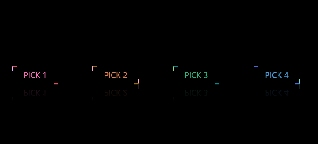
一、效果如图所示:
鼠标悬浮效果:

二、实现代码:
点击查看代码
<!DOCTYPE html>
<html lang="en">
<head>
    <meta charset="UTF-8">
    <meta name="viewport" content="width=device-width, initial-scale=1.0">
    <title>CSS 3.0实现按钮特效</title>
    <style>
        * {
            margin: 0;
            padding: 0;
            font-family: '微软雅黑', sans-serif;
            box-sizing: border-box;
        }

        body {
            display: flex;
            justify-content: center;
            align-items: center;
            background: #000;
            min-height: 100vh;
        }

        a {
            position: relative;
            padding: 10px 30px;
            margin: 0 45px;
            color: #49a0db;
            text-decoration: none;
            font-size: 20px;
            text-transform: uppercase;
            transition: 0.5s;
            overflow: hidden;
            -webkit-box-reflect: below 1px linear-gradient(transparent, #0003);
        }

        a:hover {
            background: #21ebff;
            color: #111;
            box-shadow: 0 0 50px #21ebff;
            transition-delay: 0.5s;
        }

        a:nth-child(1) {
            filter: hue-rotate(115deg);
        }
        a:nth-child(2) {
            filter: hue-rotate(175deg);
        }

        a:nth-child(3) {
            filter: hue-rotate(305deg);
        }

        a::before {
            content: '';
            position: absolute;
            bottom: 0;
            right: 0;
            width: 10px;
            height: 10px;
            border-bottom: 2px solid #466dd9;
            border-right: 2px solid #6de1c4;
            transition: 0.5s;
            transition-delay: 0.5s;
        }

        a:hover::before {
            width: 100%;
            height: 100%;
            transition-delay: 0s;
        }

        a::after {
            content: '';
            position: absolute;
            left: 0;
            top: 0;
            width: 10px;
            height: 10px;
            border-top: 2px solid #466dd9;
            border-left: 2px solid #6de1c4;
            transition: 0.5s;
            transition-delay: 0.5s;
        }

        a:hover::after {
            width: 100%;
            height: 100%;
            transition-delay: 0s;
        }
    </style>
</head>

<body>
    <a href="#">pick 1</a>
    <a href="#">pick 2</a>
    <a href="#">pick 3</a>
    <a href="#">pick 4</a>
</body>

</html>

 浙公网安备 33010602011771号