% 2021年7月29日23:51:21
% blzhu@buaa.edu.cn
%参考:
% https://jingyan.baidu.com/article/636f38bb6bf4ddd6b9461043.html
% https://blog.csdn.net/qq_31816741/article/details/79360574
clc
clear
close all
%数据 一般至少50个
x = [0.312
0.333
0.334
0.333
0.315
0.345
0.295
0.295
0.256
0.366
0.344
0.344
0.314
0.323
0.275
0.356
0.345
0.314
0.284
0.333
0.333
0.293
0.333
0.295
0.313
0.333
0.313
0.264
0.333
0.334
0.295
0.242
0.344
0.345
0.323
0.322
0.271
0.366
0.324
0.291
0.322
0.413
0.426
0.426
0.419
0.284
0.313
0.315
0.344
0.314
0.345
0.296
0.323
0.322
0.283
0.315
0.304
0.238
0.314
0.21
0.313
0.333
0.261
0.235
0.333
0.417
0.249
0.425
0.224
0.433
0.293
0.426
0.325
0.425
0.305
0.418
0.304
0.425
0.324
0.324
];
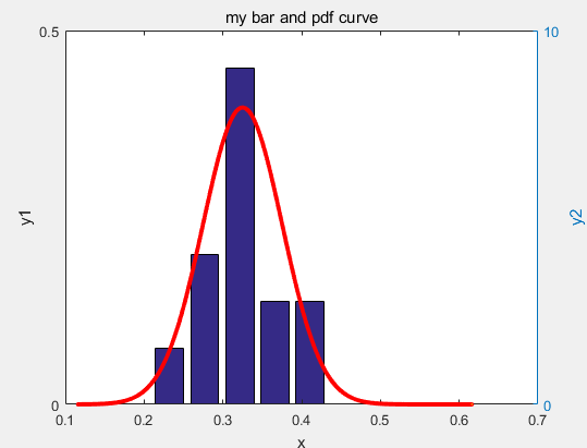
% 画频率分布直方图
[counts,centers] = hist(x,5);%柱的个数为5,可根据自己需要调整
x1=centers;%每个柱的中心x坐标
y1=counts / sum(counts);%每个柱的个数(频数)与数据总个数的比值
% 分布参数拟合
[mu,sigma]=normfit(x);%用正态分布拟合出平均值和标准差
% 画已知分布的概率密度曲线
x2 = centers(1)*0.5:((centers(end)-centers(1)))/1000:centers(end)*1.5;
% x2 =-centers(end)*1.5:((centers(end)-centers(1)))/1000:centers(end)*1.5;
y2 = pdf('Normal', x2, mu,sigma);%probability density function,求在x2处的pdf值
figure
[hAxes,hBar,hLine]=plotyy(x1,y1,x2,y2,'bar','plot')
set(hLine,'color',[1,0,0],'LineWidth',1,'Marker','o','MarkerSize',2,...
'MarkerFace','y')
title('my bar and pdf curve')
xlabel('x')
ylabel(hAxes(1),'y1')
ylabel(hAxes(2),'y2')
![]()


 浙公网安备 33010602011771号