Python-深入浅出数据分析-主观概率
在阅读前,读一下Python-深入浅出数据分析-总结会更好点,以后遇到问题比如代码运行不了,再读读也行,>-_-<
主观上觉得
你的不可能数值化后可能成了别人口中的可能

把你可能、很有可能、不可能数字化是不是更理性点
数字化后的图形
利用官方提供的原始文件,分析言论1的主管概率分布情况
import numpy as np
import pandas as pd
import matplotlib.pyplot as plt

%matplotlib inline

df = pd.read_excel('./hfda_ch07_data_transposed.xls', index_col= 0).drop('SD', axis= 1).T

fig = plt.figure(figsize= (8, 6))
ax = fig.add_subplot(1, 1, 1)

col_mean = round(df.Statement1.mean(), 3)
col_stdev = round(df.Statement1.std(), 3)

ax.scatter(df.Statement1.values, df.index.values, s= 72, facecolors= 'none', edgecolors= 'r')
ax.axvline(col_mean)

ax.set_xticks(np.arange(0, 1.1, 0.1))
ax.set_yticks([])
bbox_props = dict(boxstyle="round", fc="w", ec="0.5", alpha=0.9)
ax.text(col_mean - 0.2, df.index.values.mean(), "mean: {}\nSD: {}".format(col_mean, col_stdev), ha="center", va="center", size=10,
        bbox=bbox_props)
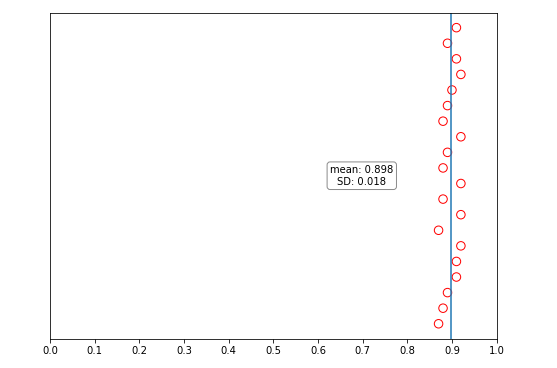
平均概率在0.898,标准差0.018,大家认为言论1很可能发生,且大家的分歧不大
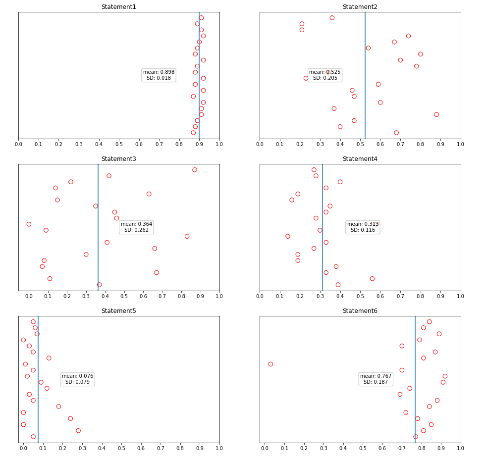
所有的言论图形化
按照分析言论1的思路,分析余下的言论
fig = plt.figure(figsize= (16, 16))

for i in range(1, 7):
    ax = fig.add_subplot(3, 2, i)

    selected_col = 'Statement{0}'.format(i)

    col_mean = round(df[selected_col].mean(), 3)
    col_stdev = round(df[selected_col].std(), 3)

    ax.scatter(df[selected_col].values, df.index.values, s= 72, facecolors= 'none', edgecolors= 'r')
    ax.axvline(col_mean)

    ax.set_xticks(np.arange(0, 1.1, 0.1))
    ax.set_yticks([])
    bbox_props = dict(boxstyle="round", fc="w", ec="0.5", alpha=0.5)
    ax.text(col_mean + 0.2 if col_mean<=0.5 else col_mean - 0.2, df.index.values.mean(), "mean: {}\nSD: {}".format(col_mean, col_stdev), ha="center", va="center", size=10,
            bbox=bbox_props)

    ax.set_title(selected_col)
引入贝叶斯规则
突然,一条新的信息打乱了你言论1预测的信心

在这条新消息的条件下言论1发生的概率是多大呢?条件概率想到了贝叶斯规则。但是这样做真的对吗?是不是重新收集分析师对言论1发生的概率更好一点?我觉得是的,但是我先把书中的思路实现一遍
\[P\left( A|B \right) =\frac{P\left( AB \right)}{P\left( B \right)}=\frac{P\left( A \right) P\left( B|A \right)}{P\left( BA \right) +P\left( B\overline{A} \right)}=\frac{P\left( A \right) P\left( B|A \right)}{P\left( A \right) P\left( B|A \right) +P\left( \overline{A} \right) P\left( B|\overline{A} \right)}
\]
import numpy as np
import pandas as pd
import matplotlib.pyplot as plt

%matplotlib inline

df_old_estimate = pd.read_excel('./hfda_ch07_data_transposed.xls', index_col= 0).drop('SD', axis= 1).T
df_new_estimate = pd.read_excel('./hfda_ch07_new_probs.xls')

# 计算
p_e_s1 = df_new_estimate['P(S1)'] * df_new_estimate['P(E|S1)']
p_e_not_s1 = df_new_estimate['P(~S1)'] * df_new_estimate['P(E|~S1)']

df_new_estimate['P(S1|E)'] = p_e_s1/(p_e_s1 + p_e_not_s1)

# 画图
fig = plt.figure(figsize=(8, 6))

ax = fig.add_subplot(1, 1, 1)

ax.scatter(df_old_estimate.Statement1.values, df_old_estimate.index.values, s= 72, facecolors= 'none', edgecolors= 'b', alpha= 0.4, linestyle='--')
ax.axvline(df_old_estimate.Statement1.mean(), alpha= 0.4, linestyle='--', color= 'b', label= 'old')

ax.scatter(df_new_estimate['P(S1|E)'].values, df_new_estimate['Analyst'].values, s= 72, facecolors= 'none', edgecolors= 'r')
ax.axvline(df_new_estimate['P(S1|E)'].values.mean(), color= 'r', label= 'new')

ax.set_xticks(np.arange(0, 1.1, 0.1))
ax.set_yticks([])
ax.legend(loc='upper left')
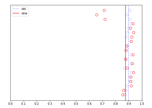
分析之后,维持原判
真的合理吗
书中讲贝叶斯规则的时候,用到的例子是患病阳性的例子,在这个例子中全国患病的概率是不受检测结果(阳性或者非阳性)影响的。
而这个例子中,言论1的概率时候到新消息的影响的,当有新消息出来,那么分析师对言论1发生的概率就会改变,但是一个人检测出来是阳性,是不会改变全国患病概率的
这个问题,等我有机会学更多的统计学知识再来解答,:),更欢迎高手告知一二
写出生活

 浙公网安备 33010602011771号