

Python-深入浅出数据分析-直方图
在阅读前,读一下Python-深入浅出数据分析-总结会更好点,以后遇到问题比如代码运行不了,再读读也行,>-_-<
数字的分布
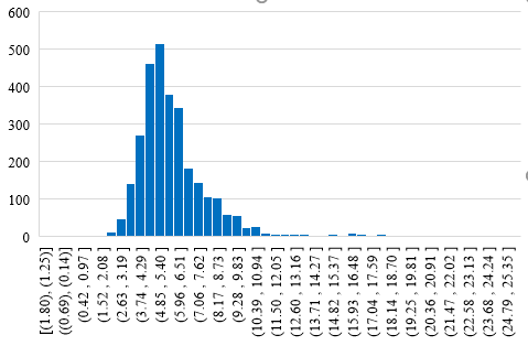
首先书中数落的一下Excel的直方图功能,其实呢,Excel2016已经改进了很多了
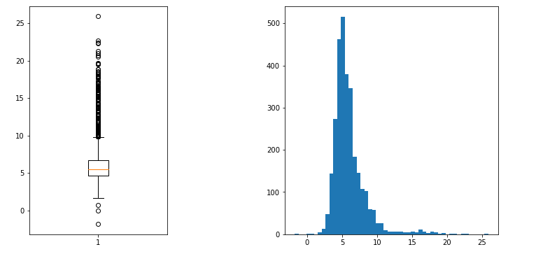
Python中的直方图和箱形图
用不了几行代码,是不是比Excel简单美观点
import numpy as np
import pandas as pd
import matplotlib.pyplot as plt

%matplotlib inline

df = pd.read_csv('./hfda_ch09_employees.csv', skiprows=1, names =['staff_num', 'received', 'negotiated', 'gender', 'year'])

fig = plt.figure(figsize=(12, 6))

ax1 = fig.add_subplot(1, 3, 1)
l = ax1.boxplot(df['received'].values)

ax2 = fig.add_subplot(1, 2, 2)
l = ax2.hist(df['received'], bins=50)
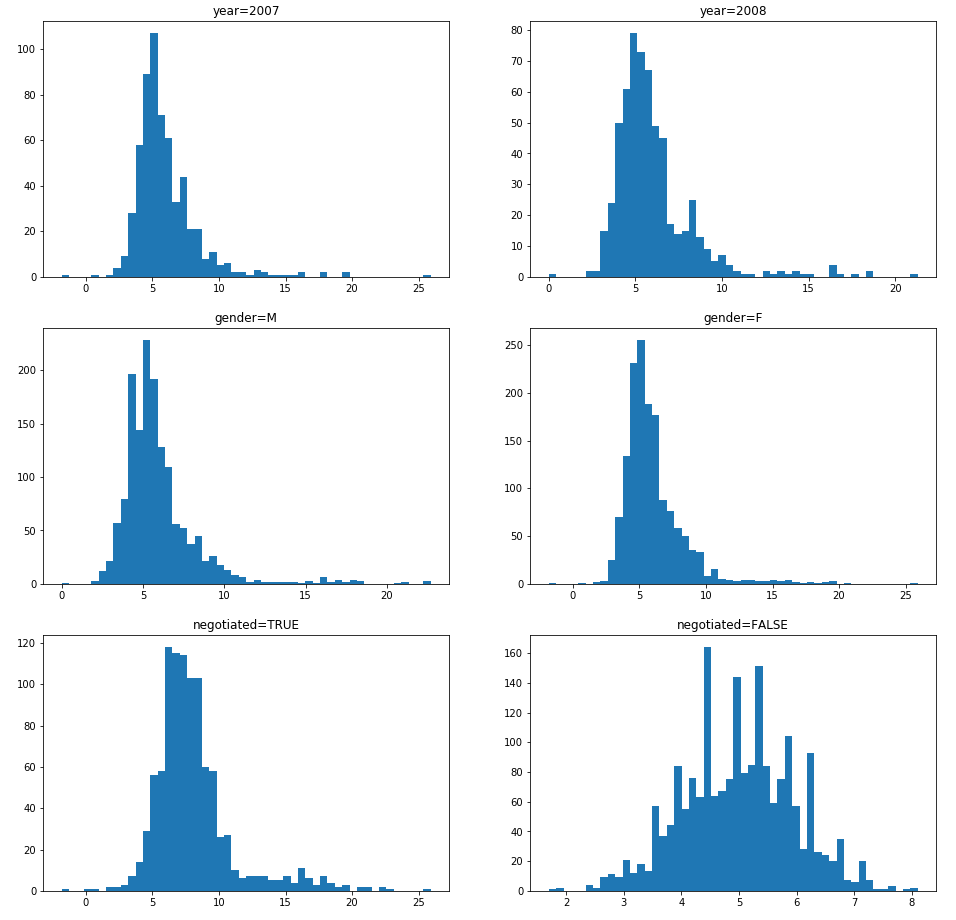
各种情况的对比
分析不同维度的数字分布
fig, ((ax1, ax2), (ax3, ax4), (ax5, ax6)) = plt.subplots(nrows=3, ncols=2, figsize=(16,16))

ax1.hist(df['received'][df['year']==2007], bins=50)
ax1.set_title('year=2007')
ax2.hist(df['received'][df['year']==2008], bins=50)
ax2.set_title('year=2008')

ax3.hist(df['received'][df['gender']=='M'], bins=50)
ax3.set_title('gender=M')
ax4.hist(df['received'][df['gender']=='F'], bins=50)
ax4.set_title('gender=F')

ax5.hist(df['received'][df['negotiated']], bins=50)
ax5.set_title('negotiated=TRUE')
ax6.hist(df['received'][~df['negotiated']], bins=50)
ax6.set_title('negotiated=FALSE')
写出生活

 浙公网安备 33010602011771号