

Python-深入浅出数据分析-线性回归
在阅读前,读一下Python-深入浅出数据分析-总结会更好点,以后遇到问题比如代码运行不了,再读读也行,>-_-<
做一个薪水预测器
书中例子很有意思,如果真的可以做一个薪水预测器,那么你就可以自己发自己薪水了,:)
怎么做
分析以前要求加薪的人最后得到的薪水提高幅度,看看有什么规律。
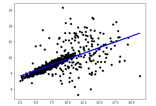
要求加薪的幅度\(\mapsto\)得到加薪的幅度,这两者有什么关系,散点图
import numpy as np
import pandas as pd
import matplotlib.pyplot as plt

%matplotlib inline

df = pd.read_csv('./hfda_ch10_employees.csv', names =['staff_num', 'received', 'requested', 'negotiated', 'gender', 'year'], skiprows=1)

fig = plt.figure(figsize=(8, 6))

ax = fig.add_subplot(1, 1, 1)

ax.scatter(df['requested'][df['negotiated']], df['received'][df['negotiated']])
ax.set_xlabel('requested', fontsize=12)
ax.set_ylabel('recieved', fontsize=12)

两者的相关性有多大?
df['requested'][df['negotiated']].corr(df['received'][df['negotiated']])

'''
输出:0.66564810255571794
'''
是不是有一个函数
输入:要求加薪的幅度
输出:大致得到加薪的幅度
from sklearn.linear_model import LinearRegression

X = df['requested'][df['negotiated']]
y = df['received'][df['negotiated']]
regr = LinearRegression()
regr.fit(X.values[:, np.newaxis], y.values)

fig = plt.figure(figsize=(8, 6))

ax = fig.add_subplot(1, 1, 1)

ax.scatter(X, y, color='black')
ax.plot(X.values, regr.predict(X.values[:, np.newaxis]),linewidth= 3, color= 'blue')

regr.coef_
regr.intercept_
误差分析
待更新
写出生活

 浙公网安备 33010602011771号