<!DOCTYPE html>
<html xmlns="http://www.w3.org/1999/xhtml">
<head>
<meta http-equiv="Content-Type" content="text/html; charset=utf-8"/>
<title>根据不同的窗口尺寸来选择不同的样式</title>
<style type="text/css">
body{margin:20px 0;}
#container {
width:960px; margin:auto;
}
#wrapper{
width:740px; float:left;
}
.height{
line-height:600px;text-align:center;font-weight:bold; font-size:2em; margin:0 0 20px 0;
}
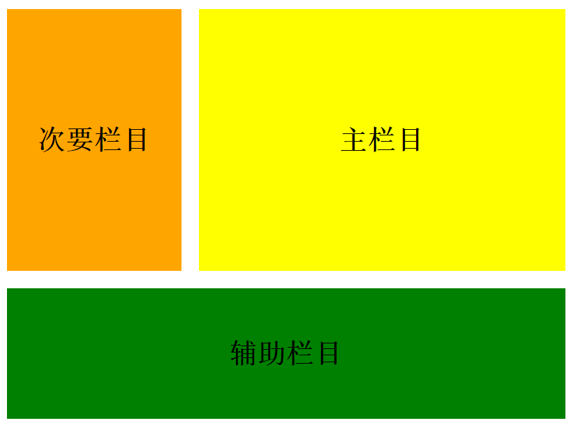
#main{
width:520px; float:right; background-color:yellow;
}
#sub01{
width:200px; float:left; background-color:orange;
}
#sub02{
width:200px; float:right; background-color:green;
}
/*窗口宽度在1000px以上,三栏显示*/
@media screen and (min-width:1000px){
#container{width:1000px;}
#wrapper{width:780px; float:left;}
#main{width:560px; float:right;}
#sub01{width:200px; float:left;}
#sub02{width:200px; float:right;}
}
/*窗口宽度在640px以上、999px以下,二栏显示*/
@media screen and (min-width: 640px) and (max-width: 999px){
#container{width:640px;}
#wrapper{width:640px; float:none;}
.height { line-height: 300px; }
#main{width:420px; float:right;}
#sub01{width:200px; float:left;}
#sub02{width:100%; float:none;clear:both;line-height:150px;}
}
/*窗口宽度在639px以下,一栏显示*/
@media screen and (max-width: 639px){
#container { width: 100%; }
#wrapper{width:100%; float:none;}
.height { line-height: 300px; }
body { margin: 20px; }
#sub01{width:100%; float:none;line-height:100px;}
#sub02{width:100%; float:none;line-height:150px;}
}
</style>
</head>
<body>
<div id="container">
<div id="wrapper">
<div id="main" class="height">主栏目</div>
<div id="sub01" class="height">次要栏目</div>
</div>
<div id="sub02" class="height">辅助栏目 </div>
</div>
</body>
</html>
![]()


 浙公网安备 33010602011771号