

css过渡模块和2d转换模块
今天,我们一起来研究一下css3中的过渡模块、2d转换模块和3d转换模块
一、过渡模块transition
(一)过度模块的三要素:
1、必须要有属性发生变化
2、必须告诉系统哪个属性需要执行过渡效果
3、必须告诉系统过渡效果持续时长
ps:当多个属性需要同时执行过渡效果时用逗号隔开即可
transition-property: width, background-color;
transition-duration: 5s, 5s;
示例代码:
<!DOCTYPE html>
<html lang="en">
<head>
    <meta charset="UTF-8">
    <title>过渡模块</title>
    <style>
        *{
            margin: 0;
            padding: 0;
        }
        div{
            width: 100px;
            height: 50px;
            background-color: red;
            /*告诉系统哪个属性需要执行过渡效果*/
            transition-property: width, background-color;
            /*告诉系统过渡效果持续的时长*/
            transition-duration: 5s, 5s;
        }
        /*
  用来改变元素的属性
  :hover这个伪类选择器除了可以用在a标签上, 还可以用在其它的任何标签上

*/
        div:hover{
            width: 300px;
            background-color: blue;
        }
    </style>
</head>
<body>
<div></div>
</body>
</html>
效果图:
 变化前
变化前
 变化中
变化中
 变化后
变化后
(二)过渡模块的其它属性:
1、告诉系统延迟多少秒之后才开始过渡动画:transition-delay: 2s;
2、告诉系统过渡动画的运动的速度:transition-timing-function: linear;
示例代码:
<!DOCTYPE html>
<html lang="en">
<head>
    <meta charset="UTF-8">
    <title>89-过渡模块-其它属性</title>
    <style>
        *{
            margin: 0;
            padding: 0;
        }
        div {
            width: 100px;
            height: 50px;
            background-color: red;
            transition-property: width;
            transition-duration: 5s;
            /*告诉系统延迟多少秒之后才开始过渡动画*/
            transition-delay: 2s;
        }
        div:hover{
            width: 300px;
        }
        ul{
            width: 800px;
            height: 500px;
            margin: 0 auto;
            background-color: pink;
            border: 1px solid #000;
        }
        ul li{
            list-style: none;
            width: 100px;
            height: 50px;
            margin-top: 50px;
            background-color: blue;
            transition-property: margin-left;
            transition-duration: 10s;
        }
        ul:hover li{
            margin-left: 700px;
        }
        ul li:nth-child(1){
            /*告诉系统过渡动画的运动的速度*/
            transition-timing-function: linear;
        }
        ul li:nth-child(2){
            transition-timing-function: ease;
        }
        ul li:nth-child(3){
            transition-timing-function: ease-in;
        }
        ul li:nth-child(4){
            transition-timing-function: ease-out;
        }
        ul li:nth-child(5){
            transition-timing-function: ease-in-out;
        }
    </style>
</head>
<body>
<!--<div></div>-->
<ul>
    <li>linear</li>
    <li>ease</li>
    <li>ease-in</li>
    <li>ease-out</li>
    <li>ease-in-out</li>
</ul>
</body>
</html>
不同的运动速度会导致不同的过渡效果,请看运行效果图:
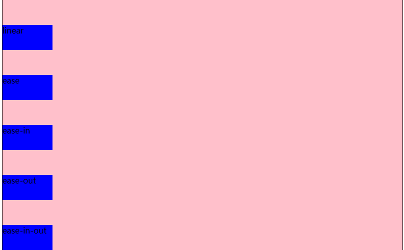 运动前
运动前
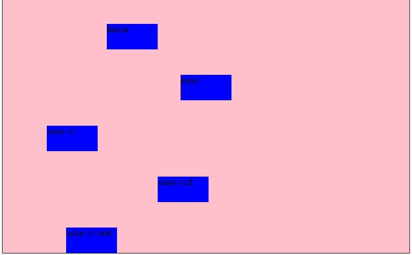 运动中
运动中
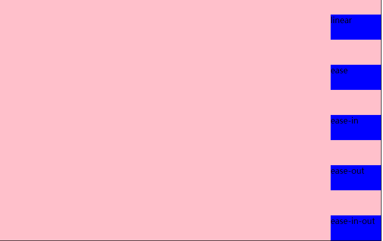 运动后
运动后
(三)过渡连写格式
transition: 过渡属性 过渡时长 运动速度 延迟时间;
过渡连写注意点
1和分开写一样, 如果想给多个属性添加过渡效果也是用逗号隔开即可
2连写的时可以省略后面的两个参数, 因为只要编写了前面的两个参数就已经满足了过渡的三要素
3如果多个属性运动的速度/延迟的时间/持续时间都一样, 那么可以简写为:transition:all 0s;
示例代码:
<!DOCTYPE html>
<html lang="en">
<head>
    <meta charset="UTF-8">
    <title>过渡模块的连写</title>
    <style>
        *{
            margin: 0;
            padding: 0;
        }
        div {
            width: 100px;
            height: 50px;
            background-color: red;
            /*注释中为简写前的代码:
            transition-property: width;
            ransition-duration: 5s;
            transition: width 5s linear 0s,background-color 5s linear 0s;
            transition: background-color 5s linear 0s;
            transition: width 5s,background-color 5s,height 5s;*/
            /*下面为简写后的代码*/
            transition: all 5s;
        }
        div:hover{
            width: 300px;
            height: 300px;
            background-color: blue;
        }
    </style>
</head>
<body>
<div></div>
</body>
</html>
(四)过度模块的编写套路和案例
编写套路:
1、不要管过渡, 先编写基本界面
2、修改我们认为需要修改的属性
3、再回过头去给被修改属性的那个元素添加过渡即可
案例1:
思路:
1、先做好基本页面布局,给div和span添加样式表;
2、考虑怎么实现要做的效果,和需要变动的属性
3、给属性添加过渡效果,在只有一种属性变动或多个属性过渡时间等相同的情况下推荐使用:transition:all 1s;
<!DOCTYPE html>
<html lang="en">
<head>
    <meta charset="UTF-8">
    <title>过渡模块-弹性效果</title>
    <style>
        *{
            margin: 0;
            padding: 0;
        }
        div{
            height: 150px;
            background-color: green;
            margin-top: 100px;
            text-align: center;
            line-height: 150px;
        }
        div span{
            font-size: 80px;
            transition: margin 3s;
        }
        div:hover span{
            margin: 0 20px;
        }
    </style>
</head>
<body>
<div>
    <span>L</span>
    <span>M</span>
    <span>S</span>
    <span>码</span>
    <span>农</span>
    <span>来</span>
    <span>过</span>
    <span>渡</span>
</div>
</body>
</html>
示例图片:
 过渡前
过渡前
 过渡中
过渡中
 过度后
过度后
案例2:
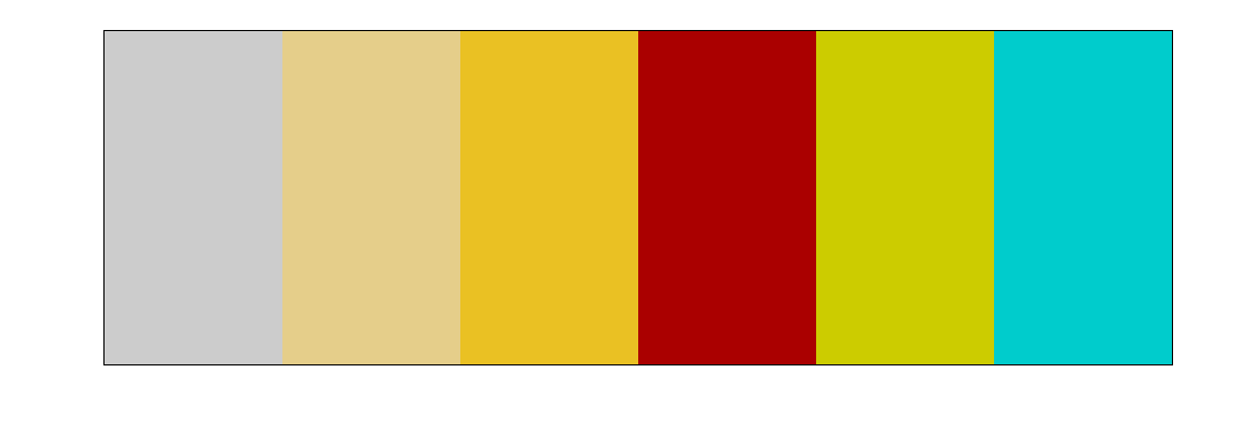
手风琴效果,示例代码:
<!DOCTYPE html>
<html lang="en">
<head>
    <meta charset="UTF-8">
    <title>过渡模块-手风琴效果</title>
    <style>
        *{
            margin: 0;
            padding: 0;
        }
        ul{
            width: 960px;
            height: 300px;
            margin: 100px auto;
            border: 1px solid #000;
            overflow: hidden;
        }
        ul li{
            list-style: none;
            width: 160px;
            height: 300px;
            float: left;
            transition: width 0.5s;
        }
        ul:hover li{
            width: 100px;
        }
        ul li:hover{
            width: 460px;
        }
    </style>
</head>
<body>
<ul>
/*这里为了方便使用了行内样式表,实际应用中一般为图片,要注意样式与内容分离*/

    <li style="background-color: #ccc;"></li>
    <li style="background-color: #e5ce8a;"></li>
    <li style="background-color: #eac123;"></li>
    <li style="background-color: #a00;"></li>
    <li style="background-color: #cc0;"></li>
    <li style="background-color: #0cc;"></li>
</ul>
</body>
</html>
思路:
1、通过浮动做好基本布局,如图:
2、考虑需要实现的效果,如下图,即鼠标移入后,具有:hover事件的li宽度变大,其余的等大。
我们可以通过ul的:hover事件让所有的li变小,然后通过li的:hover时间来使当前li宽度变大。案例事小,思路是大,这种思路在以后的js中或者其他的地方经常用到,即先将所有元素初始化,在单独改变需要改变的元素属性。

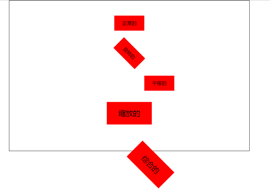
二、2d转换模块transform
(一)写法:transform:值;transform的值常用的有3种:
1、旋转:其中deg是单位, 代表多少度:transform: rotate(45deg);
2、移动:第一个参数:水平方向,第二个参数:垂直方向,transform: translate(100px, 0px);
3、缩放:第一个参数:水平方向,第二个参数:垂直方向,transform: scale(0.5, 0.5);transform: scale(1.5);
注意点:
如果取值是1, 代表不变
如果取值大于1, 代表需要放大
如果取值小于1, 代表需要缩小
如果水平和垂直缩放都一样, 那么可以简写为一个参数
ps:1、如果需要进行多个转换, 那么用空格隔开
2、2D的转换模块会修改元素的坐标系, 所以旋转之后再平移就不是水平平移的
示例代码:
<!DOCTYPE html>
<html lang="en">
<head>
    <meta charset="UTF-8">
    <title>2D转换模块</title>
    <style>
        *{
            margin: 0;
            padding: 0;
        }
        ul{
            width: 800px;
            height: 500px;
            border: 1px solid #000;
            margin: 0 auto;
        }
        ul li{
            list-style: none;
            width: 100px;
            height: 50px;
            background-color: red;
            margin: 0 auto;
            margin-top: 50px;
            text-align: center;
            line-height: 50px;
        }
        ul li:nth-child(2){
            transform: rotate(45deg);
        }
        ul li:nth-child(3){
            transform: translate(100px, 0px);
        }
        ul li:nth-child(4){
            transform: scale(1.5);
        }
        ul li:nth-child(5){
            transform: rotate(45deg) translate(100px, 0px) scale(1.5, 1.5);
            /*transform: translate(100px, 0px);*/
        }
    </style>
</head>
<body>
<ul>
    <li>正常的</li>
    <li>旋转的</li>
    <li>平移的</li>
    <li>缩放的</li>
    <li>综合的</li>
</ul>
</body>
</html>
示例图片:
(二)转换模块的形变中心点:
默认情况下所有的元素都是以自己的中心点作为参考来旋转的, 我们可以通过形变中心点属性来修改它的参考点。
1、写法:transform-origin: left top;第一个参数:水平方向,第二个参数:垂直方向。
ps:取值有三种形式
具体像素:transform-origin: 200px 0px;
百分比:transform-origin: 50% 50%;
特殊关键字:transform-origin: center center;
2、示例代码:
<!DOCTYPE html>
<html lang="en">
<head>
    <meta charset="UTF-8">
    <title>2D转换模块的形变中心点</title>
    <style>
        *{
            margin: 0;
            padding: 0;
        }
        ul{
            width: 200px;
            height: 200px;
            border: 1px solid #000;
            margin: 100px auto;
            position: relative;
        }
        ul li{
            list-style: none;
            width: 200px;
            height: 200px;
            position: absolute;
            left: 0;
            top: 0;
            transform-origin: left top;
        }
        ul li:nth-child(1){
            background-color: red;
            transform: rotate(30deg);
        }
        ul li:nth-child(2){
            background-color: green;
            transform: rotate(50deg);
        }
        ul li:nth-child(3){
            background-color: blue;
            transform: rotate(70deg);
        }
    </style>
</head>
<body>
<ul>
    <li></li>
    <li></li>
    <li></li>
</ul>
</body>
</html>

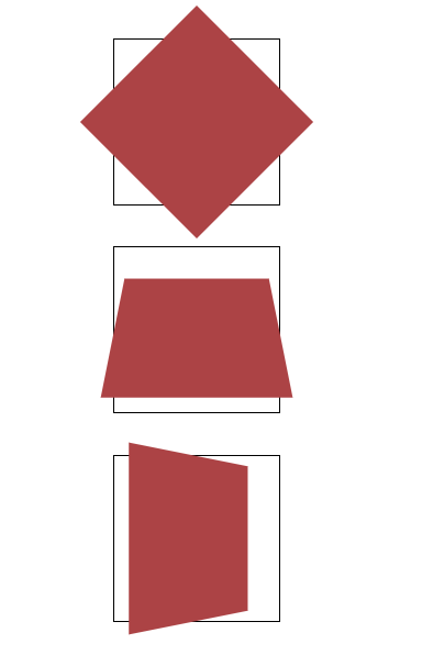
(三)2d转换模块的旋转轴
rotate旋转属性旋转是默认都是围绕z轴旋转,若需要改变旋转轴可以在rotate后加上旋转轴,即:rotateX();rotateY();rotateZ();
1、当围绕x和y轴旋转时就会改变属性距离我们的距离,也就是透视,什么事透视呢,就是近大远小。
2、你会发现元素围绕x轴或y轴旋转时并没有金达远小的效果,这时你需要添加一个透视属性:perspective: 500px;注意:这个属性需要添加在元素的父容器上;
<!DOCTYPE html>
<html lang="en">
<head>
    <meta charset="UTF-8">
    <title>旋转轴向</title>
    <style>
        *{
            margin: 0;
            padding: 0;
        }
        ul{
            width: 800px;
            height: 500px;
            margin: 0 auto;
        }
        ul li{
            list-style: none;
            width: 200px;
            height: 200px;
            margin: 0 auto;
            margin-top: 50px;
            border: 1px solid #000;
            transform:perspective(500px);
       }
        ul li div{
            width: 200px;
            height: 200px;
            background-color: #ac4345;
        }
        ul li:nth-child(1) div{
            transform: rotateZ(45deg);
        }
        ul li:nth-child(2) div{
            transform: rotateX(45deg);
        }
        ul li:nth-child(3) div{
            transform: rotateY(45deg);
        }
    </style>
</head>
<body>
<ul>
    <li><div></div></li>
    <li><div></div></li>
    <li><div></div></li>
</ul>
</body>
</html>
示例图片:
今天的分享到这里就结束了,希望大家能有一些收获。大家有什么意见和建议也可以在留言区留言,谢谢大家的支持。

 浙公网安备 33010602011771号