
在 vue-cli 项目中 使用elementUI 的“自定义主题”功能
1、安装elementUI
$ npm i element-ui -S
2、安装主题工具
npm i element-theme -g
3、安装chalk主题
npm 安装
npm i element-theme-chalk -D
(或)
GitHub 拉取最新代码
npm i https://github.com/ElementUI/theme-chalk -D
4、修改theme的sass文件
et -i   // [可以自定义变量文件,默认为element-variables.scss]

> ✔ Generator variables file //表示成功
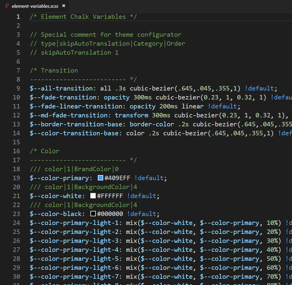
此时根目录下会产生 element-variables.scss 文件,大致如下:
5、编辑 element-variables.scss 文件,修改为自己所需要的颜色主题色
示例:
$--color-primary: #17b3a3!default;
6、编译主题
修改完变量后,要编译主题(如果编译后,再次修改了变量,需要重新编译)
et

> ✔ build theme font
> ✔ build element theme   //表示从新编译成功
执行主题编译命令生成主题,根目录会生成 theme 文件夹 。需要引入这个文件夹里的 css、font 等资源。(theme文件夹里有font文件夹和大量的css文件,css文件只留下index.css,其他的css文件都可以删掉,因为index.css中的样式包含其他全部css文件的样式。)
7、引入自定义主题
在main.js文件:
import Vue from 'vue'
import App from './App.vue'
import router from './router'
import store from './store'

import ElementUI from 'element-ui'
// import 'element-ui/lib/theme-chalk/index.css'
import '../theme/index.css'

Vue.use(ElementUI)

Vue.config.productionTip = false

new Vue({
  router,
  store,
  render: h => h(App)
}).$mount('#app')
8、使用
<el-button>默认按钮</el-button>
<el-button type="primary">主要按钮</el-button>
<el-button type="success">成功按钮</el-button>
<el-button type="info">信息按钮</el-button>
<el-button type="warning">警告按钮</el-button>
<el-button type="danger">危险按钮</el-button>
视图如:


 浙公网安备 33010602011771号