Width="200"
Height="200"
VerticalAlignment="Top"
HorizontalAlignment="Left"
Margin="120,50,0,0"
Header="开关"
Content="开"
Checked="ToggleSwitch_Checked"
Unchecked="ToggleSwitch_Unchecked">
</toolkit:ToggleSwitch>
可以在实现Checked和Unchecked事件里面调整开关的显示状态,详细的实现不再写了,前面类似的操作做过好多了
WrapPanel控件
这个控件我看视频上明明是<controlsToolkit:开头的,结果我的机子就是不行,后来还是改成<toolkit:
<toolkit:WrapPanel
Height="300"
HorizontalAlignment="Left"
Margin="58,152,0,0"
Name="myWrap"
VerticalAlignment="Top"
Width="300"
Orientation="Horizontal"/>
接下来是用代码实现多个方框放在里面
for (int i = 0; i < 50; i++)
{
myWrap.Children.Add(new Rectangle() { Width = 50, Height = 50, Fill = new SolidColorBrush(Colors.DarkGray) });
myWrap.Children.Add(new Rectangle() { Width = 50, Height = 50, Fill = new SolidColorBrush(Colors.Yellow) });
myWrap.Children.Add(new Rectangle() { Width = 50, Height = 50, Fill = new SolidColorBrush(Colors.Red) });
myWrap.Children.Add(new Rectangle() { Width = 50, Height = 50, Fill = new SolidColorBrush(Colors.Green) });
myWrap.Children.Add(new Rectangle() { Width = 50, Height = 50, Fill = new SolidColorBrush(Colors.White) });
myWrap.Children.Add(new Rectangle() { Width = 50, Height = 50, Fill = new SolidColorBrush(Colors.Orange) });
myWrap.Children.Add(new Rectangle() { Width = 50, Height = 50, Fill = new SolidColorBrush(Colors.Magenta) });
}
当然如果是做软件,可以不把方块换成按钮,然后再添加事件
模拟机效果图:

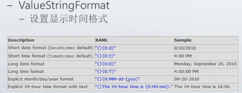
DatePicker 控件是控制日期格式的
<toolkit:DatePicker
VerticalAlignment="Top"
HorizontalAlignment="Left"
Width="450"
Height="63"
Foreground="Red"
Name="datePicker1"
ValueChanged="datePicker1_ValueChanged"
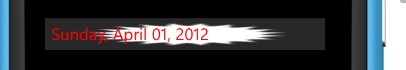
ValueStringFormat="{}{0:D}">//这里是重点要说的,这里有n种可用组合,显示你想要的日期格式,如下图
<toolkit:DatePicker.Background>
<ImageBrush//此处简单提一下它跟Image控件的区别,Image控件是可以单独出现的,该控件是作为某控件的图片填充
ImageSource="Applicationicon.png"
Stretch="Fill">
</ImageBrush>
</toolkit:DatePicker.Background>
</toolkit:DatePicker>
另外在显示日期的这一页面,默认情况下,是不会显示正常的applicationbar的,需要自己的设置,方法为在工程根目录下添加文件夹名为Toolkit.Content,在里面把小对号跟小错号图片添加进去并改为content,就大功告成,如下图
TimePicker 由于该控件与DatePicker控件极为相似就不再废话了
<toolkit:TimePicker VerticalAlignment="Top"
HorizontalAlignment="Left"
Width="450"
Height="63"
Foreground="Red"
Name="datePicker1"
ValueChanged="timePicker1_ValueChanged"
ValueStringFormat="{}{0:D}">
<toolkit:TimePicker.Background>
<ImageBrush
ImageSource="Applicationicon.png"
Stretch="Fill">
</ImageBrush>
</toolkit:TimePicker.Background>
</toolkit:TimePicker>
private void timePicker1_ValueChanged(object sender, DateTimeValueChangedEventArgs e)
{
PageTitle.Text = e.NewDateTime.ToString();
}
NavigationTransition控件,作用是设置页面进入或者是退出的效果
挺简单的,好多效果自己去尝试,想实现这个控件的前提是在App.xaml.cs文件中做这样的修改
// RootFrame = new PhoneApplicationFrame();
RootFrame = new TransitionFrame();
详细代码如下
<toolkit:TransitionService.NavigationInTransition>
<toolkit:NavigationInTransition>
<toolkit:NavigationInTransition.Backward>
<toolkit:RotateTransition Mode="Out180Clockwise"/>
</toolkit:NavigationInTransition.Backward>
<toolkit:NavigationInTransition.Forward>
<toolkit:RotateTransition Mode="Out180Clockwise"/>
</toolkit:NavigationInTransition.Forward>
</toolkit:NavigationInTransition>
</toolkit:TransitionService.NavigationInTransition>
<toolkit:TransitionService.NavigationOutTransition>
<toolkit:NavigationOutTransition>
<toolkit:NavigationOutTransition.Backward>
<toolkit:RotateTransition Mode="Out180Clockwise"/>
</toolkit:NavigationOutTransition.Backward>
<toolkit:NavigationOutTransition.Forward>
<toolkit:RotateTransition Mode="Out180Clockwise"/>
</toolkit:NavigationOutTransition.Forward>
</toolkit:NavigationOutTransition>
</toolkit:TransitionService.NavigationOutTransition>
ListPicker控件,该控件真是有的说了,纠结了我好长时间才弄明白
该控件的作用主要是实现一个类似下拉列表框的作用,但是功能比简单的列表框多就是了
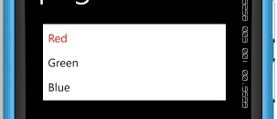
首先讲一下这个最简单的实现效果,
代码:
<toolkit:ListPicker
Name="listPicker1"
Width="400"
Height="360"
VerticalAlignment="Top"
HorizontalAlignment="Left"
Margin="20,20,0,0">
<sys:String>Red</sys:String>//使用这种方式切入字符串就得进入这个命名空间
<sys:String>Green</sys:String>// xmlns:sys="clr-namespace:System;assembly=mscorlib"
<sys:String>Blue</sys:String>
</toolkit:ListPicker>
图示:
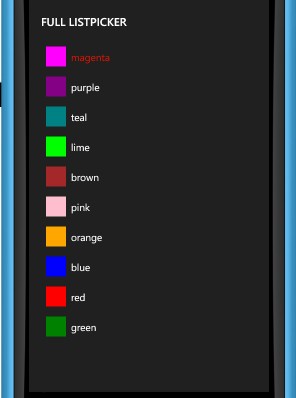
接下来就是点击详细的列表在另外一张页面中现实的那种情况
这是目标效果图:

点击后:

我是这样写的:
<toolkit:ListPicker Header="Full ListPicker"
Name="listPicker2"
Width="410"
ItemsSource="{Binding}"
Margin="20,0,26,155" Height="325" VerticalAlignment="Bottom">
<toolkit:ListPicker.FullModeItemTemplate>
<DataTemplate>
<StackPanel Orientation="Horizontal">
<Rectangle Fill="{Binding}" Width="40" Height="40" Margin="10, 10, 10, 10"/>
<TextBlock Text="{Binding}" VerticalAlignment="Center"/>
</StackPanel>
</DataTemplate>
</toolkit:ListPicker.FullModeItemTemplate>
<toolkit:ListPicker.ItemTemplate>
<DataTemplate>
<StackPanel Orientation="Horizontal">
<Rectangle Fill="{Binding}" Width="40" Height="40" Margin="10, 10, 10, 10"/>
<TextBlock Text="{Binding}" VerticalAlignment="Center"/>
</StackPanel>
</DataTemplate>
</toolkit:ListPicker.ItemTemplate>
</toolkit:ListPicker>
后台代码:
static readonly String[] str = { "magenta", "purple", "teal", "lime"};
DataContext = str;
按照视频的知道满怀期待得等到该控件会弹出新的展现界面,来罗列详细选项的
结果是这样的:
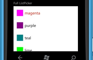
故百思不得其解,最后捉摸了半天才发现真是个蛋疼的问题啊,这个小问题好多博主也练过这个控件的竟然没人指出来,看来大家都是比着视频一点也不改的照打啊。
此处是我的填充内容过于少的问题,如果改成这样,再运行OK了
static readonly String[] str = { "magenta", "purple", "teal", "lime", "brown", "pink", "orange", "blue", "red", "green" };


 浙公网安备 33010602011771号