day16-后台管理页面布局
一、前言
之前我们练习的都是主页面,用的套路都差不多,今天我们来学习一下 后台管理页面布局。
二、position: fixed的布局
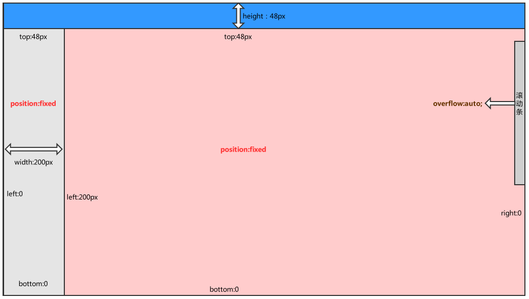
2.1、布局图
说明:这种是左侧菜单跟随滚动条
2.2、代码实现
<head>
    <meta charset="UTF-8">
    <title>Title</title>
    <style>
        body{
            margin: 0 auto;
        }
        .pg-header{
            height: 48px;
            background: #2459a2;
            color: white;
        }
        .fl{
            float: left;
        }

        .fr{
            float: right;
        }

        .pg-content .menu{
            position: fixed;
            top: 48px;
            left: 0;
            bottom: 0;
            width: 200px;
            background-color: #dddddd;
        }
        .pg-content .content{
            position: fixed;
            top: 48px;
            right: 0;
            bottom: 0;
            left: 200px;
            background: pink;
            overflow: auto;  //加滚动条
        }
    </style>
</head>
<body>
    <div class="pg-header"></div>
    <div class="pg-content">
        <div class="menu fl">a</div>
        <div class="content fl">
            <p>dwqdqw</p><p>dwqdqw</p><p>dwqdqw</p><p>dwqdqw</p><p>dwqdqw</p><p>dwqdqw</p><p>dwqdqw</p>
            <p>dwqdqw</p><p>dwqdqw</p><p>dwqdqw</p><p>dwqdqw</p><p>dwqdqw</p><p>dwqdqw</p><p>dwqdqw</p>
        </div>
    </div>
    <div class="pg-footer"></div>
</body>
</html>
这边补充一个知识点 min-width这个关键字:表示最小宽度,当你20%的宽度小于200px的时候,我就用min-width,但是当你min-width大于200px,应用width。
.pg-content .menu{
            width: 20%;
            background: red;
            min-width: 200px;
        }
三、 position: absolute 布局 *****
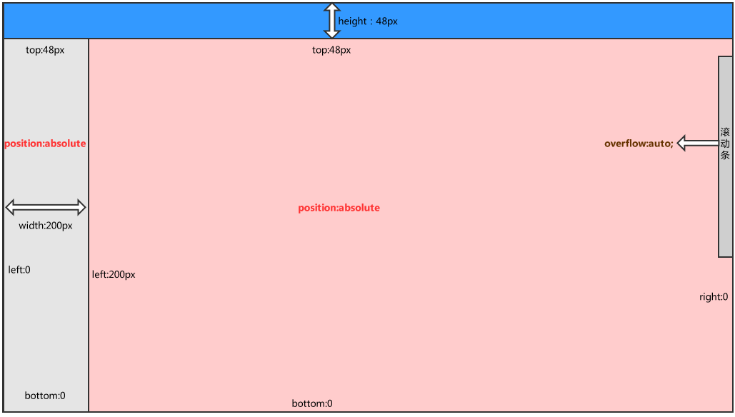
3.1、布局图
说明:左侧以及上下不动,用的比较多
3.2、逻辑代码
<!DOCTYPE html>
<html lang="en">
<head>
    <meta charset="UTF-8">
    <title>Title</title>
    <style>
        body{
            margin: 0 auto;
        }
        .pg-header{
            height: 48px;
            background: #2459a2;
            color: white;
        }
        .fl{
            float: left;
        }

        .fr{
            float: right;
        }

        .pg-content .menu{
            position: absolute; /* 改成 absolute */
            top: 48px;
            left: 0;
            bottom: 0;
            width: 200px;
            background-color: #dddddd;
        }
        .pg-content .content{
            position: absolute;  /* 改成 absolute*/
            top: 48px;
            right: 0;
            bottom: 0;
            left: 200px;
            background: pink;
            overflow: auto;
        }
    </style>
</head>
<body>
    <div class="pg-header"></div>
    <div class="pg-content">
        <div class="menu fl">a</div>
        <div class="content fl">
            <p>dwqdqw</p><p>dwqdqw</p><p>dwqdqw</p><p>dwqdqw</p><p>dwqdqw</p><p>dwqdqw</p><p>dwqdqw</p>
            <p>dwqdqw</p><p>dwqdqw</p><p>dwqdqw</p><p>dwqdqw</p><p>dwqdqw</p><p>dwqdqw</p><p>dwqdqw</p>
            <p>dwqdqw</p><p>dwqdqw</p><p>dwqdqw</p><p>dwqdqw</p><p>dwqdqw</p><p>dwqdqw</p><p>dwqdqw</p>
            <p>dwqdqw</p><p>dwqdqw</p><p>dwqdqw</p><p>dwqdqw</p><p>dwqdqw</p><p>dwqdqw</p><p>dwqdqw</p>
            <p>dwqdqw</p><p>dwqdqw</p><p>dwqdqw</p><p>dwqdqw</p><p>dwqdqw</p><p>dwqdqw</p><p>dwqdqw</p>
            <p>dwqdqw</p><p>dwqdqw</p><p>dwqdqw</p><p>dwqdqw</p><p>dwqdqw</p><p>dwqdqw</p><p>dwqdqw</p>
        </div>
    </div>
    <div class="pg-footer"></div>
</body>
</html>
四、实践
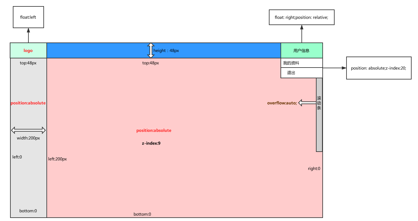
4.1、布局图
4.2、逻辑代码
<!DOCTYPE html>
<html lang="en">
<head>
    <meta charset="UTF-8">
    <title>Title</title>
    <style>
        body{
            margin: 0 auto;
        }
        .pg-header{
            height: 48px;
            background: #2459a2;
            color: white;
            line-height: 48px;
        }

        .pg-header .logo{
            width: 200px;
            background-color: cadetblue;
            text-align: center;
        }

        .pg-header .user{
            width: 160px;
            background-color: wheat;
        }

        .pg-header .user:hover{
            background-color: blue;
        }

        .pg-header .user .a img{
            height: 40px;
            width: 40px;
            border-radius: 50%;
            margin-top: 4px;
        }

        .pg-header .user .b{
            z-index: 20;
            position: absolute;
            top: 48px;
            right: 64px;
            background-color: red;
        }

         .pg-header .user .b a{
             display: block;
             width: 96px;
         }


        .fl{
            float: left;
        }

        .fr{
            float: right;
        }

        .pg-content .menu{
            position: absolute; /* 改成 absolute */
            top: 48px;
            left: 0;
            bottom: 0;
            width: 200px;
            background-color: #dddddd;
        }
        .pg-content .content{
            position: absolute;  /* 改成 absolute*/
            top: 48px;
            right: 0;
            bottom: 0;
            left: 200px;
            background: pink;
            overflow: auto;
            z-index: 9;
        }
    </style>
</head>
<body>
    <div class="pg-header">
        <div class="logo fl">
            老男孩
        </div>
        <div class="user fr" style="position: relative;">
            <a class="a" href="#">
                <img style="" src="22.jpg">
            </a>
            <div class="b">
                <a>我的资料</a>
                <a>退出</a>
            </div>
        </div>
    </div>
    <div class="pg-content">
        <div class="menu fl">a</div>
        <div class="content fl"></div>
    </div>
    <div class="pg-footer"></div>
</body>
</html>
这边有一个知识补充:border-radius属性,这个是用来表示某个块级标签的圆弧度的,这个最多变成一个圆,不能再变小了,如果真的想变成全圆的,就是50%
border-radius: 50%;#全部圆的
border-radius: 50px;局部变成圆的。
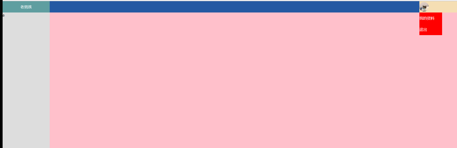
效果图:
五、hover的补充
之前我们说css样式 :hover 表示当这个鼠标放在标签上时,此css样式才会生效,那我如果想,当我鼠标放在上面的时候,只为其中的某个标签设置此样式呐。那就用到另外一种方法:
.类名(或者其他标签名):hover  .类名{
          //样式
}
例如:
.item{
    background-color: #dddddd;
}

.item:hover{    //只在item标签上生效
    color: red;
}

.item:hover .b{    //当鼠标放在上面的时候,为b加上此样式
    background-color: green;
}
具体代码:
<!DOCTYPE html>
<html lang="en">
<head>
    <meta charset="UTF-8">
    <title>Title</title>
    <style>
        .item{
            background-color: #dddddd;
        }

        .item:hover{
            color: red;
        }

        .item:hover .b{
            background-color: green;
        }
    </style>
</head>
<body>
    <div class="item">
        <div class="a">123</div>
        <div class="b">456</div>
    </div>
</body>
</html>
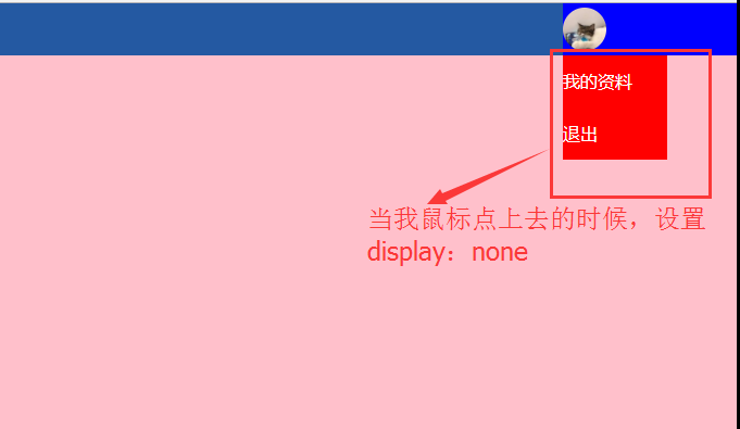
所以我在上面的实践代码中加上这么一小段,就能实现我鼠标一放在用户名上,就能显示出我想要的模块:

效果图:
六、Font-Awesome使用
以后我们需要的小图标不需要我们自己直接开发,fontawesome已经帮我做好了,只需要直接引用就行了。网址:http://fontawesome.dashgame.com/,或者在百度里面搜fontawsome就出来了。
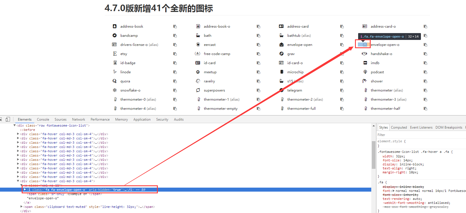
6.1、具体使用方法
①先下载
②再导入
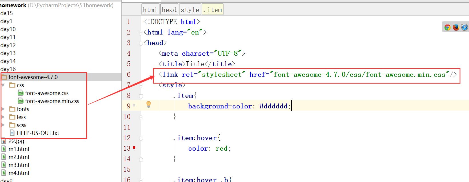
③使用某个样式


 浙公网安备 33010602011771号