

CSS盒模型
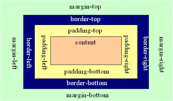
html文档被浏览器解析之后会构造一棵DOM树,文档中的每个html元素会变成DOM树上的节点,然后浏览器便要将这棵树绘制出来。为了方便节点的渲染,我们将每个节点看做一个盒子,如下图。
盒模型有三种:
- W3C提出的标准盒模型(content-box)
- IE的怪异盒模型(border-box)
- padding-box
在两种盒模型中元素所占据的区域大小都是由padding、margin、boder、内容宽、内容高决定的。
两种盒模型的区别主要在于对元素宽高的定义,即CSS中的width和height属性在不同盒模型状态下所指代的意义是不同的。
下面对两种盒模型进行详细说明。
标准盒模型(content-box)
在标准盒模型中:
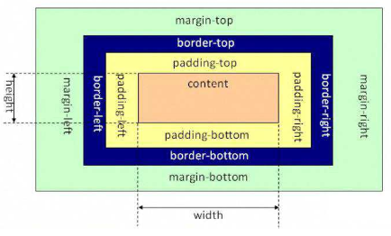
元素实际宽度 = width + padding-left + padding-right + border-left + border-right + margin-left + margin-right
元素实际高度 = height + padding-top + padding-bottom + border-top + border-bottom + margin-top + margin-bottom
说明:width、height指的是图中的content区域的宽和高。
怪异盒模型(border-box)
在怪异盒模型中:
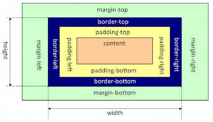
元素实际宽度 = width + margin-left + margin-right
元素实际高度 = height + margin-top + margin-bottom
说明:
width = content宽度 + padding-left + padding-right + border-left + border-right
height = content高度 + padding-top + padding-bottom + border-top + border-bottom
padding-box
在padding-box模型中:
元素实际宽度 = width + margin-left + margin-right + border-left + border-right
元素实际高度 = height + margin-top + margin-bottom + border-top + border-bottom
说明:
width = content宽度 + padding-left + padding-right
height = content高度 + padding-top + padding-bottom
总结
在CSS3中可以使用box-sizing属性进行选择,现在开发过程中渲染依照标准盒模型渲染,但是当元素设置为浮动时,元素采用padding-box渲染。
三者主要的区别在于宽高的定义。
标准盒模型:
width = content宽
height = content高
padding-box:
width = content宽 + border
height = content高 + border
怪异盒模型:
width = content宽 + border + padding
height = content高 + border + padding

 浙公网安备 33010602011771号