python css盒子型 浮动
########################总结###############
块级标签能够嵌套某些块级标签和内敛标签
内敛标签不能块级标签,只能嵌套内敛标签
嵌套就是:
<div>
    <span>
         ffff
    </span>
</div>

####p标签比较特殊,不能包含块级标签,p标签也不能包含p标签
<p>
    <div>xxxxxxxxxxx</div>
</p>
字体
.c2{
    font-family: '华文楷体';
    font-size: 100px;#默认大小是16
    Font-weight:bold;#自重 bold加粗
    Color:red;rgb(255,255,255) rgba(255,255,255,0.3)  0.3是色彩透明度
}

<span class="c2">
    小泽玛利亚
</span>
文字对齐方式 文字装饰
.c3{
text-align: left; #center,right,left
line-height: 50px; #行高
}

<!--字体对齐-->
<div class="c3">
    从前车马很慢,书信很远,一生只够爱一人
</div>
.c4 a{
text-decoration: line-through; #使用中划线
/*text-decoration: none;*/ #去掉a标签默认的下划线
}
<!--文字装饰-->
<div class="c4">
<a href="">德玛西亚</a>
</div>
首行缩进
text-indent:32px;缩进两个字符
背景属性
.c1{
            width: 900px;
            height: 900px;
            /*background-color: green;*/ #背景颜色
            /*background-image: url("gdg.png");*/#图片路径
            /*background-repeat: no-repeat;*/#不进行多图拉伸
            /*background-position: center top;*/ #把图片给居中

            background:green url("gdg.png") no-repeat 500px 200px; #写一起效果 第一个200是左边 第二个是往下

            background-attachment: fixed; #下拉的时候不会替换

            border: 1px solid red; #边框
}
边框
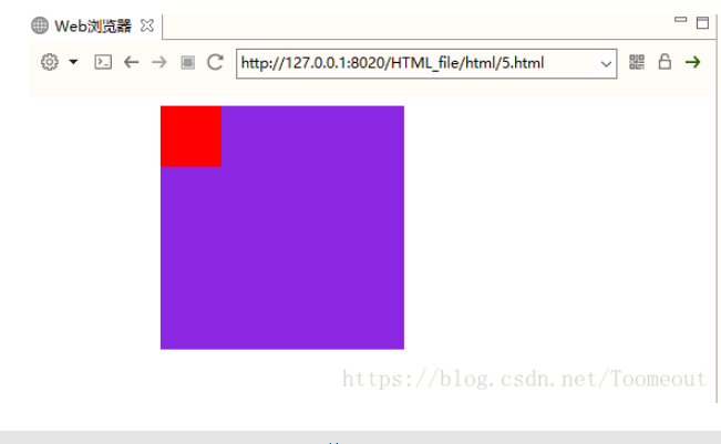
        .c1{
            /* 200*200是正方形 */
            width: 200px;
            height: 200px;
            border-left:  10px dashed green;#虚线左半圈绿色
            border-right:  10px dashed red;#右半圈绿色
            border-bottom: 10px dashed yellow;#下黄色
            border-top: 10px solid purple; #实线 紫色
            border-radius: 50%;  #50%拉
    <div class="c1">
        <img src="xyjy.png" alt="">
    </div>
.c1 img{
/*按照父级标签的宽度来展示,并且进行等比缩放*/
max-width: 100%;
}
/*溢出的部分隐藏*/
overflow: hidden;
<div class="c1">
<img src="xyjy.png" alt="">
</div>
         .c1{
            width: 200px;
            height: 100px;
            border: 1px solid black;

        }

        .c2{
            background-color: red;
            /*display: none;*/ #隐藏标签
            /*visibility: hidden;*/#隐藏标签,但是保留标签所占位置
        }


        .c3{
            background-color: blue;
        }
        .c3,.c4{ #挨着c3
            display: inline-block; #将块级标签或者内敛标签,改成块级标签和内敛标签的
        }

还有2个不常用
Display:block;将内敛标签改为块级标签
Display:inline;将块级标签改为内敛标签

####################
   <div class="c1">

    </div>
    <div class="c1 c2">

    </div>
    <div class="c1 c3"> #注意这里的class c1的样式也有c3的样式 类似继承
        我是c3标签
    </div>
    <div class="c1 c4">
        我是c4标签
    </div>
盒子模型

1(盒子型的属性)
width:内容的宽度
height:内容的宽度
margin:外边距,盒子边框到附近最近盒子的距离
border:边距,就是指定的盒子的宽度
padding:内边距,边框到内容的距离
content:内容
###常用
body{
            margin: 0;
            padding: 0;
        }
#####演示效果########
<!DOCTYPE html>
<html lang="en">
<head>
    <meta charset="UTF-8">
    <title>哈哈哈哈</title>
    <style>
        .box{
            width: 200px;
            height: 200px;
            padding: 50px;
            /* padding 分上 右 下 左 10px 20px 30px 50px*/
            background-color: red;
            border: 1px solid yellow;
            margin: 30px;
        }
    </style>
</head>
<body>
<div class="box">哈哈哈哈哈哈我是曹宝宝</div>
</body>
</html>
#############总结##########
<!DOCTYPE html>
<html lang="en">
<head>
<meta charset="UTF-8">
<title>Title</title>
<style>
body{
margin: 0;
/*外边距*/
padding: 0;
/*内边距*/
}
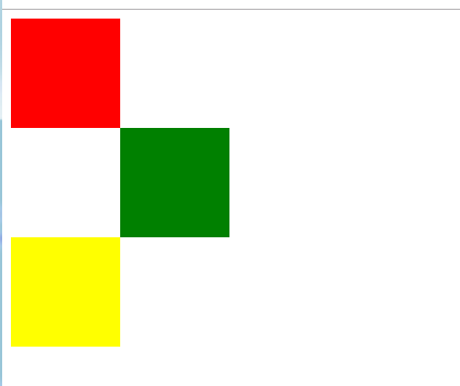
.c1,.c2{
width: 100px;
height: 100px;
background-color: red;
border: 1px solid black;
}
.c3{
width: 100%;
height: 100px;
background-color: yellow;
}
.c2{
float: right;
/*把c2放右边*/
}
.c1{
float: left;
}
/*c3默认会盖过c1 c2 设置伪类选择器,设立给他加空白 设置成block 让他占位子 清除浮动*/
.cc:after{
content: '';
display: block;
clear: both;
}
.cc:before{
/*清除浮动的标识 可不写*/
}
</style>
</head>
<body>
<div class="cc">
<div class="c1"></div>
<div class="c2"></div>
</div>
<div class="c3" >
</div>
</body>
</html>
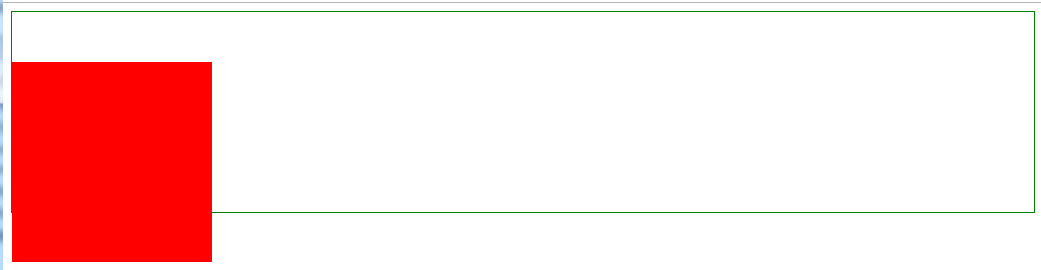
#############################如果不加浮动c3黄色会上去 变成一行#############################################

定位
relative(相对定位)

absolute(绝对定位)
#div1{
    position: absolute;
    width: 200px;
    height: 200px;
    background-color: blueviolet;
    margin-left: 100px;
}
这个位置两个div都能占
fixed(固定)不管页面怎么动,都在整个屏幕的某个位置
相对路径
<!DOCTYPE html>
<html lang="en">
<head>
    <meta charset="UTF-8">
    <title>Document</title>
    <style>
        body {
            border: 1px solid green;
        }

        div {
            width: 200px;
            height: 200px;
            background-color: red;
            /*margin-top: 50px;*/
            /*如果想让红色方块下移50px,我们首先想到的是使用margin-top 50px*/
/*打开代码注释的部分,刷新页面。会发现,body被撑开了。这不是我们想要的,这个时候,需要用到相对定位。*/
/*它不会撑开body*/

            /*相对定位,相对自己原来的位置,跟父级没有任何关系*/
            position: relative;
            /*移动50px*/
            top: 50px;
        }
    </style>
</head>
<body>
<div class="wrap">

</div>

</body>
</html>
老家留坑
<!DOCTYPE html>
<html lang="en">
<head>
    <meta charset="UTF-8">
    <title>Document</title>
    <style>
        .box1{
            width: 100px;
            height: 100px;
            background-color: red;
        }
        .box2{
            width: 100px;
            height: 100px;
            background-color: green;
            /*老家留坑*/
            position: relative;
            left: 100px;
        }
        .box3{
            width: 100px;
            height: 100px;
            background-color: yellow;
        }
    </style>
</head>
<body>
    <div class="box1">
    </div>
    <div class="box2">
    </div>
    <div class="box3">
    </div>
</body>
</html>
相对路径:让搜索框和提交按钮在一条水平线显示
<!DOCTYPE html>
<html lang="en">
<head>
    <meta charset="UTF-8">
    <title>Document</title>
    <style>
        .where{
            font-size: 30px;
        }
        .search{
            width: 100px;
            height: 40px;
            position: relative;
            top: -4px;
        }
    </style>
</head>
<body>

<div>
    <form action="" method="post">
        <input type="text" class="where">
        <input type="submit" class="search" value="搜索">
    </form>
</div>

</body>
</html>
绝对路径 制作导航栏 不会随着鼠标的拉取而变化
<!DOCTYPE html>
<html lang="en">
<head>
    <meta charset="UTF-8">
    <title></title>
    <style>
        *{
            padding: 0;
            margin: 0;
        }
        ul{
            list-style: none;
        }
        .nav{
            width: 960px;
            overflow: hidden;
            /*margin: 0px auto;*/
            background-color: purple;
            border-radius: 5px;
            position: fixed;
            left: 50%;
            margin-left: -480px;
        }
        .nav ul li{
            float: left;
            width: 160px;
            height: 40px;
            line-height: 40px;
            text-align: center;

        }
        .nav ul li a{
            width: 160px;
            height: 40px;
            display: block;
            color: white;
            font-size: 14px;
            text-decoration: none;

        }
        .nav ul li a:hover{
            background: yellow;
            color: green;
            text-decoration: underline;
        }

        .wrap{
            width: 100%;
            height: 400px;
            background-color: #666;
        }

    </style>
</head>
<body style="height: 3000px">
<div class="nav">
    <ul>
        <li>
            <a href="#">网站导航</a>
        </li>
        <li>
            <a href="#">网站导航</a>
        </li>
        <li>
            <a href="#">网站导航</a>
        </li>
        <li>
            <a href="#">网站导航</a>
        </li>
        <li>
            <a href="#">网站导航</a>
        </li>
        <li>
            <a href="#">网站导航</a>
        </li>
    </ul>
</div>

<div class="wrap"></div>

</body>
</html>
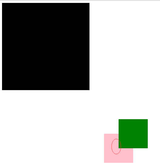
z-index
- z-index 值表示谁压着谁,数值大的压盖住数值小的,
- 只有定位了的元素,才能有z-index,也就是说,不管相对定位,绝对定位,固定定位,都可以使用z-index,而浮动元素不能使用z-index
- z-index值没有单位,就是一个正整数,默认的z-index值为0如果大家都没有z-index值,或者z-index值一样,那么谁写在HTML后面,谁在上面压着别人,定位了元素,永远压住没有定位的元素。
- 从父现象:父亲怂了,儿子再牛逼也没用
只要又定位的盒子,一定大于标准流的盒子
从父现象
<!DOCTYPE html>
<html lang="en">
<head>
    <meta charset="UTF-8">
    <title>Document</title>
    <style>
        .lzy{
            width: 300px;
            height: 300px;
            background-color: black;
            position: absolute;
            z-index: 14;
        }
        .tl{
            width: 300px;
            height: 300px;
            background-color: yellow;
            position: absolute;
            z-index: 11;

        }
        .kimi{
            width: 100px;
            height: 100px;
            background-color: green;
            position: absolute;
            top: 400px;
            left: 400px;
        }
        .sd{
            width: 100px;
            height: 100px;
            background-color: pink;
            position: absolute;
            top: 450px;
            left: 350px;
            z-index: 1000;
            /*优先级最高不是最前面*/
        }
    </style>
</head>
<body>
    <div class="lzy">
        <div class="kimi"></div>
    </div>
    <div class="tl">
        <div class="sd"></div>
    </div>
</body>
</html>
不怕大牛比自己牛,就怕大牛比自己更努力

 浙公网安备 33010602011771号