CSS制作华为mate8手机模型示例
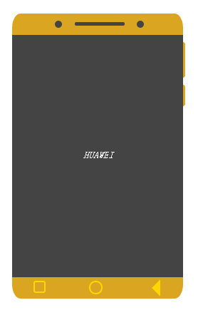
CSS制作华为mate8手机模型效果图
1.HTML代码
<!DOCTYPE html>
<html>
    <head>
        <meta charset="UTF-8">
        <title></title>
    </head>
    <body>
        <div class="phone">
            <div class="body"></div>
            <div class="head"></div>
            <div class="cinema"></div>
            <div class="button"></div>
            <div class="screen"></div>
            <div class="probutton"></div>
            <div class="brobutton"></div>
        </div>
        <hr>
        <div class="RotateButton"></div>
    </body>
</html>
2.CSS代码
*{
    list-style: none;
    text-decoration: none;
    font-family: "微软雅黑 UI";
    font-size: 14px;
    padding: 0;
    margin: 0;
}
body {
    padding: 20px;
    margin: 0 auto;
}
.phone {
    position: relative;
}
.body {
    width: 240px;
    height: 400px;
    background-color: #daa520;
    border-radius: 5%;
}
.screen {
    width: 240px;
    height: 340px;
    background-color: #444;
    position: absolute;
    top: 30px;
    left: 0;
}
.screen:before {
    content: 'HUAWEI';
    font-style: italic;
    position: absolute;
    top: 160px;
    left: 100px;
    color: #FFFFFF;
}
.cinema {
    background-color: #444;
    border-radius: 50%;
    position: absolute;
    top: 10px;
    left: 60px;
    width: 10px;
    height: 10px;
}
.cinema:before {
    content: '';
    background-color: #444;
    border-radius: 50%;
    position: absolute;
    top: 0;
    left: 115px;
    width: 10px;
    height: 10px;
}
.cinema:after {
    content: '';
    background-color: #444;
    border-radius: 15px;
    position: absolute;
    top: 2px;
    left: 28px;
    width: 70px;
    height: 5px;
}
.button {
    border-radius: 0 10px 10px 0;
    width: 3px;
    height: 50px;
    position: absolute;
    top: 40px;
    left: 240px;
    background-color: #DAA520;
}
.button:before {
    content: '';
    border-radius: 0 10px 10px 0;
    width: 3px;
    height: 30px;
    position: absolute;
    top: 60px;
    left: 0;
    background-color: #DAA520;
}
.probutton {
    width: 15px;
    height: 15px;
    border-radius: 50%;
    border: 2px solid #ffd700;
    position: absolute;
    top: 375px;
    left: 108px;
}
.probutton:before {
    content: '';
    width: 13px;
    height: 13px;
    border-radius: 20%;
    border: 2px solid #FFD700;
    position: absolute;
    top: -2px;
    left: -80px;
}
.probutton:after {
    content: '';
    border-style: solid;
    border-width: 12px;
    border-color: transparent #FFD700 transparent transparent;
    width: 0;
    height: 0;
    position: absolute;
    top: -4px;
    left: 74px;
}
备注:伪类before、after配合使用,减少标签使用量。
Best wishes to you.
LaoYu
此文章为程序猿原创,特此声明。转载请注明出处,谢谢!

 浙公网安备 33010602011771号