CSS布局
一、垂直居中和水平居中
(1)纯文字可以利用line-height=height;来实现垂直居中
(2)父盒子相对定位,子盒子绝对定位。margin: auto法。盒子大小不确定也可以。
    .Center-Container {
      /* 实现左右边距是10px */
      margin: 0 10px;
      height: 100%;
      background-color: pink;
      position: relative;
    }
    .Absolute-Center {
      width: 60%;
      height: 60%;
      background-color: blue;
      position: absolute;
      top: 0;
      left: 0;
      right: 0;
      bottom: 0;
      margin: auto;
    }
(3)父盒子相对定位,子盒子绝对定位。负外边距法。盒子大小必须得确定。
    .Center-Container {
      /* 实现左右边距是10px */
      margin: 0 10px;
      height: 100%;
      background-color: pink;
      position: relative;
    }

    .Absolute-Center {
      width: 300px;
      height: 200px;
      background-color: blue;
      position: absolute;
      top: 50%;
      left: 50%;
      margin-left: -150px;
      margin-top: -100px;
    }
(4)父盒子相对定位,子盒子绝对定位。负外边距之transform法。盒子大小不确定也可以。
    .Center-Container {
      width: 1000px;
      height: 500px;
      background-color: pink;
      position: relative;
      margin: 0 auto;
    }

    .Absolute-Center {
      width: 50%;
      height: 50%;
      background-color: blue;
      position: absolute;
      top: 50%;
      left: 50%;
      -webkit-transform: translate(-50%, -50%);
      -ms-transform: translate(-50%, -50%);
      transform: translate(-50%, -50%);
    }
(5)弹性布局法。父盒子设置display: flex; 子级设置margin:auto实现自适应居中;盒子大小不确定也可以。
    .Center-Container {
      width: 1000px;
      height: 500px;
      background-color: pink;
      margin: 0 auto;
      display: flex;
    }

    .is-Center {
      width: 200px;
      height: 50%;
      background-color: blue;
      margin: auto;
    }
(6)flex布局法。都在父元素上设置。盒子大小不确定也可以。
    .Center-Container {
      width: 1000px;
      height: 500px;
      background-color: pink;
      margin: 0 auto;
      display: flex;
      /* 设置水平居中 */
      justify-content: center;
      /* 设置垂直居中 */
      align-items: center;
    }
(7)表格单元格table法。需要将居中的内容/图片放在第三层。盒子大小是确定的。
<style>
   .Center-Container {
     width: 1000px;
     height: 500px;
     display: table;
     background-color: pink;
   }

   .is-Center {
     display: table-cell;
     /* 垂直对齐表格单元内容: */
     vertical-align: middle;
     text-align: center;
   }
 </style>
</head>
 <div class="Center-Container">
   <div class="is-Center ">
     <!-- <p>我爱你</p>
     <p>亲爱的中国</p> -->
     <img src="images/img.jpg" alt="">
   </div>
 </div>
二、自适应盒子的高宽有一定的比例
法一:利用height:0; padding-bottom: 50%;
    .outer_wrapper {
      margin: 0 10px;
      height: 100%;
      /* flex布局让块垂直居中 */
      display: flex;
      align-items: center;
    }

    /* 利用height:0; padding-bottom: 50%; 这是一半的关系*/
    .inner_wrapper {
      background: red;
      position: relative;
      width: 100%;
      height: 0;
      padding-bottom: 50%;
    }

    .box {
      position: absolute;
      width: 100%;
      height: 100%;
      /* flex布局让块水平垂直居中 */
      display: flex;
      justify-content: center;
      align-items: center;
      font-size: 20px;
    }
法二:利用calc和vw
    .wrapper {
      position: relative;
      width: 100%;
      height: 100%;
    }

    .box {
      /* 下面五行实现高度是宽度的一半 */
      margin-left: 10px;
      /* vw是视口的宽度, 1vw代表1%的视口宽度 */
      width: calc(100vw - 20px);
      /* 宽度的一半 比例变了改这儿就行*/
      height: calc(50vw - 10px);
      position: absolute;
      background: red;
      /* 下面两行让块垂直居中 */
      top: 50%;
      transform: translateY(-50%);
      /* 下面四行让内容垂直水平居中 */
      display: flex;
      align-items: center;
      justify-content: center;
      font-size: 20px;
    }
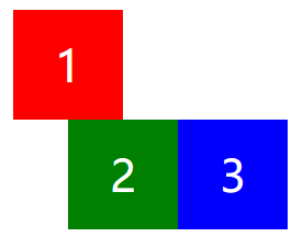
三、CSS如何进行品字布局?
1.非全屏
   div {
      margin: 0 auto;
      width: 100px;
      height: 100px;
      background: red;
      font-size: 40px;
      line-height: 100px;
      color: #fff;
      text-align: center;
    }
    .div1 {
      margin: 100px auto 0;
    }
    .div2 {
      /* 先走到视区的中央 */
      margin-left: 50%;
      background: green;
      float: left;
      /* 向左移一个div的宽度 */
      transform: translateX(-100%);
    }
    .div3 {
      background: blue;
      float: left;
      transform: translateX(-100%);
    }
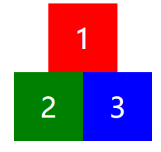
2.全屏
    div {
      width: 100%;
      height: 100px;
      background: red;
      font-size: 40px;
      line-height: 100px;
      color: #fff;
      text-align: center;
    }
    .div1 {
      margin: 100px auto 0;
    }
    .div2 {
      background: green;
      float: left;
      width: 50%;
    }
    .div3 {
      background: blue;
      float: left;
      width: 50%;
    }

四、CSS如何进行圣杯布局?

而且要做到左右宽度固定,中间宽度自适应。
1.flex布局
    .header,
    .footer {
      height: 40px;
      line-height: 40px;
      width: 100%;
      background: red;
    }
    .container {
      display: flex;
    }
    .middle {
      flex: 1;
      background: yellow;
    }
    .left {
      width: 200px;
      background: pink;
    }
    .right {
      background: blueviolet;
      width: 300px;
    }
2.float布局
    .header,
    .footer {
      height: 40px;
      width: 100%;
      background: red;
    }
    .container {
      overflow: hidden;
    }
    .middle {
      background: yellow;
    }
    .left {
      float: left;
      width: 200px;
      background: pink;
    }
    .right {
      float: right;
      width: 250px;
      background: aqua;
    }
3.绝对定位布局
    .header,
    .footer {
      height: 40px;
      width: 100%;
      background: red;
    }
    .container {
      min-height: 1.2em;
      position: relative;
    }
    .container>div {
      position: absolute;
    }
    .middle {
      left: 200px;
      right: 250px;
      background: yellow;
    }
    .left {
      left: 0;
      width: 200px;
      background: pink;
    }
    .right {
      right: 0;
      width: 250px;
      background: aqua;
    }
4.grid布局
五、CSS如何实现双飞翼布局?
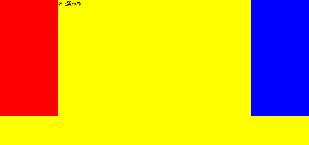
注意:这三个盒子是兄弟关系
<!DOCTYPE html>
<html lang="en">
<head>
  <meta charset="UTF-8">
  <meta name="viewport" content="width=device-width, initial-scale=1.0">
  <meta http-equiv="X-UA-Compatible" content="ie=edge">
  <title>Document</title>
  <style>
    * {
      margin: 0;
      padding: 0;
    }

    .container {
      min-width: 500px;
    }

    .left {
      float: left;
      width: 200px;
      height: 400px;
      background: red;
      margin-left: -100%;
    }

    .center {
      float: left;
      width: 100%;
      height: 500px;
      background: yellow;
    }
    .center .inner {
      margin: 0 200px;
    }
    .right {
      float: left;
      width: 200px;
      height: 400px;
      background: blue;
      margin-left: -200px;
    }
  </style>
</head>
<body>
  <article class="container">
    <div class="center">
      <div class="inner">双飞翼布局</div>
    </div>
    <div class="left"></div>
    <div class="right"></div>
  </article>
</body>

</html>
六、一个高度自适应的div,里面有两个div,一个高度100px,希望另一个填满剩下的高度
  <div class="father">
    <div class="son1"></div>
    <div class="son2"></div>
  </div>
1.calc法
    .father {
      height: 100%;
      margin: 0 50px;
    }
    .son1 {
      height: 100px;
      width: 100%;
      background-color: pink;
    }
    .son2 {
      /* 注意:calc用法,符号间有空格 */
      height: calc(100% - 100px);
      width: 100%;
      background-color: red;
    }
2.定位法
   .father {
      position: relative;
      height: 100%;
      margin: 0 50px;
    }
    .son1 {
      height: 100px;
      width: 100%;
      background-color: pink;
    }
   .son2 {
      position: absolute;
      top: 100px;
      bottom: 0;
      width: 100%;
      background-color: red;
    }
3.flex法
   .father {
     height: 100%;
      margin: 0 50px;
      display: flex;
      flex-direction: column;
    }
    .son1 {
      height: 100px;
      width: 100%;
      background-color: pink;
    }
    .son2 {
      flex: 1;
      width: 100%;
      background-color: red;
    }
七、纯CSS实现侧边栏/分栏高度自动相等
<!DOCTYPE html>
<html lang="en">
<head>
  <meta charset="UTF-8">
  <meta name="viewport" content="width=device-width, initial-scale=1.0">
  <meta http-equiv="X-UA-Compatible" content="ie=edge">
  <title>Document</title>
  <style>
    #content {
      overflow: hidden;
    }
    .left {
      width: 200px;
      margin-bottom: -3000px;
      padding-bottom: 3000px;
      background: #cad5eb;
      float: left;
    }
    .right {
      width: 400px;
      height: 400px;
      background: #f0f3f9;
      float: right;
    }
  </style>
</head>
<body>
  <div id="content">
    <div class="left">左边,无高度属性,自适应于右边的高度</div>
    <div class="right">右边,有高度属性</div>
  </div>
</body>
</html>

 浙公网安备 33010602011771号