

WPF 控件模板ControlTemplate
<Button>
<Button.Template>
<ControlTemplate>
<Grid>
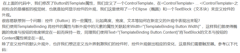
<Ellipse Name="faceEllipse" Width="{TemplateBinding Button.Width}" Height="{TemplateBinding Control.Height}" Fill="{TemplateBinding Background}"></Ellipse>
<TextBlock Name="txtBlock" Margin="{TemplateBinding Button.Padding}" VerticalAlignment="Center"></TextBlock>
</Grid>
</ControlTemplate>
</Button.Template>
</Button>
<Button>
<Button.Template>
<ControlTemplate>
<Grid>
<Ellipse Name="faceEllipse" Width="{TemplateBinding Button.Width}" Height="{TemplateBinding Control.Height}" Fill="{TemplateBinding Background}"></Ellipse>
<TextBlock Name="txtBlock" Margin="{TemplateBinding Button.Padding}" VerticalAlignment="Center"></TextBlock>
</Grid>
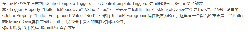
<ControlTemplate.Triggers>
<Trigger Property="Button.IsMouseOver" Value="True">
<Setter Property="Button.Background" Value="Red" />
</Trigger>
</ControlTemplate.Triggers>
</ControlTemplate>
</Button.Template>
</Button>
<Window x:Class="WPFDemo2.窗体.CustomControlTemplateWindow"
        xmlns="http://schemas.microsoft.com/winfx/2006/xaml/presentation"
        xmlns:x="http://schemas.microsoft.com/winfx/2006/xaml"
        xmlns:d="http://schemas.microsoft.com/expression/blend/2008"
        xmlns:mc="http://schemas.openxmlformats.org/markup-compatibility/2006"
        xmlns:local="clr-namespace:WPFDemo2.窗体"
        mc:Ignorable="d"
        Title="CustomControlTemplateWindow" Height="450" Width="800">
    <Window.Resources>
        <ControlTemplate TargetType="Button" x:Key="ButtonTemplate">
            <!--定义视觉树-->
            <Grid>
                <Ellipse Name="faceEllipse" Width="{TemplateBinding Button.Width}" Height="{TemplateBinding Control.Height}" Fill="{TemplateBinding Background}"></Ellipse>
                <TextBlock Name="txtBlock" Margin="{TemplateBinding Button.Padding}" VerticalAlignment="Center"></TextBlock>
            </Grid>

            <!--定义动画资源-->
            <ControlTemplate.Resources>
                <Storyboard x:Key="MouseClickButtonStoryboard">
                    <DoubleAnimationUsingKeyFrames Storyboard.TargetName="faceEllipse" Storyboard.TargetProperty="Width" BeginTime="00:00:00">
                        <SplineDoubleKeyFrame KeyTime="00:00:00" Value="50"/>
                        <SplineDoubleKeyFrame KeyTime="00:00:00.3" Value="100"/>
                    </DoubleAnimationUsingKeyFrames>
                </Storyboard>
            </ControlTemplate.Resources>

            <!--定义觉树 end-->
                <!--定义触发器-->
            <ControlTemplate.Triggers>
                <Trigger Property="Button.IsMouseOver" Value="True">
                    <Setter Property="Button.Background" Value="Red" />
                </Trigger>
                <EventTrigger RoutedEvent="Mouse.MouseDown" SourceName="faceEllipse">
                    <EventTrigger.Actions>
                        <BeginStoryboard Storyboard="{StaticResource MouseClickButtonStoryboard}"/>
                    </EventTrigger.Actions>
                </EventTrigger>
                <EventTrigger RoutedEvent="Mouse.MouseDown" SourceName="txtBlock">
                    <EventTrigger.Actions>
                        <BeginStoryboard Storyboard="{StaticResource MouseClickButtonStoryboard}"/>
                    </EventTrigger.Actions>
                </EventTrigger>
            </ControlTemplate.Triggers>
                <!--定义触发器 End-->
        </ControlTemplate>
    </Window.Resources>
    <Grid ShowGridLines="True">
        <Grid.ColumnDefinitions>
            <ColumnDefinition Width="0.2*"/>
            <ColumnDefinition Width="0.6*"/>
            <ColumnDefinition Width="0.2*"/>
        </Grid.ColumnDefinitions>
        <Grid.RowDefinitions>
            <RowDefinition Height="0.3*"/>
            <RowDefinition Height="0.3*"/>
            <RowDefinition Height="0.4*"/>
        </Grid.RowDefinitions>
        <Button Content="test btn1" Grid.Column="0" Grid.ColumnSpan="1" Grid.Row="1" Grid.RowSpan="1"/>
        <Button Content="test btn2" Grid.Column="1" Grid.ColumnSpan="1" Grid.Row="1" Grid.RowSpan="1" Template="{StaticResource ButtonTemplate}"></Button>
        <Button Content="test btn2" Grid.Column="2" Grid.ColumnSpan="1" Grid.Row="2" Grid.RowSpan="1" Template="{StaticResource ButtonTemplate}"></Button>
    </Grid>
</Window>
来源:https://blog.csdn.net/qq_30725967/article/details/126657013
扩展:
WPF不仅支持传统的Windows Forms编程的用户界面和用户体验设计,同时还推出了以模板为核心的新一代设计理念。在WPF中,通过引入模板,将数据和算法的“内容”和“形式”进行解耦。模板主要分为两大类:数据模板【Data Template】和控件模板【Control Template】
基本上,ControlTemplate描述如何显示控件,而DataTemplate描述如何显示数据
控件模板 Control Template
控件模板让我们可以定义控件的外观,改变控件的展现形式,通过Control Template实现。
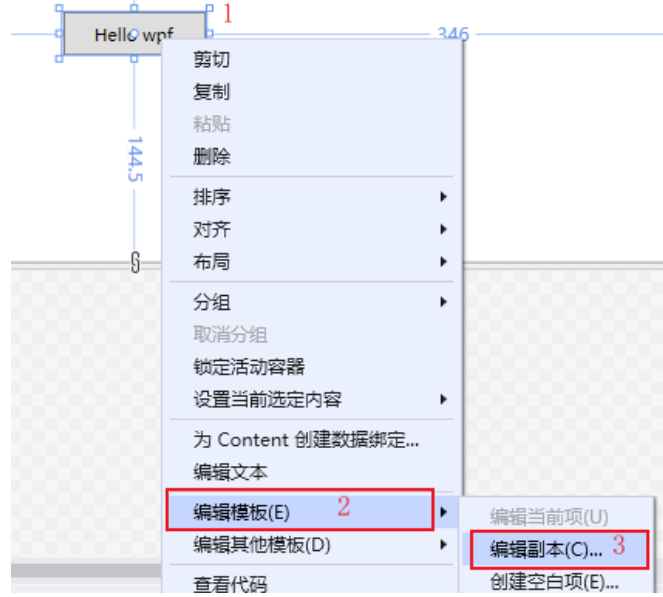
1. 编辑默认模板
选中控件--右键--编辑模板--编辑副本,打开创建Style资源对话框,如下所示:
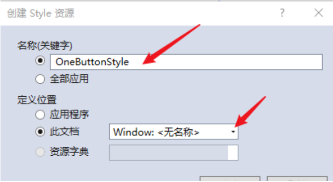
创建Style资源,输入资源名称,定义位置,默认为此文档【Window】,然后点击【确定】,创建资源。如下所示

创建控件元素的默认资源,如下所示:
<Window x:Class="WpfApp2.TwoWindow"
        xmlns="http://schemas.microsoft.com/winfx/2006/xaml/presentation"
        xmlns:x="http://schemas.microsoft.com/winfx/2006/xaml"
        xmlns:d="http://schemas.microsoft.com/expression/blend/2008"
        xmlns:mc="http://schemas.openxmlformats.org/markup-compatibility/2006"
        xmlns:local="clr-namespace:WpfApp2"
        mc:Ignorable="d"
        Title="TwoWindow" Height="350" Width="800">
    <Window.Resources>
        <Style x:Key="FocusVisual">
            <Setter Property="Control.Template">
                <Setter.Value>
                    <ControlTemplate>
                        <Rectangle Margin="2" SnapsToDevicePixels="true" Stroke="{DynamicResource {x:Static SystemColors.ControlTextBrushKey}}" StrokeThickness="1" StrokeDashArray="1 2"/>
                    </ControlTemplate>
                </Setter.Value>
            </Setter>
</Style>
        <SolidColorBrush x:Key="Button.Static.Background" Color="#FFDDDDDD"/>
        <SolidColorBrush x:Key="Button.Static.Border" Color="#FF707070"/>
        <SolidColorBrush x:Key="Button.MouseOver.Background" Color="#FFBEE6FD"/>
        <SolidColorBrush x:Key="Button.MouseOver.Border" Color="#FF3C7FB1"/>
        <SolidColorBrush x:Key="Button.Pressed.Background" Color="#FFC4E5F6"/>
        <SolidColorBrush x:Key="Button.Pressed.Border" Color="#FF2C628B"/>
        <SolidColorBrush x:Key="Button.Disabled.Background" Color="#FFF4F4F4"/>
        <SolidColorBrush x:Key="Button.Disabled.Border" Color="#FFADB2B5"/>
        <SolidColorBrush x:Key="Button.Disabled.Foreground" Color="#FF838383"/>
        <Style x:Key="OneButtonStyle" TargetType="{x:Type Button}">
            <Setter Property="FocusVisualStyle" Value="{StaticResource FocusVisual}"/>
            <Setter Property="Background" Value="{StaticResource Button.Static.Background}"/>
            <Setter Property="BorderBrush" Value="{StaticResource Button.Static.Border}"/>
            <Setter Property="Foreground" Value="{DynamicResource {x:Static SystemColors.ControlTextBrushKey}}"/>
            <Setter Property="BorderThickness" Value="1"/>
            <Setter Property="HorizontalContentAlignment" Value="Center"/>
            <Setter Property="VerticalContentAlignment" Value="Center"/>
            <Setter Property="Padding" Value="1"/>
            <Setter Property="Template">
                <Setter.Value>
                    <ControlTemplate TargetType="{x:Type Button}">
                        <Border x:Name="border" BorderBrush="{TemplateBinding BorderBrush}" BorderThickness="{TemplateBinding BorderThickness}" Background="{TemplateBinding Background}" SnapsToDevicePixels="true">
                            <ContentPresenter x:Name="contentPresenter" Focusable="False" HorizontalAlignment="{TemplateBinding HorizontalContentAlignment}" Margin="{TemplateBinding Padding}" RecognizesAccessKey="True" SnapsToDevicePixels="{TemplateBinding SnapsToDevicePixels}" VerticalAlignment="{TemplateBinding VerticalContentAlignment}"/>
                        </Border>
                        <ControlTemplate.Triggers>
                            <Trigger Property="IsDefaulted" Value="true">
                                <Setter Property="BorderBrush" TargetName="border" Value="{DynamicResource {x:Static SystemColors.HighlightBrushKey}}"/>
                            </Trigger>
                            <Trigger Property="IsMouseOver" Value="true">
                                <Setter Property="Background" TargetName="border" Value="{StaticResource Button.MouseOver.Background}"/>
                                <Setter Property="BorderBrush" TargetName="border" Value="{StaticResource Button.MouseOver.Border}"/>
                            </Trigger>
                            <Trigger Property="IsPressed" Value="true">
                                <Setter Property="Background" TargetName="border" Value="{StaticResource Button.Pressed.Background}"/>
                                <Setter Property="BorderBrush" TargetName="border" Value="{StaticResource Button.Pressed.Border}"/>
                            </Trigger>
                            <Trigger Property="IsEnabled" Value="false">
                                <Setter Property="Background" TargetName="border" Value="{StaticResource Button.Disabled.Background}"/>
                                <Setter Property="BorderBrush" TargetName="border" Value="{StaticResource Button.Disabled.Border}"/>
                                <Setter Property="TextElement.Foreground" TargetName="contentPresenter" Value="{StaticResource Button.Disabled.Foreground}"/>
                            </Trigger>
                        </ControlTemplate.Triggers>
                    </ControlTemplate>
                </Setter.Value>
            </Setter>
</Style>
    </Window.Resources>
    <Grid>
        <Button x:Name="one" Content="Hello wpf" Margin="5" Width="100" Height="30" Style="{DynamicResource OneButtonStyle}"></Button>
    </Grid>
</Window>
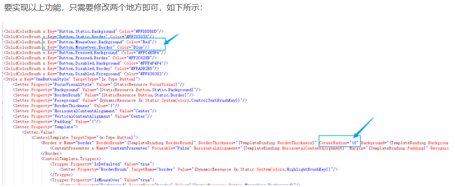
2. 修改默认样式
通过默认创建的控件模板Style,可以修改和重定义控件的显示内容,如:设置按钮显示圆角,和鼠标放上去为红色。

 浙公网安备 33010602011771号