11.3 QSS伪状态
一、QSS伪状态
- 为选择器添加一些特殊的效果,比如鼠标停留高亮效果,或者鼠标按下切换效果等,都是为了使控件和用户的交互更加明显,这节课就来介绍几种常用的QSS伪状态的使用。
1.基本原理
常见伪状态:
 '''常见伪状态
        :checked  # 控件被选中
        :unchecked  # 控件被取消选中
        :hover  # 鼠标停留
        :pressed  # 控件被按下
        :focus  # 获取到焦点
        :disable  # 失效控件
        :enable  # 有效控件
        :indeterminate  # checkBox或radioButton被部分选中
        :on  # 开启状态
        :off  # 关闭状态
        '''
伪状态取反:
 '''伪状态取反(加!号)
        :!checked == :unchecked
        '''
        '''伪状态连用规则
        :hover:checked   鼠标覆盖并且选中
        :hover:!checked  鼠标覆盖没有选中
2.代码
from PyQt5.Qt import *
import sys
class Window(QWidget) :
def __init__(self) :
super().__init__()
self.setWindowTitle("QSS-伪状态 - PyQt5中文网")
self.resize(600, 500)
self.func_list()
def func_list(self) :
self.func()
def func(self) :
'''常见伪状态
:checked # 控件被选中
:unchecked # 控件被取消选中
:hover # 鼠标停留
:pressed # 控件被按下
:focus # 获取到焦点
:disable # 失效控件
:enable # 有效控件
:indeterminate # checkBox或radioButton被部分选中
:on # 开启状态
:off # 关闭状态
'''
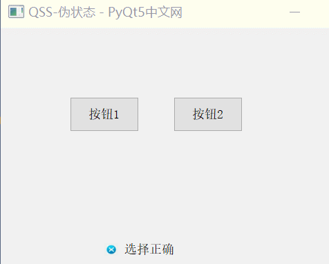
btn1 = QPushButton('按钮1', self)
btn1.move(100, 100)
btn1.resize(100, 50)
btn2 = QPushButton('按钮2', self)
btn2.move(250, 100)
btn2.resize(100, 50)
'''伪状态
QPushButton:hover{
background-color: red;
}
QPushButton:pressed{
background-color: green;
}
'''
ck = QCheckBox('选择正确答案', self)
ck.move(150, 300)
ck.resize(100, 40)
ck.setTristate(True)
'''伪状态三态设置
QCheckBox::indicator{
width:20px;
height:20px;
}
QCheckBox::indicator:checked{
image:url(y.png);
}
QCheckBox::indicator:indeterminate{
image:url(../2.png);
}
QCheckBox::indicator:unchecked{
image:url(n.png);
}
'''
'''伪状态取反(加!号)
:!checked == :unchecked
'''
'''伪状态连用规则
:hover:checked 鼠标覆盖并且选中
:hover:!checked 鼠标覆盖没有选中
QCheckBox::indicator:checked:hover{
image:url(y.png);
border:2px solid red;
}
'''
pass
if __name__ == '__main__' :
app = QApplication(sys.argv)
window = Window()
with open('qss11_3.qss', 'r', encoding='UTF-8') as f :
qApp.setStyleSheet(f.read())
window.show()
sys.exit(app.exec_())
3.效果

 浙公网安备 33010602011771号