关于inline元素和block元素
inline和block
inline
行内元素。a span strong
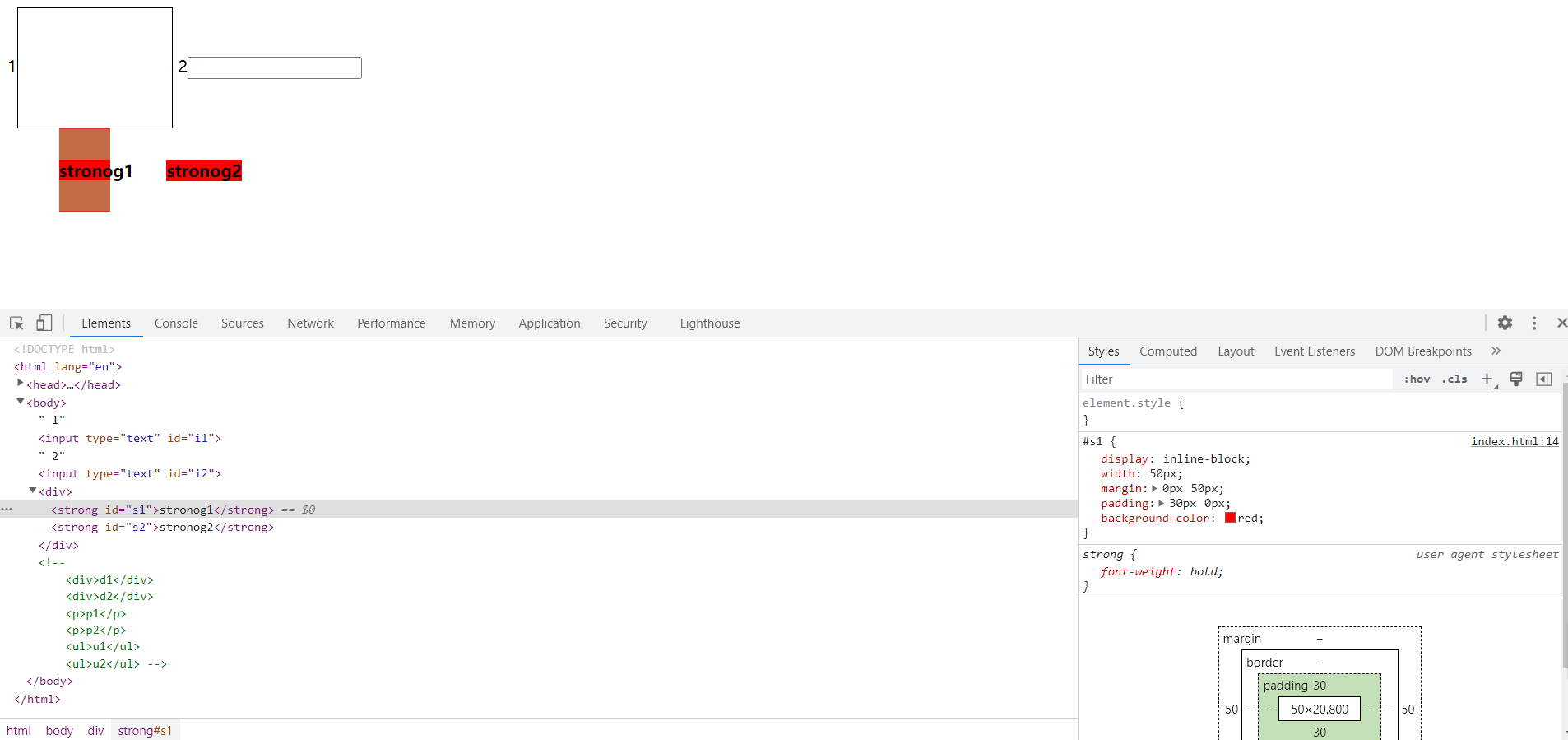
行内元素标签之间可以同行显示。如:
    1<input type="text" id="i1">
    2<input type="text" id="i2">
    <div>
        <strong id="s1">stronog1</strong>
        <strong id="s2">stronog2</strong>
    </div>
显示为:

行内元素有三个特点:
- 同行显示;
- 不能设置宽高;
- 不能设置垂直方向上的margin和padding。
其中,inline元素垂直方向上的margin设置无效。

垂直方向上的padding虽然有所显示,但是并不能够给元素撑开一个空间,上方的input直接与strong的padding部分重叠了。如果将strong的display改成inline-block,则不会出现这种情况。
w3c中给出的解释是:
While padding can be applied to all sides of an inline element, only left and right padding will have an effect on surrounding content. In the example below, 50px of padding has been applied to all sides of the element. As you can see, it has an affect on the content on each side, but not on content above or below
当我们使用内边距时,只有左右方向有效;当我们设置四个方向的内边距时,对于该行内元素,确实显示出效果,但是竖直方向的内边距只有效果,对其他元素无任何影响(即无法为当前元素在视图中占据位置)。
block
块级元素。 div h1 ul p
块级元素独占一行。如:
    <div>d1</div>
    <div>d2</div>
    <p>p1</p>
    <p>p2</p>
    <ul>u1</ul>
    <ul>u2</ul>
显示为:

块级元素的三个特点:
- 独占一行,多个块状默认从上到下;
- 可以设置宽高,默认width为父元素width,即100%;
- 设置margin和padding都有效。
可替换元素
如果说行内元素是可以同行显示的元素,但是input、img、textarea这类元素,不仅可以设置宽高,而且可以设置竖直方向上的margin和padding。

这类元素属于可替换元素,即显示内容需要根据标签的属性来决定,如input需要根据type来决定,img需要根据src来决定,textarea需要根据cols和rows来决定。这类可替换元素具有行内块元素的性质,其中input和textarea(可能是除了img以外的可替换元素)的display直接显示为inline-block。
总结
- 行内元素的margin-top、margin-bottom和padding-top、padding-bottom属性设置是无效的,但是必须注意的是,对于padding-top和padding-bottom的设置,从显示效果上来看是增加的,但其实设置是无效的,因为它们没有撑大盒子,并不会对周围的元素产生影响。
- img input textarea等属于行内元素,几乎所有的可替换元素都是行内元素。

 浙公网安备 33010602011771号