1.数据格式:
GeoJSON、
  ESRI控制格式和其他矢量文件格式的优秀工具
    字段:
	  adcode
	  name
	  childrenNum
	  level
	  parent
	  subFeatureIndex
	  geometry: geometry列,可以通过经纬度数据Latitude和Longitude创建该列
Shapely

 WKT (Well-Known Text) 是一种用于描述地理位置的数据格式。
    WTK格式的数据包含点、线、多边形等地理位置信息
    。WTK格式的数据可以被许多GIS软件和地理位置分析工具所读取和处理
数据处理
GeoPandas
   GeoPandas的目标是使在python中使用地理空间数据更容易。它结合了Pandas和Shapely的能力
     核心是 geopandas.GeoDataFrame geopandas.GeoSeries
生成关于南美城市的dataframe数据
import pandas as pd
import geopandas as gpd
df = pd.DataFrame(
    {
        "City": ["Buenos Aires", "Brasilia", "Santiago", "Bogota", "Caracas"],
        "Country": ["Argentina", "Brazil", "Chile", "Colombia", "Venezuela"],
        "Latitude": [-34.58, -15.78, -33.45, 4.60, 10.48],
        "Longitude": [-58.66, -47.91, -70.66, -74.08, -66.86],
    }
)
gdf = gpd.GeoDataFrame(
    df, geometry=gpd.points_from_xy(df.Longitude, df.Latitude), crs="EPSG:4326"
)
数据可视化
 分级统计图 Choropleth
     scheme="QUANTILES", # 设置分层设色标准

 比例尺可以帮助我们了解地图上的距离和大小关系。
    基于matplotlib进行可视化时,可以利用matplotlib-scalebar[6]库添加比例尺。

 # pip install matplotlib_scalebar安装
 from matplotlib_scalebar.scalebar import ScaleBar

 pip install mapclassify
GeoPandas需要安装,以下第三方库也需要安装:
pip install mapclassify
pip install matplotlib_scalebar
pip install rtree
pip install contextil
pip install shapely
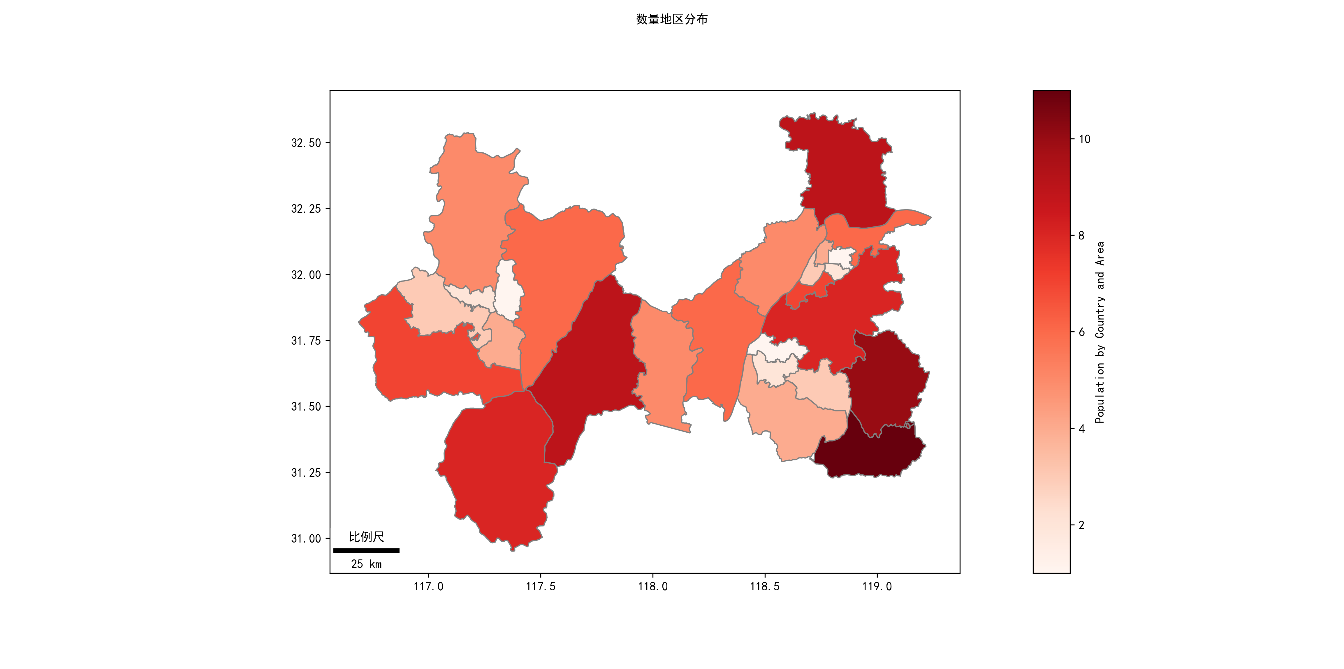
代码示例
import geopandas as gpd
import matplotlib.pyplot as plt
from mpl_toolkits.axes_grid1 import make_axes_locatable
import pandas as pd

from matplotlib_scalebar.scalebar import ScaleBar

# 设置matplotlib绘图模式为嵌入式
plt.rcParams["font.family"] = "SimHei" # 设置全局中文字体为黑体
# 读入中国领土面数据
china_nj = gpd.read_file(r'D:\a_mark_stat\geojson\南京市.json', encoding='utf-8')
china_hf = gpd.read_file(r'D:\a_mark_stat\geojson\合肥市.json', encoding='utf-8')
china_mas = gpd.read_file(r'D:\a_mark_stat\geojson\马鞍山市.json', encoding='utf-8')

result = pd.concat([china_nj, china_hf,china_mas], axis=0)
result["parent_id"]=result["parent"].str.get('adcode').astype("str")
#result["parent_id"]=result["parent"].str.get('adcode')

data_cot = pd.DataFrame([1,2,3,4,5,6,7,8,9,10, 11,
                         21 ,22,23,24,25,26,27,28,29,
                         31,32,33,34,35,36],columns=["data_value"])
print("data_nm",len(result["parent_id"]),len(data_cot["data_value"]))
# 初始化画板
fig, ax = plt.subplots(figsize=(8, 2))

# 设置图例,right表示位置,size=5%表示图例宽度,pad表示图例离图片间距
divider = make_axes_locatable(ax)
cax = divider.append_axes("right", size="5%", pad=0.2)
# # 将数据从DataFrame转换为GeoDataFrame
#data_with_geometry = gpd.GeoDataFrame(result)
#print("type",type(data_with_geometry),type(result))
# 创建ScaleBar对象所需的唯一参数是 dx 。这等于现实世界中一个像素的大小。此参数的值取决于您的CRS的单位

from shapely.geometry.point import Point
points = gpd.GeoSeries([Point(-73.5, 40.5), Point(-74.5, 40.5)], crs=4326)  # Geographic WGS 84 - degrees
points = points.to_crs(32619) # Projected WGS 84 - meters
distance_meters = points[0].distance(points[1])
result = result.to_crs(4326)
ax = result.plot(ax=ax,
                 #kind ="geo",
                 column= data_cot["data_value"], # 根据geoDataFrame的哪一列来进行着色
                 cmap='Reds',
                 edgecolor='grey',
                 legend=True,
                 cax=cax,
                 #  pip install mapclassify
                  #legend_kwds={'title': "Population by Country and Area", 'loc':'lower left',},
                  legend_kwds={'label': "Population by Country and Area", 'orientation': "vertical"},
                 #scheme= "NaturalBreaks",
                 k=5,
                 #categorical=True,
                 )
#scalebar =ScaleBar(distance_meters,label='比例尺',location='lower left', color='#b32400', box_color='yellow',box_alpha=0.8)
scalebar =ScaleBar(distance_meters,label='比例尺',location='lower left',box_alpha=0.8)
ax.add_artist(scalebar)
# # 显示各地级市包含区县数量
# for index in result.index:
#     x = result.iloc[index].geometry.centroid.x
#     y = result.iloc[index].geometry.centroid.y
#     name = result.iloc[index]["childrenNum"]
#     names = result.iloc[index]["name"]
#     print(x, y, name,names)
#     ax.text(x, y, name, ha="center", va="center",color='red')
# vertical horizontal
#ax.legend(result["parent_id"],title="数量分级", loc='lower left', ncol=1, shadow=False)
# 移除坐标轴
#ax.axis('off')
# 添加大标题、小标题和数据说明文字
# 添加最高级别标题
plt.suptitle('数量地区分布', fontsize=10)
plt.tight_layout(pad=0.5) # 调整不同标题之间间距
# ax.text(-2000, 1000, '* 原始数据来源:que')
# 显示曲线图像
plt.show()
fig.savefig(r'D:\a_mark_stat\geojson\图16.png', dpi=300)
图片
图片内容
![]()
其他数据格式
OSM文件
OSM文件是OpenStreetMap的原生文件
    GIS格式OSM是OpenStreetMap基于XML的文件格式
涵盖了节点(Nodes)、道路(Ways)、关系(Relations)和标签(Tags)

格式说明
       经度(longitude)和纬度(latitude)缩写为lon和lat
       bounds节点记录了这个文件的范围
       4个node节点代表了4个位置。
       way节点引用了node节点(通过id),以这样的方式表示出了一个范围。以此可见way节点并不仅表示“路(way)”。
       tag指出了这个way节点是一个建筑(building)

      relation节点,它指明了自己的边界包含了哪些way节点
参考
 https://www.cnblogs.com/feffery/p/12361421.html
Python绘制数据地图-GeoPandas使用要点 https://blog.csdn.net/lemonbit/article/details/131447360
向matplotlib绘图添加比例尺 https://www.osgeo.cn/geopandas/gallery/matplotlib_scalebar.html
https://datav.aliyun.com/portal/school/atlas/area_selector
 [数据分析与可视化] Python绘制数据地图2-GeoPandas地图可视化 https://www.cnblogs.com/luohenyueji/p/17299870.html
 https://zhuanlan.zhihu.com/p/554141479
https://geopandas.org/en/stable/
 https://blog.csdn.net/qq_40206371/article/details/120464056
 Python绘制数据地图-GeoPandas使用要点 https://blog.csdn.net/lemonbit/article/details/131447360


 浙公网安备 33010602011771号