react-ui--material-ui学习
package.json
"dependencies": {
    "@material-ui/core": "^4.12.3",
    "@material-ui/lab": "^4.0.0-alpha.60",
    "@testing-library/jest-dom": "^5.14.1",
    "@testing-library/react": "^11.2.7",
    "@testing-library/user-event": "^12.8.3",
    "react": "^17.0.2",
    "react-dom": "^17.0.2",
    "react-scripts": "4.0.3",
    "web-vitals": "^1.1.2"
  },
App.js
import React from "react";
import Autocomplete from '@material-ui/lab/Autocomplete';
import TextField from '@material-ui/core/TextField';
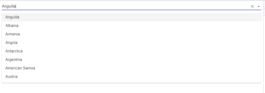
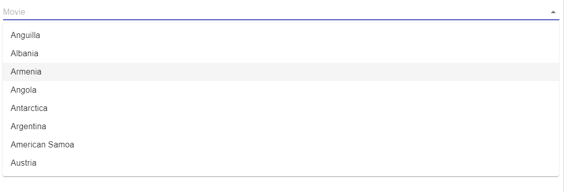
const top100Films = [
{ code: 'AI', label: 'Anguilla', phone: '1-264' },
{ code: 'AL', label: 'Albania', phone: '355' },
{ code: 'AM', label: 'Armenia', phone: '374' },
{ code: 'AO', label: 'Angola', phone: '244' },
{ code: 'AQ', label: 'Antarctica', phone: '672' },
{ code: 'AR', label: 'Argentina', phone: '54' },
{ code: 'AS', label: 'American Samoa', phone: '1-684' },
{ code: 'AT', label: 'Austria', phone: '43' },
];
function App() {
return (
<Autocomplete
// disablePortal
id="combo-box-demo"
options={top100Films}
getOptionLabel={(option) => option.label}
sx={{ width: 300 }}
renderInput={(params) => <TextField {...params} placeholder="Movie" />}
/>
);
}
export default App;
界面
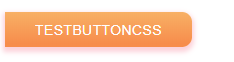
使用自定义样式
方法一,使用 styled
- 定义自定义样式的组件
// import React from 'react';
import Button from '@material-ui/core/Button';
import {styled} from '@material-ui/core/styles'

const CustomButtonCss = styled(Button)({
    color: 'white',
    border: 0,
    height: '35px',
    padding: '0 30px',
    background: 'linear-gradient(180deg, #feb16b 00%, #ff8e53 90%)',
    boxShadow: '0 3px 5px 2px rgb(255, 105, 135, .3)',
    borderRadius: '0 10px 10px 0',
});

function ButtonCss(){
    return (
        <CustomButtonCss>testButtonCss</CustomButtonCss>
    );
}

export default ButtonCss;
2.页面效果
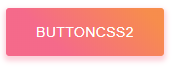
方法二,使用 makeStyles
1.包装自定义组件
import * as React from 'react';
import { makeStyles } from '@material-ui/styles';
import Button from '@material-ui/core/Button';

const useStyles = makeStyles({
  root: {
    background: 'linear-gradient(45deg, #FE6B8B 30%, #FF8E53 90%)',
    border: 0,
    borderRadius: 3,
    boxShadow: '0 3px 5px 2px rgba(255, 105, 135, .3)',
    color: 'white',
    height: 48,
    padding: '0 30px',
  },
});

export default function Hook() {
  const classes = useStyles();
  return <Button className={classes.root}>ButtonCss2</Button>;
}
2.效果
修改组件内部嵌套元素的样式
const useStyles = makeStyles({
  root: {
    color: 'red',
    '& p': {
      color: 'green',
      '& span': {
        color: 'blue',
      },
    },
  },
});
方式三,使用 withStyles
1.定义组件
import * as React from 'react';
import PropTypes from 'prop-types';
import { withStyles } from '@material-ui/styles';
import Button from '@material-ui/core/Button';
const styles = {
root: {
background: 'linear-gradient(45deg, #FE6B8B 80%, #FF8E53 10%)',
border: 0,
borderRadius: 3,
boxShadow: '0 3px 5px 2px rgba(255, 105, 135, .3)',
color: 'white',
height: 48,
padding: '0 30px',
},
};
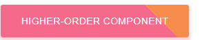
function HigherOrderComponent(props) {
const { classes } = props;
return <Button className={classes.root}>Higher-order component</Button>;
}
HigherOrderComponent.propTypes = {
classes: PropTypes.object.isRequired,
};
export default withStyles(styles)(HigherOrderComponent);
2.效果

 浙公网安备 33010602011771号