

React 配置 rem (移动端适配)
移动端适配方案介绍
- 在移动端中,为了设配不同的设备,通常使用rem来做适配。
- rem是通过根元素进行适配的,网页中的根元素指的是<html>,我们通过设置<html>的字体大小就可以控制 rem 的大小(1rem = 1根元素字体大小)
- 可见,只要我们根据不同屏幕(使用css媒体查询或js)设定好根元素<html>的字体大小,其他已经使用了rem单位的元素就会自适应显示相应的尺寸。
- 设计稿一般是按照一种特定设备型号(如iphone6 375px)为基础且以px单位来定义样式,为了让设计稿能够通用在不同的设备型号中,则存在着从px到rem的繁琐计算转化过程,因此需要更加科学的方式来使用rem单位。
- px2rem或postcss-px2rem的原理:将css中px编译为rem,配合js根据不同手机型号计算出dpr的值,修改<meta>的viewport值和置<html>的font-size。
配置步骤
1. 安装依赖包
yarn add lib-flexible postcss-px2rem
2. 配置
- 2.1 导出 webpack 配置文件 :
- 命令 :
yarn eject - 需要添加到本地git仓库 :
git add . 和 git commit -m xxx - 查看配置文件 :
config/webpack.config.js
- 命令 :
- 2.2 修改配置文件
- 引入模块 :
const px2rem = require('postcss-px2rem') - 添加配置 :
px2rem({ remUnit: 37.5 })
- 引入模块 :
px2rem({ remUnit: 37.5 }) 的意思就是1rem = 37.5px 这个是根据375px设计稿来的
2.3 改后代码
{
        loader: require.resolve('postcss-loader'),
        options: {
          ident: 'postcss',
          plugins: () => [
            require('postcss-flexbugs-fixes'),
            require('postcss-preset-env')({
              autoprefixer: {
                flexbox: 'no-2009'
              },
              stage: 3
            }),
            px2rem({ remUnit: 37.5 }),  //  添加的代码
            postcssNormalize()
          ],
          sourceMap: isEnvProduction && shouldUseSourceMap
        }
      }
3. 引入
在 入口文件 index.js 里引入 lib-flexible
import 'lib-flexible'
4. 演示
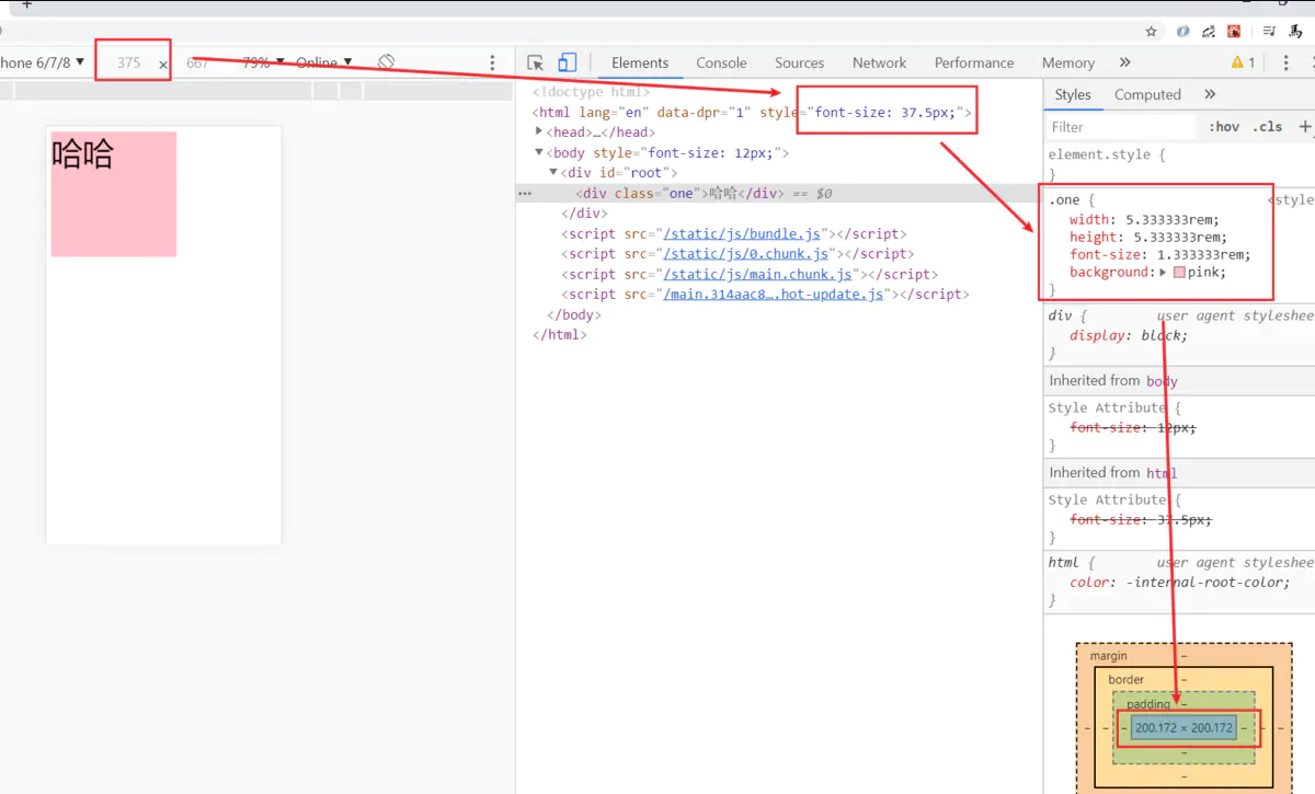
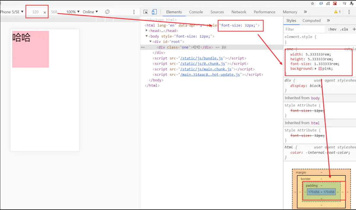
- 4.1 编写的代码样式
.one {
  width: 200px;
  height: 200px;
  font-size: 50px;
  background: pink;
}
4.2 效果1 : 375px宽
4.3 效果2 :
4.4 效果3

淘宝弹性布局方案lib-flexible不兼容ipad和ipad pro的解决方法
<script>
        /(iPhone|iPad|iPhone OS|Phone|iPod|iOS)/i.test(navigator.userAgent)&&(head=document.getElementsByTagName('head'),viewport=document.createElement('meta'),viewport.name='viewport',viewport.content='target-densitydpi=device-dpi, width=480px, user-scalable=no',head.length>0&&head[head.length-1].appendChild(viewport));
</script>

 浙公网安备 33010602011771号